Positivo Group
Branding
Branding

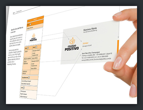
All brands have kept the Positivo logotype as unifying element, with color being the one element differentiating the areas of expertise each brand acted on. The hand was kept unchanged for the strength of its symbol, known to the whole country. The project focused more on unifying the many brands of the group under one same template than propose a new positioning.

To aid the creation of new brands, for the holding is constantly expanding and creating new products and internal divisions, the brandbook had strict instructions on how such logos should be. Over 300 files were made available for the client, comprising artworks, grids, fonts and guides.