

'Big Brand' Corporate Identity Rebranding: Process
In this project, students are starting from ”scratch” with a company of their choosing, and asked to redefine the existing company from logo through guerrilla marketing. This is a significant body of work with many components, each requiring special attention and development to match tightly to the new strategy, positioning, and verbal and graphic tonality.
Because of my interest in social and politically relevant issues, I want to explore rebranding an issue, rather than a consumer-driven company. In my initial research, I found one social issue in desperate need of a 'rebranding' in the eyes of Americans: Nuclear Power.

Preconceived Notions
The word "nuclear" conjures images of mushroom clouds, radioactive symbols, large, threatening cooling towers, and the devastated rubble in places like Chernobyl and Fukushima. Especially with the popularity of HBO series Chernobyl, a whole new generation of Americans have been introduced to the possible horrors of nuclear power malfunctions.
Yet, most people are unaware of the presence of nuclear plants in their home state, and the role that they play in the production of clean power. While nuclear power is not without its problems, it remains a source of reliable, affordable and clean energy that produces no greenhouse gases.
The goal of this rebranding is to change nuclear's reputation from
a terrible, dirty threat to an invaluable and irreplaceable
part of solving the worst
energy crisis in history.
a terrible, dirty threat to an invaluable and irreplaceable
part of solving the worst
energy crisis in history.
I've chosen to use the organization 'Nuclear Matters,' as the target for this rebranding. Nuclear Matters is comprised of the former CASEnergy Coalition and Nuclear Advocacy Network (NAN), combined to form a coalition with the goal of informing the public about the benefits of nuclear energy. I chose this organization because they are educational, and not focused on partisanship or politics. We'll explore more about this organization later in the process when it comes to redesigning the logo.
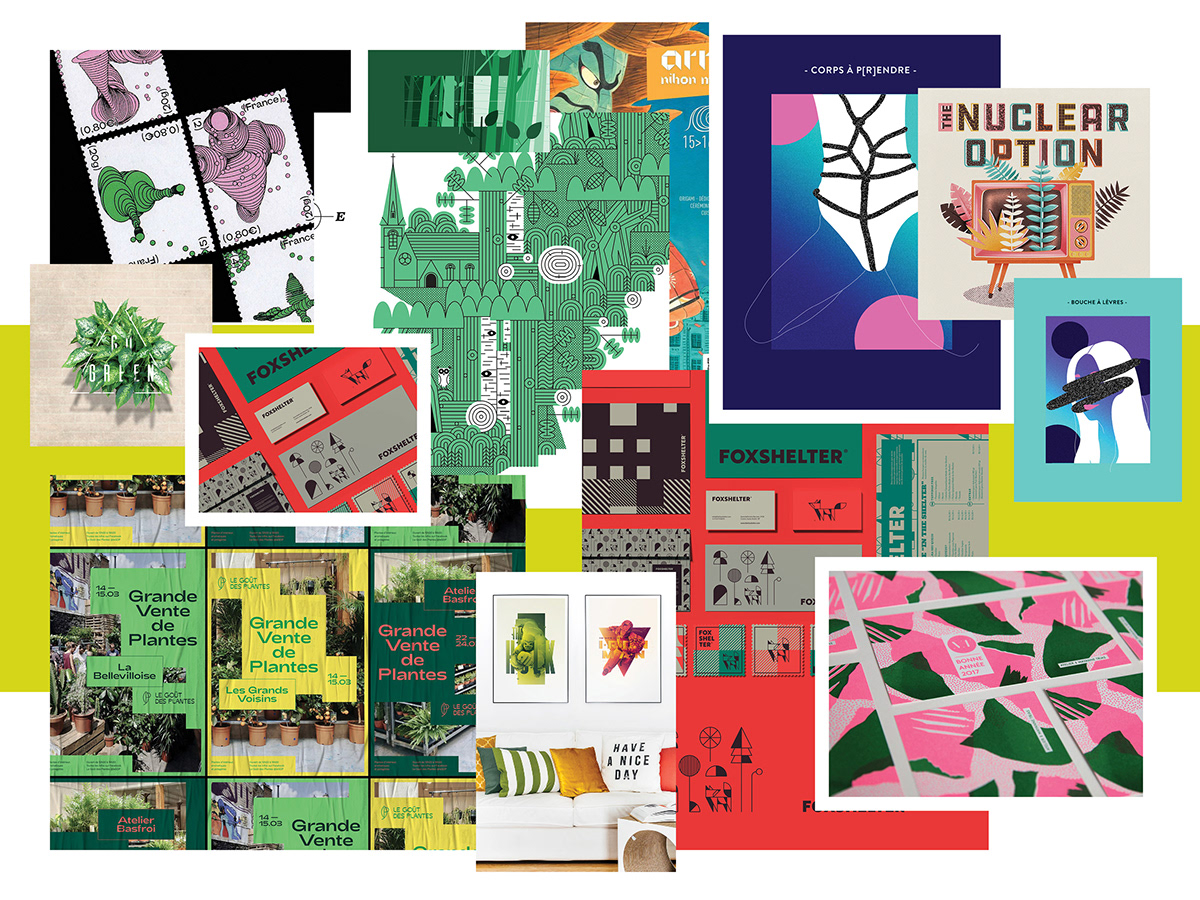
Mood board: Overall look and feel
Doing some initial research, I pulled images that captured the overall look and feel that I think will successfully achieve the goal of the project.
Bright, bold colors complimented by light neutrals steer the project in a fun and dynamic direction, rather than making it appear stagnant and threatening. Linear detailing paired with large, organic shapes parallel the simplification of the hyper-specific process of creating nuclear energy, hopefully in a way that all viewers can easily understand.
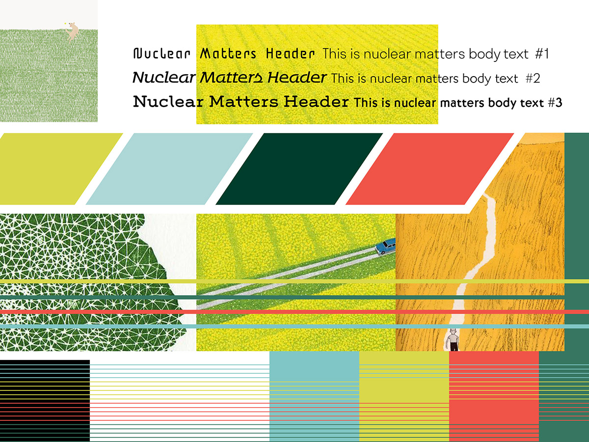
Mood board: Texture, color, and type
I then pulled images, textures, colors, and fonts that I wanted to consider when beginning to design deliverables.
Subtle, consistent texture—especially that of grass, fields, and other greenery—work well in creating the feel I'm looking for. I've also picked a color palette that mimics that of other renewable energy; natural, green tones with a funky twist on them freshen up the look.
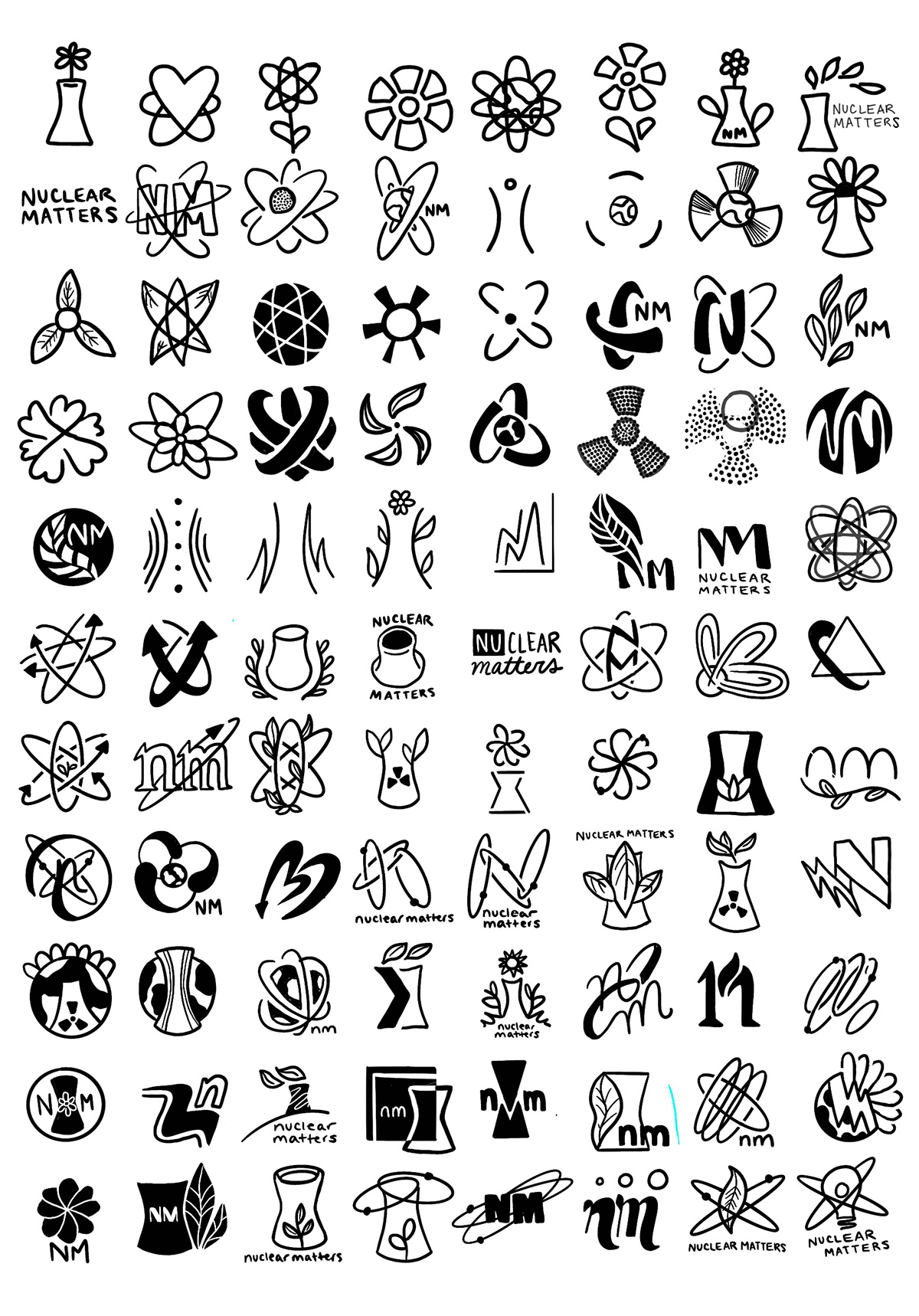
100 Logo Sketches
The best way to ensure you've come up with the best logo possible? Come up with 100 possible versions. This exercise allows me to explore all possible directions for the new Nuclear Matters logo, starting with the most obvious solution and ending up in some new, creative territory. The inspiration for many of my sketches was typical 'green-energy' logos, which I wanted to emulate while putting my own fresh twist on them.
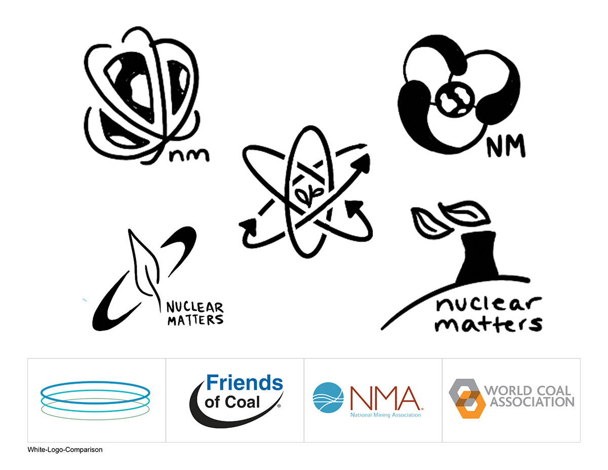
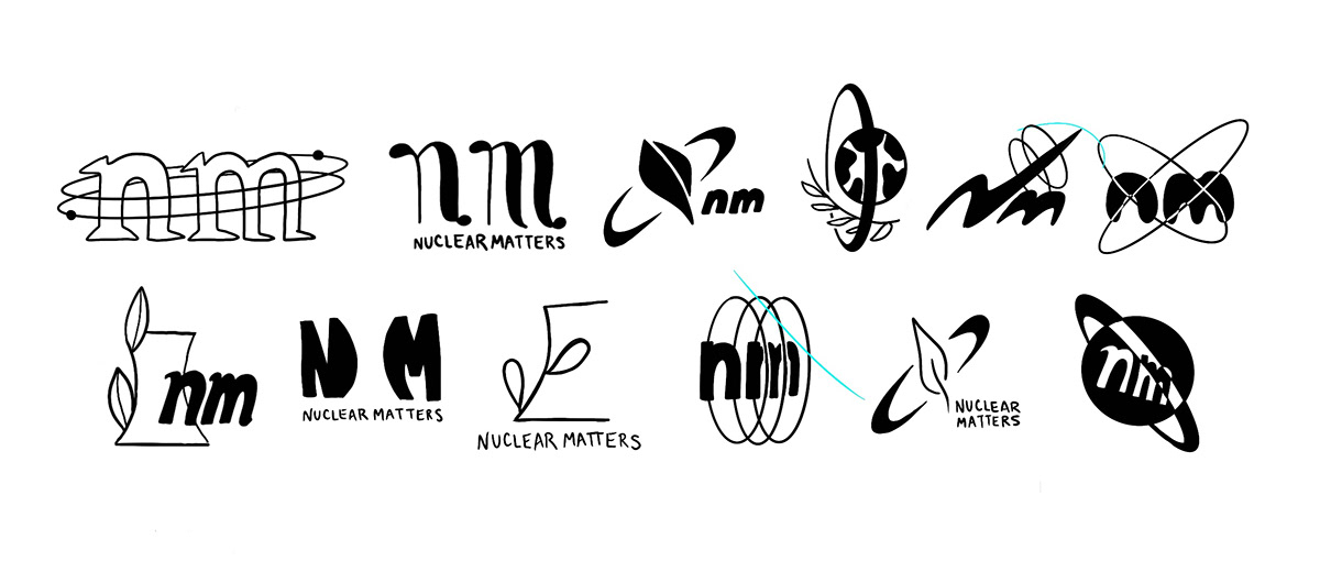
Logo Options
To begin the process of narrowing down which logo sketch would be the basis of my final Nuclear Matters logo, I narrowed down my options from 100 to 5. I was able to do this through my classmates' guidance, as well as evaluating my own favorites. Most of these are inspired by the atomic orbit-shape (some more literal than others), while one took inspiration from the shape of reactor cooling towers. As it happens, the cooling tower sketch was chosen as one of the favorites following this critique, as well as the center atomic symbol.

Refined Logo Options
Upon my classmates choosing their favorites, I then refined these logos using Illustrator and added some sample type. While both of these options are far from finished, it's from here that I need to decide which direction I would be moving in: the atomic symbol or cooling tower. Listening to critique, my professor pointed out that the atomic symbol is more of an obvious choice, while the cooling tower is conceptual and a little more far-out of an option. He suggested that if I chose that option, I should explore the form further and experiment with it.

Final Logo(ish)
And experiment I did! Pushing the concept of the cooling tower a little further, I added some highlights that mimic the form of a capital N, for Nuclear Matters. The leaves flowing from the tower represent the steam the cooling reactor emits, which is clean in comparison to the pollution from coal plants.
I'm pretty confident that this is the direction I'd like to go in, but I'll continue to tweak until I'm 100% happy with it, and ready to move forward with the project.

Final Logo
After some final tweaking with type and dimension, I've finally worked out the final logo for this project. The final uses font Interstate Mono, in all caps, stylized in the horizontal lockup to emphasize the "nu" and "clear" as two distinct parts of the same whole.

Mindmapping
To begin generating ideas for the concept, I went ahead and started mindmapping Nuclear Matters, using the research I had compiled up until this point. This helped me pull out the most important points and the most powerful facts, all in one place, that will come in handy when working out the messaging.


Messaging
Brainstorming the messaging came next. While I'm not a copywriter, students are required to complete all parts of the project themselves, so I needed to work through the messaging as best I could. Luckily, after making my mind map, I had a pretty good idea of what to say. Knowing that this campaign would be targeting a younger audience, I wrote up some punny, humorous headlines and paired them with facts and calls to action to get the point across.
While writing my messaging, I began thinking of what visuals would work best to emphasize the concept and calls to action. This is super helpful, as my next step is sketching layouts.

Layout sketches
Using that brainstorming, I then sketched out some visuals of each of these layouts, and placing in temporary, integrated type. This is so exciting, as this will be the basis of the campaign, and these illustrations will be used in many different ways. The next step is making these sketches come to life digitally.


Illustrations
Starting with the illustrations, which take on a Pop Art, Roy Lichtenstein-style approach. The inspiration for using this style came from my research and writing the messaging, while I was thinking of the cold-war era nuclear drills in the 1960's that baby boomers experienced. As part of my goal for this project is to change the memories associated with Nuclear, I thought using a style from the same era would be a good start.


Posters | WIP
Starting to experiment with the poster design using the sketches and illustrations I completed previously. Once I complete one, it gets easier to keep going, but this first poster is crucial in developing the look and feel of the entire campaign. This is also a good look at how I'm laying out my workspace on Illustrator; with my sketches and messaging close by. The second image shows how the number of layers looks in Photoshop.


Brand Guide | WIP
The next deliverable in progress is the brand guide. This will take on the same overall look and feel of the posters, but toned down just a tad in the interest of maintaining the brand standards outlined within the document. The hardest part of this deliverable is not the branding itself, but the copy, as describing every last detail is important when creating a manual.
These WIP screenshots give a good idea of the grid I'm using, my workspace, and how I've chosen to lay out the document. Luckily, after designing the brand guide for the South Africa Office of Tourism, this is a breeze now.

Zine | WIP
Next, I've started to work on a zine, which will act as my guerilla marketing tactic. The zine will act as a takeaway from the COSI Exhibit (more on that later), and from other events that Nuclear Matters attends, such as rallies against climate change, and fundraisers for renewable energy.
Because of the Roy-Lichtenstein, comic book-inspired style I'm using for the project, I thought an excellent way to carry that forward while engaging my target audience of 13-20 year/olds would be to have the zine work as a mini-comic book. The first step was drawing out the panels and coming up with a story and rough draft of the layout. I had a rough idea of what the story would be when I began, but once I started drawing the layout it started to flow naturally. This could be because of my love for comic books; my childhood was filled with collecting vintage Archie comics, and reading Calvin and Hobbes, Zits, Bloom County, Get Fuzzy, and the Far Side.


Once I finished this rough draft, I started to think how I'd be laying this out in a zine. One of my worst habits as a designer is thinking about the logistics as an afterthought, and this is one of these times. Luckily, after cutting and stapling some paper together, I had a layout for a 4x5 in zine, where each strip of the comic would act as a spread.


Next, I started rendering each panel of the comic as a final illustration using ProCreate. This is fun, but a long process, so I'm moving through it as fast as possible so I can get this deliverable finished. The process starts with measuring the size that the panel needs to be in InDesign, creating a canvas in ProCreate to match that, sketching out an initial layer of general placement, another layer of refinement and detail, and then a final layer in black of the finished illustration.
Here's a look at what this process looks like from start to (almost) finish. This is about an hour's worth of work, sped up for your convenience. Since I'm not a professional illustrator and this is not the style I usually draw in, this involves a lot of drawing, erasing, and redrawing to get all the proportions right. Still, I'm fairly happy with the panels so far.
Time allowing, I'm also considering screen printing the comic on newsprint for a fun, vintage effect. The print would be huge (2ft by 1ft), and fold out like a real newspaper. I think this would be a fun addition to the project and a cool thing to bring in as my "surprise and delight" for my presentation, so hopefully I get a chance to do it!


Website & Press Kit | WIP
The next deliverable I'm working on is a few pages of the website, redesigned in the style of the campaign. I've created a home page, an about page, and a media kit page, with active links to access each one. Also included with this portion of the project is a video showing the user navigating the website prototype.
The Press Kit, another deliverable, is also included on the website. A media kit is a package of information that provides basic information about itself to reporters. The idea is that if a reporter wanted to write an article about Nuclear Matters, they could navigate to the page on the website and have all of the assets they need.


Direct Mailer | WIP
One of the last deliverables in progress is the direct mailer. The mailer has the function of promoting the COSI Exhibit (which is the last last deliverable). While this may seem a little backwards, sometimes it helps me to design something advertising a larger deliverable before that deliverable is in progress, so I can make faster decisions on the little things about it that will make it easier for me to get started.
For this deliverable I repurposed the layout for my South Africa gate fold mailer, because I enjoyed how effective it was for the message. For the imagery, I also repurposed some of the preliminary illustrations I did for the project. With this deliverable in progress, I'm excited to be nearing the end of this project!


COSI Exhibit | WIP
The final deliverable of this project is also my capstone element, which is a wild card deliverable of my choice, based off of my career ambitions for the future. Because I hope to be an art director one day, I chose the design of a COSI Exhibit for this deliverable. While I'm not an interior designer, I do have skills in art direction and concept, and that's what this deliverable will be.
I started this deliverable by collecting lots and lots of images of museum exhibits and play environments for children that stuck out to me in their overall design aesthetic and function. Next, I mind-mapped and drew some sketches of the environment, while noting key points.


