


For 22 years, KIDDISVIT has been changing the lives of many children by bringing them joy through toys and games.
But, one thing they haven't changed for many years is their logo. To stand out while staying relevant in this modern era, KIDDISVIT decided that 2018 was the year to update its identity.
Create a new logo for KIDDISVIT. Together with the client, we discussed and approved the criteria by which we will evaluate
the new identity: compliance with brand values and target audience, recognition, adaptability, simplicity, and empathy.

Since the mission of the brand is to enrich childhood, we decided to revive the words of KIDDISVIT and turn them into images
of children. Therefore, the new brand symbol was named KIDDI.
To stand out, we decided to paint KIDDI in three different eye-catching brand colors: navy, blue, and green.

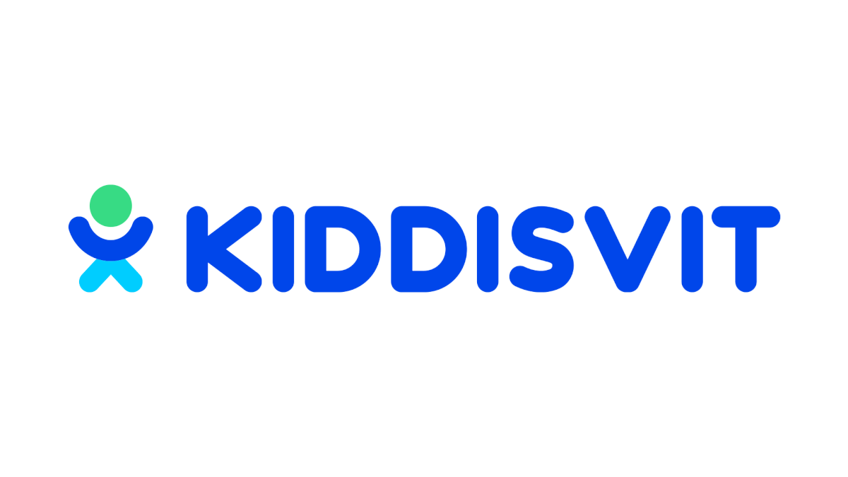

KIDDI — behave like a child: live, laugh, play.


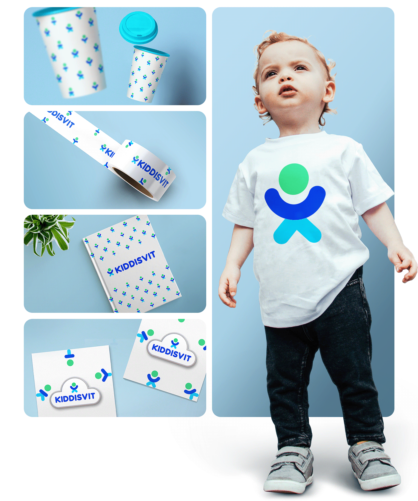
Just like kids, KIDDI also has to behave by the rules. And, like a caring parent, we created a concise set of rules in logbooks
and guides. These rules will tell KIDDI how to live in statics, dynamics, and patterns.

To diversify KIDDI's brand colors, even more, we've selected an extra range specifically for digital communication channels.
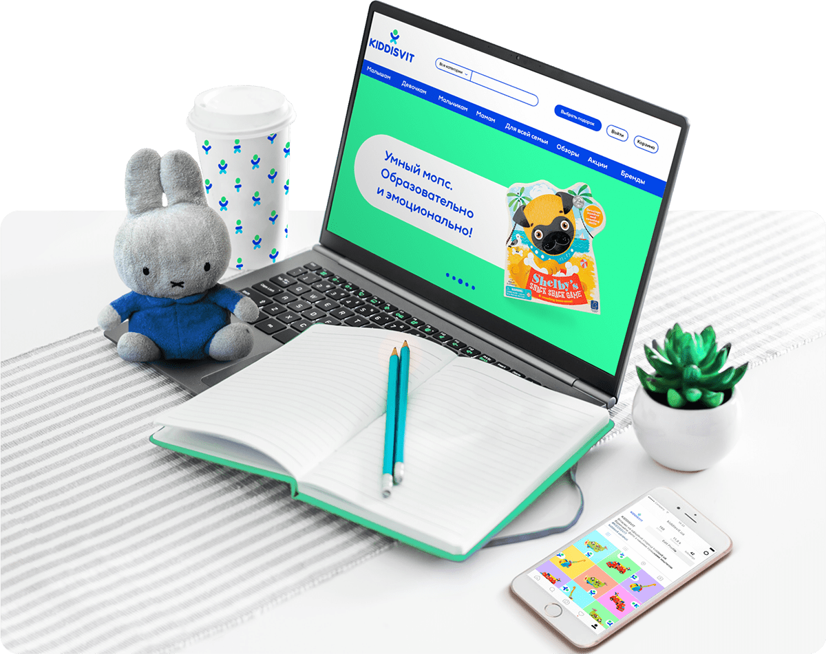
The updated logo met all the approved criteria and is now live on the website. The logo clearly defined the brand values
and is easily implemented online and offline. A distinctive childhood logo that is simple, clear, and modern.

Creative Director: Katerina Pikul’, Svetlana Boldyreva
Logo Design: Polina Zhmur
Logobook & Brandbook Design: Vlad Burma
Design for case: Maryna Shelestova
Logo Design: Polina Zhmur
Logobook & Brandbook Design: Vlad Burma
Design for case: Maryna Shelestova


