

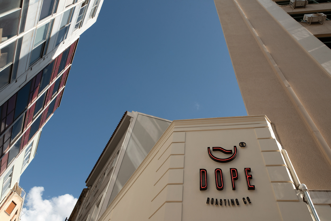
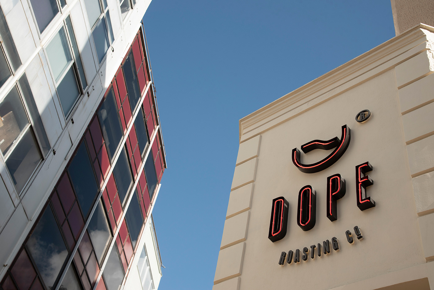
Dope® Roasting Co.
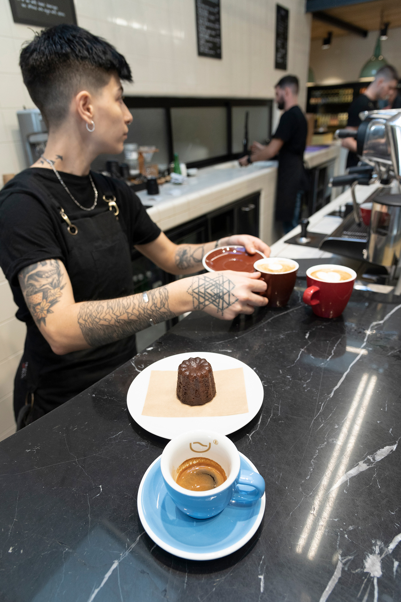
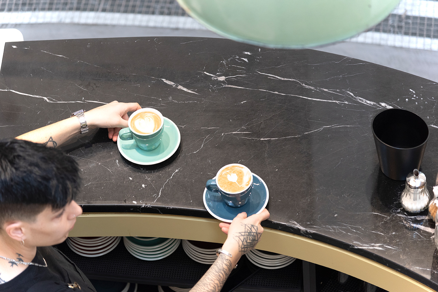
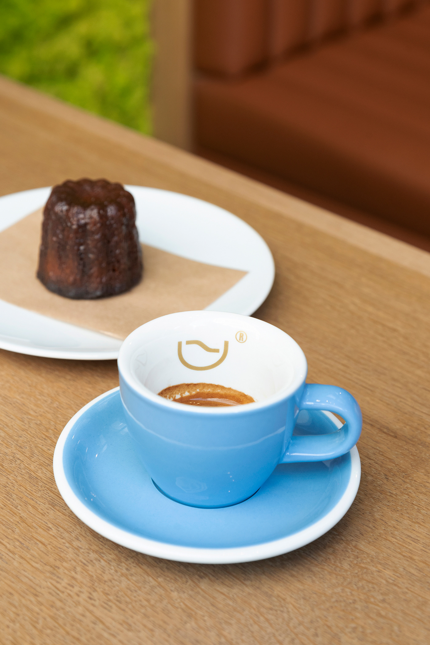
Dope® Roasting is a company specialising in the production, serving and distribution of fresh coffee.
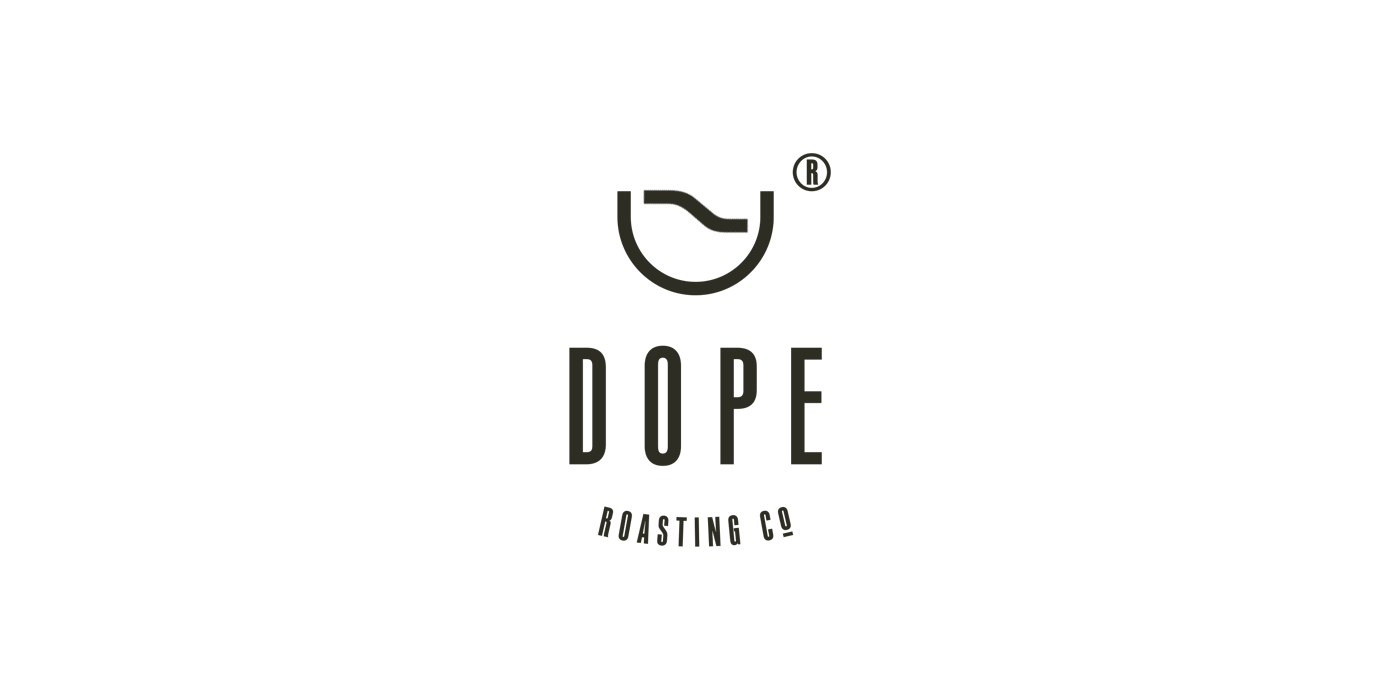
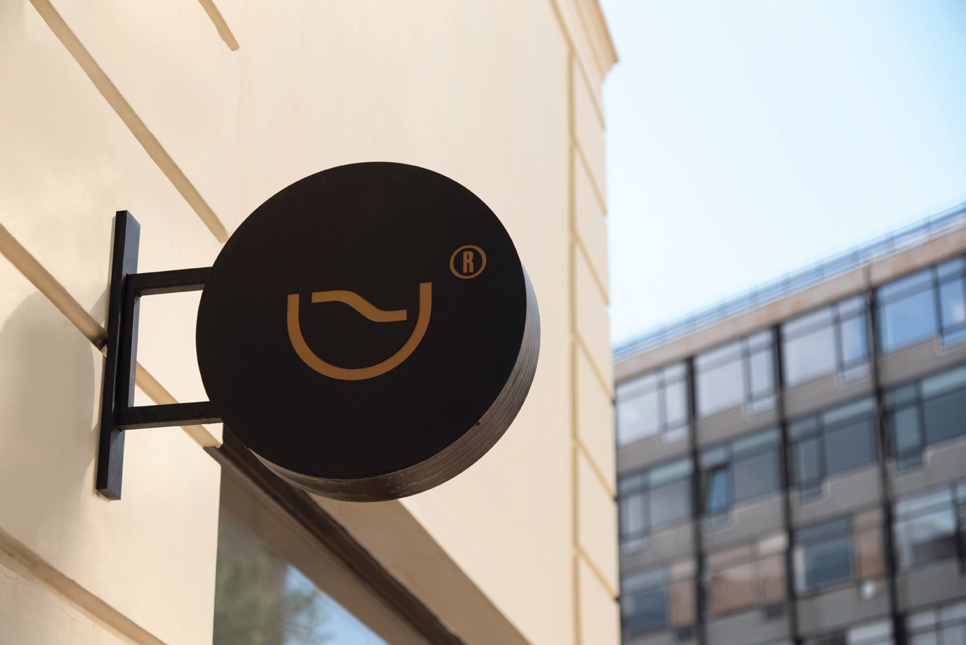
Semantically, the logo symbol can be interpreted both as a cup of coffee with the geometric form of a raw coffee bean and with the register mark suggesting a handle and as a coffee roasting grinder where the granules are cooled, as seen from above.
In a 90-degree rotation the symbol forms a 'D', the first letter of the company, while the width of the fonts chosen equals that of the symbol.
Lastly, the corporate colours are inspired by the shades of the different coffee roasts.

Η επιχείρηση δραστηριοποιείται στον χώρο της εστίασης, παραγωγής και διανομής φρέσκου καφέ.
Το σύμβολο του λογοτύπου, σημειολογικά έχει διττή έννοια: συμβολίζει το φλιτζάνι του καφέ με τη γεωμετρική φόρμα ενός ακατέργαστου κόκκου καφέ και με το register mark να δίνει την αίσθηση της χειρολαβής, ενώ ταυτόχρονα το ίδιο αυτό σύμβολο οπτικοποιεί κατοψικά τον μύλο της δεξαμενής καβουρδίσματος του καφέ όπου γίνεται η ψύξη των κόκκων.
Το σύμβολο σε περιστροφή 90 μοιρών σχηματίζει το αρχίγραμμά της επιχείρησης ‘D’, ενώ η τυπογραφία του λογοτύπου είναι ισόπαχη με το σύμβολο.
Τέλος, τα εταιρικά χρώματα είναι εμπνευσμένα από τις αποχρώσεις που προκύπτουν από τα διαφορετικά καβουρδίσματα του καφέ.


CLIENT Dope Roasting Co.
CONCEPT & DESIGN Chris Trivizas
COPYWRITER Sissy Caravia
SIGN LightON
ARCHITECTURE Mutiny architecture and design
CONSTRUCTION Gounelas G. Dimitrios
PHOTOGRAPHY Aphroditi Houlaki
©2019


