
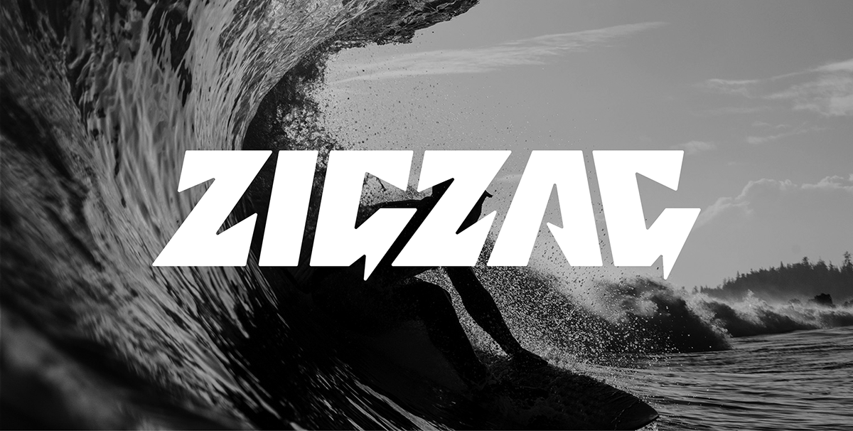
Zigzag is a South African surf publication that began ripping in 1976. As South Africa's oldest core surf magazine, it has had it's pages graced by many legendary local and international surf personalities, photographers and journalists. Taking over the creative directorship and design of this revered magazine, was a huge honour for the studio. Despite the fact that none of us surf, we were quickly engrossed, and fell in love with the culture, style and creativity, that is surfing. From the outset, it was clear that we would need to refresh and evolve Zigzag's branding. Let us show you:
"THE SAME BUT DIFFERENT"
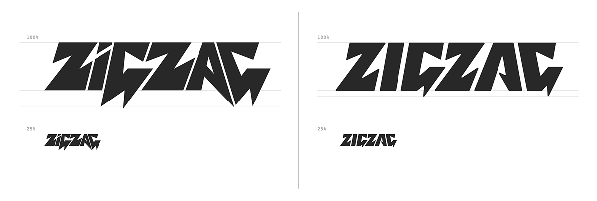
For Zigzag's logo refresh we had some key objectives: improve the spacing, increase legibility at all sizes, uniform the character weighting and relationships and most importantly, fix that god awful baseline! The real challenge was to also retain the attitude, character and highly recognisable aesthetic of this iconic logotype. SNEAKY OBJECTIVE: Replace the old logo with the new one without the reader even noticing.

"THE NEXT WAVE"
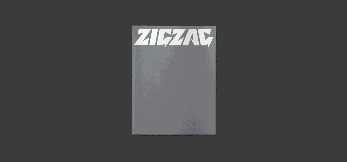
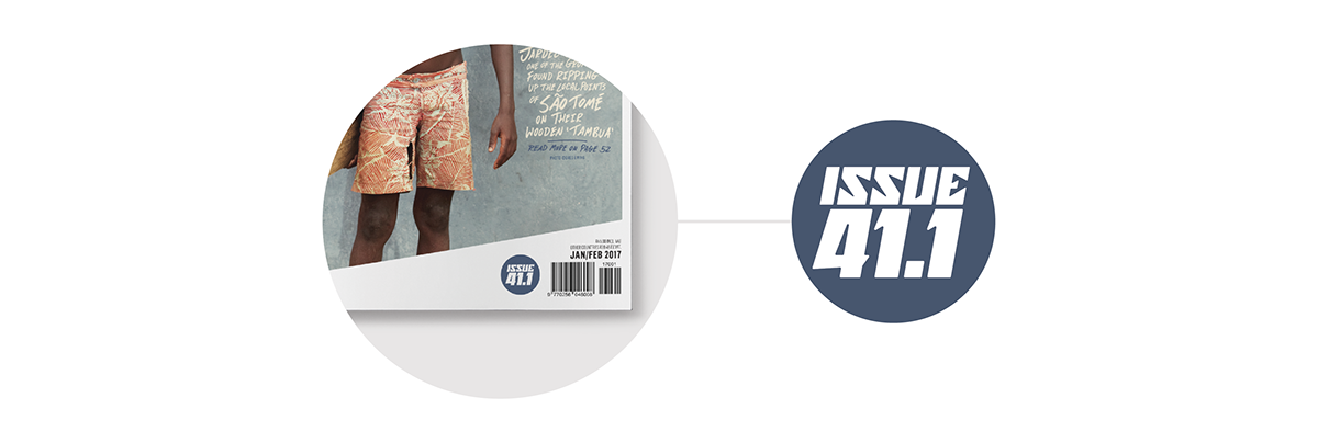
After refreshing Zigzag's logo, we really wanted to strengthen brand consistency and align the magazine's editorial design and look. To start, the cover template needed to be as recognisable as the logo. To achieve this, we introduced the "Zangle", a wedge like shape at the bottom of a bordered frame. The Zangle was uniquely Zigzag and provided a functional space to house the issue number, details and barcode on the cover. FUN FACT: When multiple magazines are placed side by side, the Zangles create a zigzag pattern that represents rolling wave-sets.
"THE REGULARS"
Unlike most magazines, the regulars sections in Zigzag had always been using illustrated icons. We really liked that, so to improve design and brand consistency, new and old editorial icons were crafted to fit our new Zigzag aesthetic.


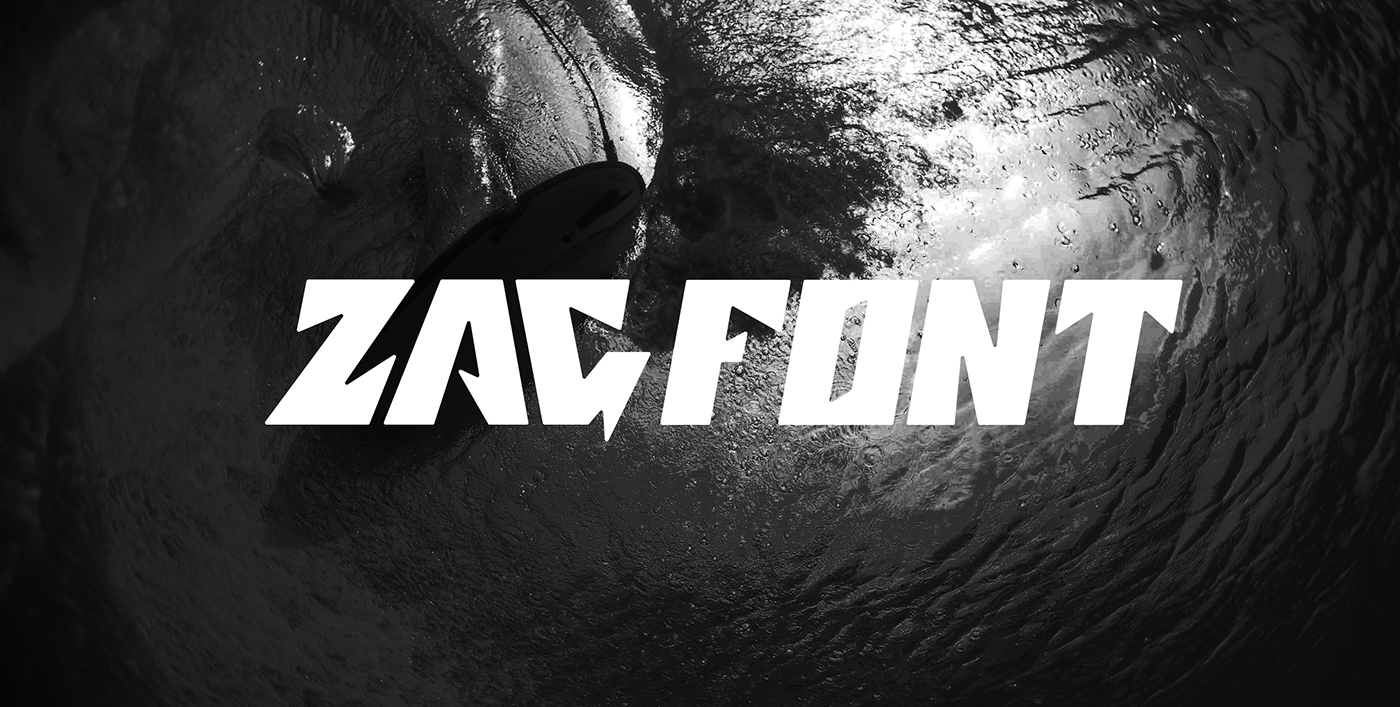
"A FONT FOR FUN"
A small but important feature that we looked to emphasise on the magazine cover, was the issue number. We felt, making each issue feel like a chapter in a larger story or saga, would add a collectible element and give each issue importance. For this purpose we initially designed a few numerals and letters in the style of the logotype. But as usual, we could not just stop there. We then created a complete typeface called ZAGFONT, just for the fun of it.


"BRAND MARKS"
Zigzag always has "special projects" going on. They also really needed brand marks or icons for their sub-brands, special projects, subscriber platform, social media and for places where the logo would not work well. For these marks, we used the logotype's aesthetics and ZAGFONT to help us get the job done.


For social media avatars on Instagram, Twitter, etc, the monogram logo has greater visibility than the type logo. Though the type logo would work here, the monogram is a nice throwback to an old Zigzag logo from 1976. The two Z’s form a little bolt, which even today, is pretty damn smart.