Panasonic Design Kyoto
パナソニックデザイン京都

VI Design of Panasonic Design Kyoto (Panasonic Corporation’s new design headquarters)
The Logo -
As the function of this hub location was not only to design Panasonic products, but also to create life and lifestyle design for the future, we created a logo consisting of simple lines, but when viewed from a specific location at a specific time, letters “p” and “d” emerge.
We chose "the line" as the key motif for the design, as it is the minimum element of 2-dimensional design. The letters “p” and “d” appear just as each of the lines transform into planes.
パナソニック株式会社の家電デザイン拠点となるPanasonic Design KyotoのVI計画。
ただプロダクトの形状をデザインする訳では無く、生活や暮らし方も含めた未来をデザインしている場所として
その瞬間に、その場所から見た時に浮かび上がるようなシンボルマークを制作した。
モチーフは二次元グラフィックとしての最小構成でもある線を選び、
線が面に変形する瞬間に「p」と「d」が浮かび上がるようなデザインとした。
ただプロダクトの形状をデザインする訳では無く、生活や暮らし方も含めた未来をデザインしている場所として
その瞬間に、その場所から見た時に浮かび上がるようなシンボルマークを制作した。
モチーフは二次元グラフィックとしての最小構成でもある線を選び、
線が面に変形する瞬間に「p」と「d」が浮かび上がるようなデザインとした。


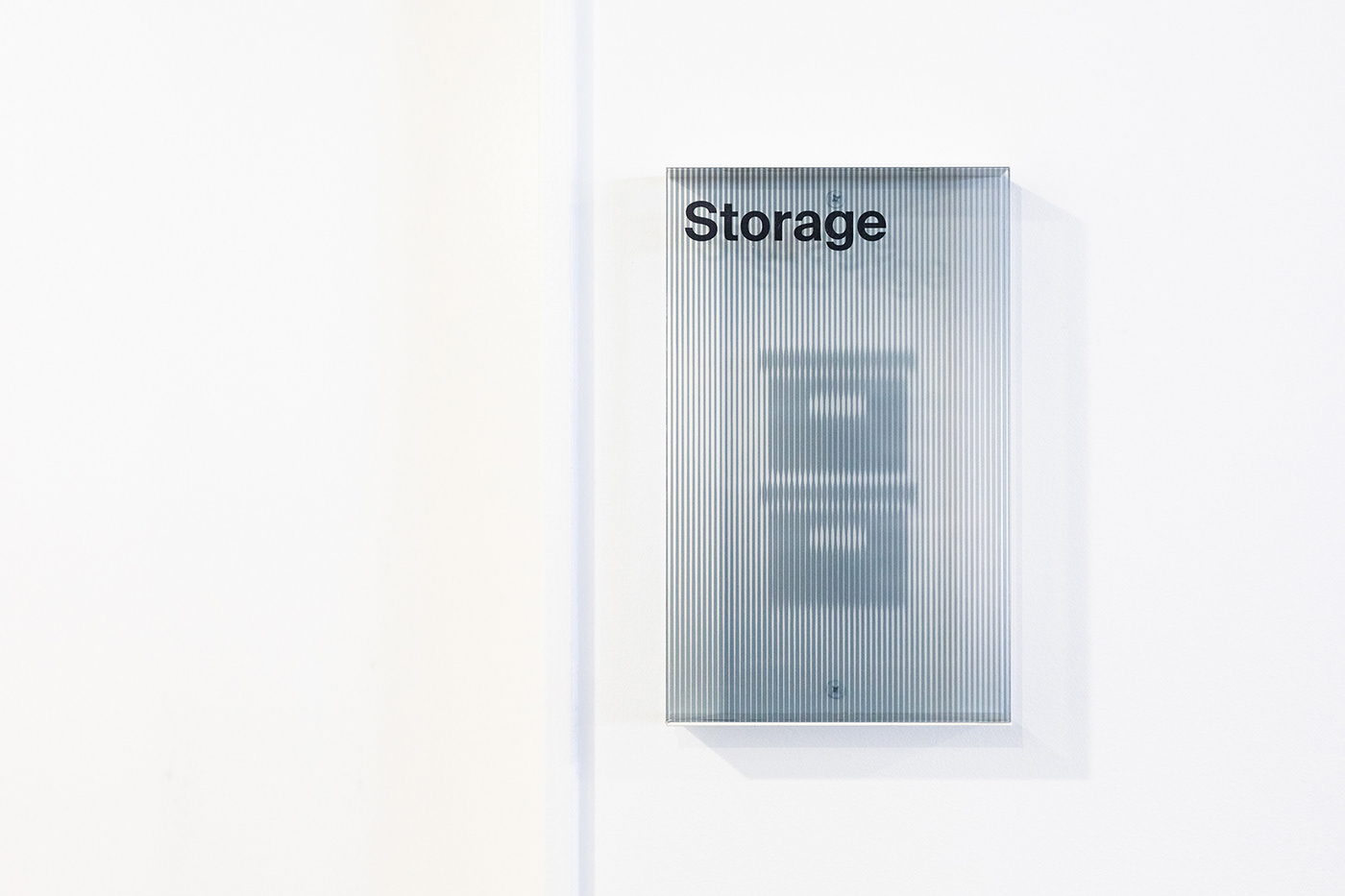

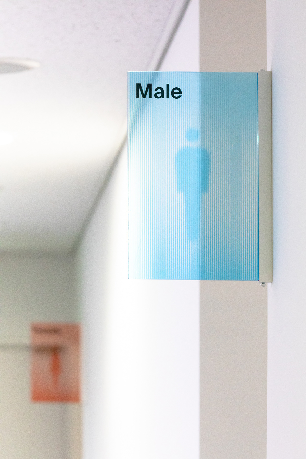
Signage -
Similar to the logo, pictograms were expressed using modulations in line thickness. Pictograms appear depending on the viewer’s angle.
Similar to the logo, pictograms were expressed using modulations in line thickness. Pictograms appear depending on the viewer’s angle.
シンボルマークと同様にピクトグラムを線の抑揚で表現し、
角度によって浮かび上がるサイン計画。


Art Director: Mitsutaka Nakao
Designers: Takayuki Isomi, Takashi Kuroyanagi
Photographer: Mitsuyuki Nakajima
Awards
SDA Award 2018 Silver Prize 日本サインデザイン賞 銀賞
HKDA GDA2018 nominate タイポグラフィ年鑑 VI部門・ロゴ部門入選
Japan Typography Award 2019 香港国際デザインアワード Excellence賞
HKDA GDA2018 nominate タイポグラフィ年鑑 VI部門・ロゴ部門入選
Japan Typography Award 2019 香港国際デザインアワード Excellence賞
Thank You
ありがとうございます


