


Jae Jae Hyun is a South-Korea based graphic designer and is about to start up her own freelance presence, mainly focused on graphic design for the music and fashion industry. She asked me to create an identity that represents this.
To start of, I collated some of JaeJae's most interesting characteristics:
- she loves Manchester and its music scene
- she collects water bottles
- she collects LP's
- she worked in a record shop and loved it
- she is very hopeful, quirky, into trends
- her voice is lovely and goes up at the end of the sentences
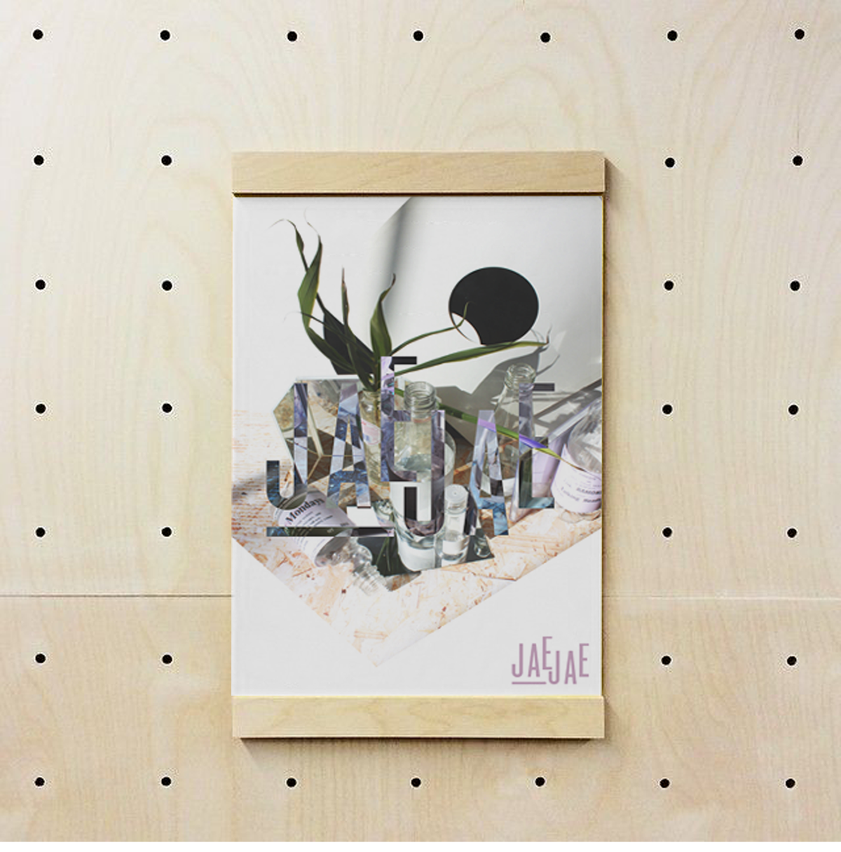
Instead of creating a logo/identity straight in 2D, with sketches and design software, I decided to re-create her personality a bit more vividily and spacious by building a still life, literally translating aspects of her personality and using this a a starting point of her graphic identity. I thought it would represent her more (as a fervent object collector) than just a flat graphic.
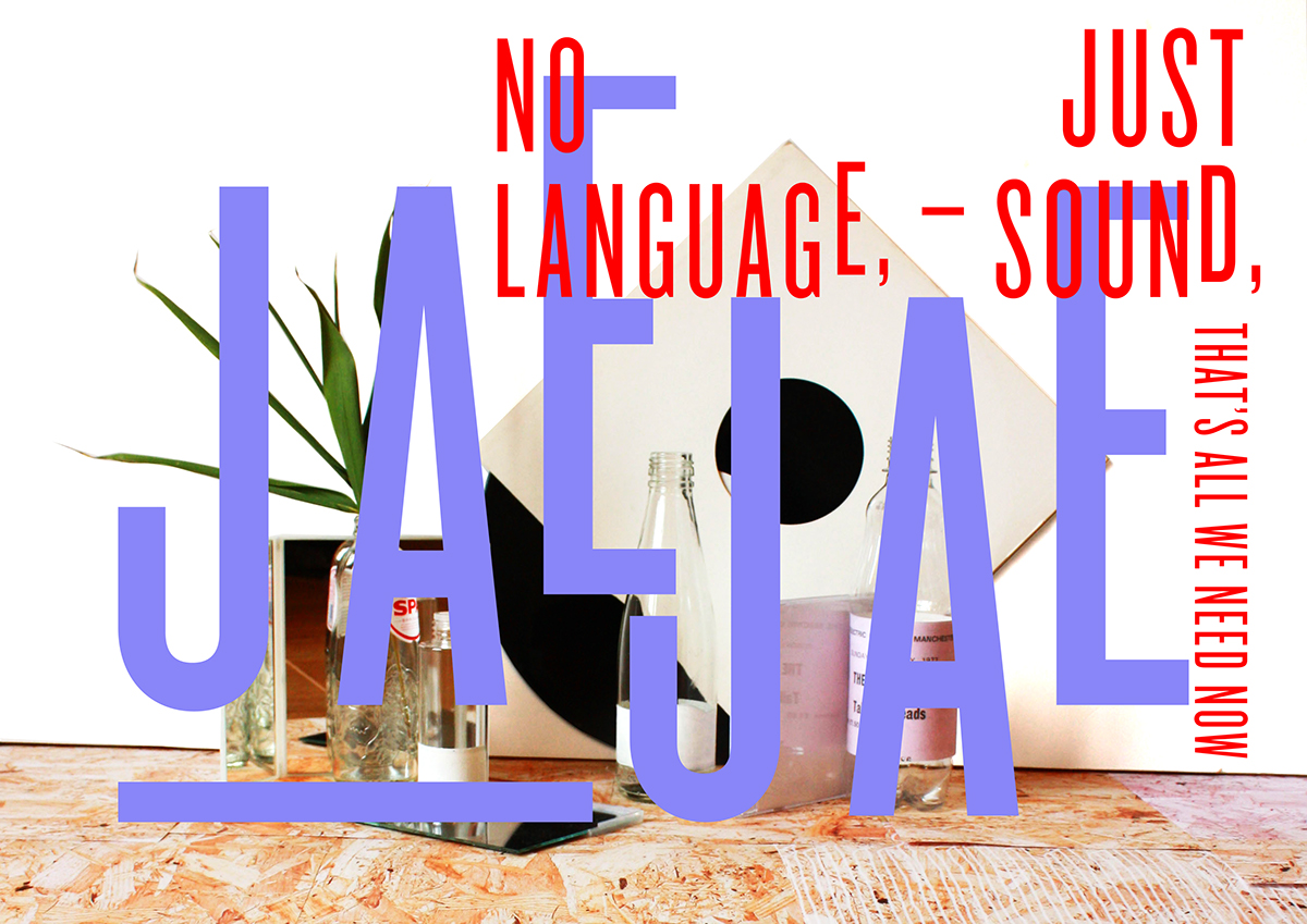
The still life included some of the following ornaments: plastic/glass water bottles (as she is a fervent collecter of them), concert tickets of Manchester music scene as labels, a palm leave for hope, cd+lp's, chipboard texture that represents her spark/quirkiness, mirrors that create reflection and angles for her different capabilities, etc
I then photographed the still life and started playing with quotes of her favourite band, Joy Division, that I feel represents her brand perfectly.
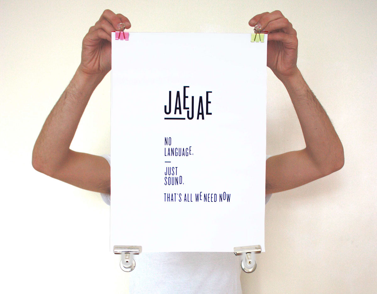
To bring her name in, a typographical logo of her first name was created, based on the way her quirky and sweet voice sounds (it goes up at the end of the sentence/word).
Combining the typographical logo and the photographic imagery creates an almost panelled graphic pattern/style that can be used as the starting point of her own graphic identity an translated into various media.
- she loves Manchester and its music scene
- she collects water bottles
- she collects LP's
- she worked in a record shop and loved it
- she is very hopeful, quirky, into trends
- her voice is lovely and goes up at the end of the sentences
Instead of creating a logo/identity straight in 2D, with sketches and design software, I decided to re-create her personality a bit more vividily and spacious by building a still life, literally translating aspects of her personality and using this a a starting point of her graphic identity. I thought it would represent her more (as a fervent object collector) than just a flat graphic.
The still life included some of the following ornaments: plastic/glass water bottles (as she is a fervent collecter of them), concert tickets of Manchester music scene as labels, a palm leave for hope, cd+lp's, chipboard texture that represents her spark/quirkiness, mirrors that create reflection and angles for her different capabilities, etc
I then photographed the still life and started playing with quotes of her favourite band, Joy Division, that I feel represents her brand perfectly.
To bring her name in, a typographical logo of her first name was created, based on the way her quirky and sweet voice sounds (it goes up at the end of the sentence/word).
Combining the typographical logo and the photographic imagery creates an almost panelled graphic pattern/style that can be used as the starting point of her own graphic identity an translated into various media.


.
©
Studío Lé
.


