


MOKSOP.
Sharp and firm emotions in the new identity of the Museum of Kharkiv School of Photography.
Client: MOKSOP
Location: Ukraine
Year: 2018-2019
Activities: logo; identity
Kharkiv School of Photography is a cultural phenomenon formed in 1970-s. An aspiration to affirm photography status as an art pushed its representatives to experiments with multiple techniques: collage, overlays and coloring of frames. This exact innovative impulse became a feature of Kharkiv School of photography. Using harshness of images authors make the viewer “awaken”, get out of usual perception mode of everyday life and, at the same time, they are telling about the routine in all its versatility.
Serhii Lebedynskyi, the founder and CEO of MOKSOP, applied to us in 2017 with a proposal to elaborate a logo and identity system for the new project that should unite a museum, an archive and an education and research platform of Kharkiv School of Photography. Today the museum works in online mode and in partnership with other institutions. The official opening of museum space is scheduled for 2020. A44 studio is working on the project of its reconstruction.
Having been inspired by the idea of the project and character of Kharkiv School of Photography, we realized that the tasks we were facing would become a true challenge for us in a new area. Results of our work should have emphasized strength of KSoP, experimentation, courage, provocation and high esthetic level.
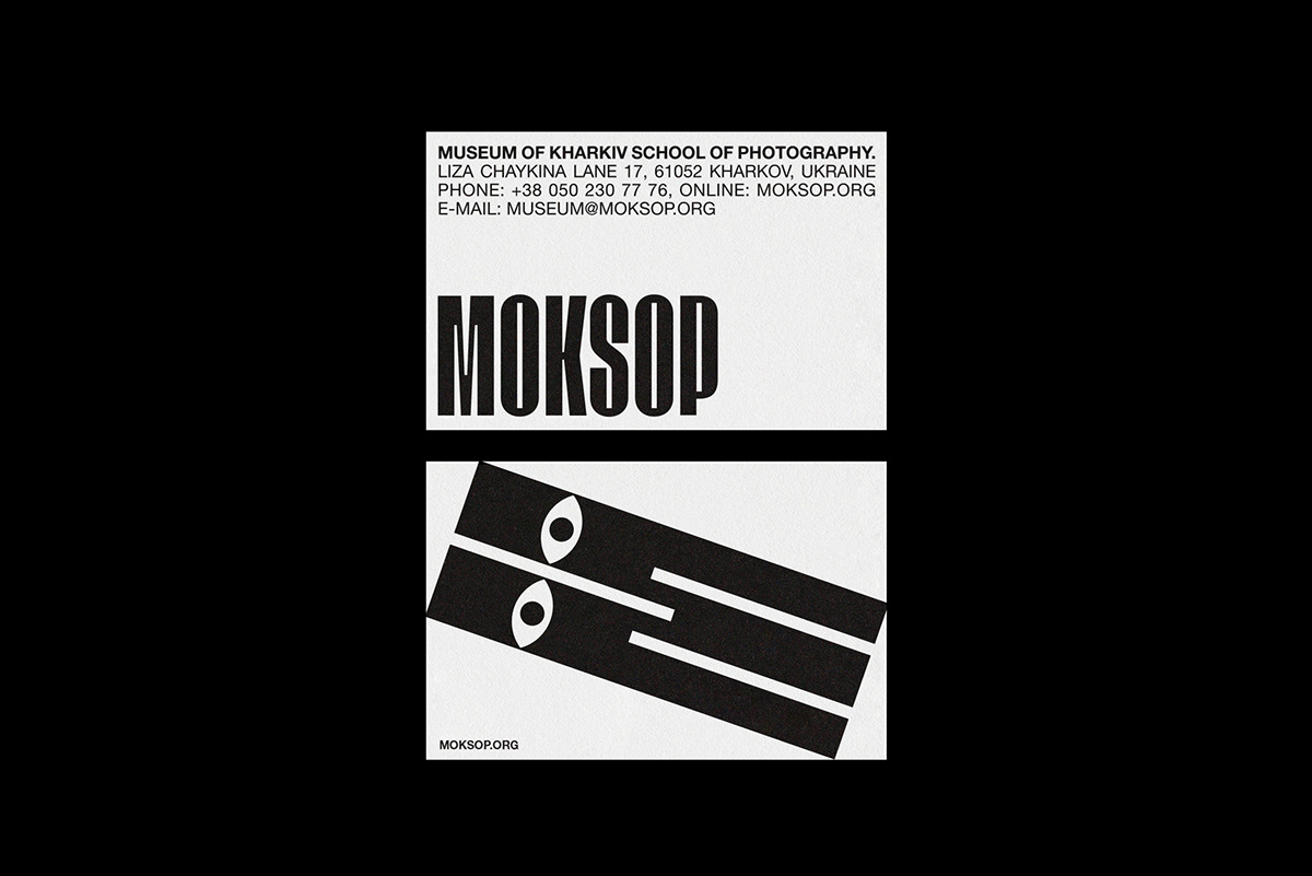
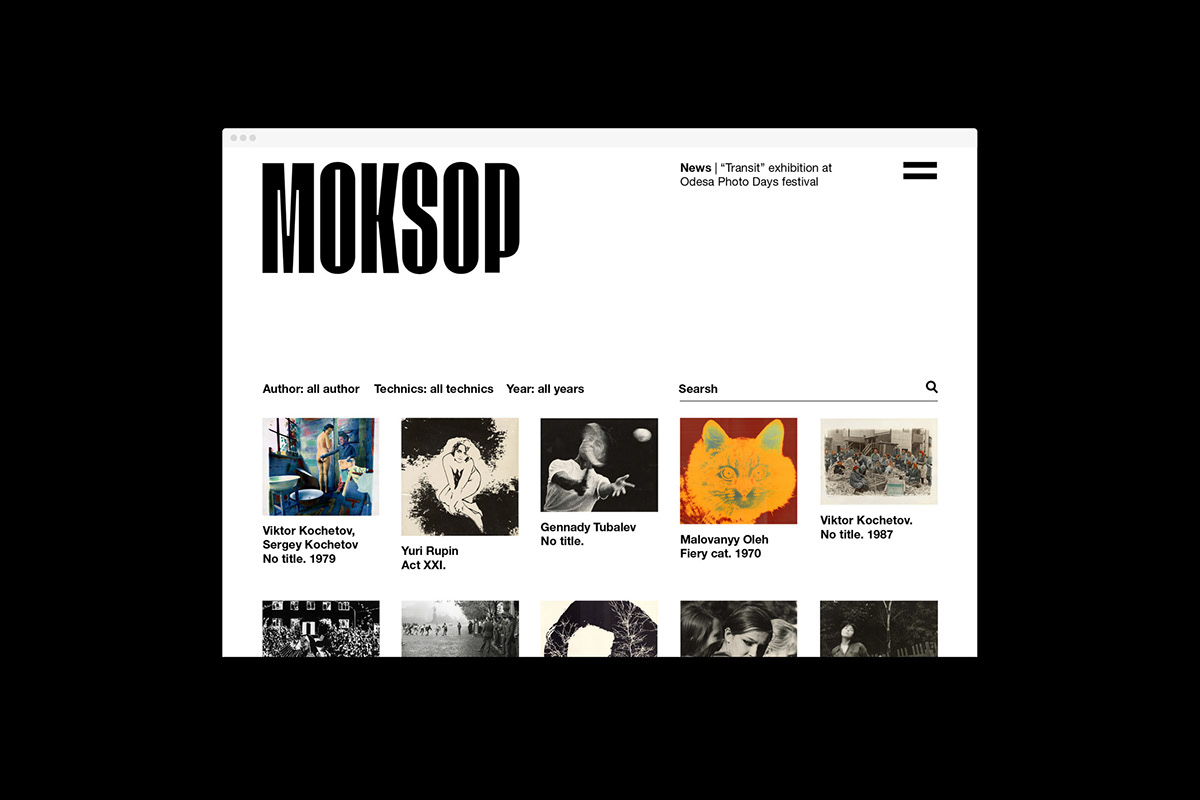
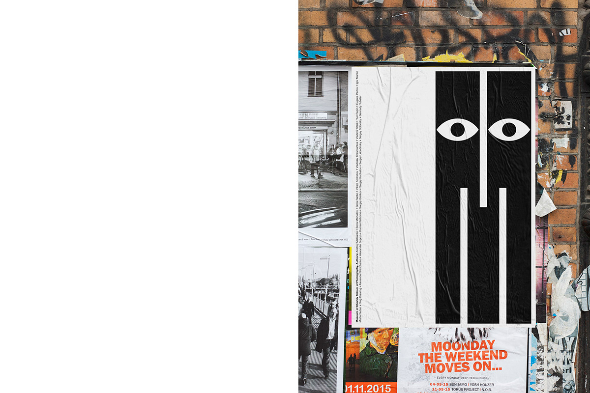
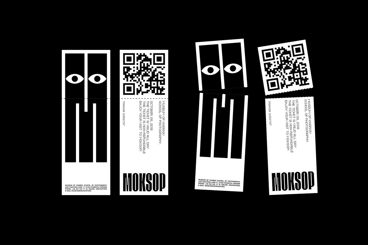
MOKSOP logo represents an abbreviation of the Museum of Kharkiv School of Photography. Working on typography we were looking for something new and simultaneously close to soviet style of that era. Headlines of soviet newspapers became the initial point in search of style. Massive contrast typography perfectly described spirits of that time. Having rethought typography of 1970-s, we developed a logo in more simplified contemporary motives, preserving its massiveness, high contrast and proportions close to soviet era. But our search didn’t finish there.
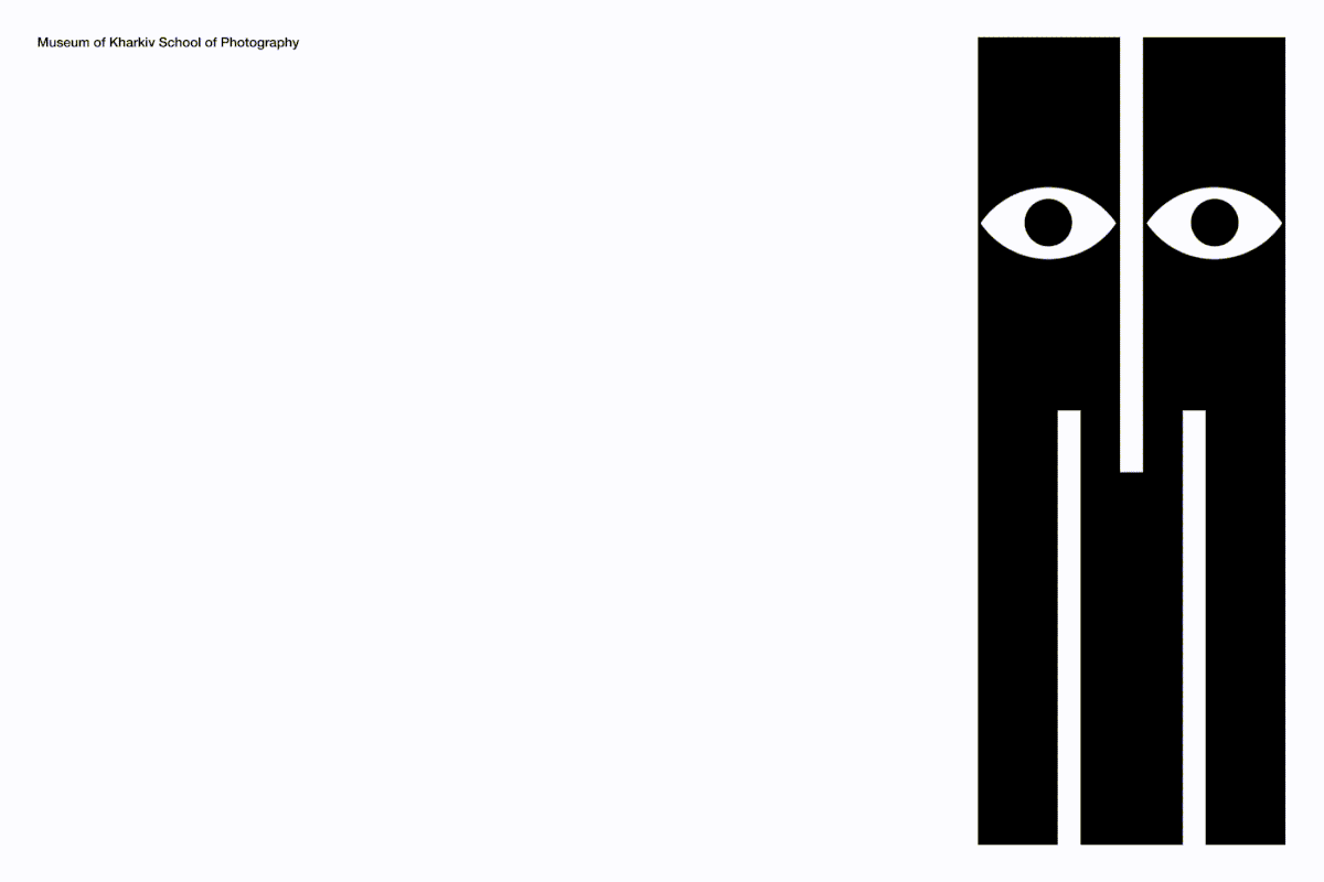
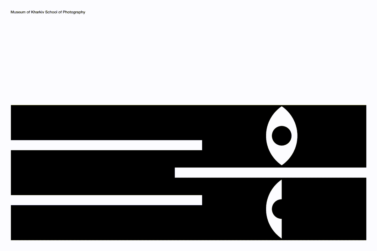
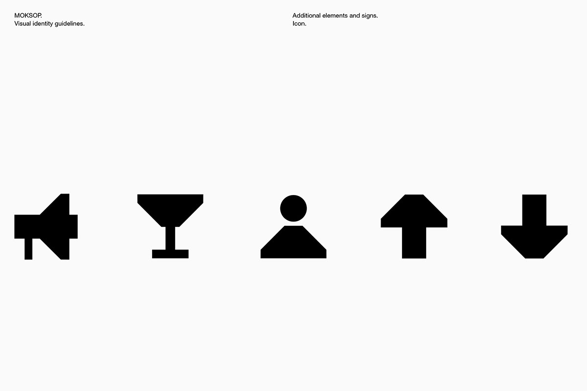
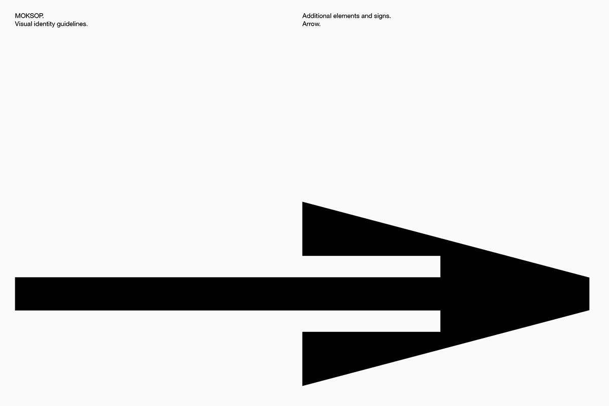
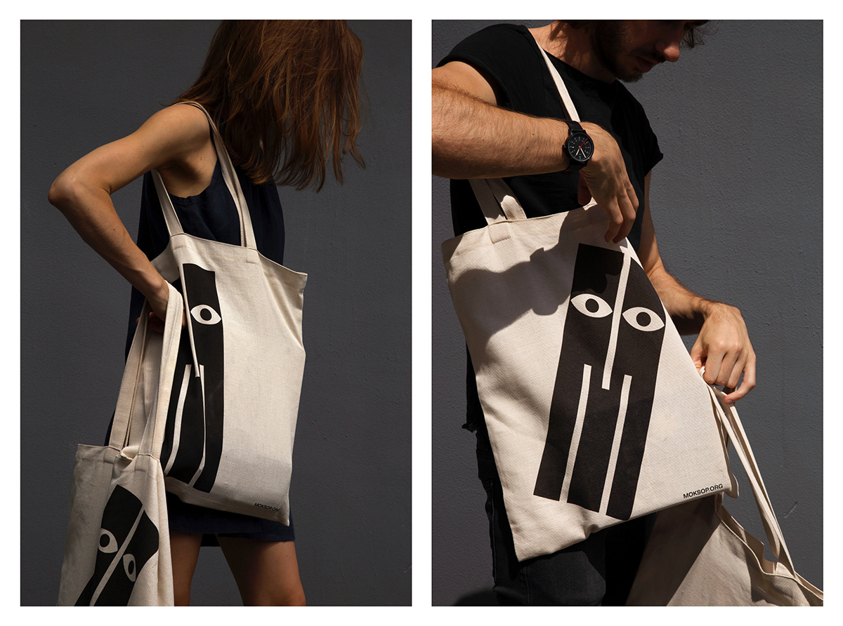
For depiction of character peculiar to the Kharkiv School a strong, provocative element was needed that could nicely show wide emotional spectrum typical for KSoP works. We were looking for something emotionally sharp and firm, a logo that would start a conversation with the viewer. At the same time we wanted to save the field for play and development of identity system.
The M sign – this is about life and society, about its various sides and emotional manifestations. The M, as personality, can fall and stand up, feel excitement or disturbance, peer into something or remain indifferent. Playing and filling the style with emotional coloring, the M sign has become a strong living identifier which nicely combines and supplements typographic part of the logo.


"It’s an odd identity element but I like how it’s, literally, a surprise — I’m betting it’s not something most of you expected to see today when you woke up."
Dec. 11, 2019 by Armin Vit