


PT
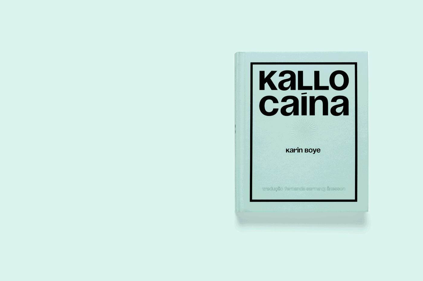
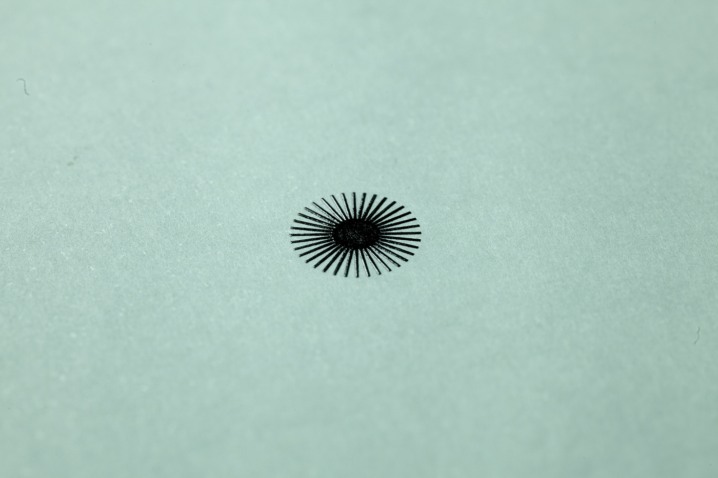
O projeto gráfico deste livro partiu da ideia de que as personagens da narrativa estão continuamente sob o controle de um Estado totalitário, que, apesar de invisível faz sentir sua presença a cada passo. Esse controle é representado aqui pela figura do olho que permeia toda a narrativa.
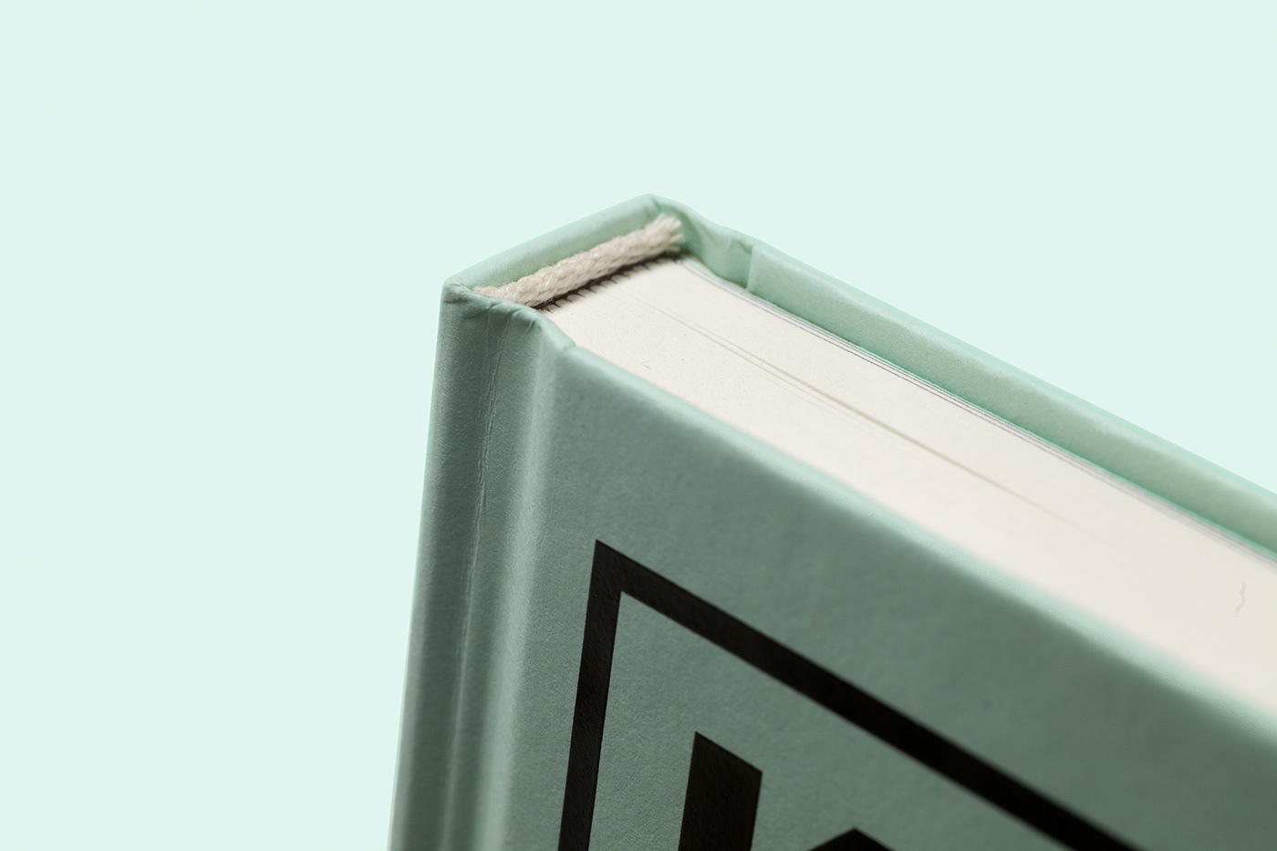
A serigrafia com tinta fotoluminescente na capa faz com que o olho continue espiando o leitor (mesmo com a luz apagada), além de remeter ao desejo de Leo Hall de ver o céu estrelado, nesta história praticamente passada nos subterrâneos. Para dar essa sensação de enclausuramento, a mancha do livro é bastante densa, e o texto parece confinado a ambientes fechados.
E tipografia usada no título e na entrada dos capítulos é a Soyuz Grotesk, desenhada por Roman Gornitsky em 2017, e traz ao livro uma referência ao Leste Europeu. Já a Brenner Serifa, desenhada pelo croata Nikola Djurel, é uma interpretação contemporânea de algumas fontes de alto contraste produzidas por Bodoni e Didot e, diferente das fontes modernas do século passado, dá ao texto um ritmo de manuscrito em ponta fina.
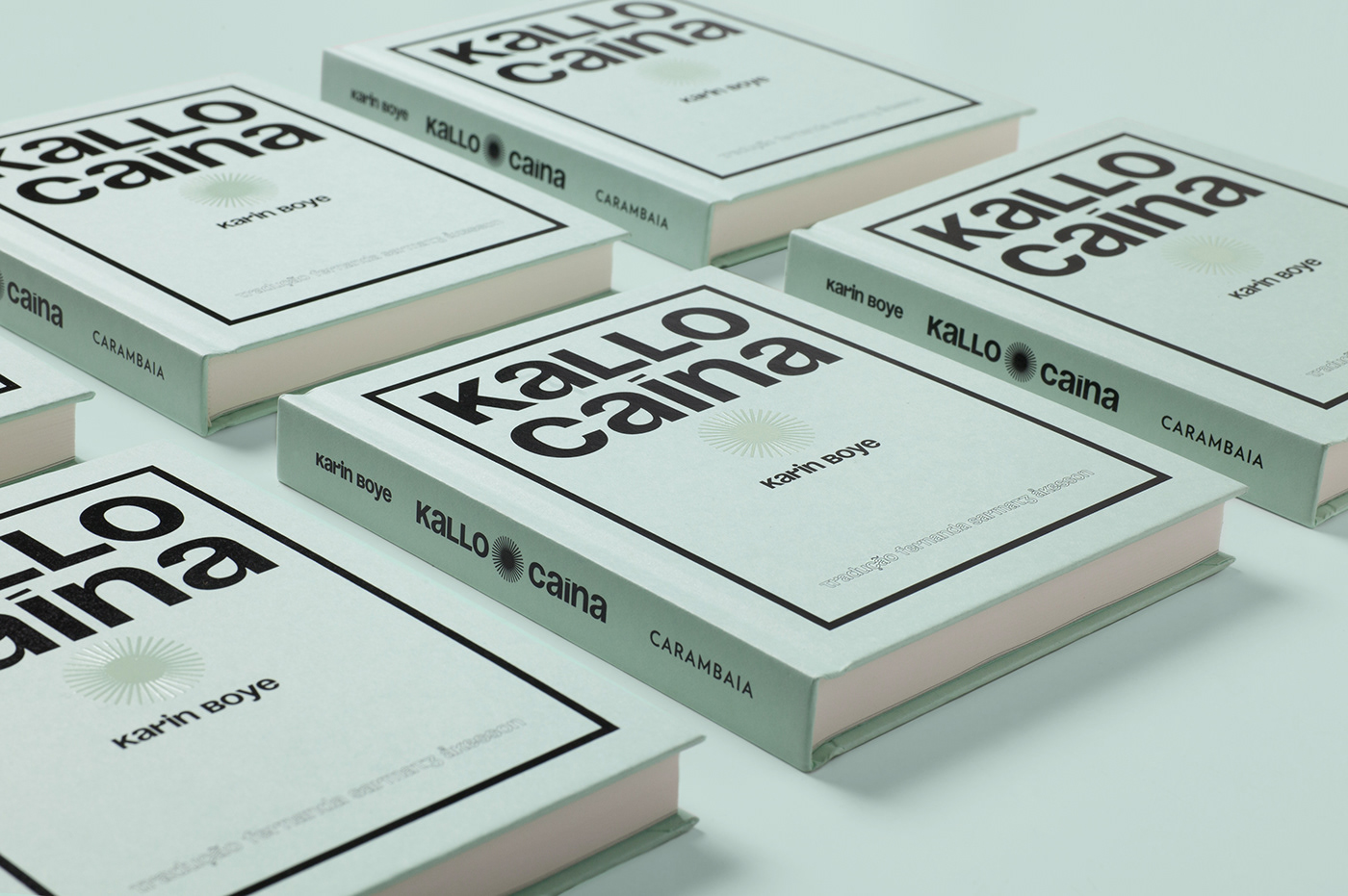
O livro foi publicado pela editora Carambaia e impresso em papel Munken Print Cream 80g/m2, na gráfica Ipsis, em julho de 2019.
____
EN
The graphic design of this book came from the idea that the characters in the narrative are continually under the control of a totalitarian state, which, although invisible, makes its presence felt at every step. This control is represented here by the eye figure that permeates the whole narrative.
The silkscreen with photoluminescent ink on the cover keeps the eye still peering at the reader (even with the lights off), as well as Leo Hall's desire to see the starry sky, in this story spent almost whole underground. To give this cloistered feel, the book's stain is quite dense, and the text seems confined indoors.
And typography used in the title and entry of chapters is Soyuz Grotesk, designed by Roman Gornitsky in 2017, and brings to the book a reference to Eastern Europe. Brenner Seria, designed by Croatian Nikola Djurel, is a contemporary interpretation of some high-contrast fonts produced by Bodoni and Didot and, unlike the modern fonts of the last century, gives the text a fine-handwritten rhythm.
The book was published by Carambaia and printed on Munken Print Cream 80g / m2 paper at the Ipsis press in July 2019.
PROJETO GRÁFICO E DIREÇÃO DE ARTE [GRAPHIC PROJECT AND ART DIRECTION] Julia Masagão
FOTOS [PHOTOS] Nino Andres Biasizzo
____
Obrigada!
Thank you!
→ @allesblau.studio
Obrigada!
Thank you!
→ @allesblau.studio


