Student Project
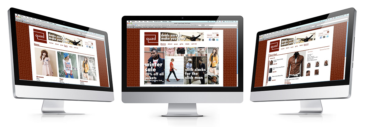
Quad was designed as a moderately expensive modern clothing company. The name originates from the word for the social meeting area on a college campus. Quad wants its customers to show off and flaunt their new clothing in public much like in a promenade. The target demographic for the company is college students and those between the ages of 18 and 30. The style for the company is sleek, trendy, and simple. With a modern theme in mind, the logo and the accompanying pieces were created to be simple and geometric. Due to the double meaning of the name Quad, quadrilaterals, squares, and series of four were desired to be implemented into the overall design.
In the logo of the company, a sans serif typeface was chosen in order to reflect simple, geometric design in mind. The name is in lowercase letters in order to give the feeling of a more relaxed and trendy company. A framing square and another implied square were added to the name in order to achieve the double entendre of the name as well as push the sleek geometric style. Finally, a red hue was applies to the framing square in order to breathe life into the design as well as give an impression of fine clothing and style.