For this project me and my partner created a fictitious umbrella brand that was a combination of five other brands. We also wanted to explore the concept of designing for environmental sustainability. Since it is something most brands are striving for we found it relevant for this project.
our first step was identifying a problem that our brand could offer solutions to. We identified it as man-made climate change.
Man-made climate change: the drastic, unnatural change in our planets environments due to our own human activity.
As a result of this, our ozone is depleting,

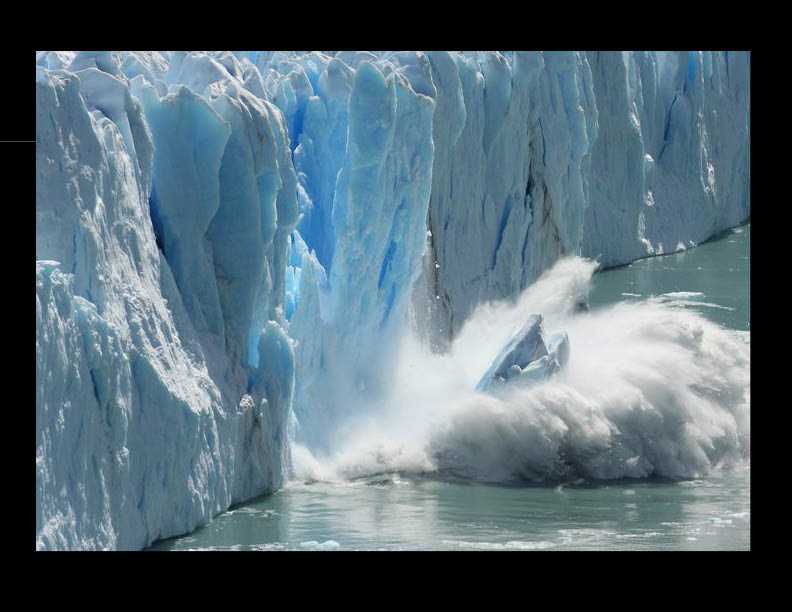
Ice caps are melting,
California is on fire,

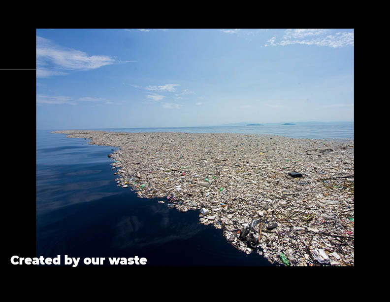
and there is a giant trash continent forming in the Pacific.
We decided that tackling that entire problem might be a bit too much for one brand so we honed in on one specific section; removing and preventing waste from our water ways.

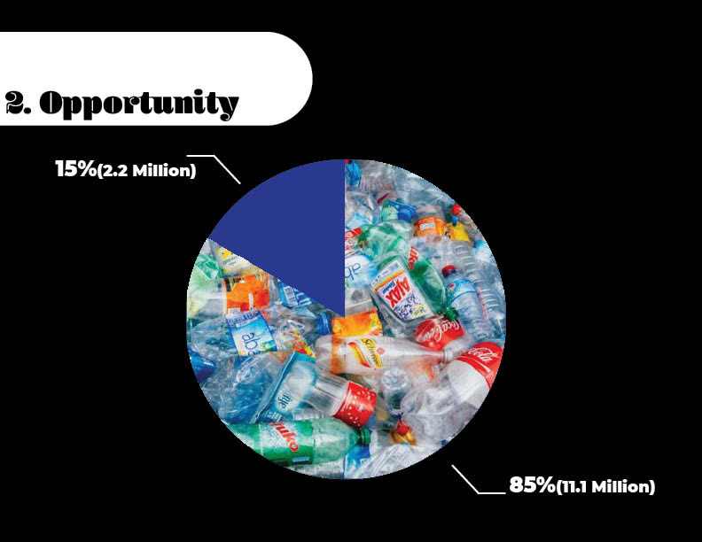
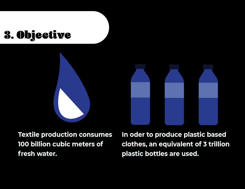
Of all the waste that ends up in our environment 15% of that is fabric and textile waste. We wanted to create a brand that would support sustainable manufacturing processes, textile recycling methods and textile waste removal.
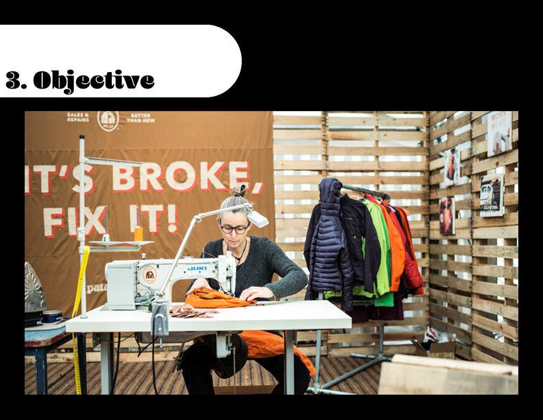
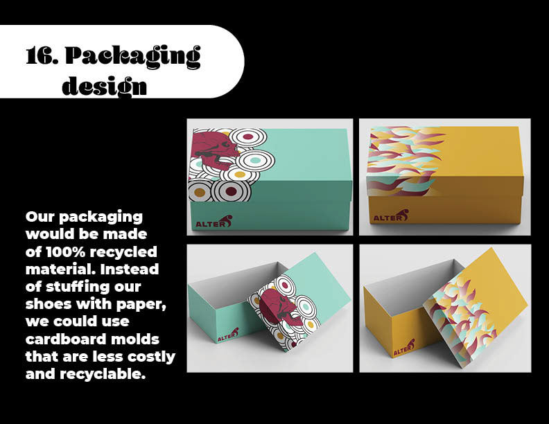
Our objective becomes to reduce textile waste by, recycling old material, utilizing recyclable packaging, and creating a more sustainable production method.
One solid solution we found was to offer a service that would repair and upcycle old clothes.
The problem we kept running into was the logistics. Me and my partner kept hitting walls within the more logical side of this problem. In order to solve this we teamed up with a couple friends who were working on a similar project.

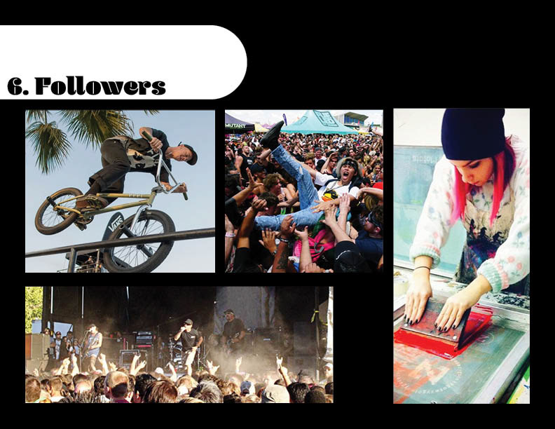
Once we had an idea of where we wanted our brand to go we decided to start figuring out what we wanted the brand to look like. We started by defining our target audience. Our Target audience would be made up of young, creative, outgoing potential activists.
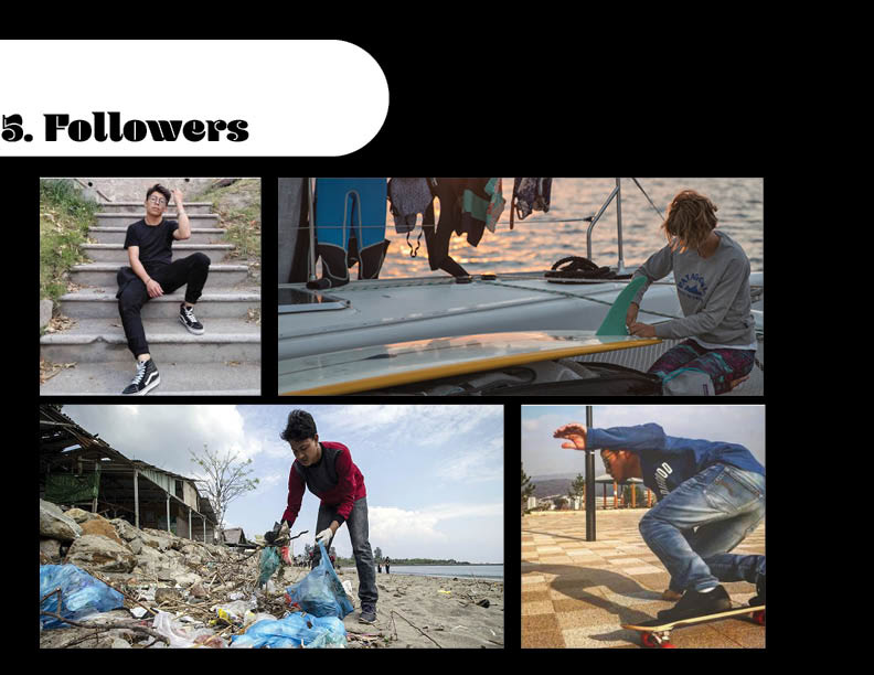
We decided to call our target audience followers. We wanted to make sure our brand valued them as modern people so we picked a modern term for them. We also wanted to humanize them. It is their actions that will determine the future, they are very important and should not be seen as just a statistic.Our followers would be into active in the arts, music, and extreme sports. They are the people we want to inspire to do good for the environment and wear our brand.
From there we created our positioning statement. We wanted something adventurous and environmental.

Our positioning statement is more for the corporate end of the brand so we came up with a mission statement that would be in the publics eye.

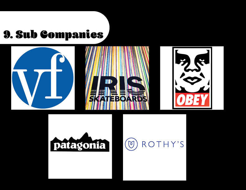
Next we did research and chose the sub companies we want to work with.

The first and most obvious choice was VF corporation. The brand that produced vans, Levi's, and other goods of this nature. This brand fit both our aesthetic and our values. They have a green initiative as well as a very similar target audience. their creativity and artistic nature would also make collaborations with other brands very successful.

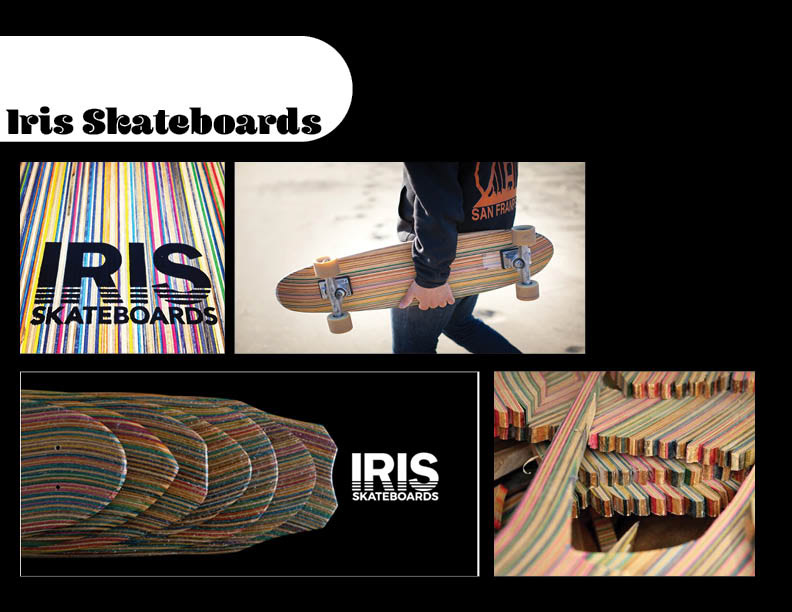
Iris skateboards once again fits both our aesthetic and our mission statement. They build boards out of old, and broken skateboards, effectively up cycling them. They cater to skaters and perpetuate skate culture which is part of our target audience.
We chose Obey for their aesthetic and political positioning. Our brand can benefit greatly from having a celebrity like Shepard Fairy and his brand with us.

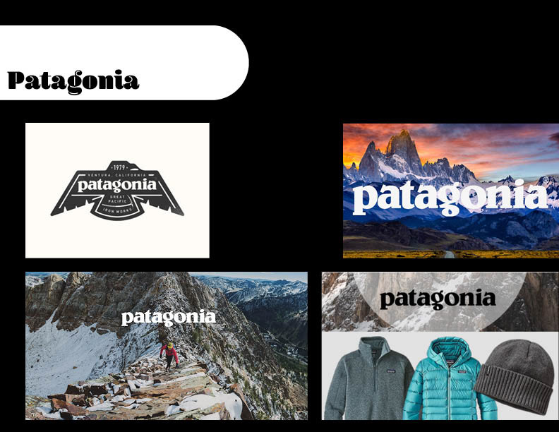
Patagonia may not be the most stylish brand but their sustainable programs are way ahead of their competitors. They have multiple green initiatives including a free repair service for clothing.
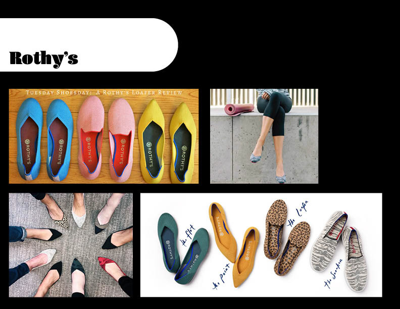
Rothy's is a small brand of footwear made of recycled material. They once again do not have the style that we are looking for however they could potentially collaborate with vans or obey to create something our followers would love to wear.
With our sub companies chosen we had to form a unified identity for them. We wanted a name that would reflect the culture and the sustainable nature of the brand. We landed on; Alternative. This name is a genre of music, a lifestyle, an aesthetic and a term for sustainable resources.
We had a solid name but it felt a little too long, so we shortened it to Alt.
After asking our potential followers about this name we got some negative feedback on the abbreviated version. We took a couple steps back and came up with alter as a good way to imply everything we wanted it to and be short, simple and memorable.

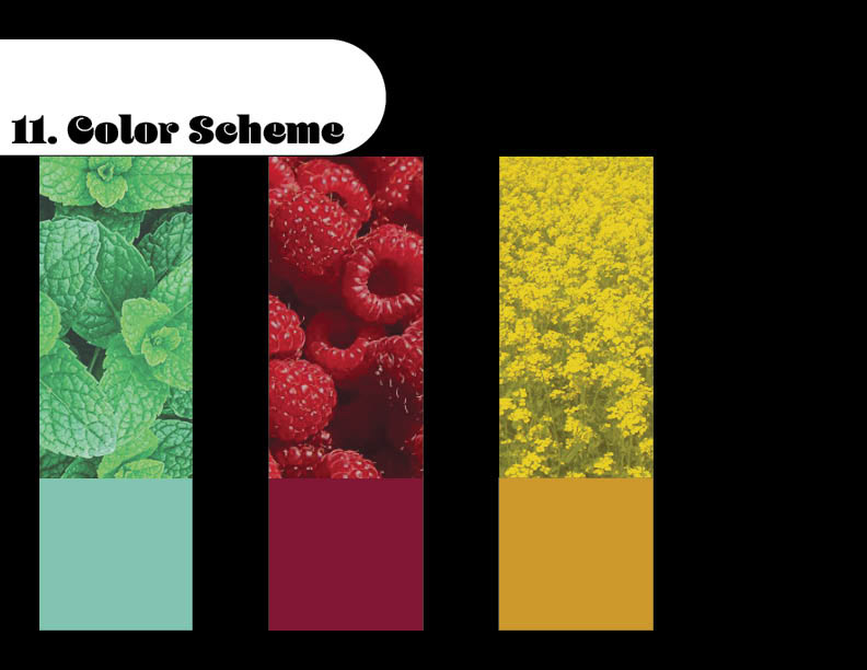
Once the name was selected we started working on our brand assets. Beginning with a color scheme, we drew inspiration from an artist named Boneface. His art fit our aesthetic and his colors really caught our attention.

We then darkened the colors to match up with colors found are in nature.
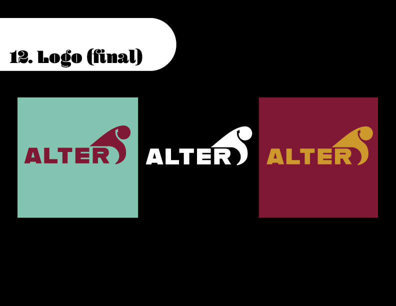
We then got to work on logo designs.
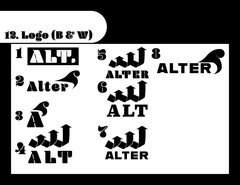
We wound up split between two designs, one that conveyed the concept of upcycling really well, and the other that conveyed the tone well.
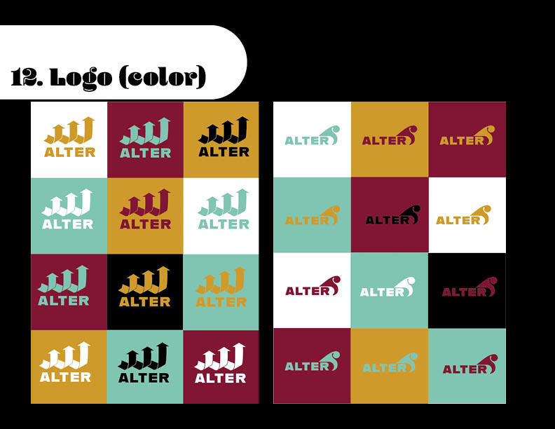
We once again consulted our followers and found that we could combine the two concepts. The final logo has the name of the brand with a wave shape over it. The bottom of the wave creates the shape of a skateboard. There is also an arrow in the curve of the wave conveying our upcycling nature. The wave itself has connections to surfing and boarding in general, as well as the California culture that produced most f our brands and influenced their aesthetics.
Once we had some visual assets for our brand we started creating some conceptual advertising and publicity ideas.
The first part to that came in the form of a slogan.

This slogan acts in the same way that Nike's "Just do it" slogan acts. It is a memorable call to action.
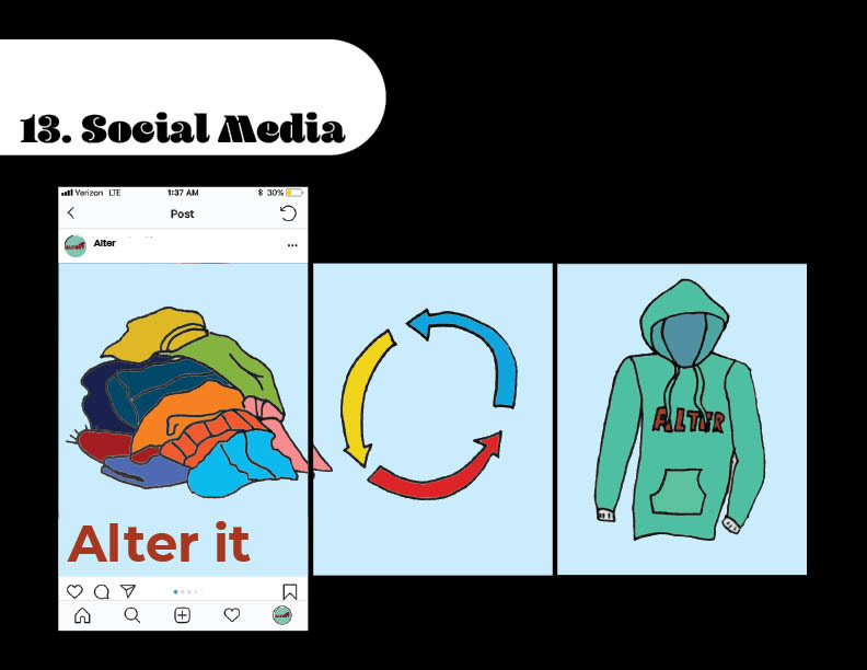
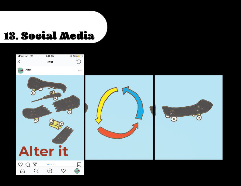
Our first campaign ideation came in the form of a social media campaign. This would feature images of worn out clothes, boards, or shoes, followed by symbolic representation of upcycling, followed by our product.
In collaboration with Gaia, we decided to throw an event with a focus on upcycling. The premise of the event would be where people can bring their old clothes and even other materials they find and they can be turned into something new. Moore specifically turned into works of art. We decided we would hire artists to turn peoples scraps into sculptures. We put together a small list of potentials, focusing indifferent materials.
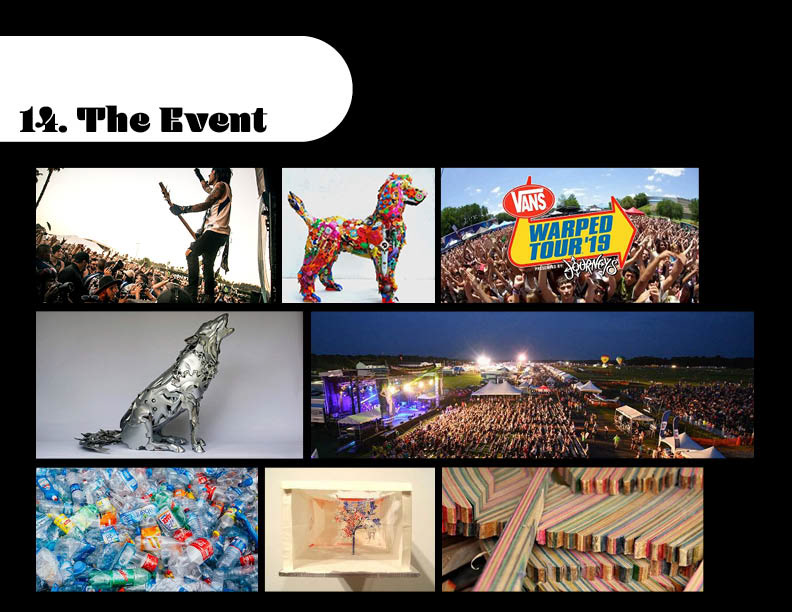
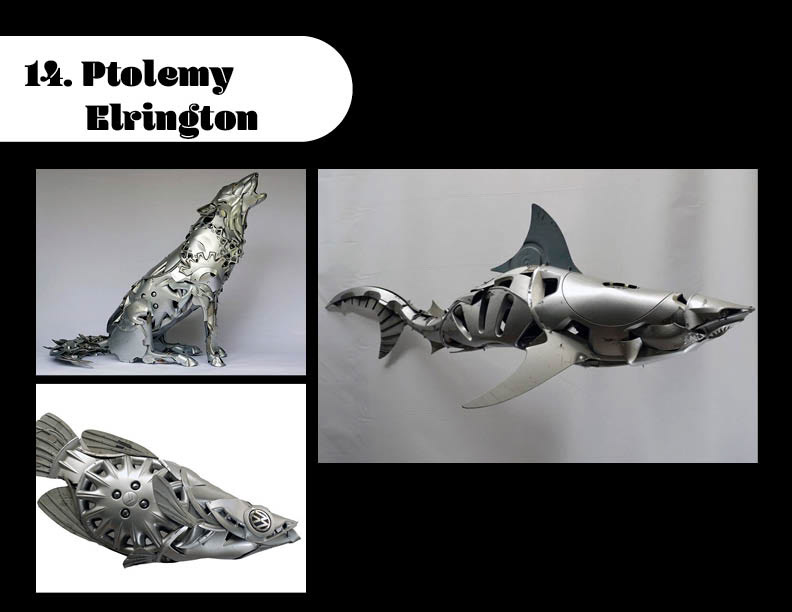
For Metal we picked Ptolemy Elrington. He works primarily with car parts to create sculptures of animals. This not only lines up with the environmental message but is also totally badass.
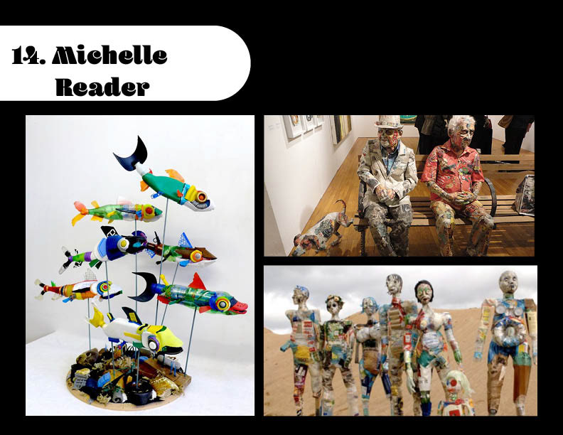
For plastics we chose Michelle Reader. She focuses on creating organic subjects out of found objects, and her skills with a wide range of materials made her a stand out candidate.
For wood materials we chose Iris's Founder George Rocha. He not only makes boards but some sculptural pieces as well. He was the obvious choice since his brand is a clear embodiment of our values and aesthetic.

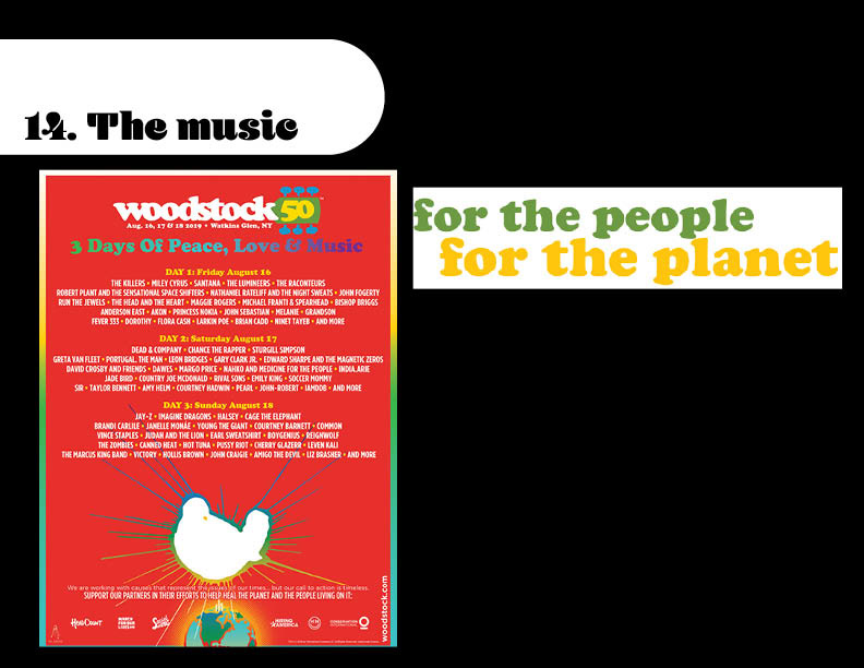
Getting these awesome artists together is great but Gaia felt we needed to draw a bit more attention and give people more to do at this event. We decided the best course of action would be to get some musical acts together. Sadly, Woodstock fifty was canceled this year, however they were platforming with an environmental message. We decided to look at this proposed line up in choosing our acts. Not only would bands like The Killers, The Raconteurs, and Greta Van Fleet draw a crowd, but if they were supporting Woodstock fifty's messaging then they would support ours too.
We then focused on building content for our brand itself. We decided to link each one of our brand colors with a specific aesthetic. We could then release these aesthetics as different product lines.

For products we wanted to show something a little less traditional. Of course clothes and shoes are part of our brand but we wanted to display less traditional products with our aesthetic choices. so we chose skate decks.