Located in Joinville, Santa Catarina - Brazil, Sol do Oriente Apiaries produces honey and its derivatives by hand. Since 1980, honey has been harvested and processed naturally and sustainably, respecting bees and the entire production cycle. Given its presence in the segment for so many years and its expertise, the brand realized that it needed a repositioning, where it was possible to realize through its packaging the added value of its products.
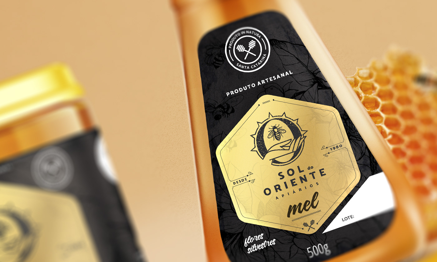
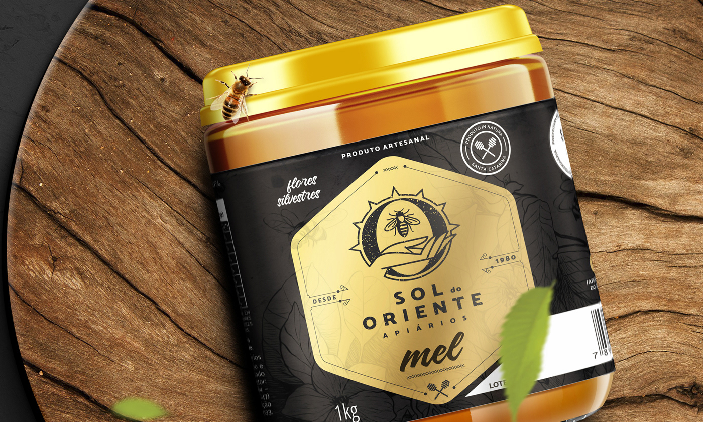
Thus, HeadMade was responsible for redesigning the logo, as well as creating a new visual identity for packaging that accommodates honey and other products. The logo developed maintained the essence of the company, where the sustainable and harmonious relationship with nature is represented by a hand that welcomes the bee, while the initial O refers to the sun, a fundamental part of the production cycle.
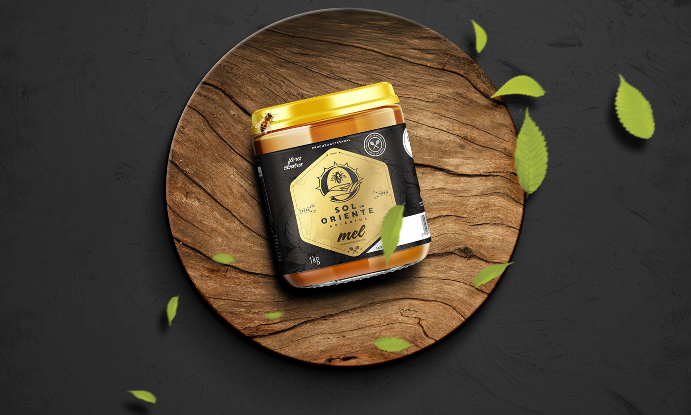
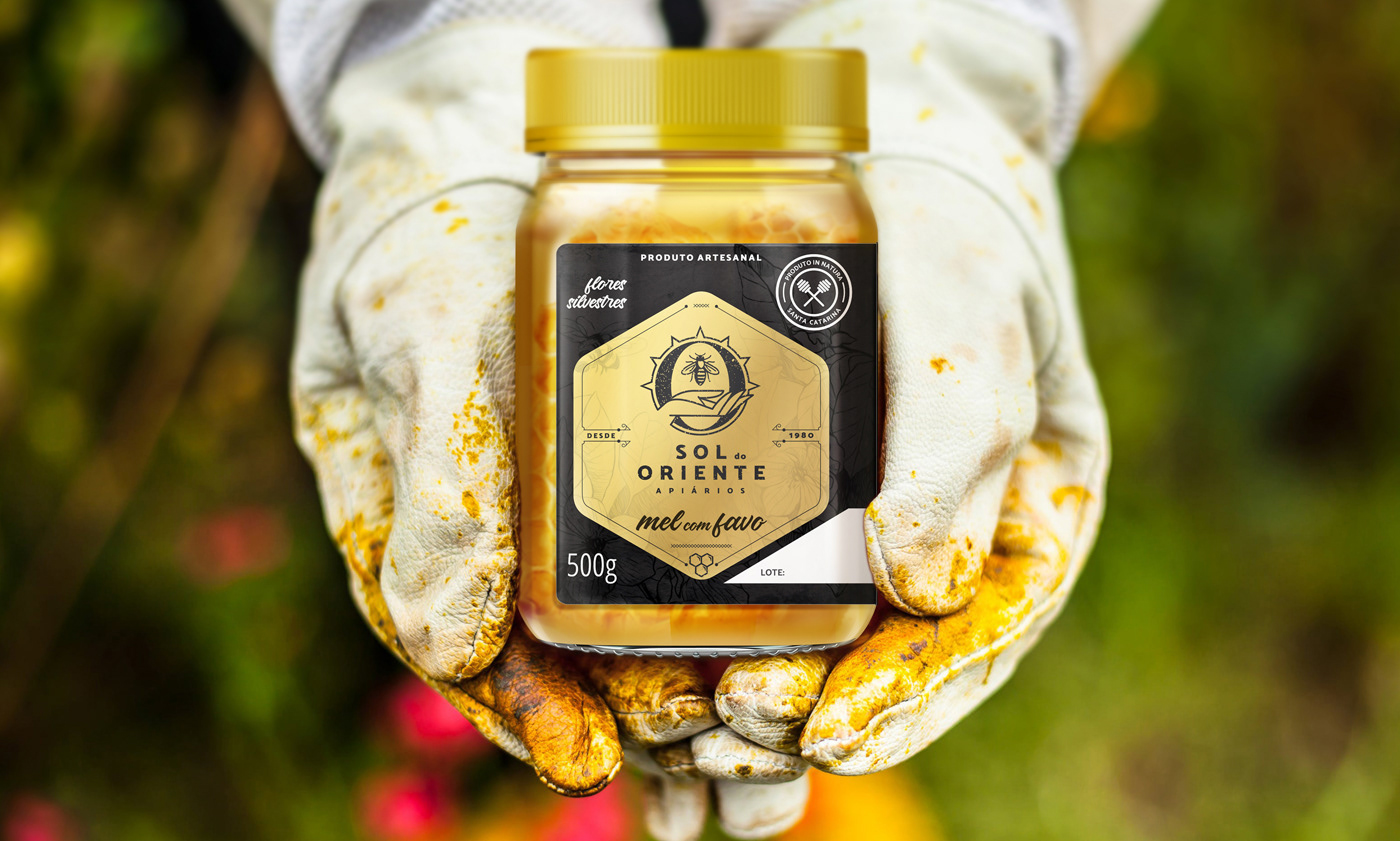
The new labels gave the packaging an elegant look, placing the brand nowadays, without losing the handmade essence. The golden and metallic pantone finishes, the black background, the matte lamination and the wild flower-shaped varnish bring the added value that the Sol do Oriente product needed. Thus, the brand stood out among its competitors, increasing its perception of quality before consumers.
Thus, HeadMade was responsible for redesigning the logo, as well as creating a new visual identity for packaging that accommodates honey and other products. The logo developed maintained the essence of the company, where the sustainable and harmonious relationship with nature is represented by a hand that welcomes the bee, while the initial O refers to the sun, a fundamental part of the production cycle.
The new labels gave the packaging an elegant look, placing the brand nowadays, without losing the handmade essence. The golden and metallic pantone finishes, the black background, the matte lamination and the wild flower-shaped varnish bring the added value that the Sol do Oriente product needed. Thus, the brand stood out among its competitors, increasing its perception of quality before consumers.