Analysis of font shaping.
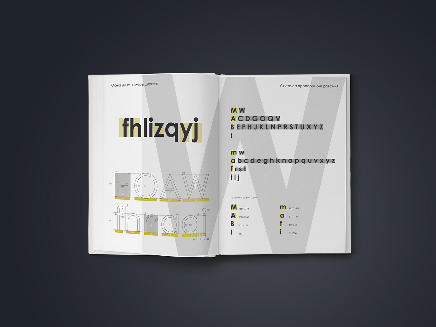
That work is a part of an academic instruction. In that project, I analyzed the Century Gothic font compared to Rockwell. Antiqua and grotesque types are the main contrasts in this work. I used the example of it to illustrate the basic font parameters such as typeface, simbols openness and contrast, letter void, ascenders and descenders, strokes measurement, simbols proportional system, dynamics, and their main components.