項目背景:
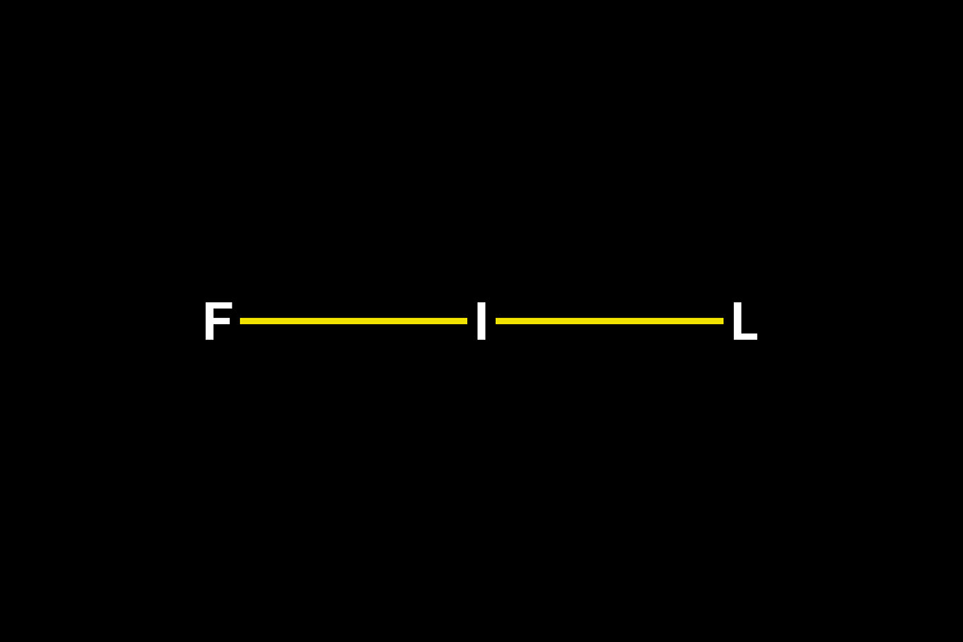
FIL 是壹個全新的設計師集合品牌的買手店,銷售不同有趣和設計感的各式物品。
FIL 是壹個全新的設計師集合品牌的買手店,銷售不同有趣和設計感的各式物品。
-
Project Background:
FIL is a brand-new designer collection brand buyer's shop, selling various interesting and design items.
FIL is a brand-new designer collection brand buyer's shop, selling various interesting and design items.
解決方案:
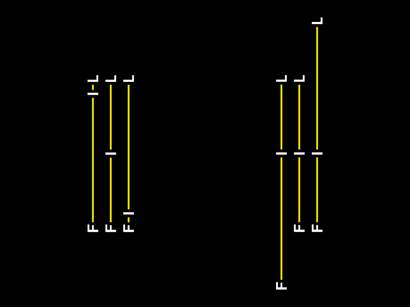
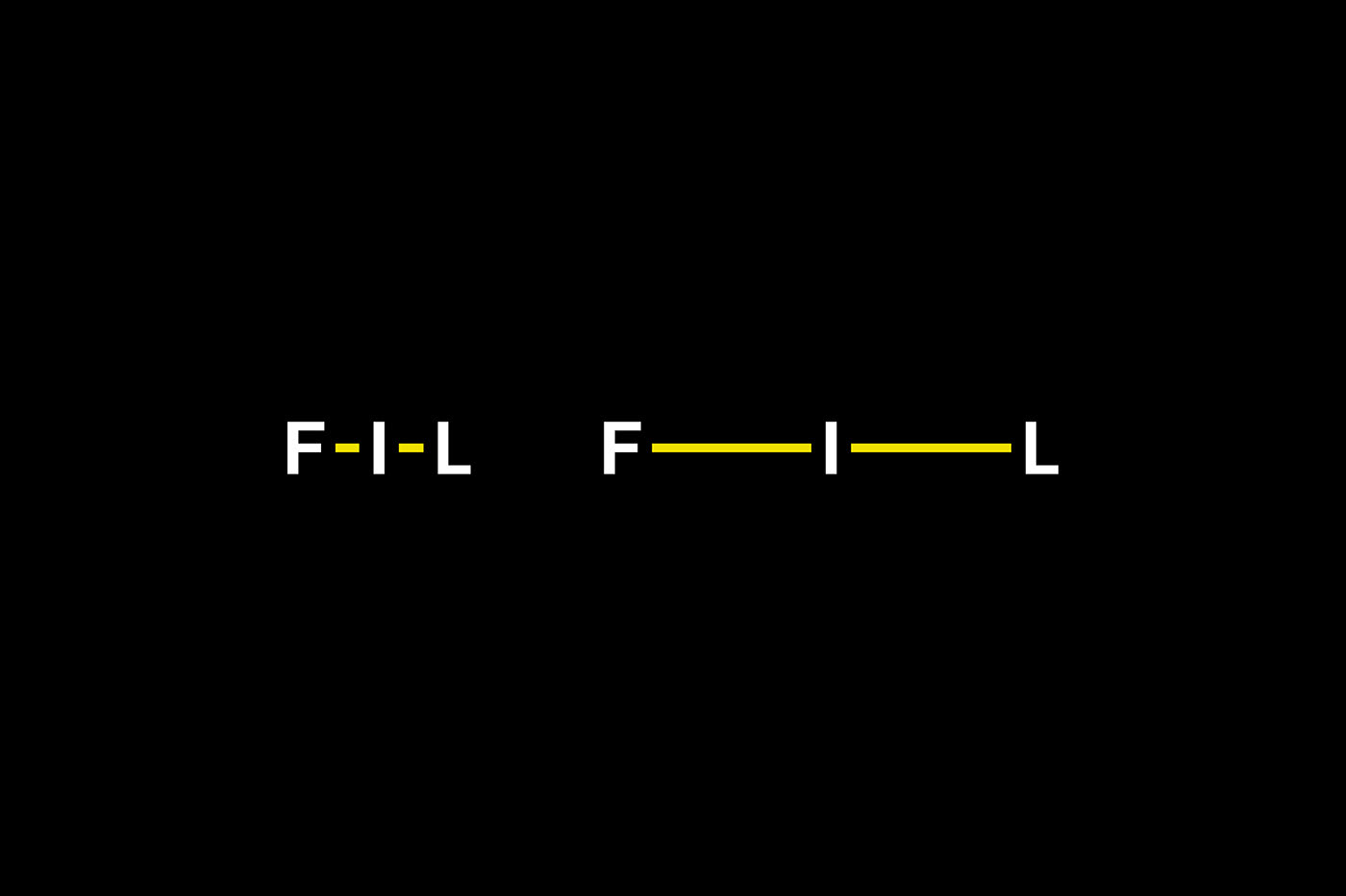
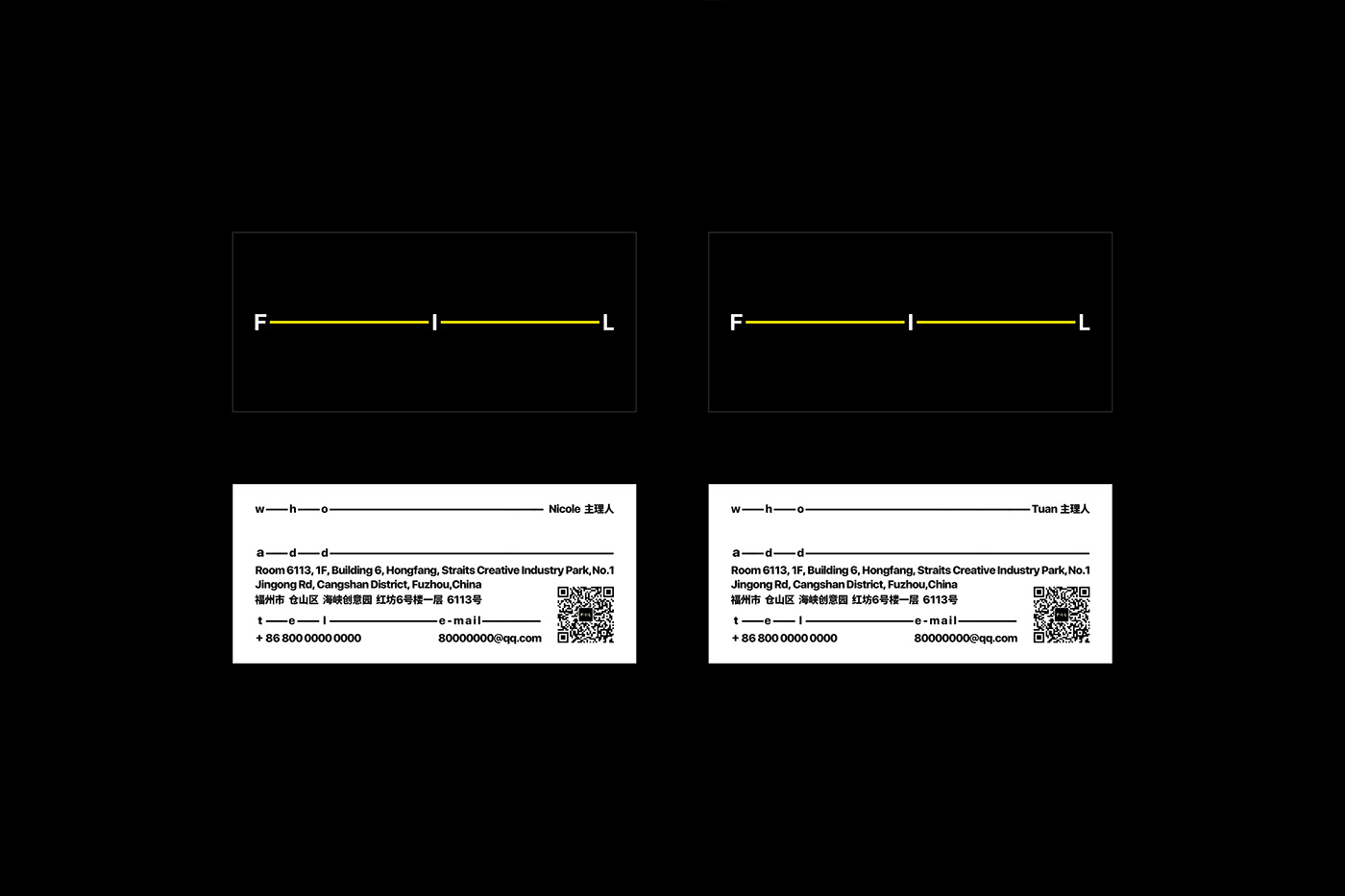
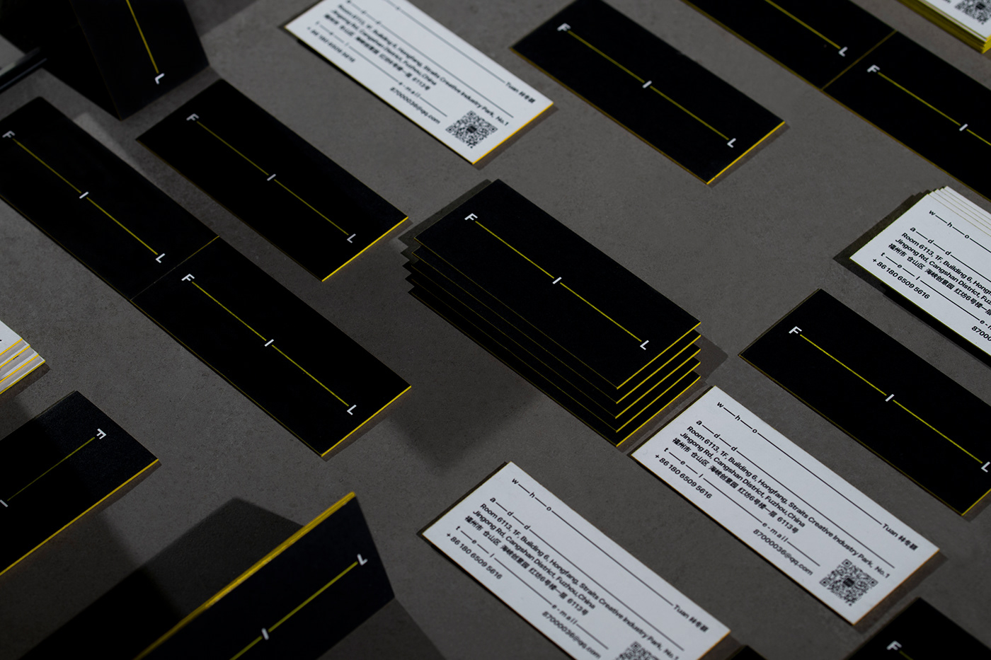
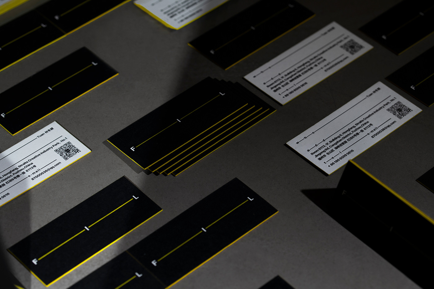
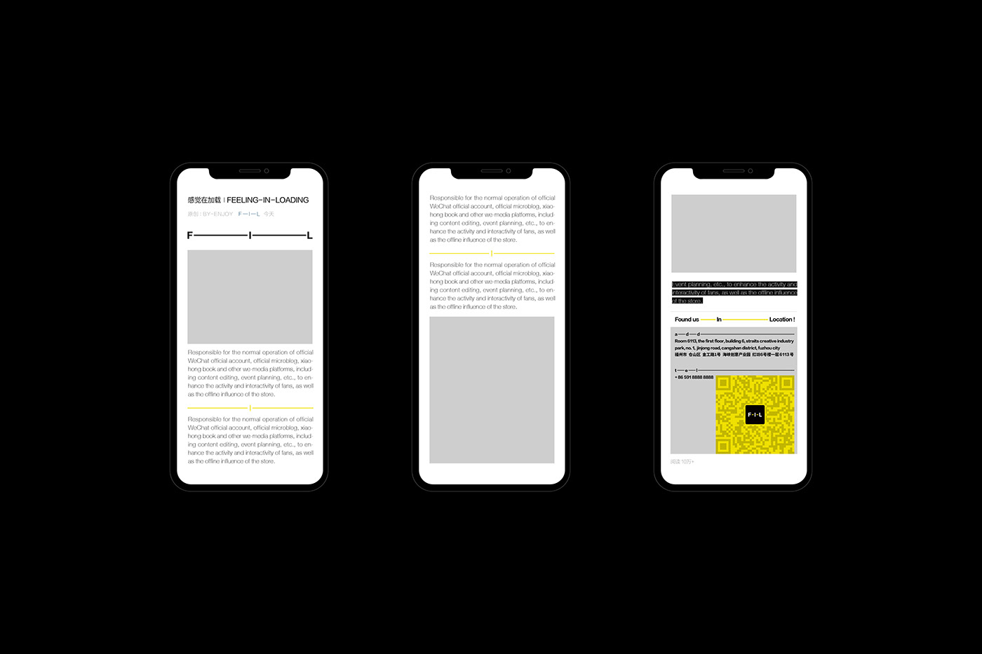
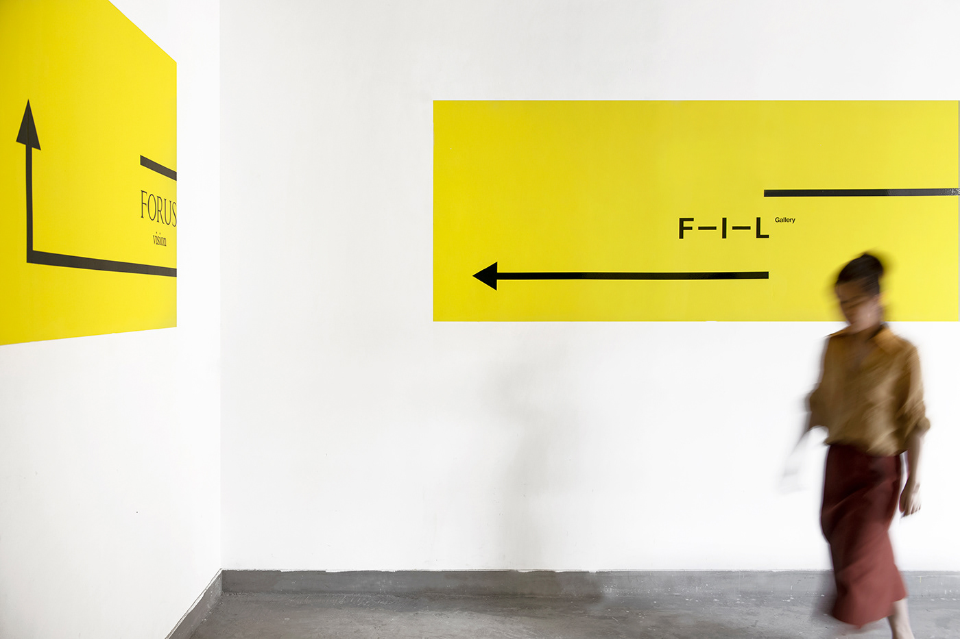
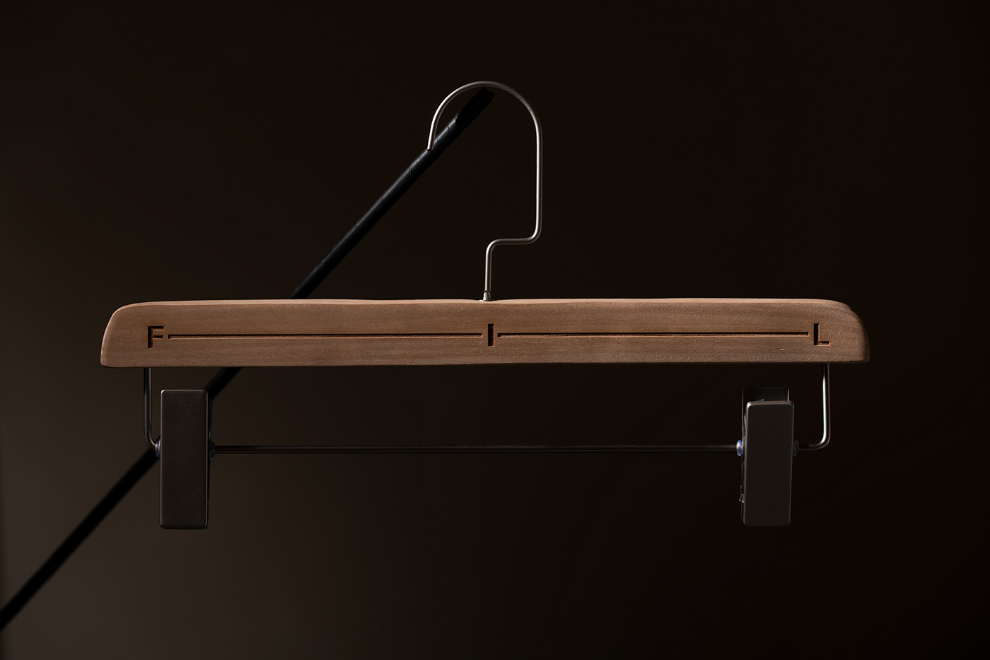
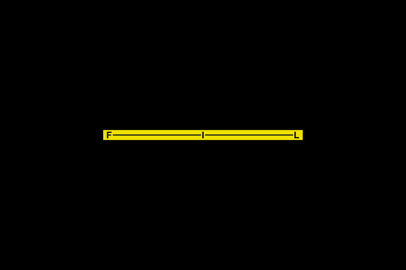
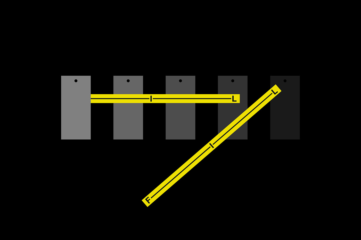
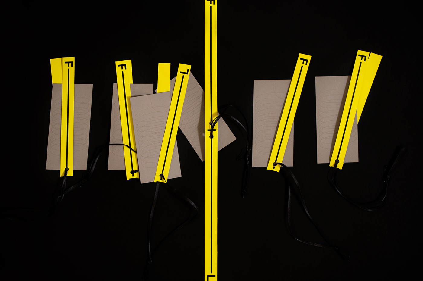
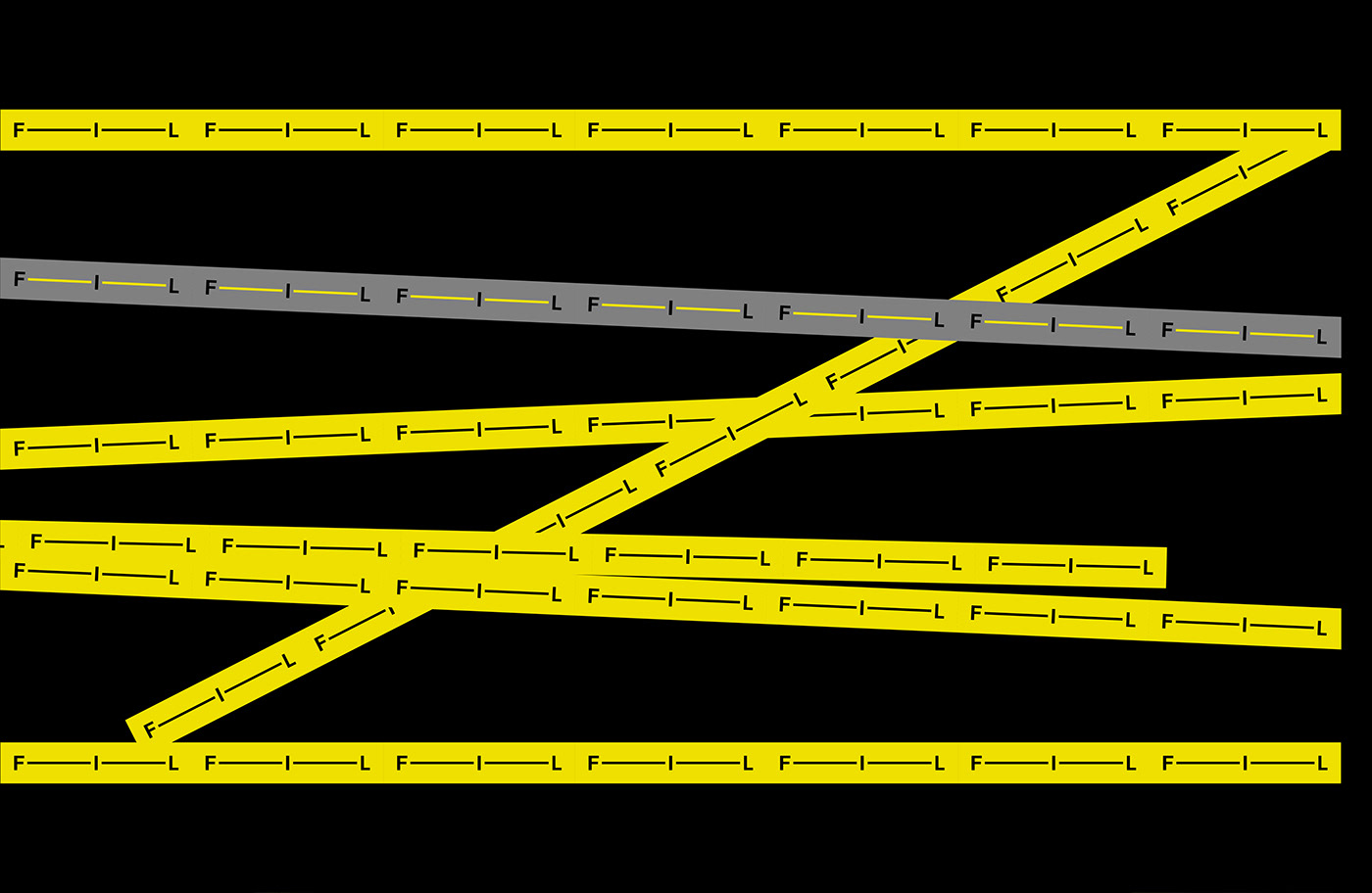
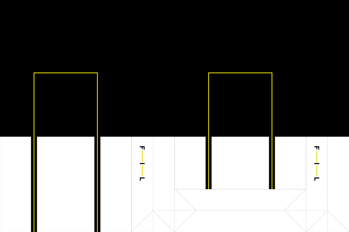
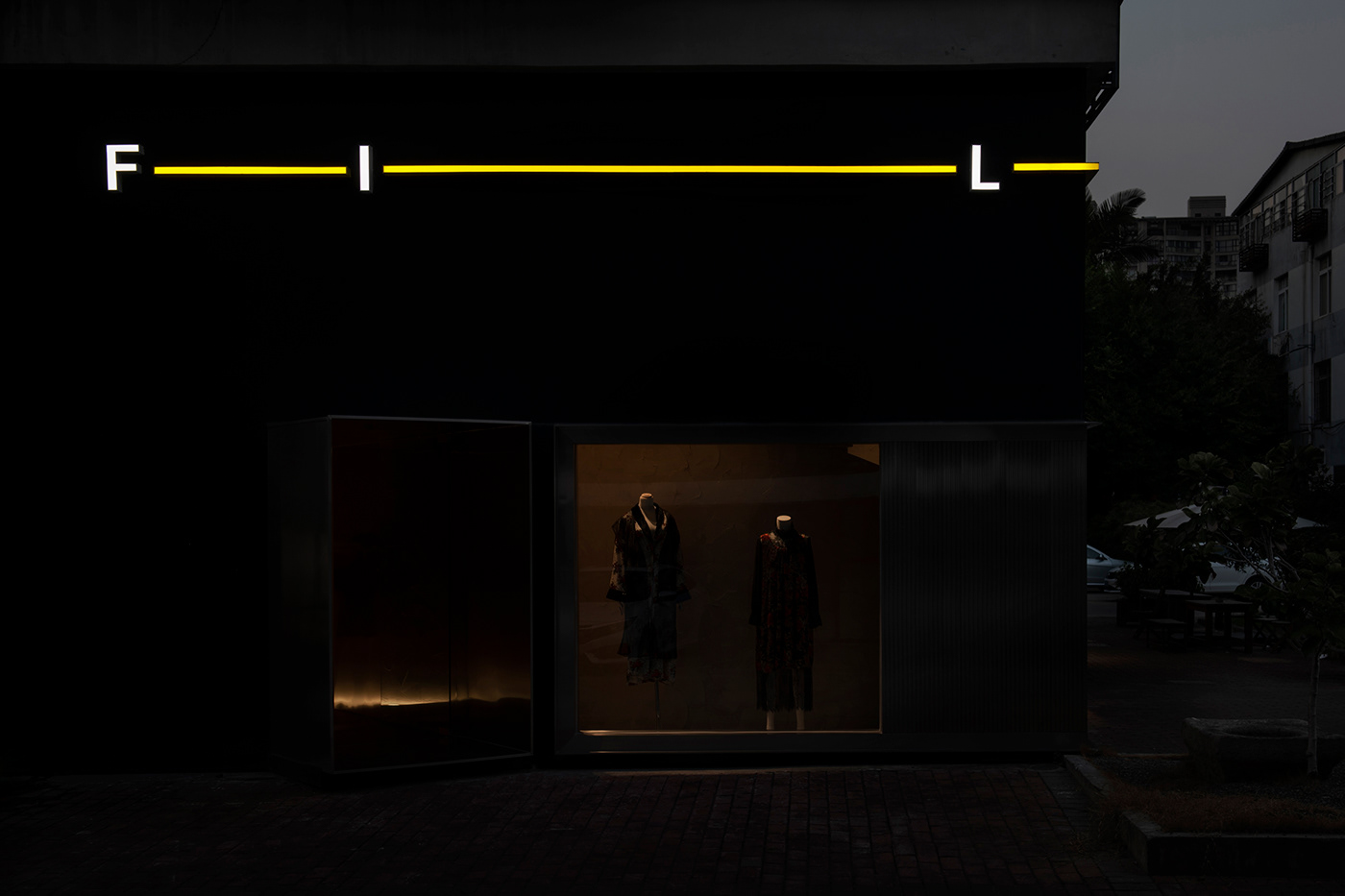
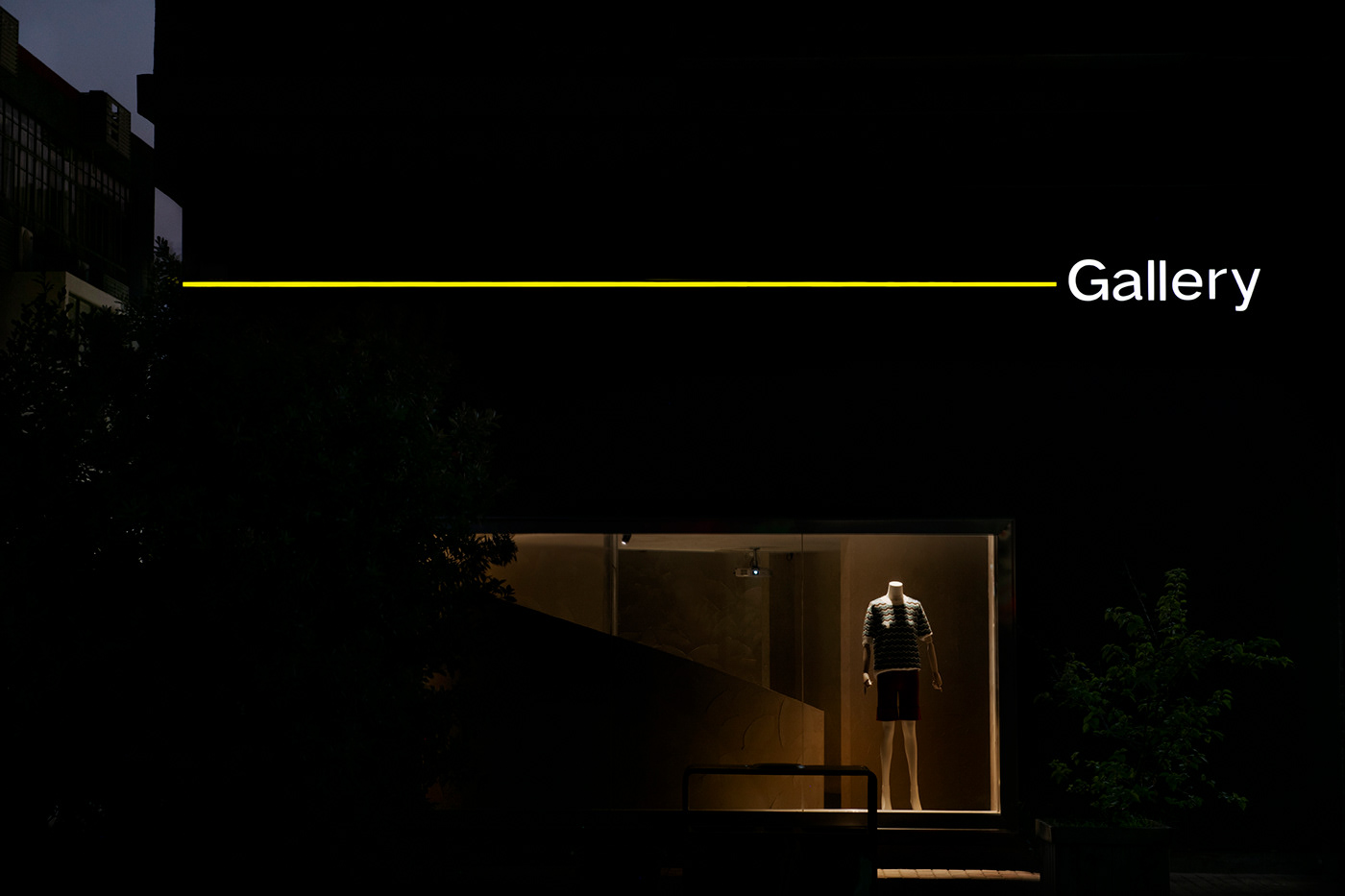
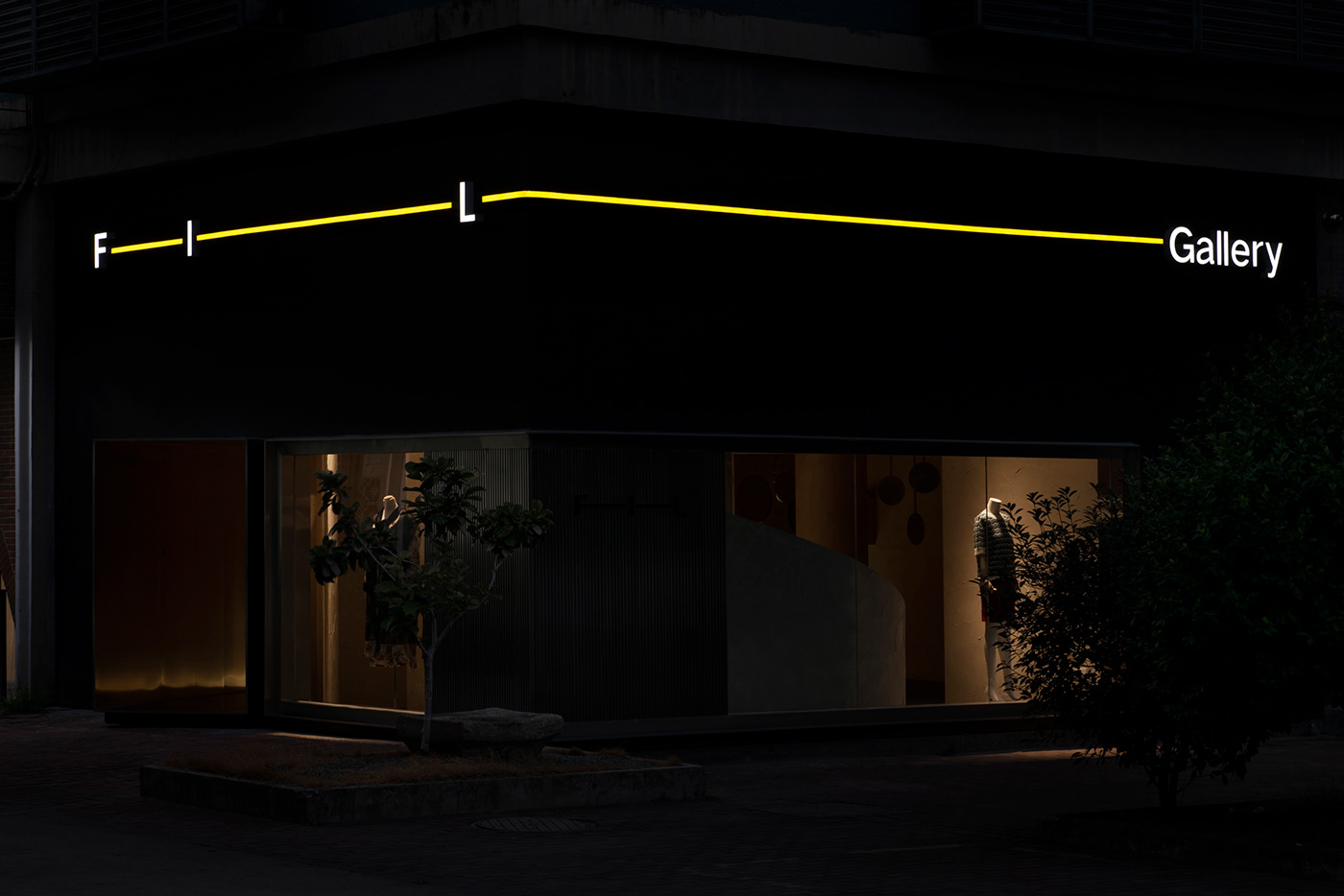
FIL在法語中,是“線”的意思。我們就期待它像這個名字壹樣:它是物化的、沒有情緒的、擁有包容性的。它可以是千萬種審美的最基礎構成,但它又不獨立存在。在為它進行品牌形象標誌設計的時候,我們在三個字體中間貫穿了“線”,讓標誌和品牌概念的“線”真實直觀存在,並且利用字體中間的“I”和左右兩邊的“線條”形成整個標誌互動的壹個角色,它像是進度條或者調節器壹樣的形象,可以生動和靈活地移動在任何品牌標誌的隨意壹個位置,也可以伸縮整個標誌的長短關系,於是,這個FIL的品牌形象系統真的可以像是壹條線壹樣伸縮有度,任意量尺,它們應用在品牌形象系統裏的每個環節,都可以是不同長短和隨意位置,但具有統壹的形象。
FIL在法語中,是“線”的意思。我們就期待它像這個名字壹樣:它是物化的、沒有情緒的、擁有包容性的。它可以是千萬種審美的最基礎構成,但它又不獨立存在。在為它進行品牌形象標誌設計的時候,我們在三個字體中間貫穿了“線”,讓標誌和品牌概念的“線”真實直觀存在,並且利用字體中間的“I”和左右兩邊的“線條”形成整個標誌互動的壹個角色,它像是進度條或者調節器壹樣的形象,可以生動和靈活地移動在任何品牌標誌的隨意壹個位置,也可以伸縮整個標誌的長短關系,於是,這個FIL的品牌形象系統真的可以像是壹條線壹樣伸縮有度,任意量尺,它們應用在品牌形象系統裏的每個環節,都可以是不同長短和隨意位置,但具有統壹的形象。
-
The Solution:
FIL means "line" in French. We expect it to resemble the name: it is materialized, non-emotional, and inclusive. It can be the most basic composition of thousands of aesthetics, but it does not exist independently. When designing the brand image logo for it, we inserted a "line" in the middle of the three fonts to make the "line" of the logo and the brand concept truly and intuitive, and use the "I" in the middle of the font and the "lines" on the left and right sides. "It forms a role for the entire logo interaction. It looks like a progress bar or a regulator. It can move in any position of any brand logo vividly and flexibly, and it can also stretch the length of the entire logo. So, This FIL brand image system can really be as flexible as a line, with any scale, they can be applied to each link in the brand image system, they can be of different lengths and random positions, but they have a unified Image.
FIL means "line" in French. We expect it to resemble the name: it is materialized, non-emotional, and inclusive. It can be the most basic composition of thousands of aesthetics, but it does not exist independently. When designing the brand image logo for it, we inserted a "line" in the middle of the three fonts to make the "line" of the logo and the brand concept truly and intuitive, and use the "I" in the middle of the font and the "lines" on the left and right sides. "It forms a role for the entire logo interaction. It looks like a progress bar or a regulator. It can move in any position of any brand logo vividly and flexibly, and it can also stretch the length of the entire logo. So, This FIL brand image system can really be as flexible as a line, with any scale, they can be applied to each link in the brand image system, they can be of different lengths and random positions, but they have a unified Image.
















Project:
Branding Design
-
Client:
FIL
-
Design Produced:
不亦乐乎 | BY-ENJOY
-
Art Director:
Young Huale
-
Designer:
Young Huale / Hong Jing / Zheng Rong
-
Photographer:
Zou Xunkai

