


A tribute to locals
Gravitatsiya (Gravity) is a new shopping center soon to be open in the Chertanovo district of Moscow. It’s aiming to become the center of attraction for the locals. So we’ve created an identity system full of local pride — inspired by the view from space at the Soviet era modernist architecture the place is well known for.


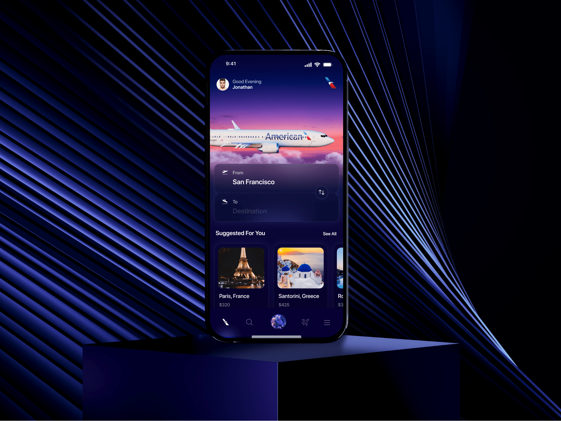
A bit of dynamics
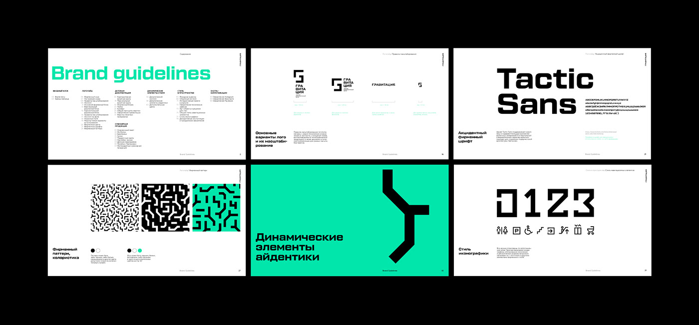
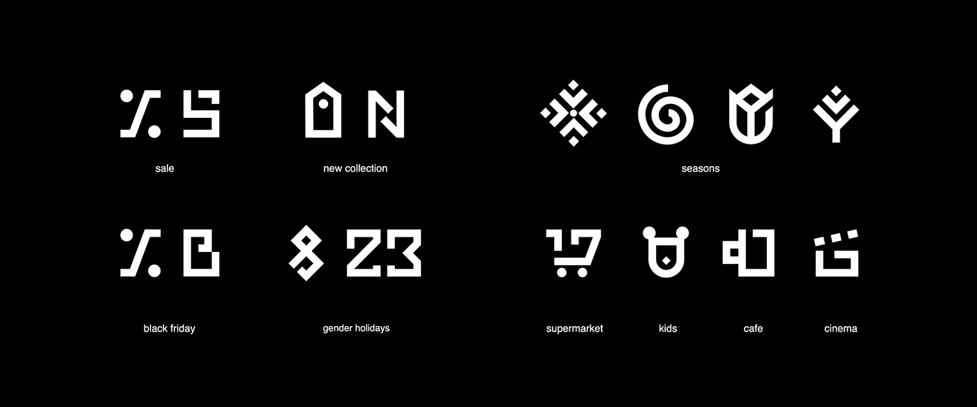
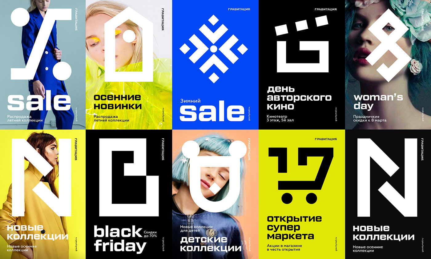
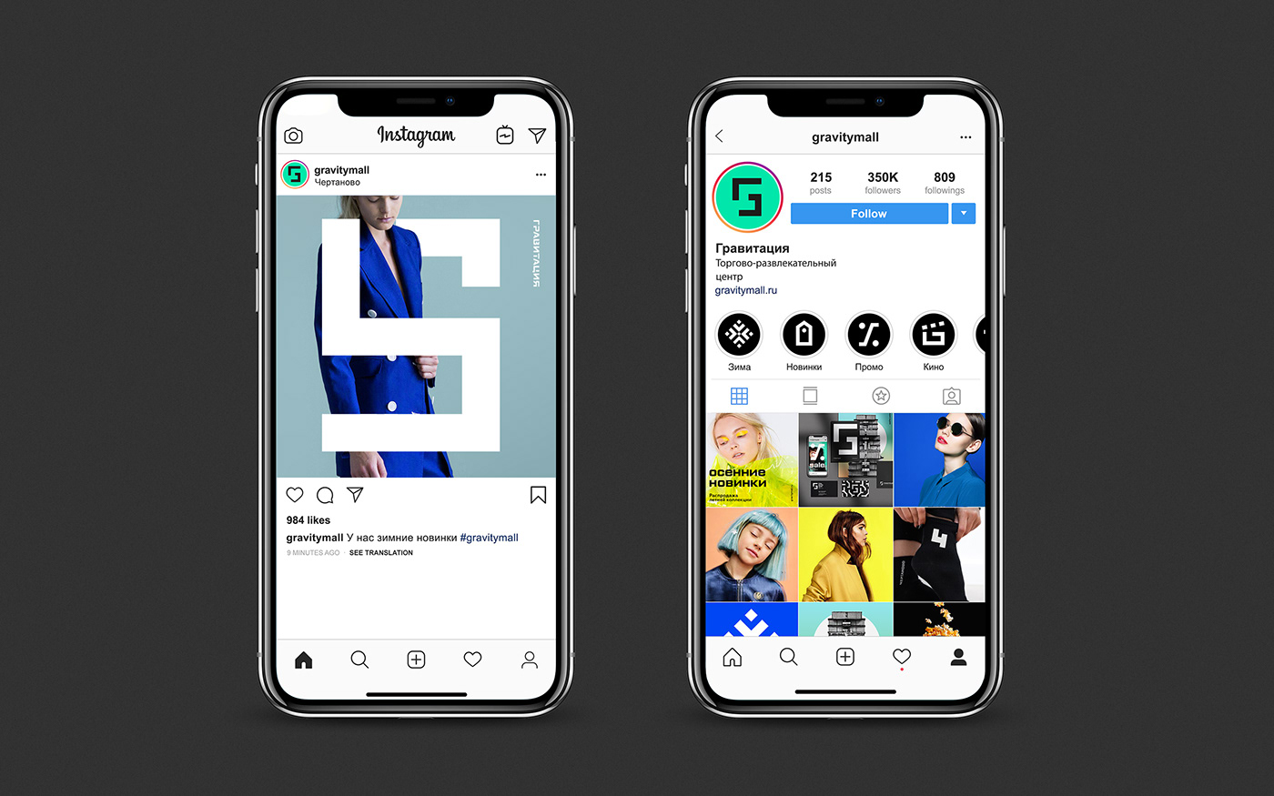
When it comes to communicating mall’s activities logo is never enough. So we’ve created a full featured iconography system aimed at solving different communication tasks, such as introducing new categories and events.
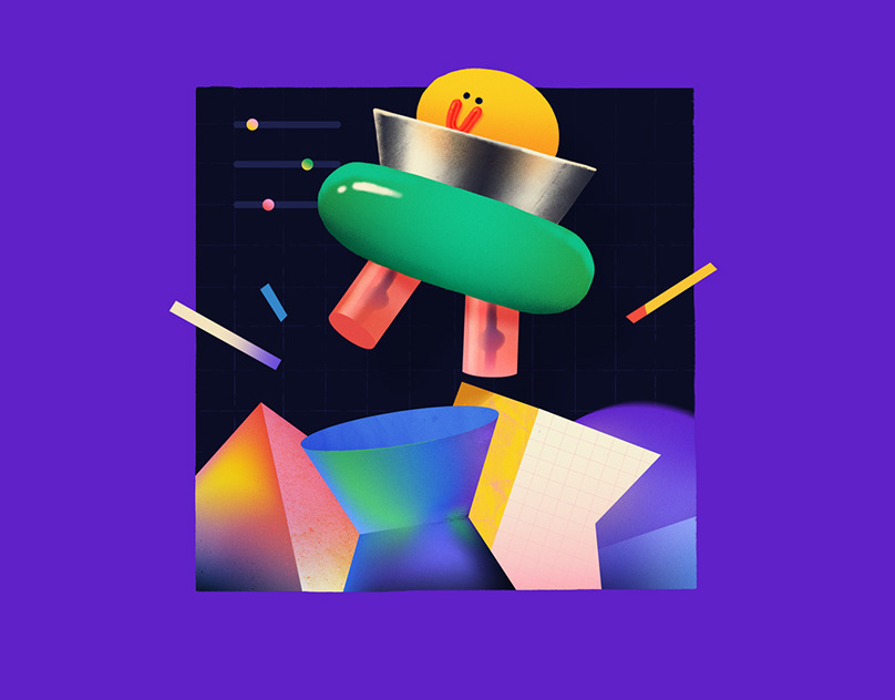
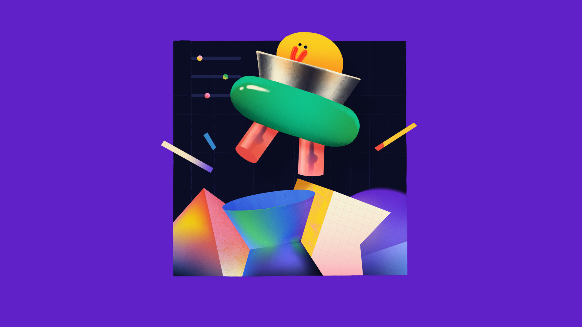
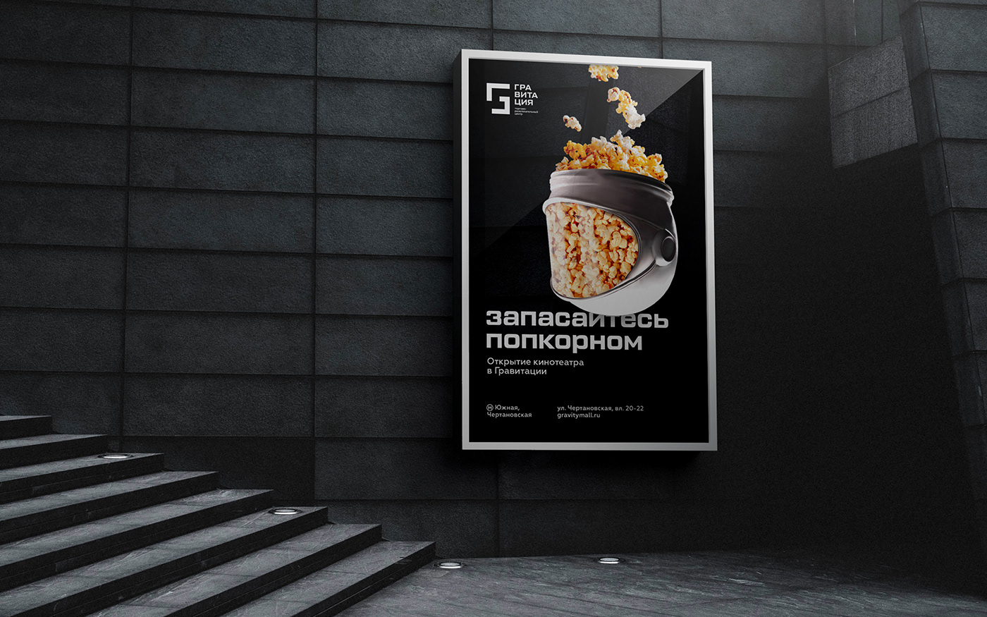
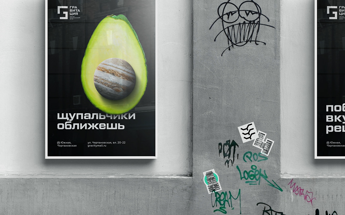
A hint of surrealism
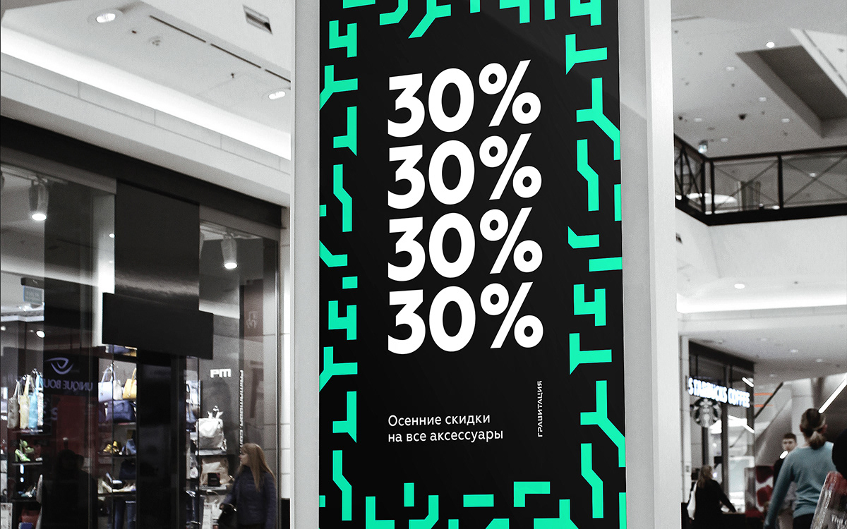
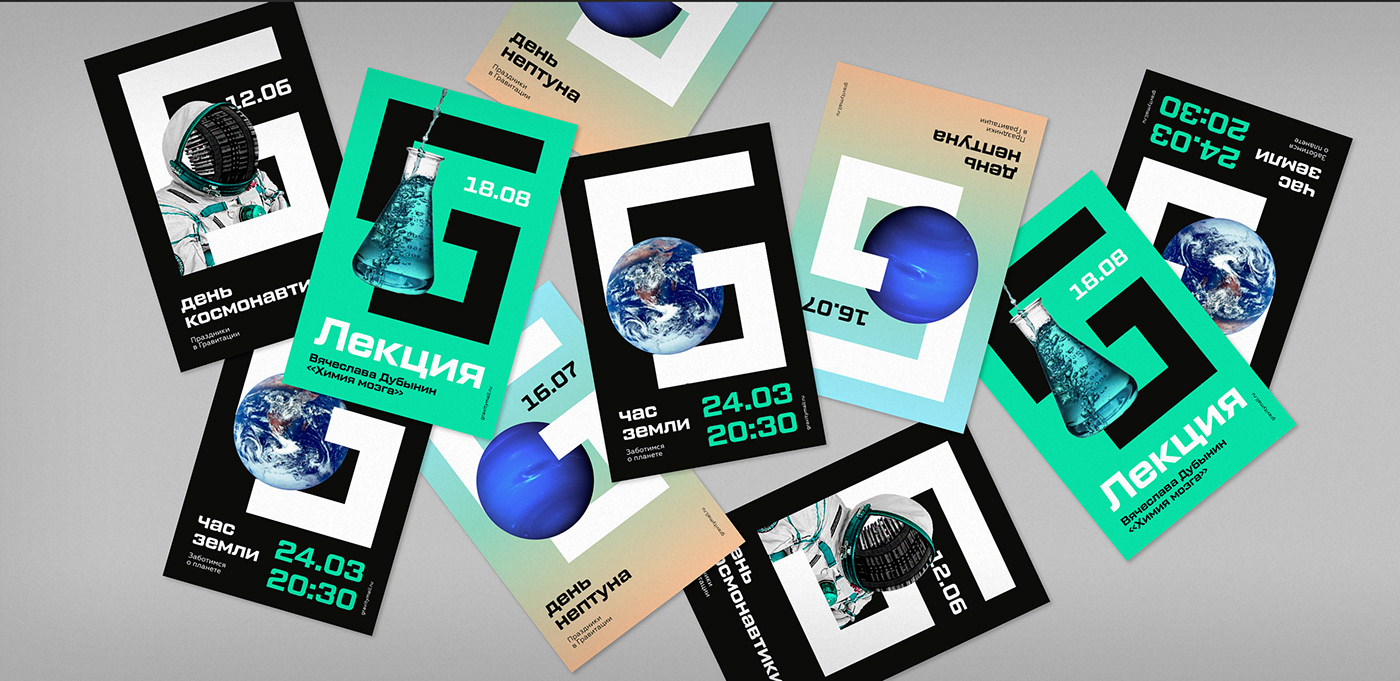
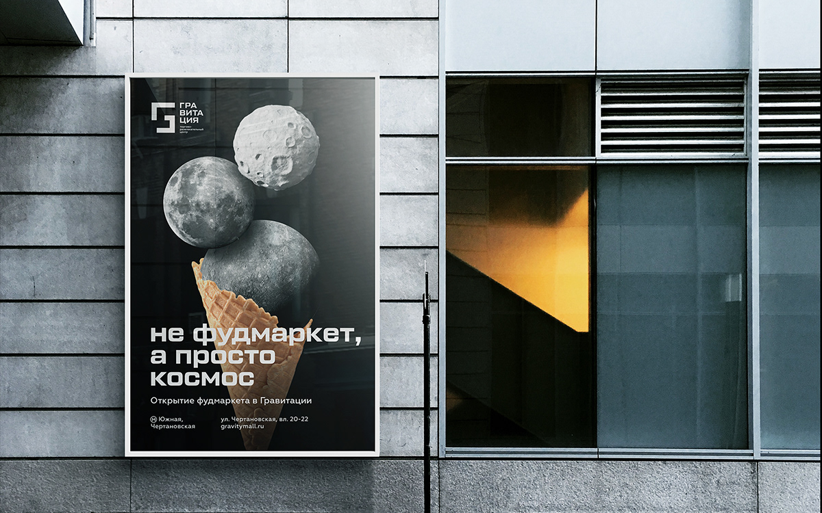
Space is the topic reflected in the interior design and popular science events to be held at the mall. So we’ve created a series of key visuals that mix the mystery of space with daily activities that one can enjoy at the mall.


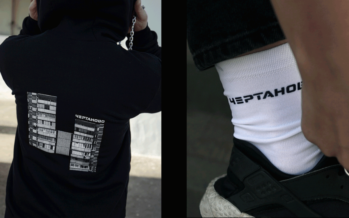
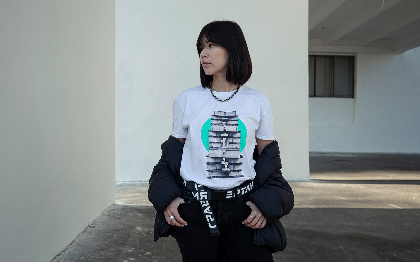
A drop of merch
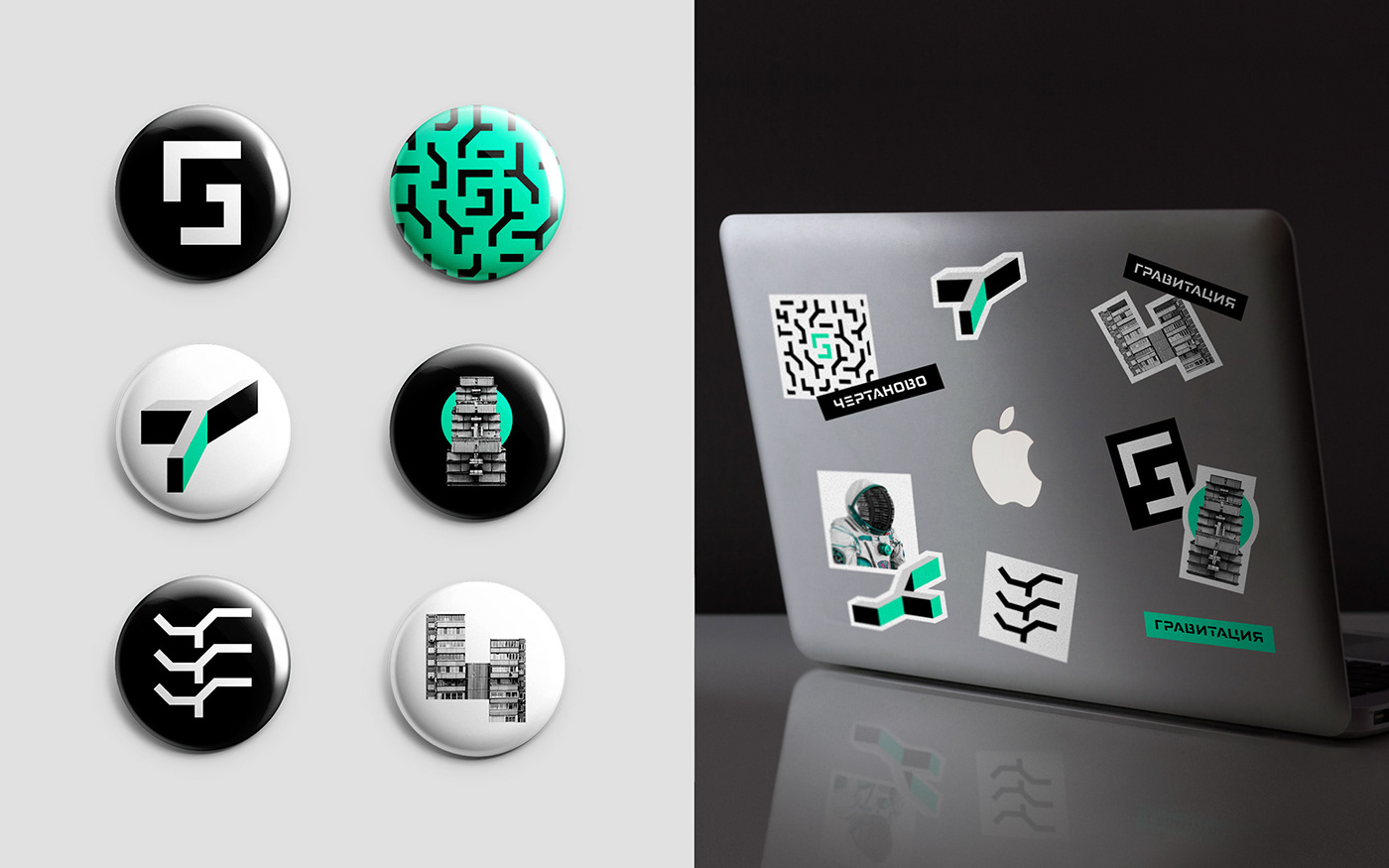
This identity is already quite playful, but we’ve decided to turn it up a notch. We’ve hidden a Russian letter „Ч“ (Ch), the first letter of the district name, right in the main logo. And made a drop of merch to celebrate the local pride.


The Clients
Strategy & creative: Alexandr Bozhko, Ivan Dergachev
Account director: Maria Chechelova
Art director: Lidiya Kapysh
Design: Anna Pazyuk, Albert Safin, Alexandra Chushkina
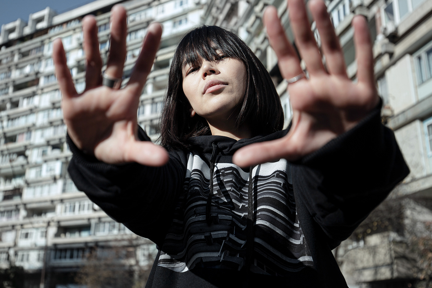
Photographer: Anna Pazyuk
Model: Alexandra Chushkina, Anatoly Chipenko
Video editor: Aleksey Polianchekov