Introduction
Online research has helped me to understand that coffee culture in Ireland continues to grow. 75% of Irish people surveyed state that they drink more than one cup of coffee every day. Having coffee in cafes are just as popular as taking coffee to go.
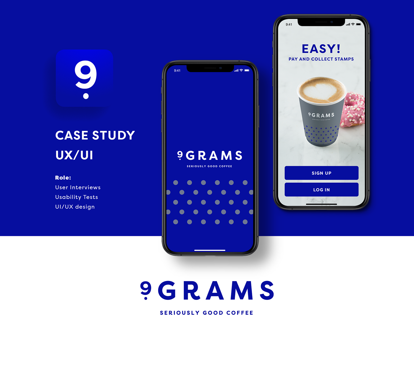
About The Project
9grams Coffee is new brand in Irish retail business. It is a sub-brand of the Daybreak convenience store in Ireland, where I am working full time as a Graphic Designer. As I am now transitioning my career to UX/UI, I have decided that it would be fun to practice my new skills and do a full case study, and to create an app concept. The main focus of the project is to create a new experience for new and existing coffee shop customers and help them to make the process of ordering coffee easier and faster.
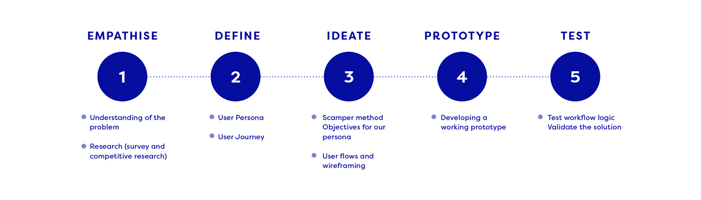
I achieved this by going through stages of research to the ideation, prototyping, testing and visual design.
Note: This project is just a concept developed for my portfolio, and not developed for commercial purposes.
The Problem
The Company has a paper loyalty-card, but the customers sometimes would forget their wallet, or can't find the Loyalty card, or forget to present it to the cashier at the time of purchasing coffee.
For now there are 55 coffee stations built into Daybreak stores across Ireland, many of them have regular customers. Business is growing rapidly, and now is the right time to focus on enhancing customer satisfaction by improving a more convenient customer service.
The Solution
The main purpose of the app will let users to increase customer satisfaction by improving and simplifying the process of ordering coffee. This can be done in three simple steps:
1. Find the nearest coffee shops using the in-app location finder
2. Pay fast and secure by linking credit card to app
3. Collect loyalty stamps automatically as part of the transaction
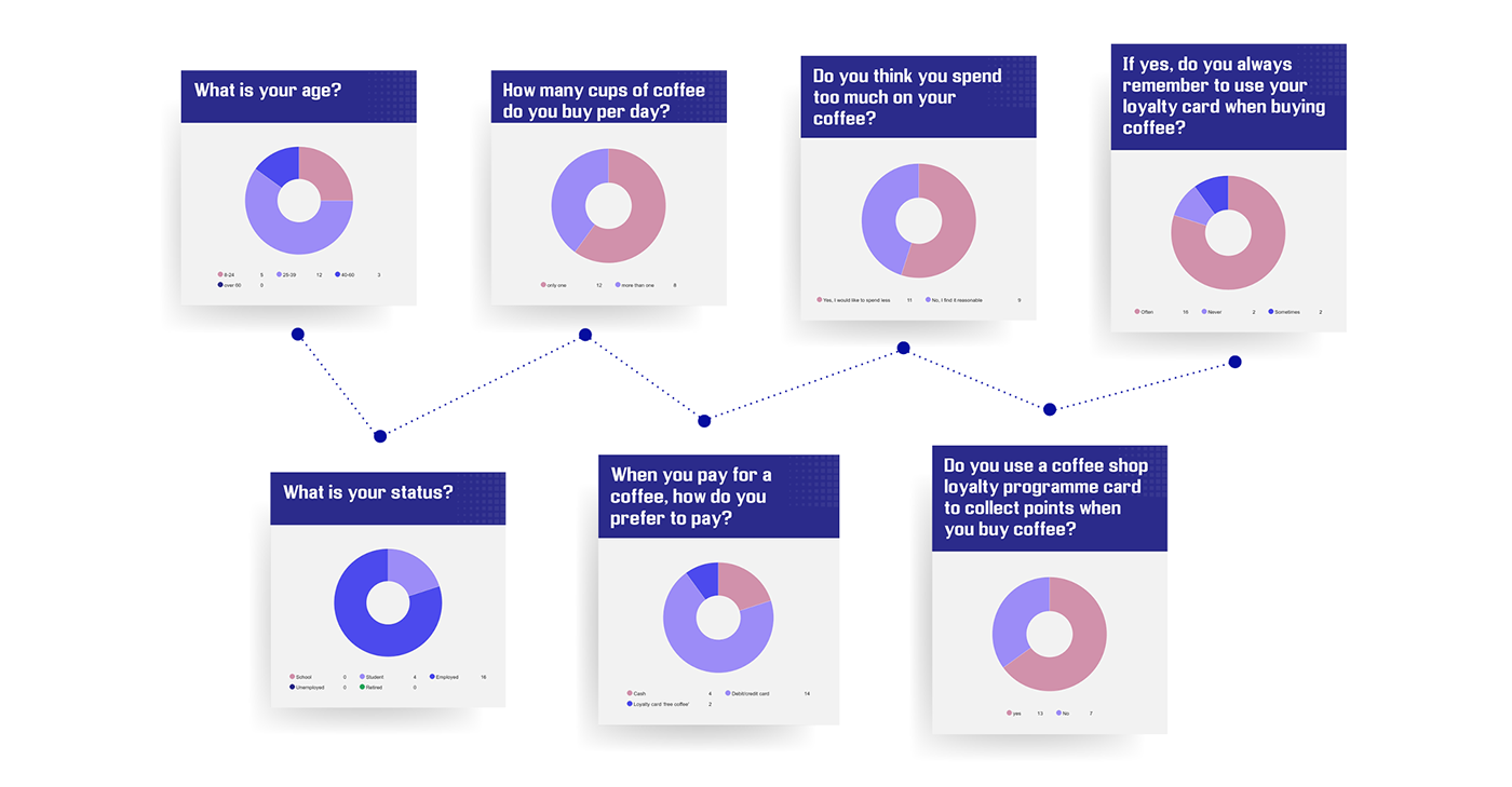
Research By Survey
I conducted a survey with 20 regular customers from a coffee shop, which gave me a few basic insights:

Competitive Research
During my research, I have discovered that in the Irish market there exists two very similar versions of the product I intend to create, so I have decided to investigate both.
I downloaded two of the apps and examined them for myself as well as asked other people to test the apps to gain their opinion and making notes of what they like and what they do not.
I also read the reviews of the two different products in ‘Google Play’ and ‘Apple Store’ and understood that there is a successful product and an unsuccessful product.
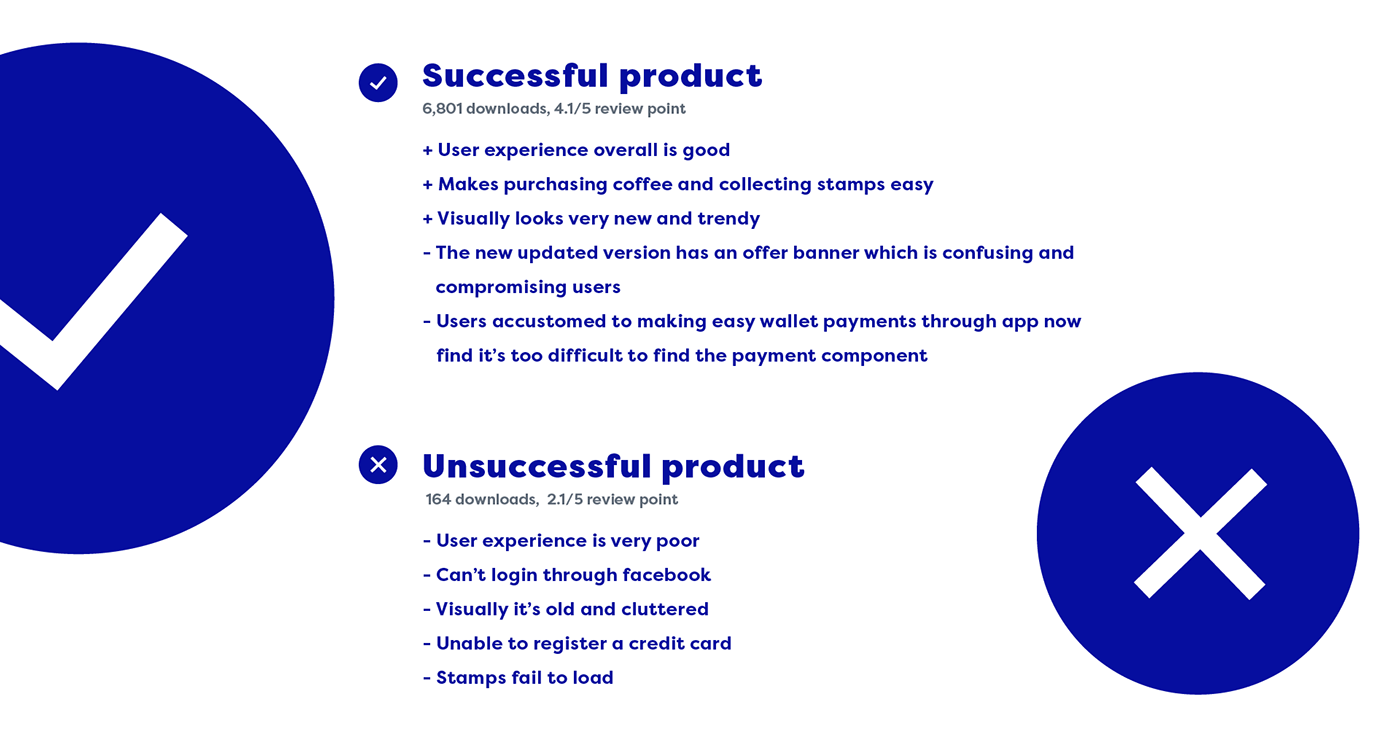
Some quotes from frustrated users while investigating competitor apps:
- “Downloaded it and completely unusable. Can't login with Facebook, can't register because you can't type in your email. Absolutely useless”
- “I therefore can't be sure how many cups have been stamped, which is very unhelpful”
- “big offer banner always blocking view of my stamps, constantly have to close it. I struggled to find my completed card”
Journey Map
After I completed comparing the existing competitor products, I produced a Journey Map as follows:

Scamper method
Creating a journey map helped me to understand how I can innovate and improve the product I'm working on.
For my ideation, I used the SCAMPER method which has the following steps:
1. Substitute
2. Combine
3. Adapt
4. Modify (Also Magnify and Minify)
5. Put to another use
6. Eliminate
7. Reverse
I was able to generate some ideas on what I would focus on for this project. Two key areas I wanted to focus on were:
• Welcoming - It has to be easy to create an account
• Simplicity - It’s a simple app, so concentrate on simple tasks such as pay/collect stamps,
find the completed cards, and keep other things like ‘offers’ on secondary screens
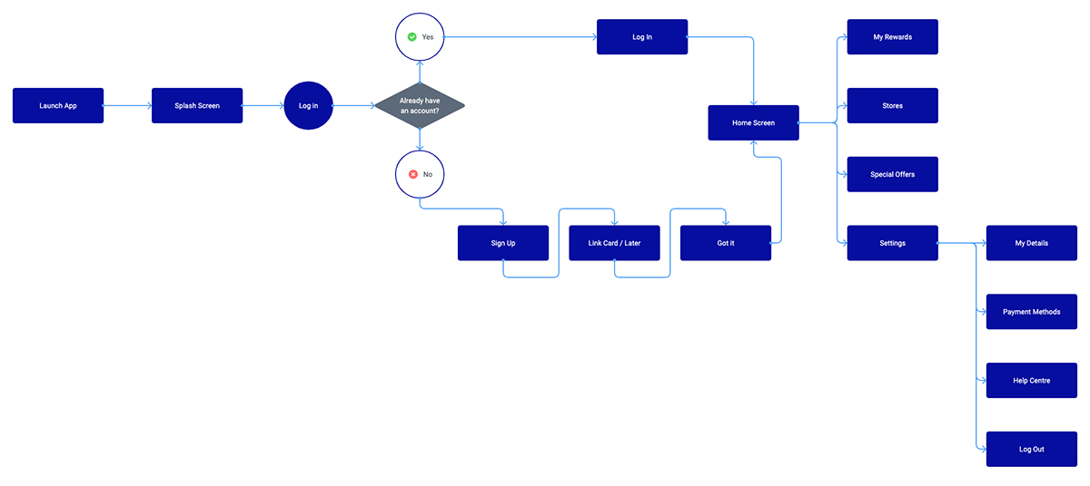
User Flowchart
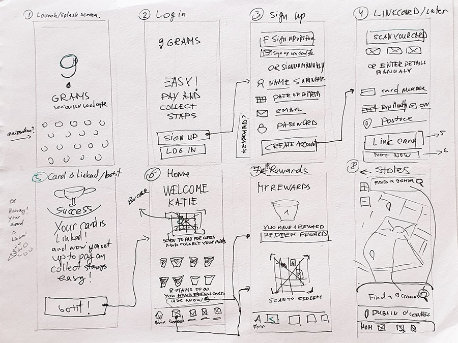
Sketches
While sketching the first screens, it helped me get a visual idea of how the app might look.
I concentrated on straightforward steps that a user would follow to have a simple registration process with the app. And then the main focus would be on the main screen where the user is shown their reward card status and barcode in same window for easy and quick payment.
Wireframes
When working on low fidelity wireframes I concentrated on where all elements will sit and when making a simple prototype I could test how they will work.

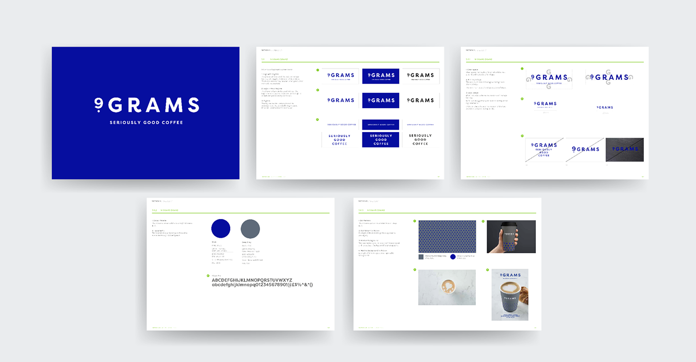
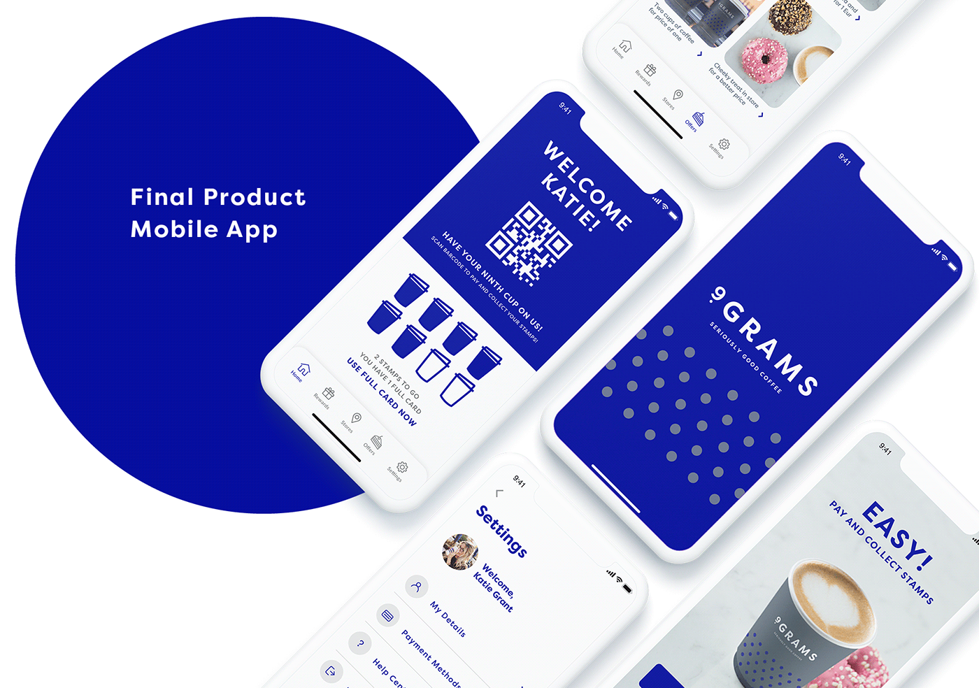
9 Grams Coffee Brand Design
I use the brand guidelines and key brand creative provided by the company’s creative agency.
I really enjoyed creating the app with this newly designed brand, as it has very strong visuals and imagery. I know this brand very well as I’m working with it daily.
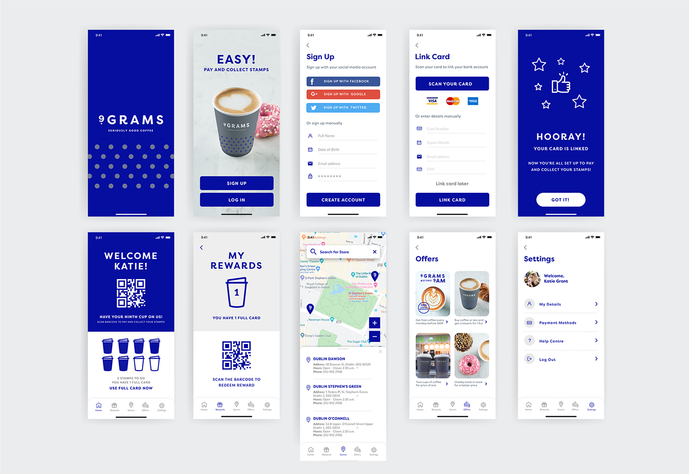
pixel perfect screens


Conclusion
Designing an app and user experience for this project was challenging yet interesting. I had a chance to explore the needs of users by holding a survey and having conversations with customers about what they would find useful in an app like this. Lastly, I challenged myself by trying to create an engaging and visually appealing design for an app that would captivate customers who should want to use the app.
The main goal of the project was to create a great user experience with an uncluttered design. I got some level of confirmation of this with testing with a few users. I was happy with positive feedback, where users generally enjoyed the look of the app and the simple navigation through it. The following are some user feedback:
User Review:
"This is a nice and clean clutter-free design with a workflow that makes signing up to using the service quick and easy."
User comment:
“A further improvement could be the addition of a little blue dot on the map to indicate the user's current location to help the user find nearby coffee shops.”
I had no deadline for the project, however I tried to work through the process from start to finish at a consistent pace. In thinking of how I can improve my process and my result, I could revisit the project and work more on testing, as this sometimes helps provide insight into the use of the design that early research might not have taken into account. Further, if there could be more resources, the product could have further features added, where for example, a user could have an opportunity to order coffee through the app in advance, and collect their coffee at a chosen time, and in that way the customer could skip the queue and save time.

