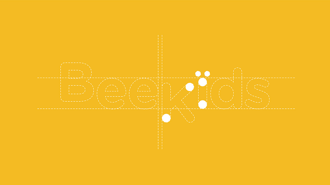
Bee Kids - Visual Identity
Branding
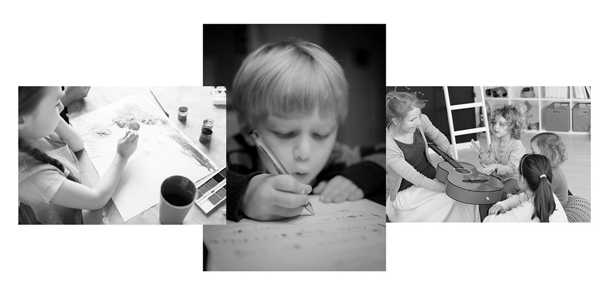
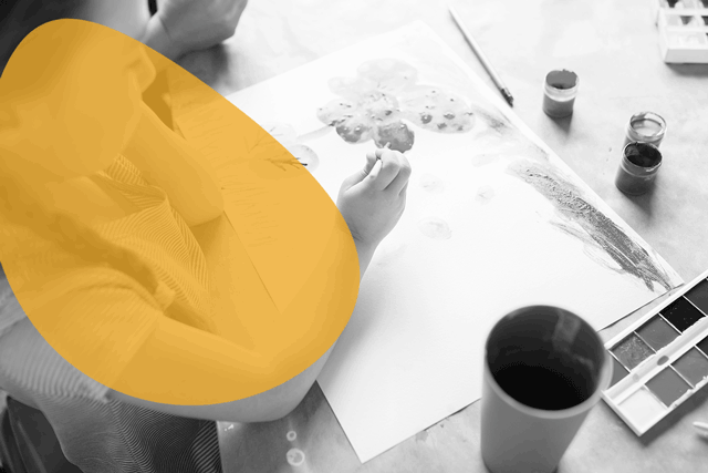
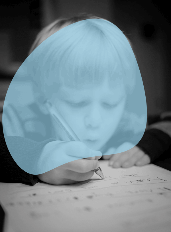
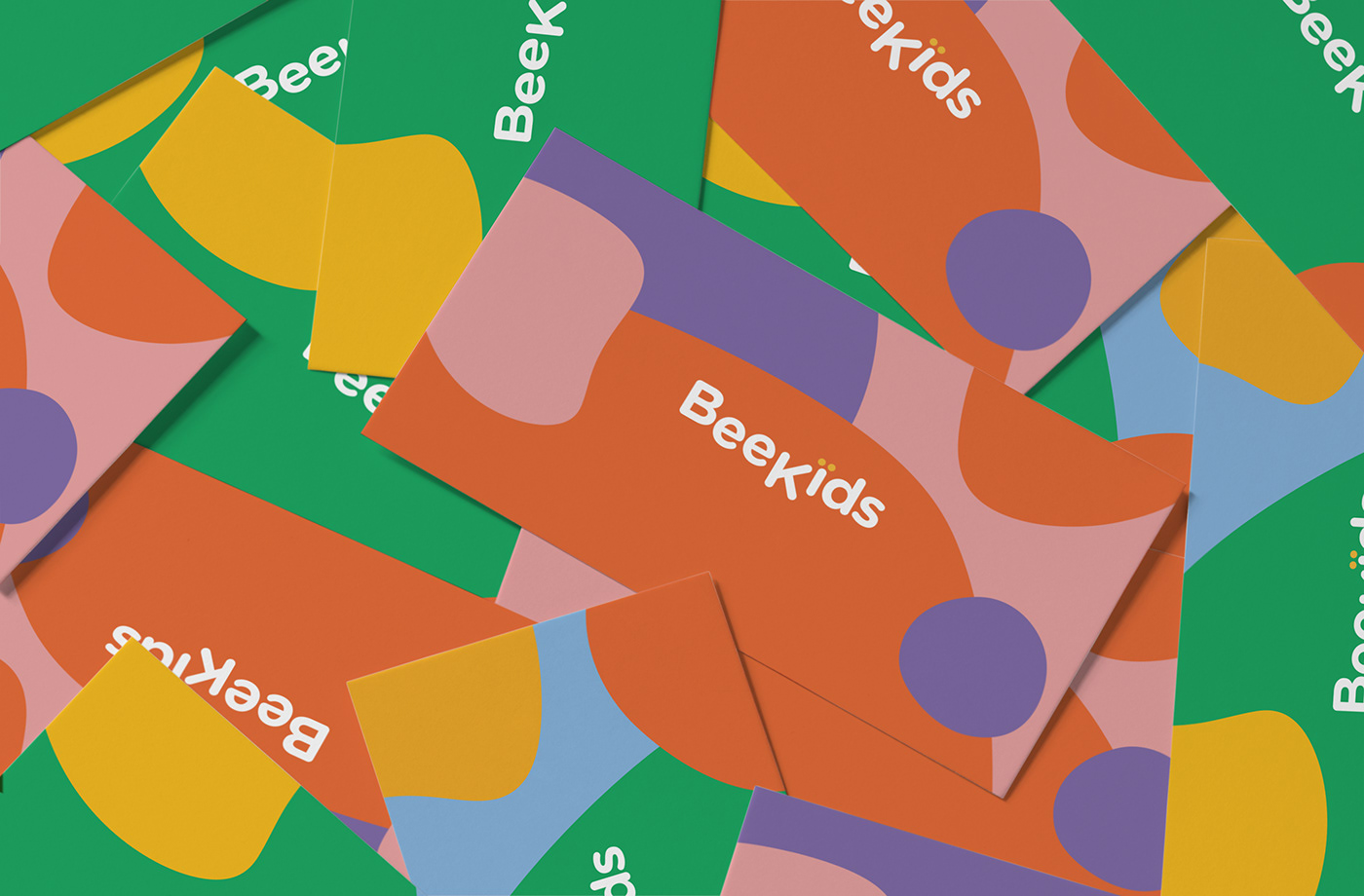
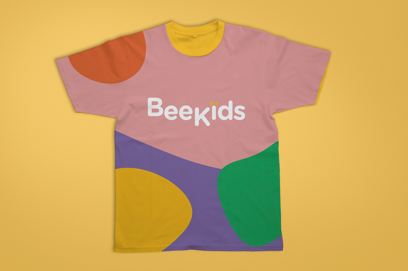
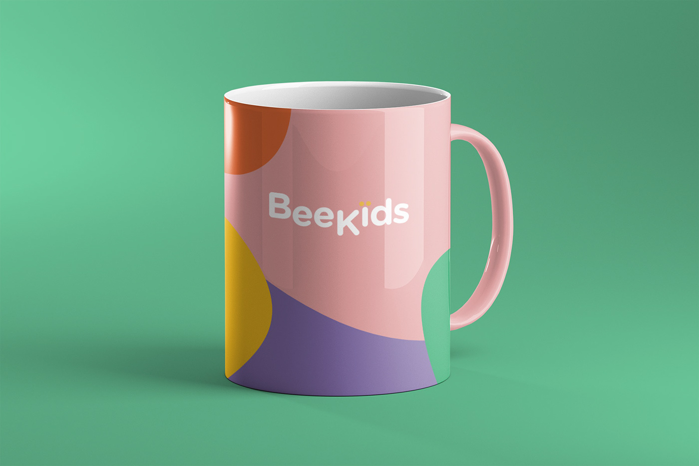
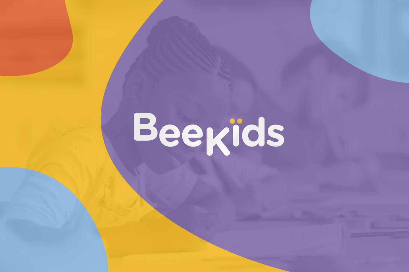
Bee Kids is an educational institution that focuses on English, music and drawing development.
Its goal is for every child to learn things in a playful and fun way. The identity concept explores affection and enjoyment in learning a new language and art by seeing from kids’ perspective. This resulted in a geometric logotype, the different position of the letters in logo resemble bee’s movement which conveys the sense of vitality and using simple shapes and vivid colors could better emphasize emotions and catch viewer's attention. The goal with the design was to create an innovative, friendly and reliable expression with an identity rich in elements and playful forms and an overall differentiated identity in its field of practice.