Specialty coffee is a thriving global industry. From our interpretation, its visual language is divided into three main elements: the bean, the latte art and the coffee cup.
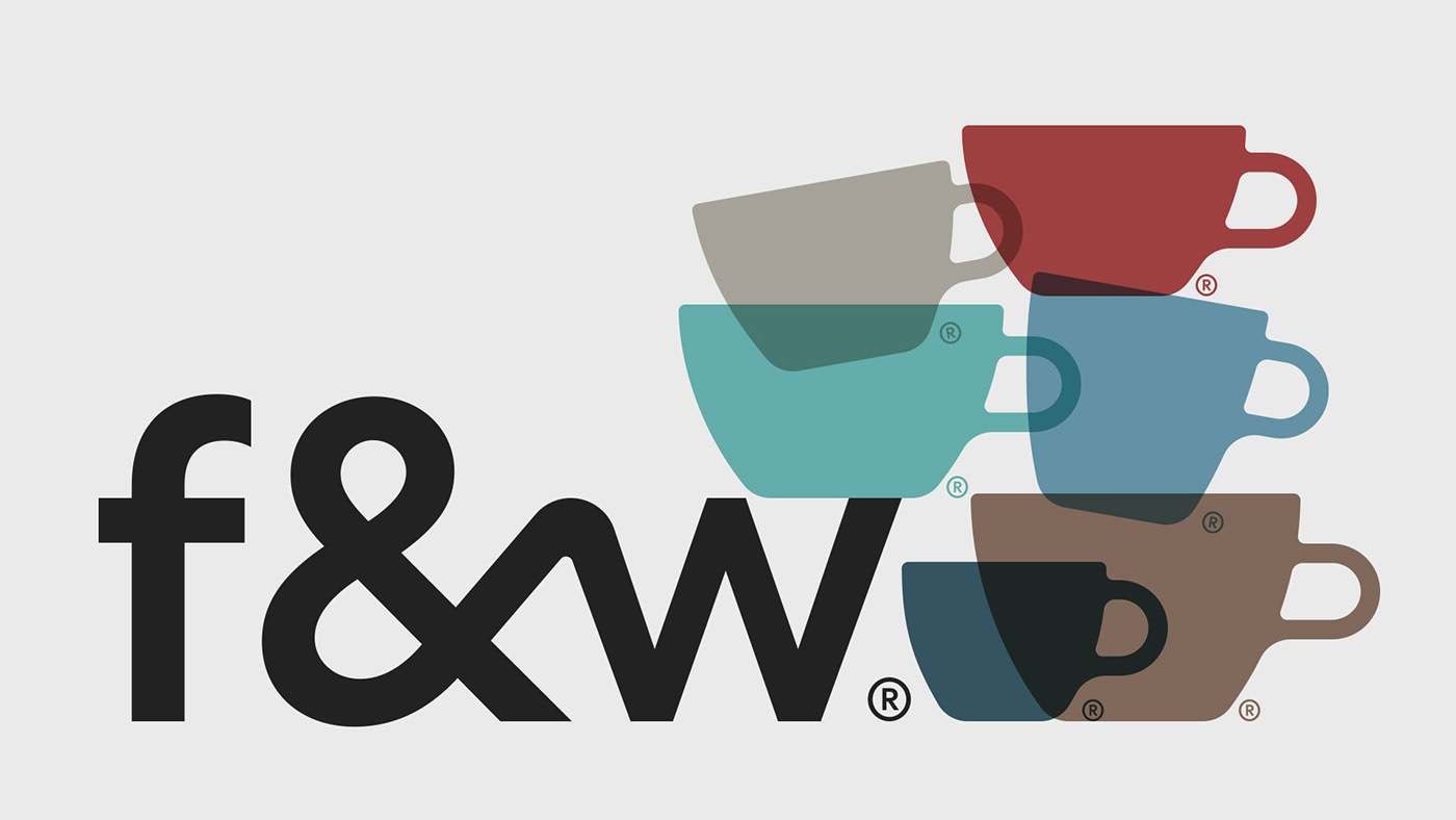
As beans and latte art can be confused for Nature stores or Yoga related activities, @flatnwhiteba brand focuses on the essential, the cup. Its LOGO and ISO aim to simplify the message by pushing forward an image anyone can understand.
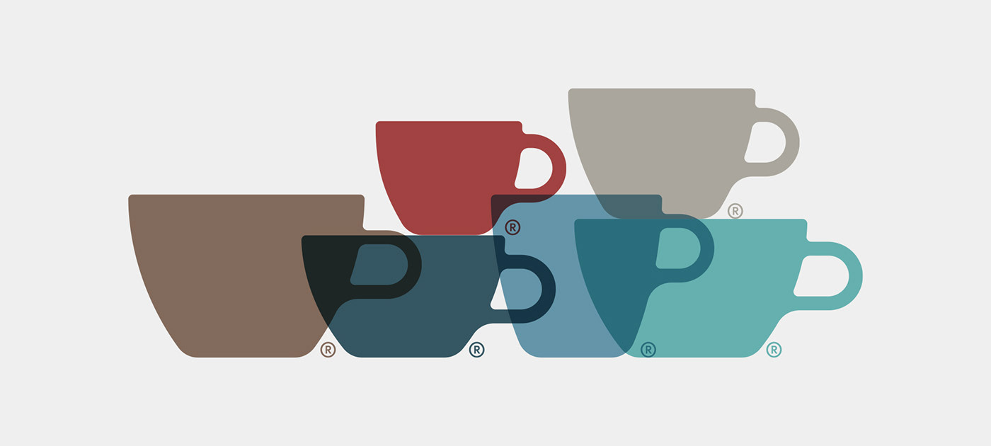
Flat & White's main image is a specialty coffee cup (flat white) and all of the secondary ones represent the best measure for each drink. The ® symbol embodies the idea that each cup has a purpose and its meant for a specific coffee drink.
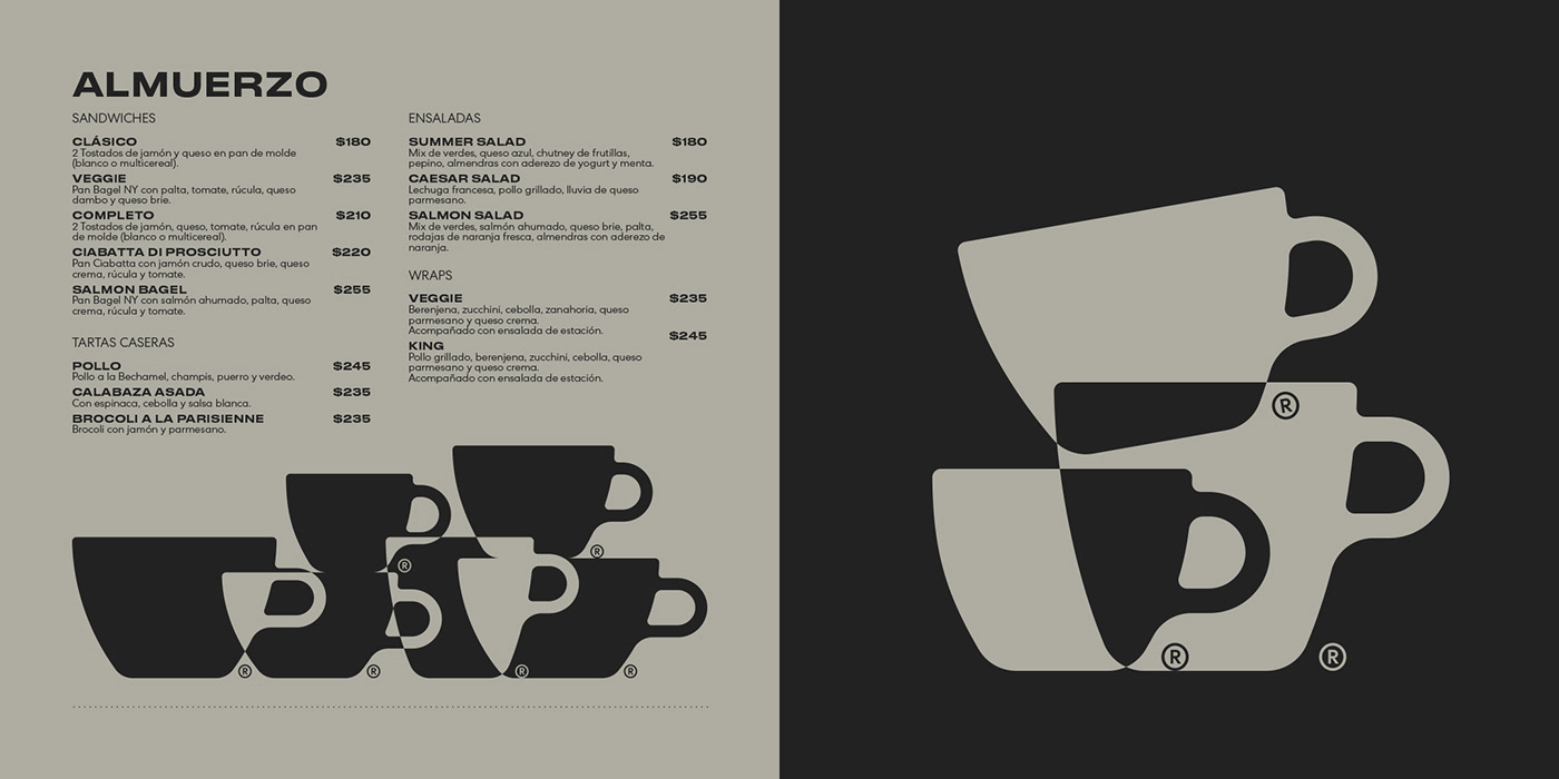
As all of the elements come into composition, the brand grows into a visual system in which the customer is presented with a playful way to select a coffee, and learn in the process of doing so.



Client: Flat&White
Agency: Hueso
Agency: Hueso
Director: Gianluca Fallone
Executive Producer: Santiago Moncalvo
Executive Producer: Santiago Moncalvo


