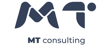
MT Consulting is a Puerto Rico based medical and technology consulting firm with clients all over Puerto Rico and the United States. With over 15 years in business, their brand identity was due for a refresh and they came to Diéresis for this. Here, we present the new brand identity for MTC, we hope you like it as much as we did.


a. The first element, the M, when super-imposed create a DNA double helix. A nod to the medical and technology industries which MTC serves. The M alone hints to the single stranded RNA. This duality adds some playfulness to the logo while still looking professional and business oriented.
b. Of the shapes that form the T, the two main pieces when duplicated and super-imposed create a wind turbine. A nod, not only to the technology and power industries, but also to the Drone
Industry.
Industry.
c. The circle that completes the letter T is used not only to complete the shape of the letter but also to allude the globe. Circles are used often to signify wholeness and completeness, just like MTC encompasses a whole series of services.
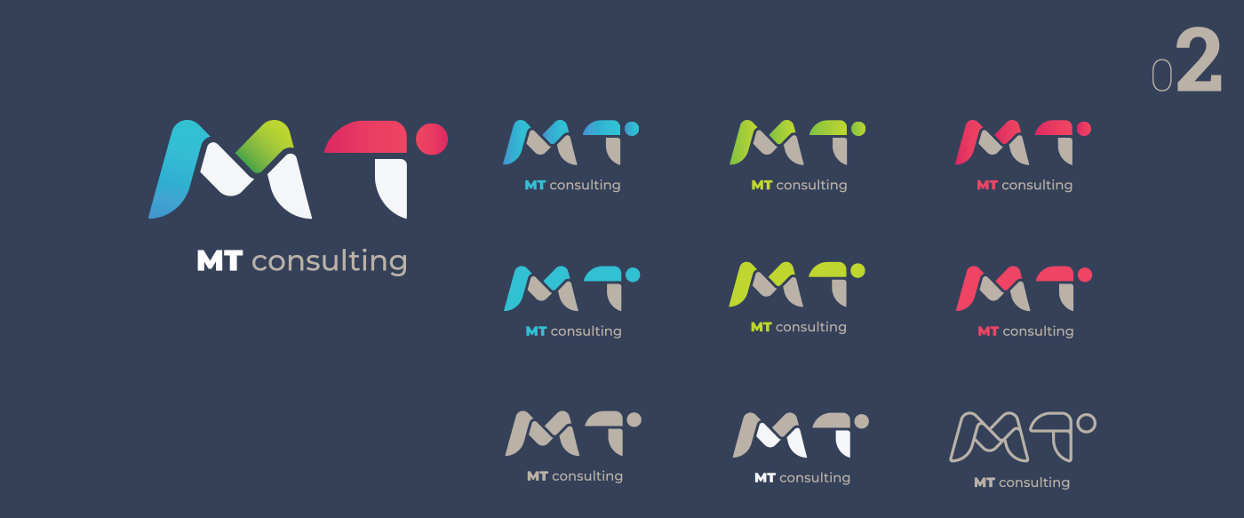
d. Lastly, movement. Here, a combination of all the variants shows the highlights and shadows. Each elements feels like a single ribbon fabric that bends to shape, forming the letters M and T. This logo was created with agility and movement in mind.