Project: Logo Redesign and identity design for "The Grind" Coffee House.
The Grind is a small coffee house chain located in Seattle, WA with five different locations.
The coffee house prides itself on natural and local ingredients. For their new logo, they didn't want to use any browns, as many coffee houses around there use brown and they want to stand out.
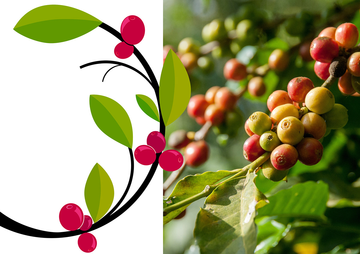
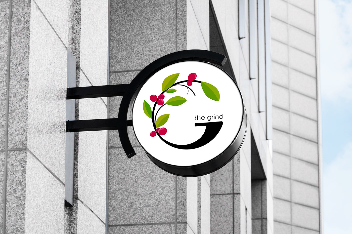
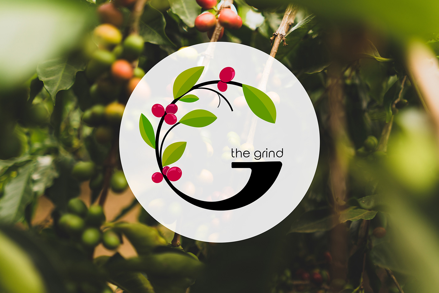
For the second version of the branding strategy, I used two symbols: the coffee tree branch with coffee beans and the letter "G" from "The Grind". The choice of a green coffee tree branch was pretty obvious, as it represents what "The Grind" is priding itself on, which is: natural ingredients, local, flavorful and organic.
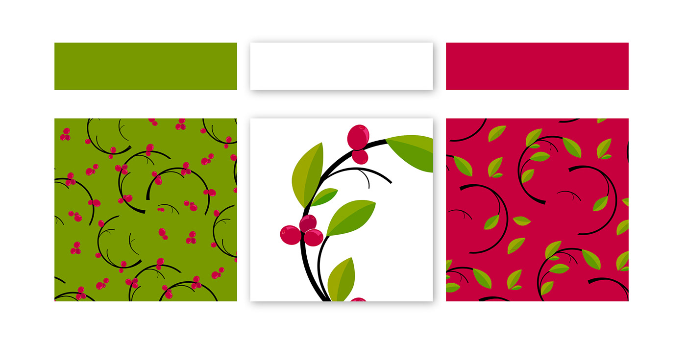
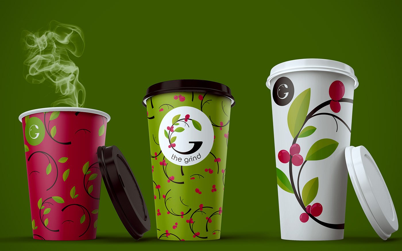
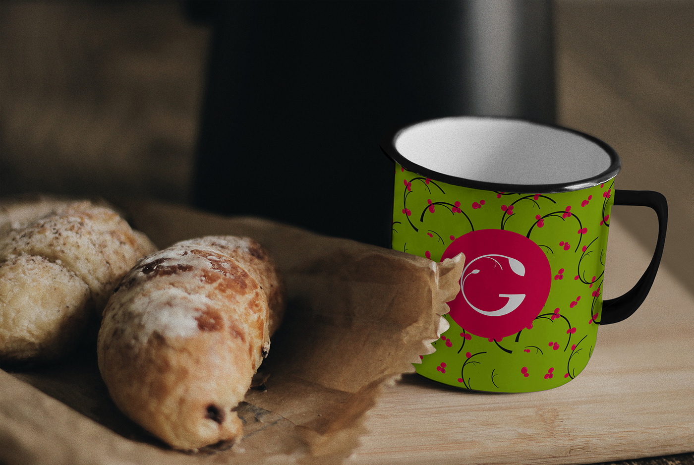
The logo can be adapted for different sizes and uses, as it can get simplified, by removing some details. The patterns for the brand identity are also adaptable, using the variation of colors from the main logo.
