Crisp and serrated, Tesseract is a study in modernity and restraint.
Crisp and serrated, Tesseract is a study in modernity and restraint.
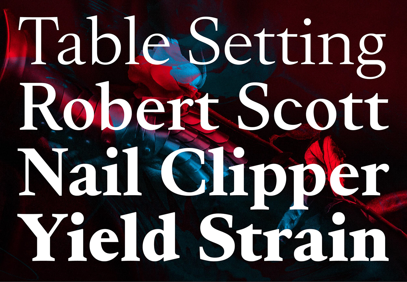
As Tesseract plunged into classical references, it earned its contemporaneity through whetted endings and constrained curves, lending a focused aspect to texts and titles.
With optical sizes for text and a display, Tesseract shimmers across media. The Display size plays the wide aperture and x-height card, with chiseled terminals and see-through counterspace. The Text size is quieter, with a firm and sturdy structure for immersive reading. The matching italics dance a vibrant staccato and complete the family.
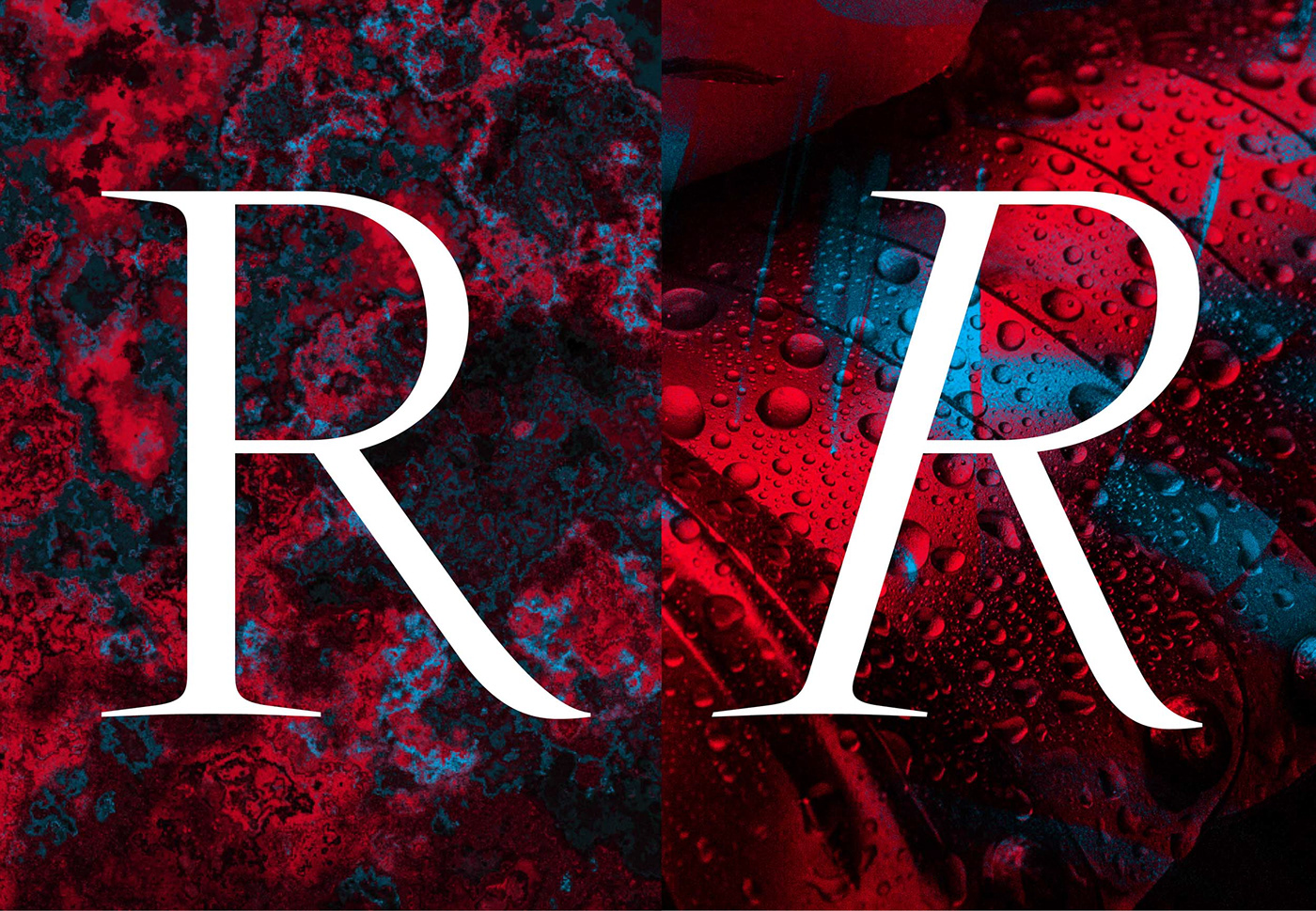
The crucible for Tesseract is made of many; and not unlike Walt Whitman’s multitudes, it contains paradoxes. Where round turns give affability and amplitude to the design, abrupt endings and spiky details grant some grave austerity to an otherwise delicate design. For adventurous users, Tesseract contains multiple dimensions. Dive in.
As Tesseract plunged into classical references, it earned its contemporaneity through whetted endings and constrained curves, lending a focused aspect to texts and titles.
With optical sizes for text and a display, Tesseract shimmers across media. The Display size plays the wide aperture and x-height card, with chiseled terminals and see-through counterspace. The Text size is quieter, with a firm and sturdy structure for immersive reading. The matching italics dance a vibrant staccato and complete the family.
The crucible for Tesseract is made of many; and not unlike Walt Whitman’s multitudes, it contains paradoxes. Where round turns give affability and amplitude to the design, abrupt endings and spiky details grant some grave austerity to an otherwise delicate design. For adventurous users, Tesseract contains multiple dimensions. Dive in.
→ Buy Tesseract from €59. Family of 20 styles from €349.
→ Download the PDF specimen.
Design:
Jean-Baptiste Levée.
Team:
Hugues Gentile,
Marion Sendral.
→ Download the PDF specimen.
Design:
Jean-Baptiste Levée.
Team:
Hugues Gentile,
Marion Sendral.