


The font used to create the logotype is a varition of Invisible Color, designed by a young Thai designer Tarin Yuangtrakul.
I decided to use this font because it is based on a triangular modules –which is the shape of the old Illuminati logo – and
because it’s quite difficult to read, even if it’s very recognisable. The poor legibility of the logo works as a metaphor for the
New World Order: it is everywhere, but you can’t understand it, it is in front of you but you need a deeper sight to spot it.

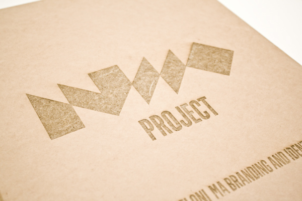
Box containing the Annual Report and the related materials of the NWO project.


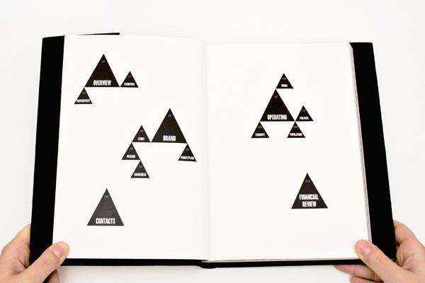
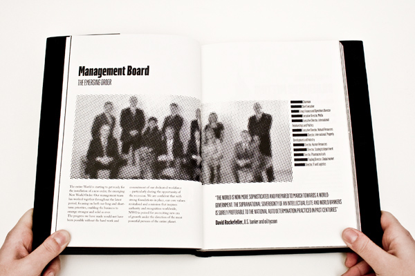


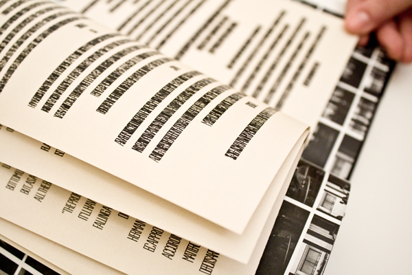

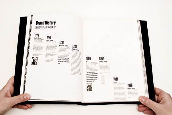


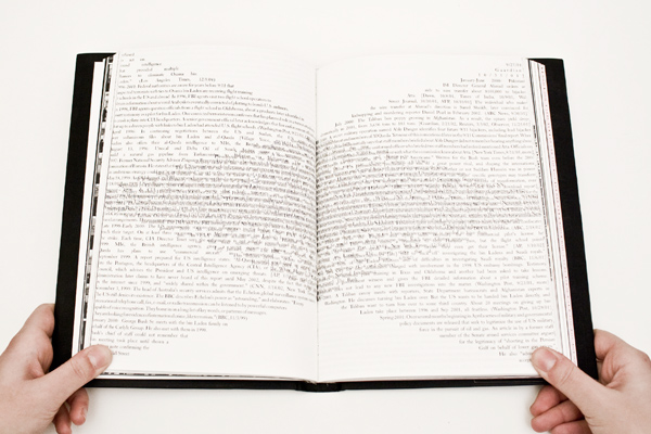
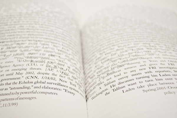
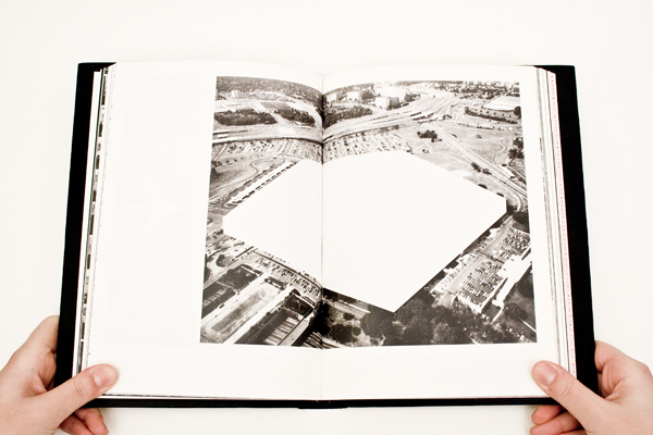


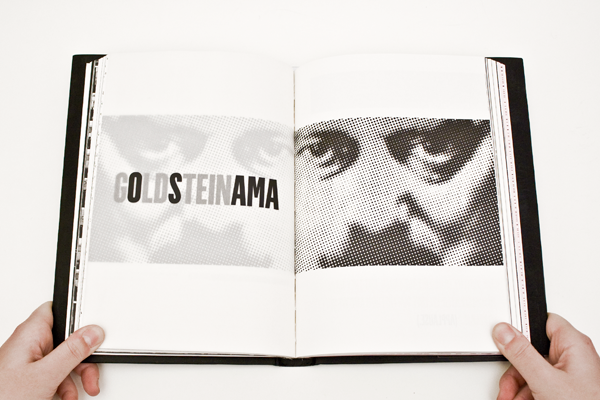
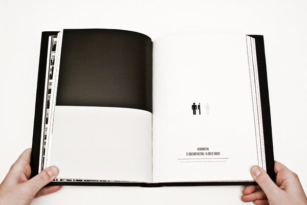


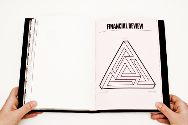

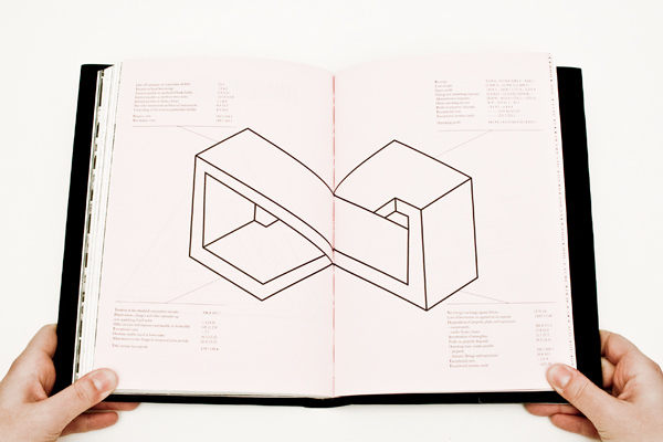


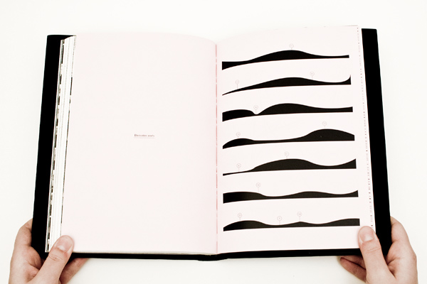
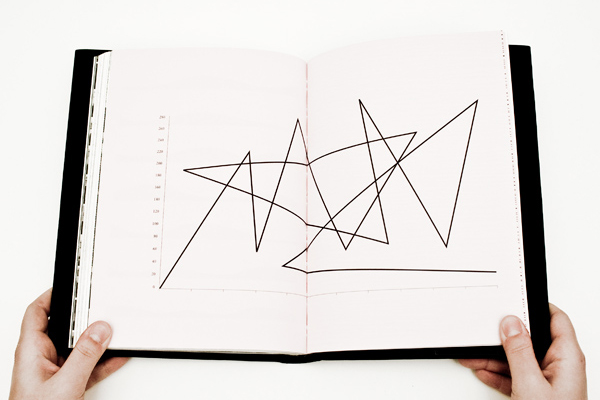

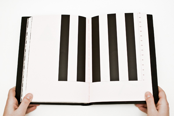

Spreads from different chapters of the book.
The NWO Annual Report 2010 is a B5 book with 200 pages.
The NWO Annual Report 2010 is a B5 book with 200 pages.
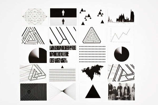

Personal cards


