
Kana
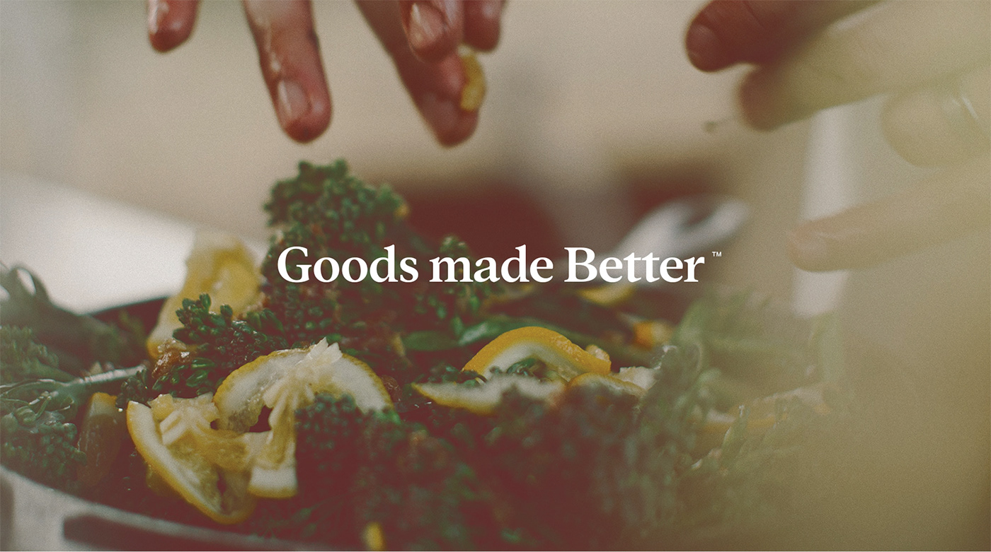
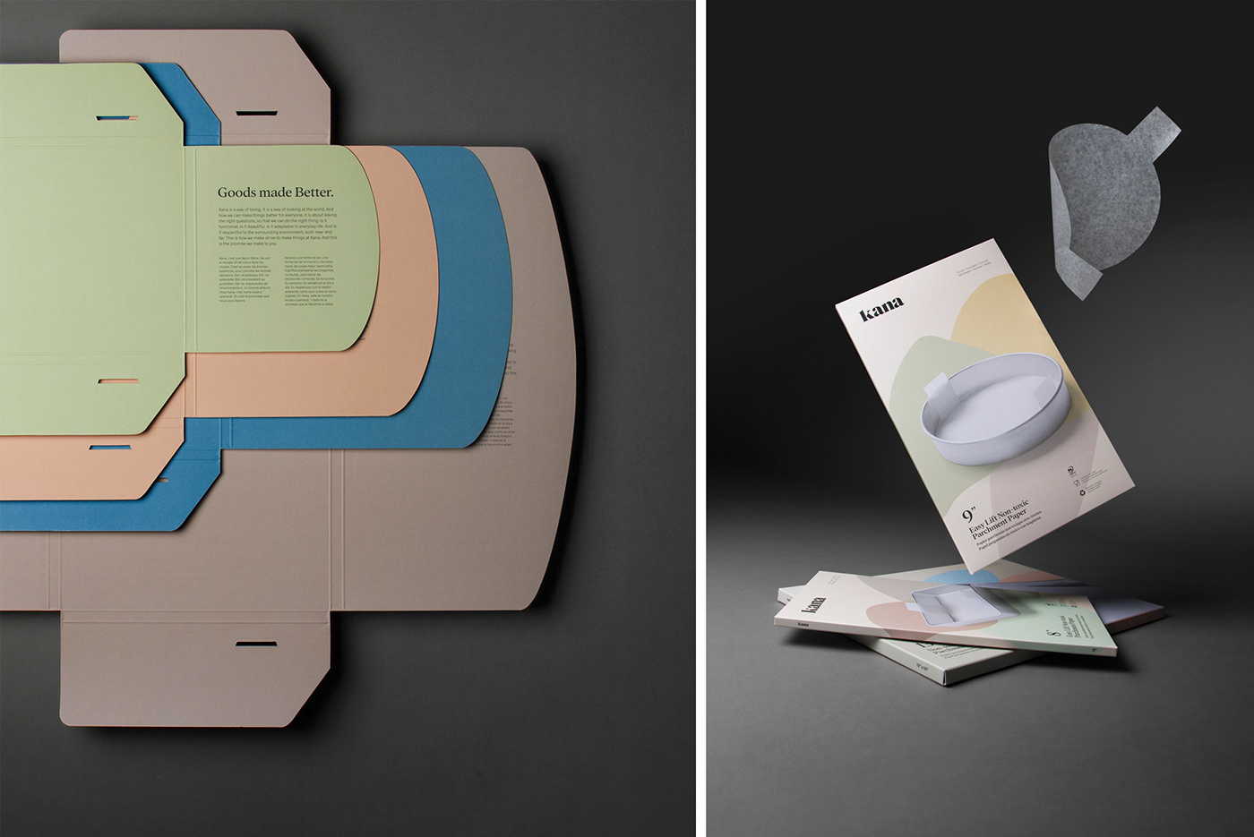
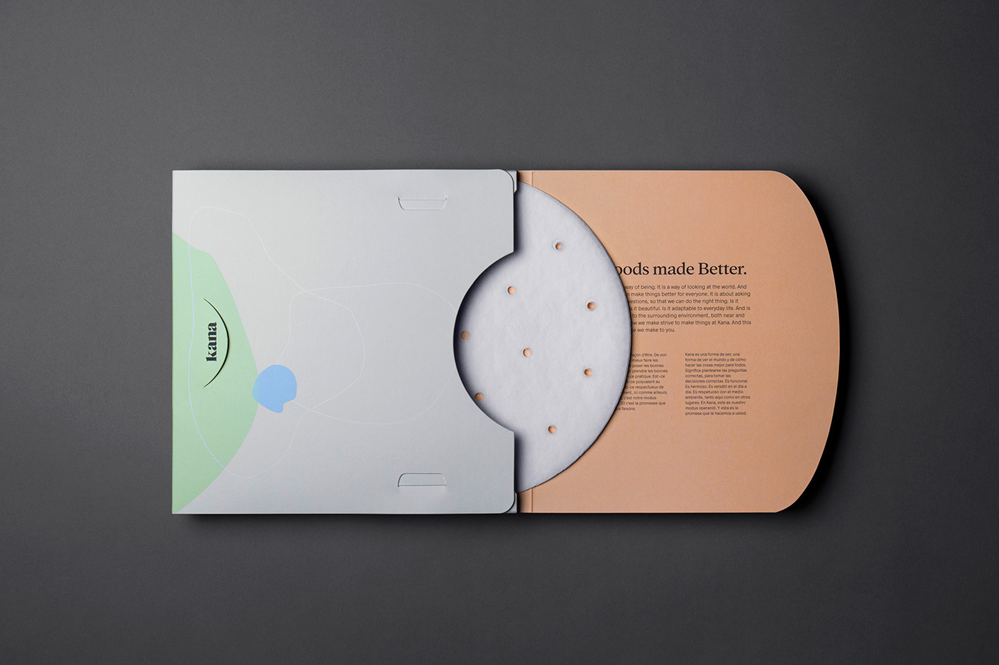
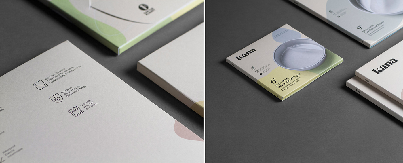
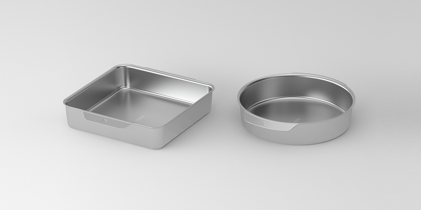
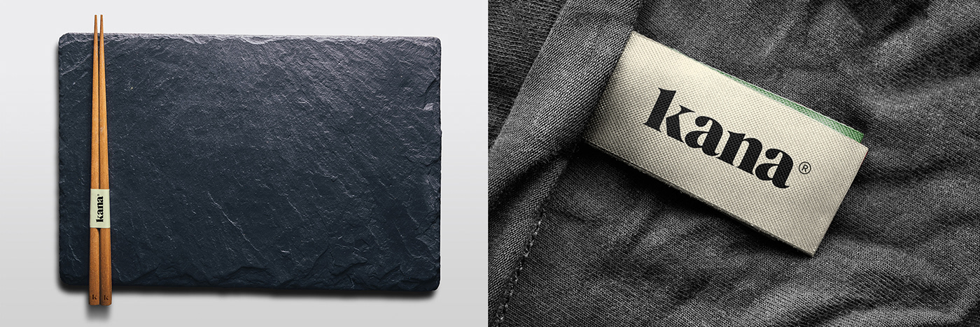
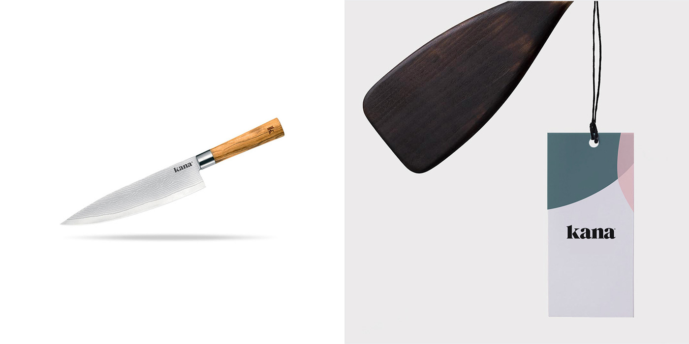
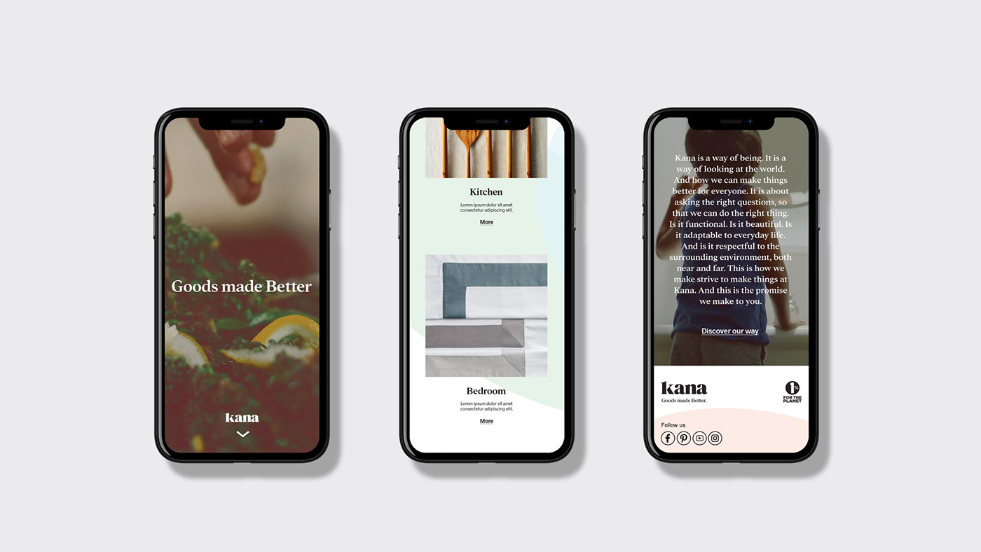
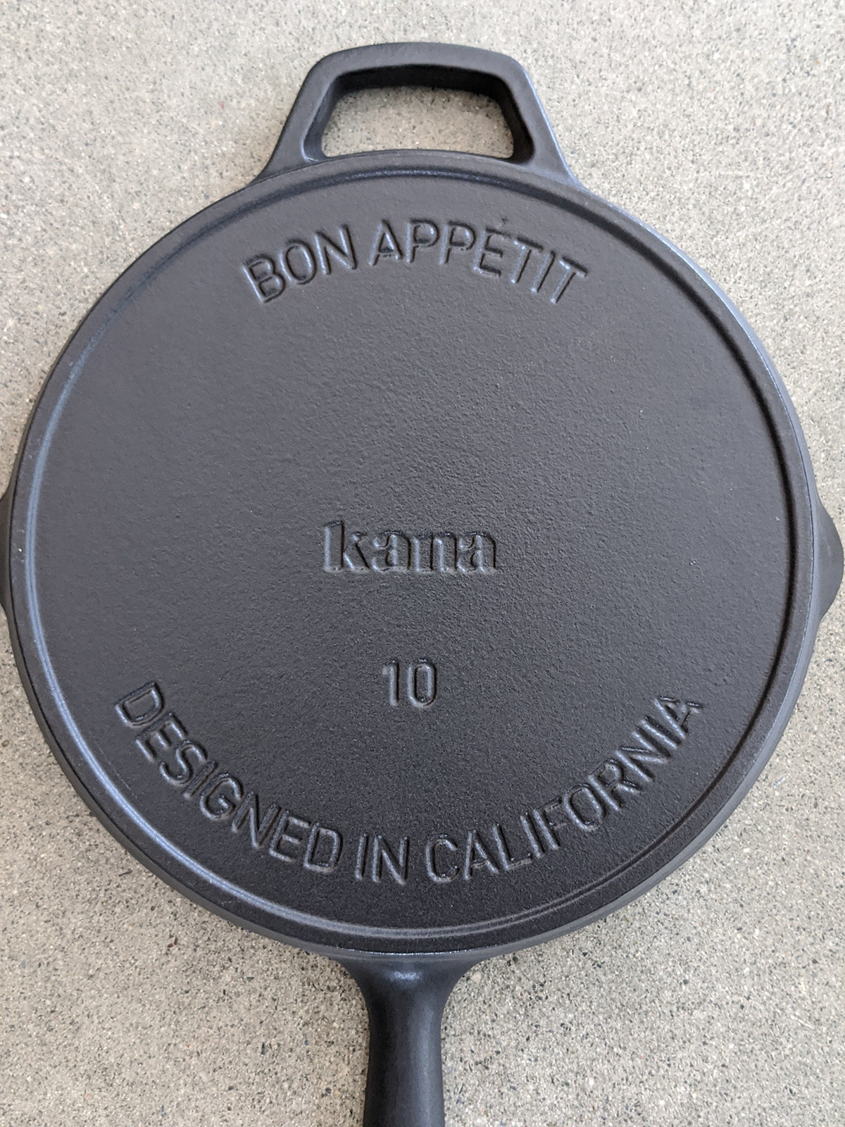
Visual identity for Kana, a brand of home products that facilitates the adoption of healthy and eco-responsible behaviours. Wishing to contribute to our individual and collective well-being, the brand aims to offer a wide range of useful, simple and beautiful products. This promise is visually embodied through the sinuosity of the typography and the earth/pastel colors, all backed by a play of abstract forms. This combination gives an organic look to the whole, exuding a general emotion of serenity. First attacking the market with a range of non-toxic, pre-cut parchment paper, we packaged the product in a large set of boxes that required no glue but rather interlocked like origami.
Goods made Better.


Client : Nolk
Copywriting : Marcus Hildebrandt


