POW! Entertainment
-
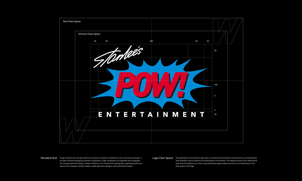
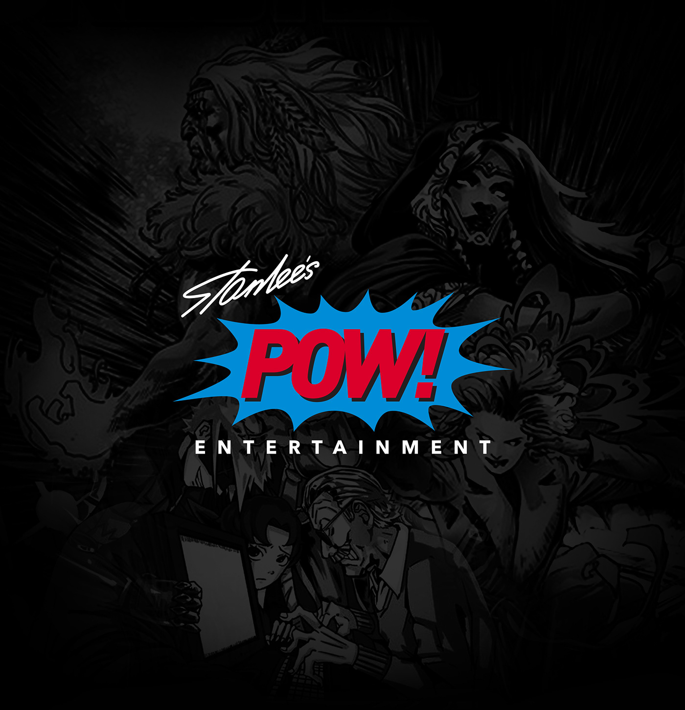
此專案為POW! Entertainment 的Logo設計,POW! Entertainment 是由美國漫畫界的傳奇人物「超级英雄之父」Stan Lee於2001年所創辦的娛樂公司,此次專案的訴求為更新舊有的Logo,使新logo依舊保有一定過去logo的辨識度。在設計上保留了原本的爆炸圖型,移除方形外框,將原本黃、藍、紅三色縮減至藍、紅兩色,並將字體更新。標誌POW!文字部分使用幾何感較強的窄斜體,使文字意思透過字體呈現出來,標誌更新後更具現代感。
-
This project is the logo design of POW! Entertainment. POW! Entertainment is an entertainment company founded in 2001 by the legend of American comics Stan Lee, also known as the father of superheroes. The appeal of this project is to renew the old logo so that the new logo keeps the identifiability of the old logo. In this design, the explosive shape is kept, the rectangular frame is removed, the color is reduced from red, yellow, blue to red and blue, and the font is renewed.The lettering of the POW! logo is changed to a more geometric condensed and italic font, so that the meaning of the word is expressed through the font. the logo is more modern after renewal.