
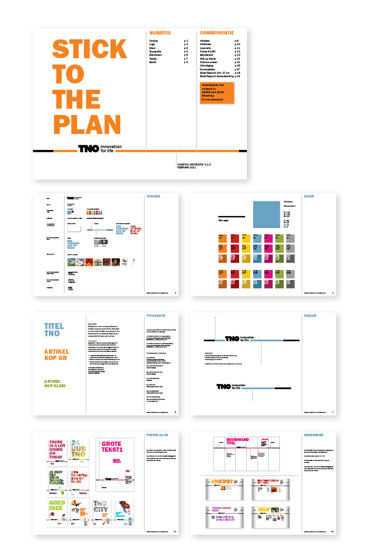
The TNO visual identity is created at Barlock. It became a large scale implementation of the new visual language through all communication of the organization. The time line metaphor is the backbone of this language. With pleasure i've worked with Marc van Bokhoven (Barlock) and Hans van der Laan (TNO) to make this new visual identity work.
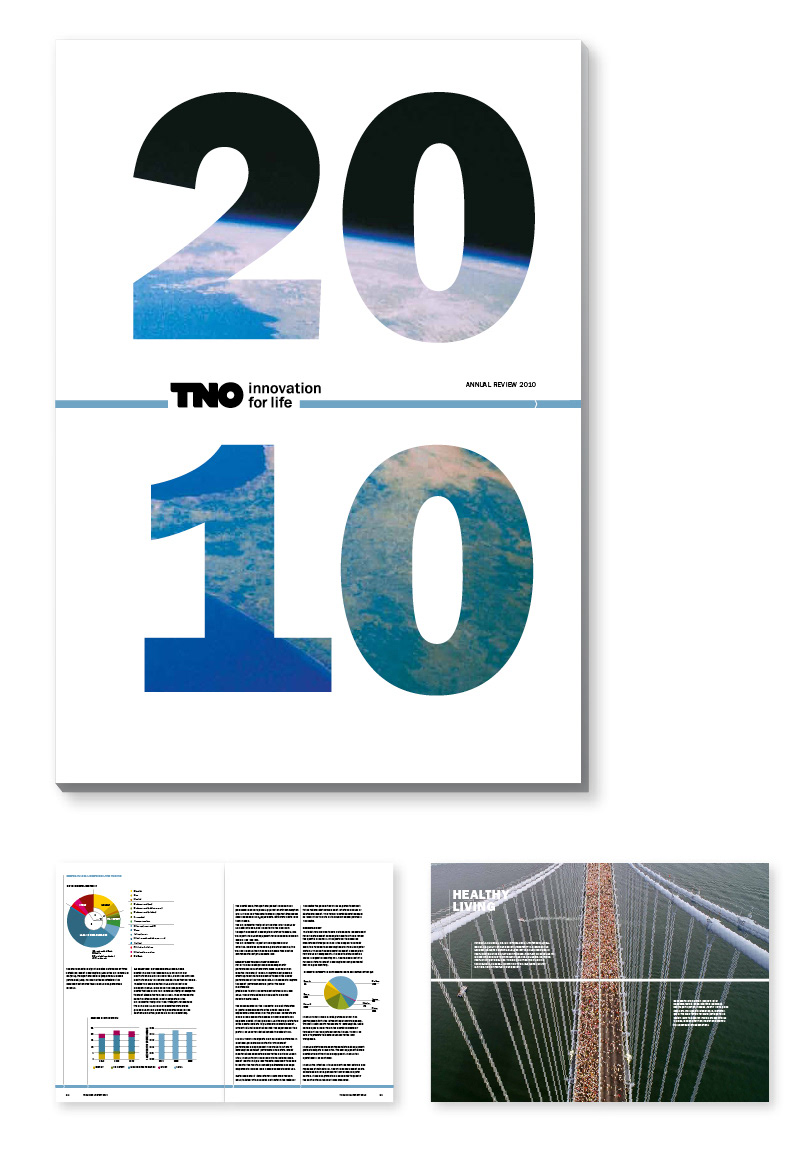
TNO is an independent research organisation whose expertise and research make an important contribution to the competitiveness of companies and organisations, to the economy and to the quality of society as a whole. TNO’s unique position is attributable to its versatility and capacity to integrate this knowledge.
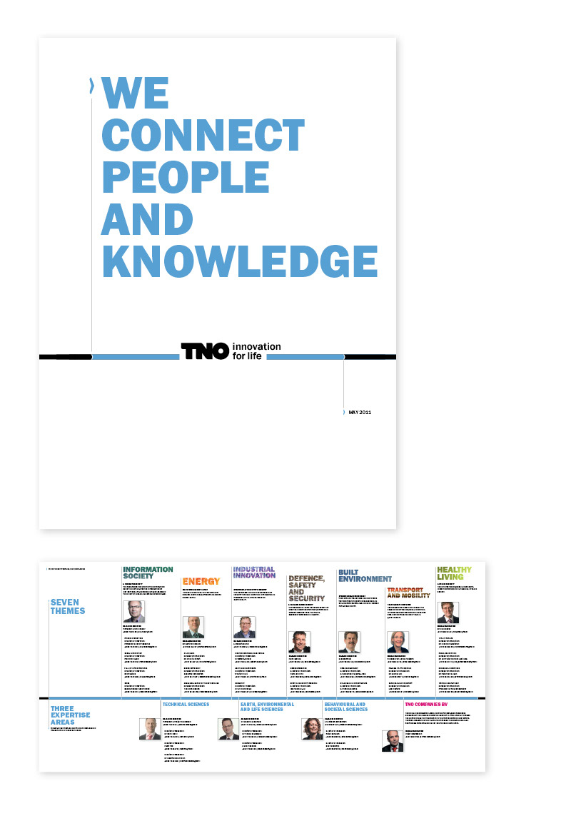
TNO connects people and knowledge to create innovations that boost the sustainable competitive strength of industry and well-being of society.
www.tno.nl


