
Молочный завод ЗАО Назаровское ежедневно производит до 100 тонн продукции, которая продаётся под брендом «Молочный городок». Визуальные коммуникации бренда устарели и требуют обновления.
The dairy plant СJSC Nazarovskoe daily produces up to 100 tons of products, which are sold under the brand “Molochny Gorodok”. The brand’s visual communications are obsolete and need to be updated.


Старый логотип напоминал адресную табличку, где название улицы — это бренд, а номер дома — процент жирности продукта. Эта идея интересна, но не подходит для современного покупателя, которому важно быстро выбрать подходящий продукт среди прочих на полке супермаркета. Информация на старой упаковке сложно считывалась и терялась среди прочих графических элементов.
Мы изменили общий вид логотипа, сохранив его основную идею. Название бренда написали в две строки, что облегчило его читаемость. Для материнского предприятия мы разработали отдельный логотип, которым легко маркировать упаковку продукции суббрендов предприятия — «Назаровское 1932». Мы расположили его на лицевой части упаковки, теперь он воспринимается отдельно и не привлекает лишнего внимания. Название бренда читается легче, логотип стал более целостным и выразительным.
The old logo looked like an address plate, where the street name is the brand, and the house number – the percentage of product fat content. This idea is interesting, but not suitable for the modern customer, who needs to make the quick choice of the right product among others on the supermarket shelf. The information on the old package was difficult to read and was lost among other graphic elements.
We have changed the overall form of the logo, preserving its main idea. The brand name was written in two lines, which made it easier to read. For the parent company, we have developed a separate logo that is easy to mark the package of the company's sub-brands – “Nazarovskoe 1932”. We have placed it on the front of the package, now it is perceived separately and does not attract extra attention. The brand name is easier to read, and the logo has become more complete and expressive.

Завод производит молочные продукты из натурального молока от собственных коров. На боковой части упаковки мы разместили историю в картинках, чтобы показать путь молока от коровы до стакана молока. Серия иллюстраций наглядно продемонстрирует происхождение и натуральность продукта.
The plant produces dairy products from natural milk of its own cows. On the side of the package, we have placed a story in pictures to trace the way of milk from a cow to a glass. A series of illustrations clearly demonstrate the origin and naturalness of the product.

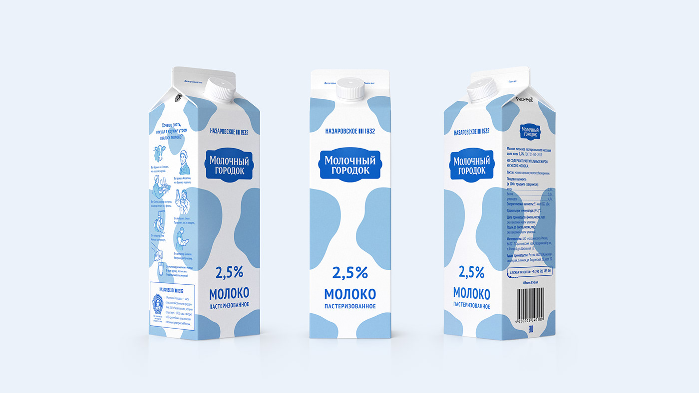
Мы хотели придать упаковке легкое, чистое и современное настроение, поэтому решили отказаться от персонажа и выбрали более абстрактный дизайн. Отразили натуральность продукции через фирменный паттерн. В нем можно узнать природный окрас коров или случайно пролитое молоко. У каждой линейки продукции есть свой цвет, что облегчает визуальное восприятие бренда.
We wanted to give the package a light, clean and modern mood, so we decided not to use the character image and chose a more abstract design. We reflected the naturalness of the product through the brand pattern. In it, you can find the natural color of cows or accidentally spilled milk. Each product line has its own color, which facilitates the visual perception of the brand.

В ходе проекта мы разработали дизайн упаковки для 25 наименований продукции «Молочного городка»: от сметаны до молока. На небольших упаковках применили однотонное оформление.
During the project, we developed a package design for 25 products of “Molochny Gorodok”: from sour cream to milk. A single-color design was applied on small packages.


Дизайн разработан с учетом размещения продуктов на витрине супермаркета. Пятна на соседних упаковках совпадают, образуя единый паттерн.
Shelf presence: the design was developed by taking into account the placement of products in the supermarket window. Spots on neighboring packages match forming a single pattern.

Продюсер — Александр Осадчий
Исполнительный продюсер — Наталья Мыреева
Арт-директор — Максим Кулдошин
Старший дизайнер — Мария Крылова
Дизайнеры: Лиза Груздева, Ксения Прохода
Шрифтовик — Ксения Белоброва
Иллюстратор — Илья Кутовой
Фотограф — Семён Алексеев
Визуализация: Евгений Усков, Давид Нельдушкин
Producer: Alexandr Osadchy
Executive Producer: Natalia Myreeva
Art Director: Maxim Kuldoshin
Senior Designer: Maria Krylova
Designers: Lisa Gruzdeva, Ksenia Prokhoda
Type Designer: Ksenia Belobrova
Executive Producer: Natalia Myreeva
Art Director: Maxim Kuldoshin
Senior Designer: Maria Krylova
Designers: Lisa Gruzdeva, Ksenia Prokhoda
Type Designer: Ksenia Belobrova
Illustrator: Ilya Kutovoy
Photographer: Semyon Alekseev
Visualization: Evgeny Uskov
Copywriter: Igor Gavrishi
Photographer: Semyon Alekseev
Visualization: Evgeny Uskov
Copywriter: Igor Gavrishi


