Olivetta is ironic, designed to reinforce the written word as image. Its name references Antique Olive, establishing a dialogue with its original concepts, while answering with the irony and spontaneity of modern times.
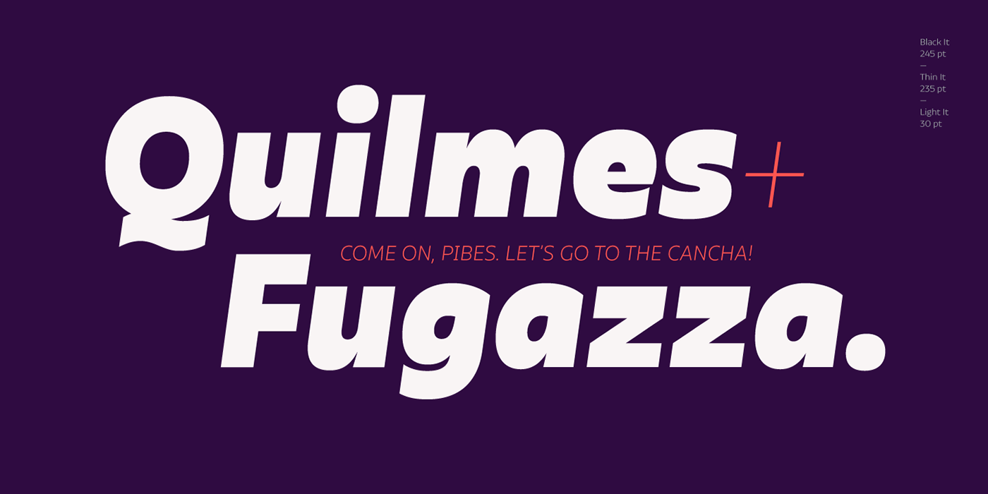
Olivetta modifies stroke contrasts to establish horizontal tension at the height of x and like this give visual strength to the word. This becomes more pronounced as the weight gets darker.
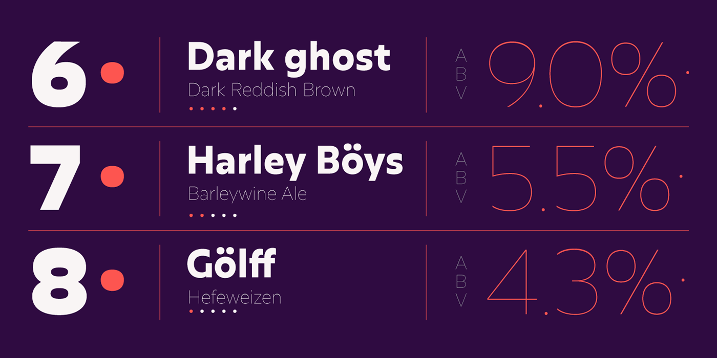
Ten weights were produced, each with their corresponding italics and with over 400 glyphs per font, including alternatives. Lighter weights are ideal for subtle headlines, while more hefty weights work perfectly for brands or short texts in posters or editorials, due to their expressive nature. Intermediate weights were specifically adjusted for use in texts with longer reading periods.
Olivetta modifies stroke contrasts to establish horizontal tension at the height of x and like this give visual strength to the word. This becomes more pronounced as the weight gets darker.
Ten weights were produced, each with their corresponding italics and with over 400 glyphs per font, including alternatives. Lighter weights are ideal for subtle headlines, while more hefty weights work perfectly for brands or short texts in posters or editorials, due to their expressive nature. Intermediate weights were specifically adjusted for use in texts with longer reading periods.