

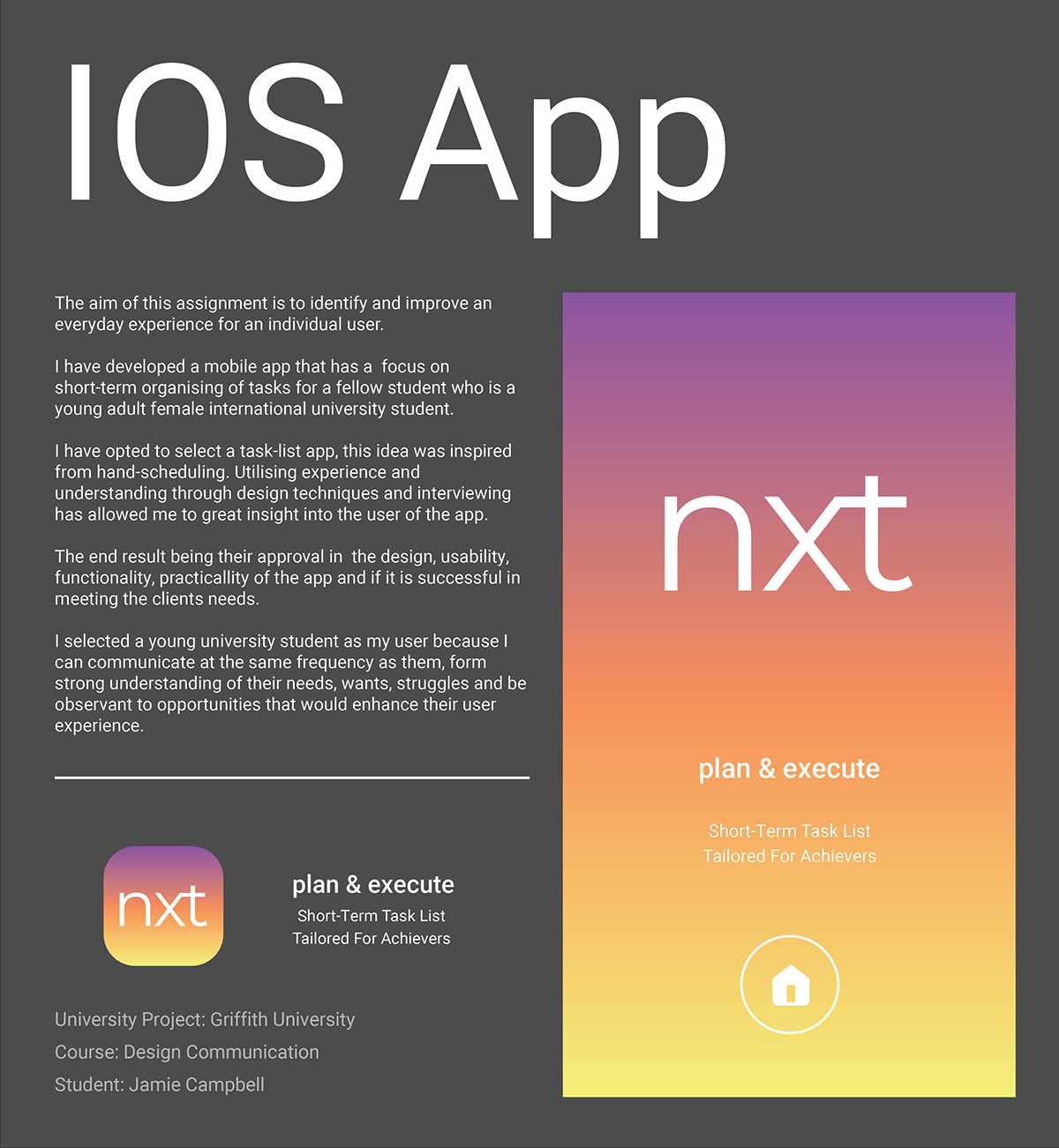
App Description
The Task-list app nxt is divided into 3 main elements for the user: Create, View and Archive. In the order they are announced mirrors the way in which the user would go about in planning for tasks.


Create
Allows the user to create tasks lists and has calendar element if user wanted to plan ahead into the week. It was determined from the user that they wanted to write less and have detailed plans.
The design considers this user desire by having the bottom of the page fade to white, subconsciously deterring the user in making numerous plans. The colour coding of the sections of the elements reflect the moods in which the user would be in. Deep purple is a colour that induces critical thinking and reflecting, having the colour linked to the creation of notes can effectively encourage the user in writing better tasks.
Allows for the user to ticked completed items and view the next task they need to do that day. Orange is the colour of excitement and interest, it suits the nature of the intent of the View element. An aspect in this area is that edits to the list cannot be made here. When questioning the way my user to generate their tasks it was determined that they never added or removed the set tasks that they had listed for that day. Changing the system that my user works may lead to confusion in the app and lower-quality notes.
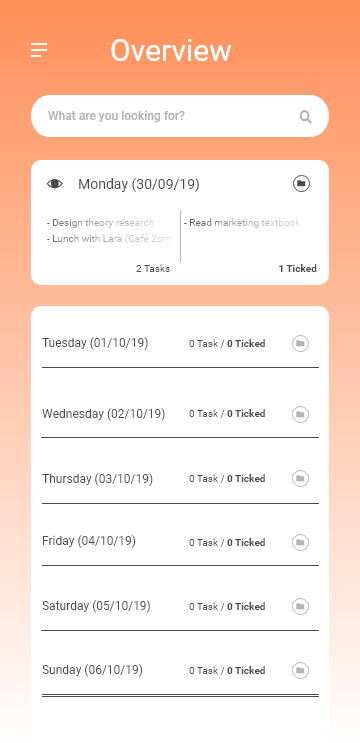
The View element has a complementary aspect Overview and this area displays the plans for the entire week; my user has always planned tasks in the early morning for the entire day, Overview allows them to reflect upon past activities to ensure it completions and to feel satisfaction of their progress.
Archive
The element is a collation of all task lists that the user has deemed to be important to them. Archiving the tasks list ensures that the user will always have the means to view the concerning task list. When looking at fond articles, my user is filled with pride and happiness; I want to extend this meaning into the app so I have made Archive to carry on the meaning.
During my ongoing observation of the user, they stipulated that once they completed tasks they would either never look at it again, or keep it somewhere safe for them to look at it again in the future or to demonstrate to friends and family of their handwork and gain words of praise and encouragement. Archiving is a familiar routine for the user, therefore it is built into the app.

The Roboto a neo-grotesque sans serif font, it was made by Google and is used as the system front for mobile operating systems. I made this the font for my app because firstly, it is designed to be suitable for mobile screen display; secondly, my user has an android mobile and should recognize the familiarity of the font (making them more susceptible to my app). The final reason for selecting this font is due to it being a sans serif that is humanist and friendly in its geometric form.
The transition from writing tasks in a journal to typing it on a screen may make the user uncomfortable. Therefore the consideration of the typography is critical for the user to have a positive relationship to the app.
Brand mark


The typography that is utilized for the nxt brand mark is Montserrat regular, all letters have been kerned closer together and the x and the t have been joined together. My goal for the brand mark and the name is to induce thoughts of modernism, simplicity and ease.
The forms that exist in Montserrat display these key words in its design: high x-height, minimal contrast in weight distribution of the 'n' and the large curved bottom of the 't'.

Break down of screens for nxt App
Sign In


Home


Create


View


Overview


Archive


