

貓居法式甜點工作室
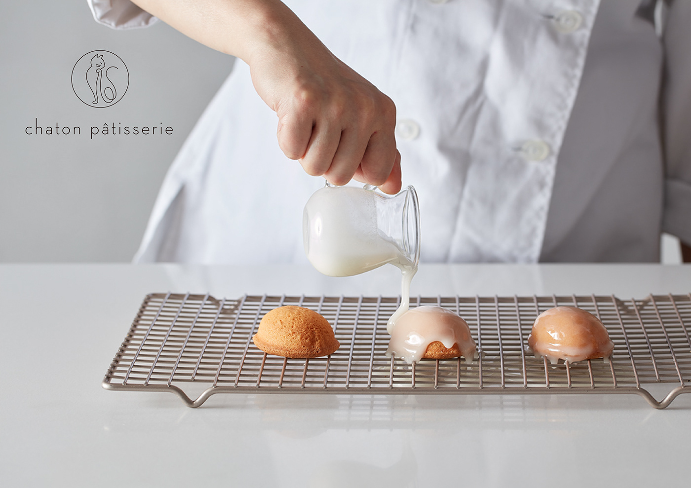
Chaton Pâtisserie
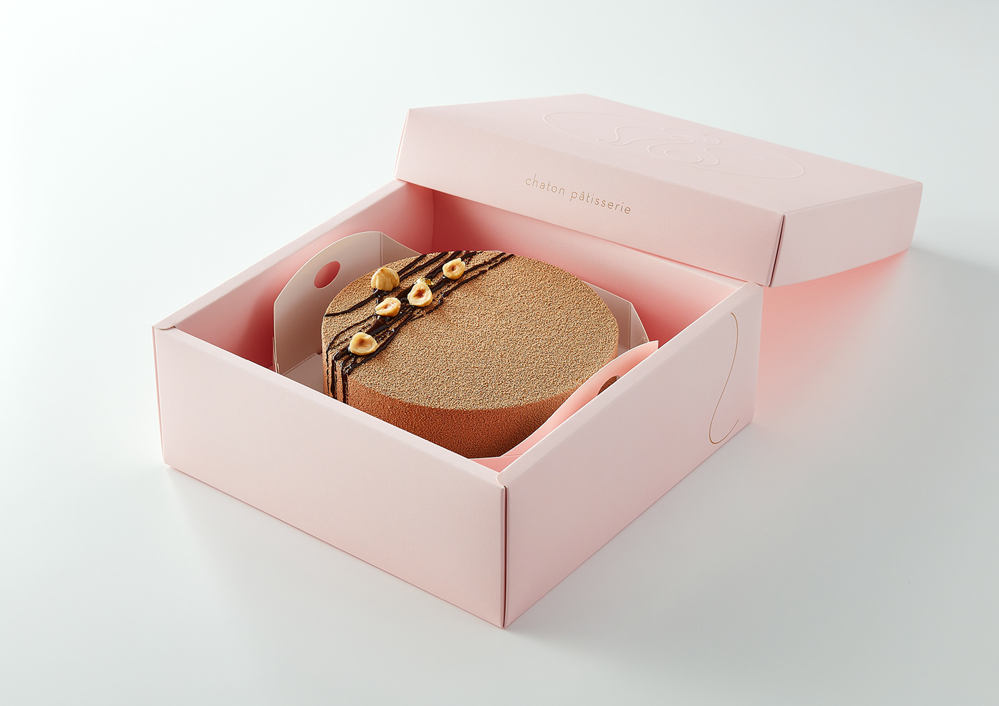
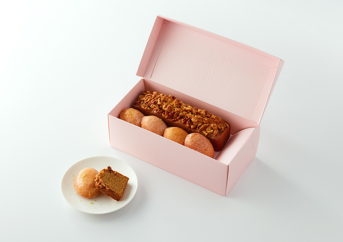
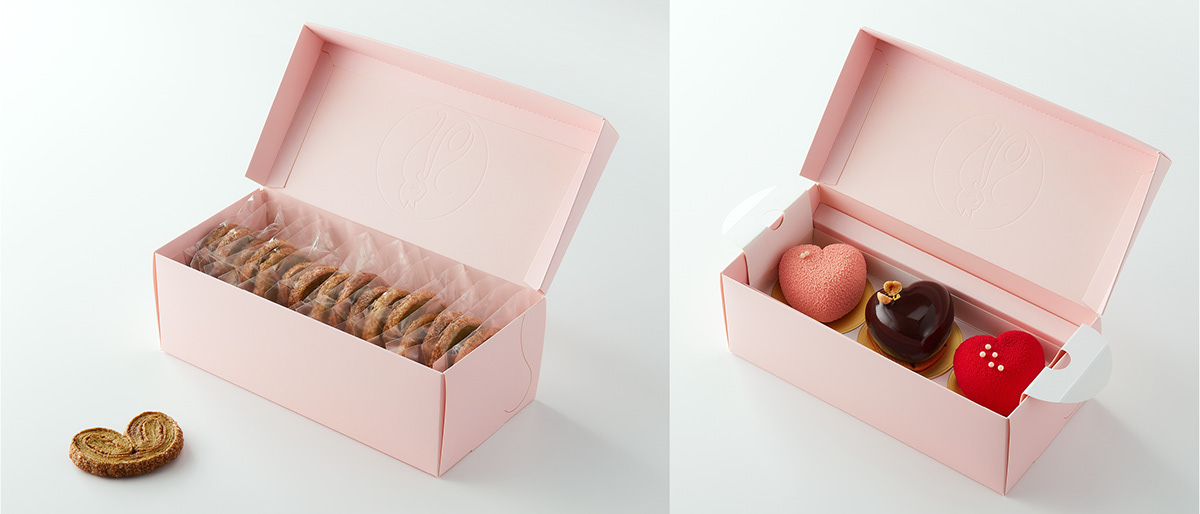
貓居法式甜點工作室是一個在網路上耕耘許久的法式甜點品牌,堅持選用好食材來製作美味無負擔的經典法式甜點,Chaton意指法文中的小貓,貓居希望每一個忙碌的人嚐上一口甜點後,能像窩在家與貓玩耍般放鬆舒適。
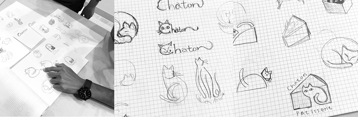
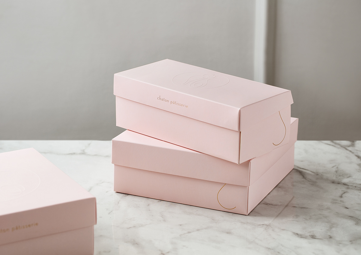
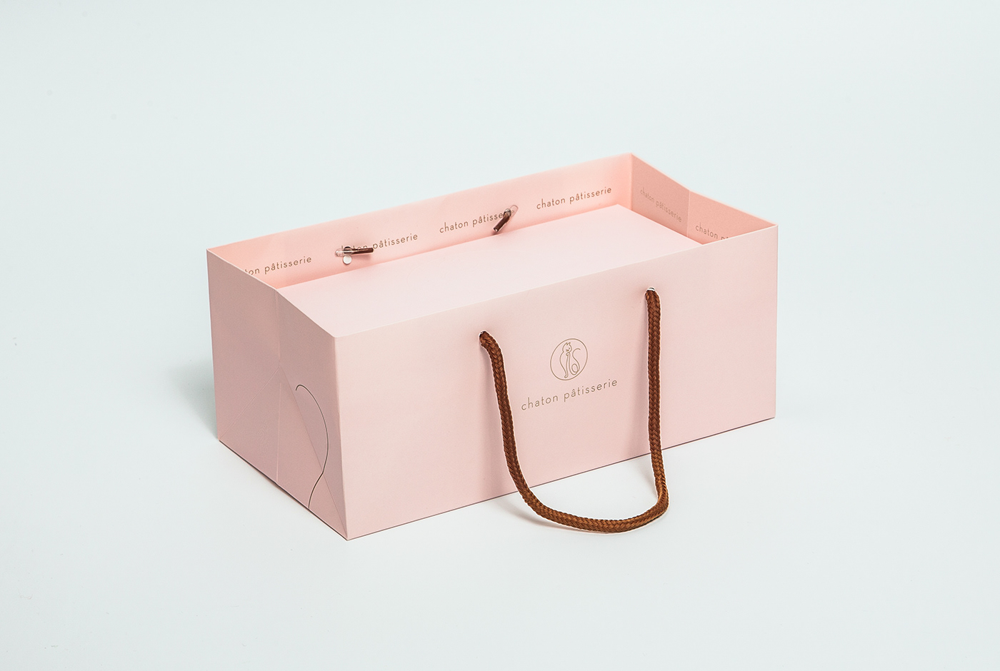
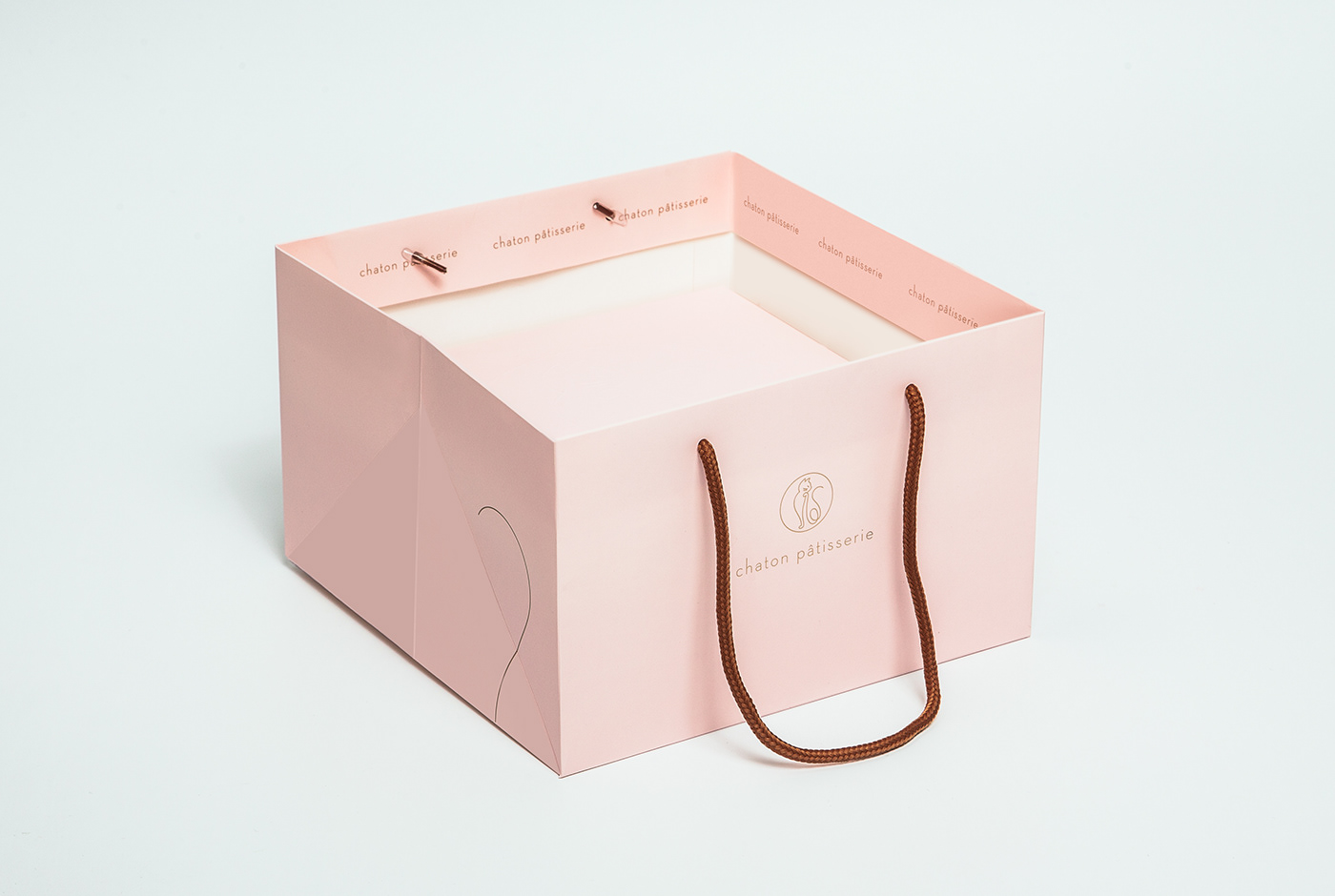
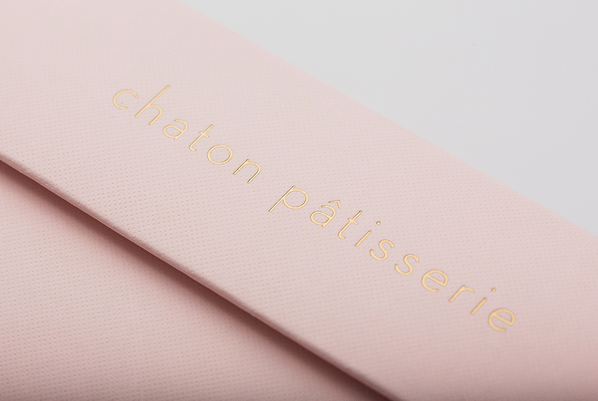
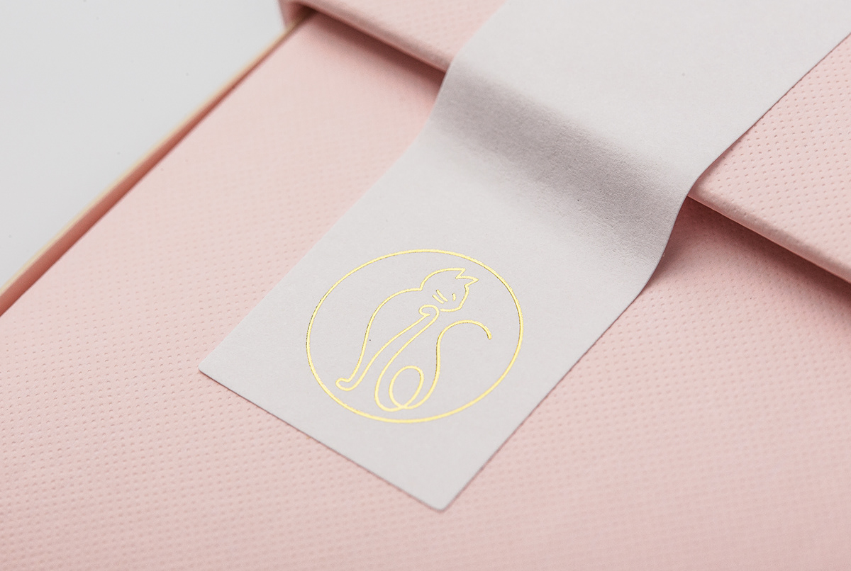
客戶希望將品牌從原本的鄉村風格轉變成更為簡約高貴的形象,我們以細緻的線條勾勒出貓的優雅姿態,用舔手動作來表示品嚐美味甜點後的意猶未盡,貓尾巴出奇不意的出現,創造趣味感與想像空間,並運用溫暖的粉紅色打造療癒放鬆的氛圍,希望讓品嚐甜點的每一位客人都能沈浸在滿滿幸福中。
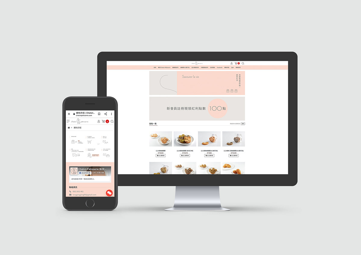
Chaton Pâtisserie is a French dessert brand established for years. “Chaton” means “kitten” in French. The owner, a cat lover, wishes to make delicate desserts for everyone, and hopes that whoever tastes the desserts will be totally relieved from stress. The brand was rustic and country-like before. By illustrating the posture of a cat licking its paws after tasting the pasty, and pairing the logo with a slim sans-serif typeface, the new brand identity becomes neater and more elegant. The gift boxes, cards and the website coherently build a relaxing and soothing image for the brand.


Credit:
Client: 貓居法式甜點工作室
Project Director: Chi-yao Tang
Design Manager: Hsiang Chia Wu
Art Director: Burusu Huang
Designer: Burusu Huang、Xin
Print: 易加印刷 Sam Hsiao
Photography: 唯物影像-MATTER IMAGE、Chi-yao Tang
Client: 貓居法式甜點工作室
Project Director: Chi-yao Tang
Design Manager: Hsiang Chia Wu
Art Director: Burusu Huang
Designer: Burusu Huang、Xin
Print: 易加印刷 Sam Hsiao
Photography: 唯物影像-MATTER IMAGE、Chi-yao Tang


