
The Brief
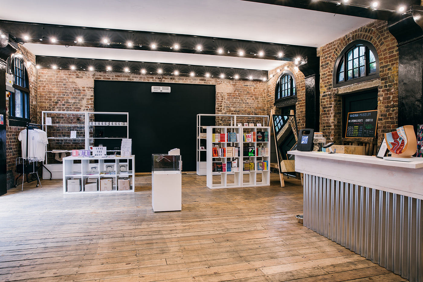
Passport was tasked with creating the full visual identity and supporting print & digital materials for the Vagina Museum in London; the world’s first bricks and mortar museum dedicated to vaginas, vulvas and the gynaecological anatomy. The identity needed to help the brand achieve their mission to destigmatise the vulva and vagina, because this has huge consequences on the health and wellbeing of people around the world.
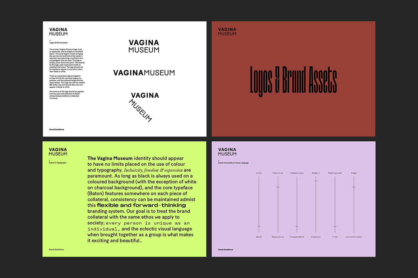
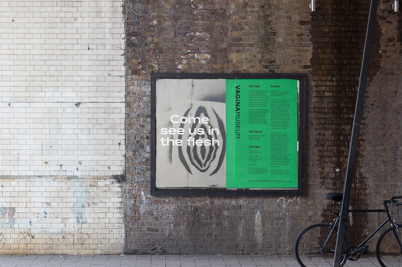
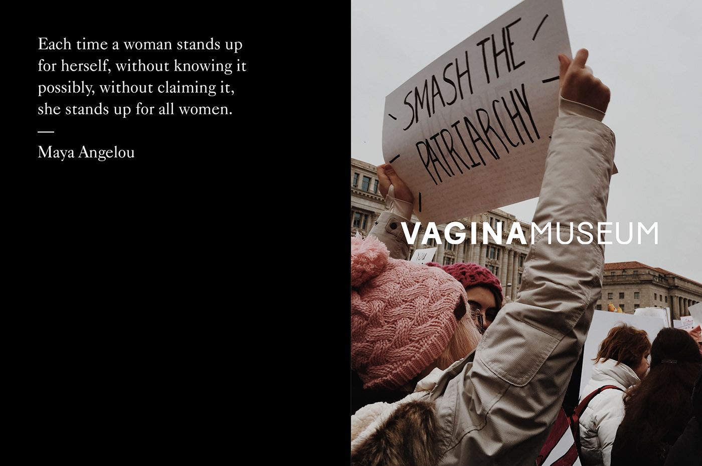
The challenge was that the branding needed to sit comfortably alongside talk of BDSM one minute, and FGM (female genital mutilation) the next. Therefore, the logo needed to be neutral enough to work in many different contexts, but with a flexible supporting visual identity system that allowed the brand's personable wit to shine through when appropriate. Secondly, it is precisely because of the huge stigmatisation that we were asked not to include any actual imagery of vulvas or vaginas in the logo itself, as it would have an impact on their ability to advertise.
A slightly more refined approach was necessary; we decided to focus on a clear, direct and unapologetic typographic direction that placed emphasis on the word ‘Vagina’ itself, with a supporting identity that really celebrates rebellion, inclusivity and individuality through the dynamic combination of unexpected typographic styling alongside an unrestricted colour palette, where expression and freedom are paramount. We have also created a secondary logo where ‘Vagina Museum’ is arranged in a ‘V’ shape giving the illusion of open legs to give the option for a more playful usage when appropriate.


Colour & Typography
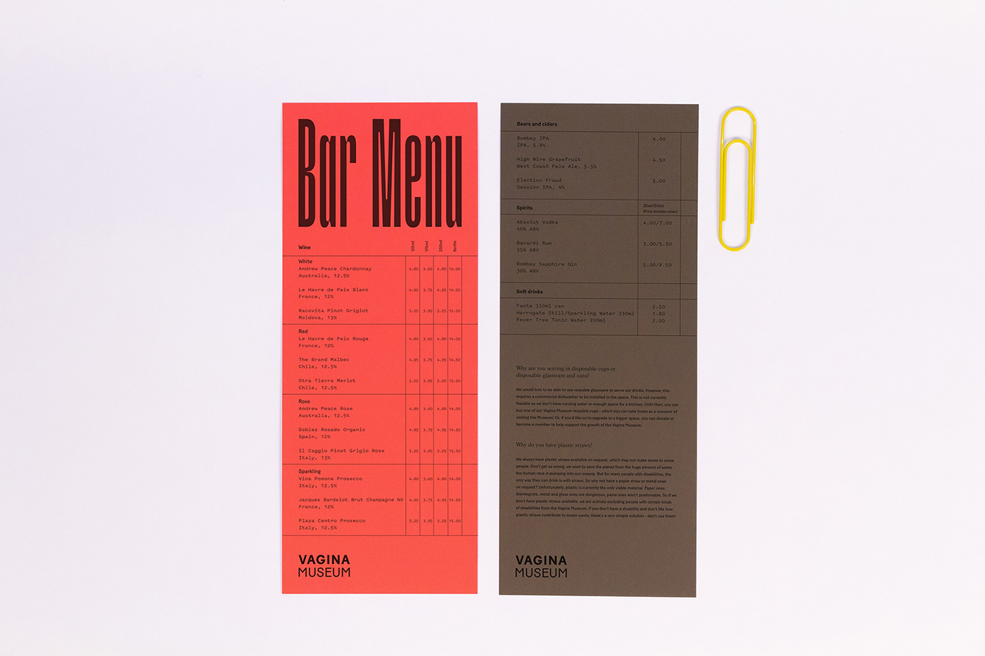
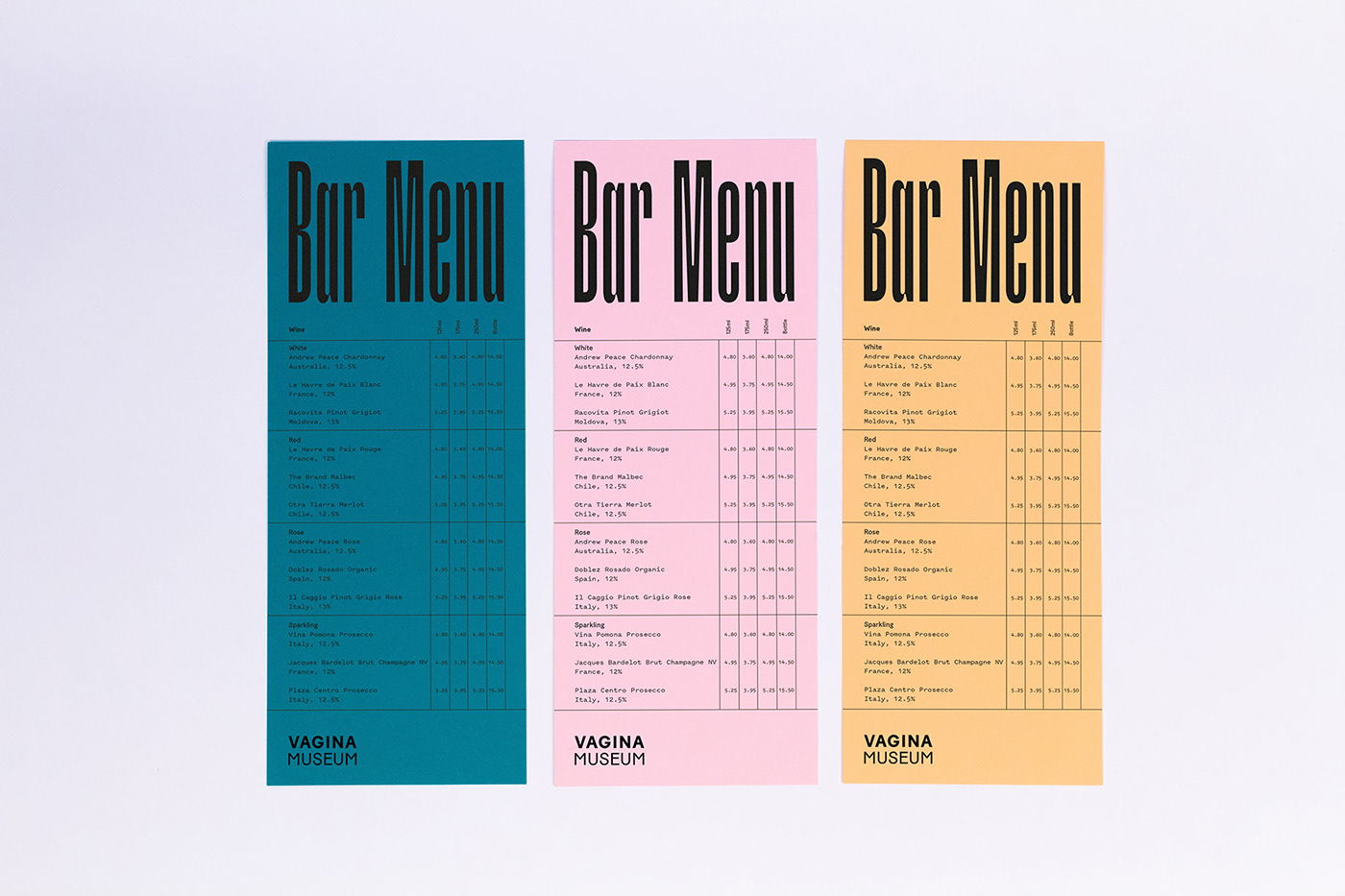
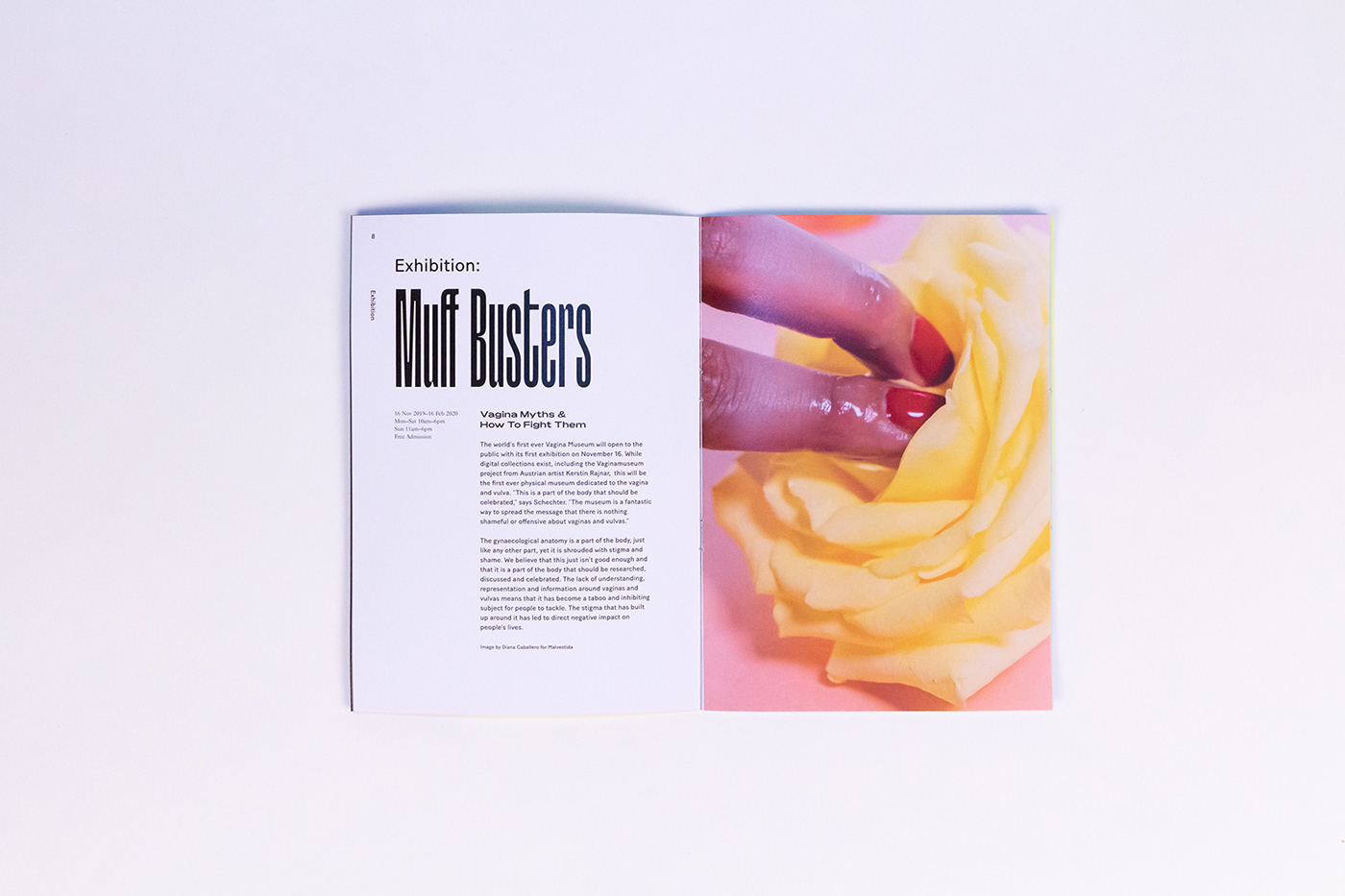
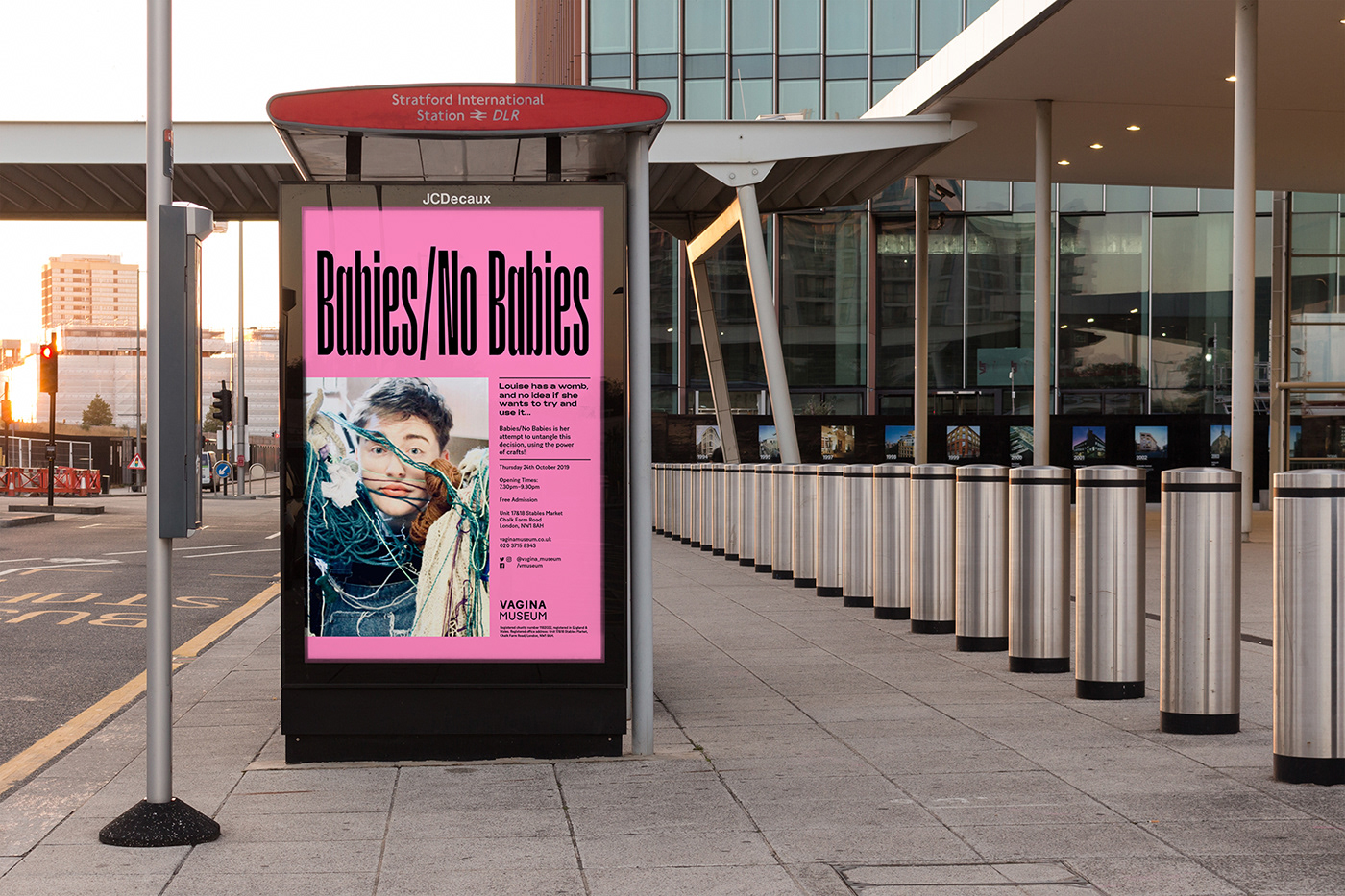
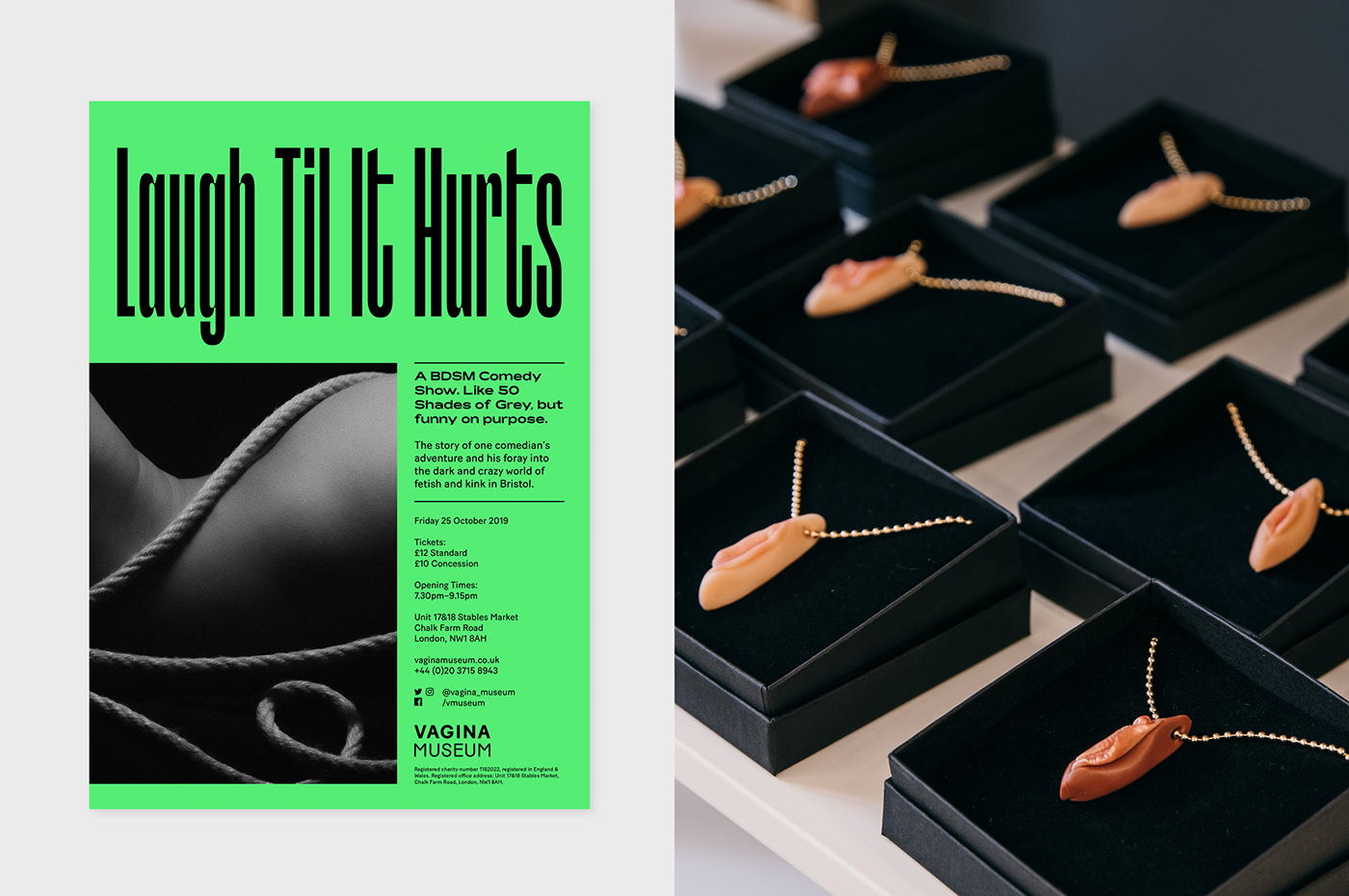
Another challenge was colour; pink seemed too obvious, purple was too commonly found in related industries like sex tech, green and yellow gave connotations of sickness, red was too on the nose. Our solution was to get rid of palette altogether; so every piece of collateral is a different colour.
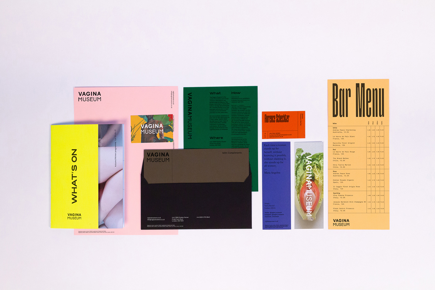
We applied a similar theory to the typographic palette, supplying seven different typefaces with a variety of personalities, which could be mixed and matched to create different aesthetics as well as distinct tones of voice. We maintained brand consistency by always using black on coloured backgrounds.
We wanted to treat the identity with the same ethos we apply to society; every person is unique as an individual, and the eclectic visual language when brought together as a group is what makes it exciting and beautiful.


Target Audience
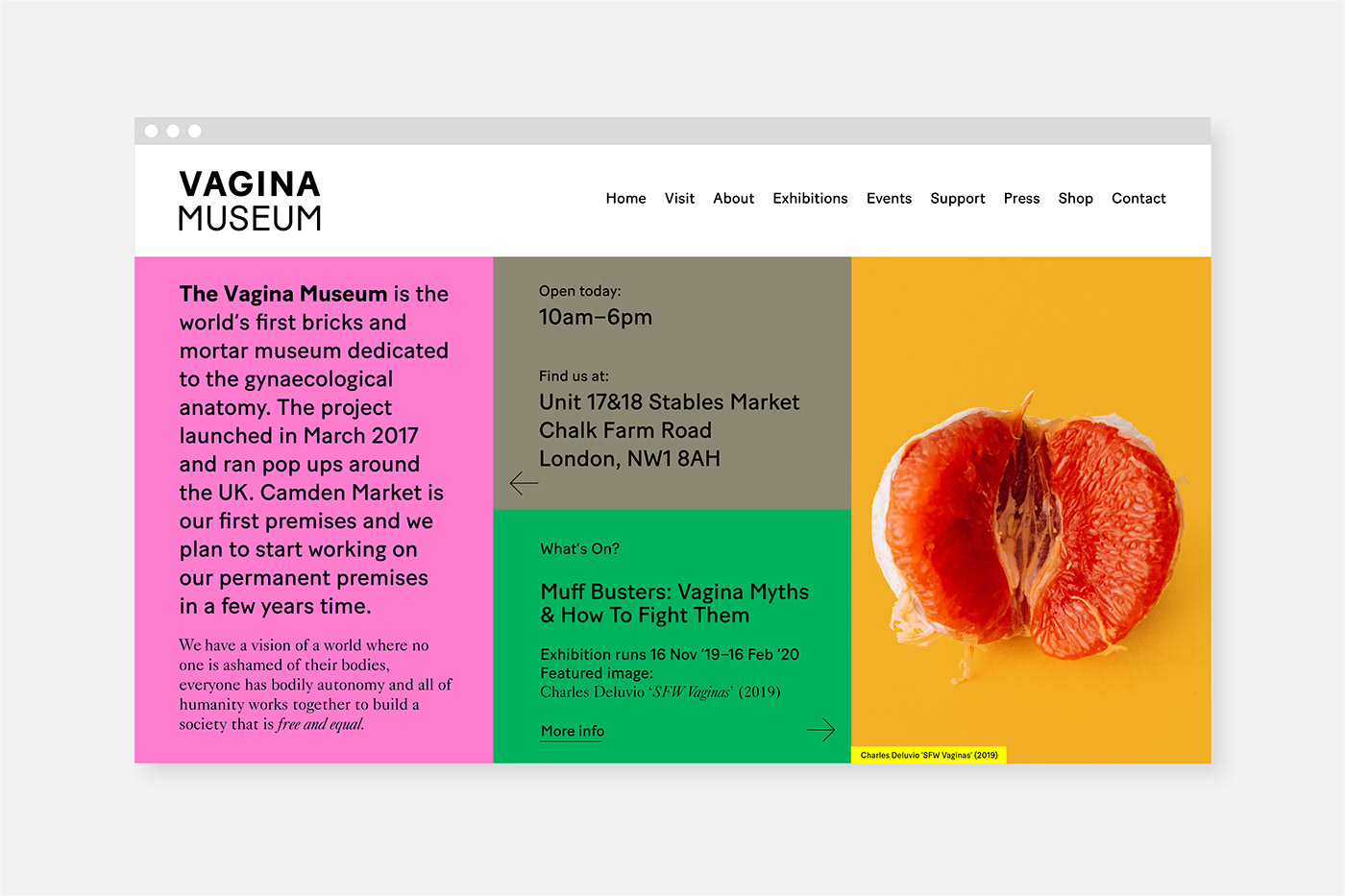
The Vagina Museum has a wide variation in target audiences; the identity needed to appeal to the progressive and fairly well informed women in their 20s, a good proportion of LGBTQ+, but also the medical sector, schools, families and older women who used to go on marches back in the day (think Margaret Atwood types). They feel keenly the effect vulva stigma has on their lives; doctors can dismiss them, the media and porn skews societal expectations of their bodies, embarrassment prevents them from getting help. They are looking for change but also connection.


We have a vision of a world where no one is ashamed of their bodies, everyone has bodily autonomy and all of humanity works together to build a society that is free and equal. There is a penis museum in Iceland. Which is pretty cool. But there is no vagina equivalent anywhere in the world. We were pretty miffed (muffed?) when we learnt this but we thought, there’s only one way to rectify this.
Make one.
— Florence Schechter (Director, The Vagina Museum)


Credits
Website: vaginamuseum.co.uk – Design by Passport, built by Outpost
Museum Photography by Tom Joy


