

fckbl (Fuckable)
FCKBL's visual identity is based on several components closely related to the fashion brand.
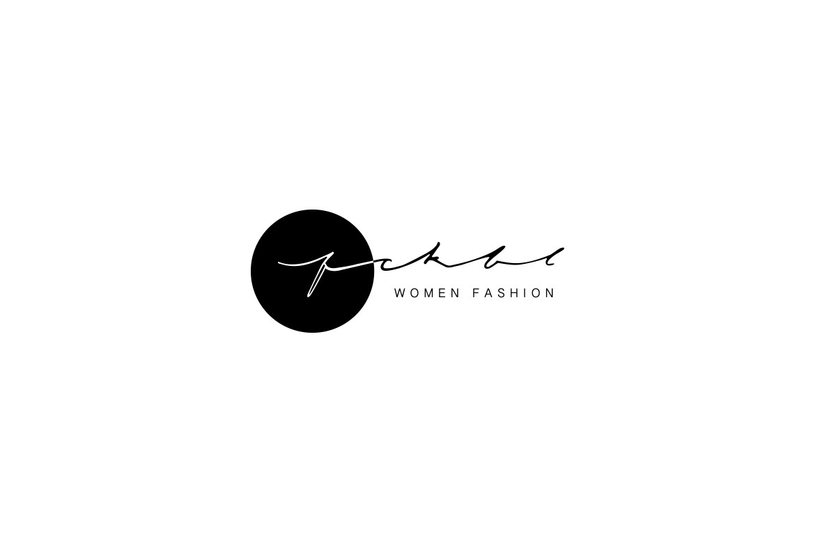
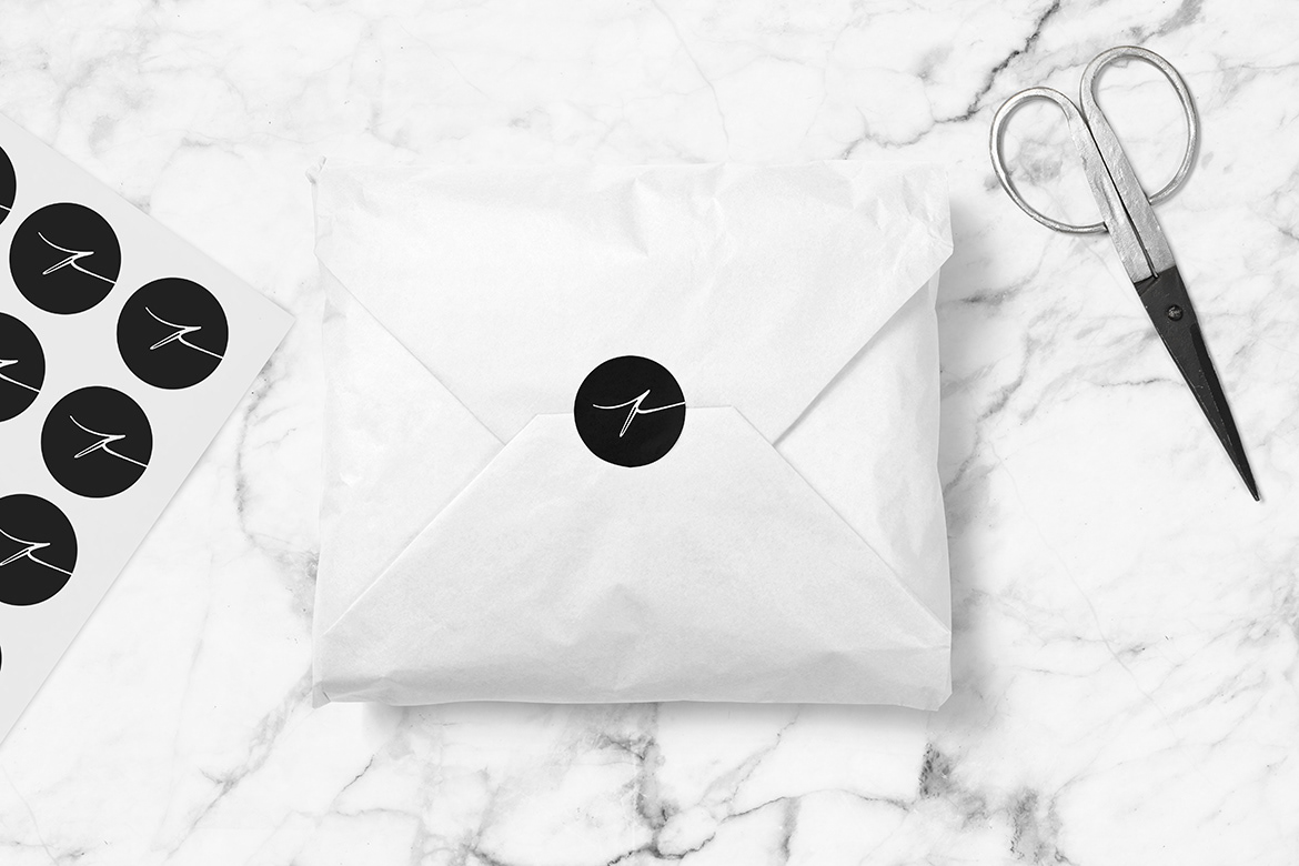
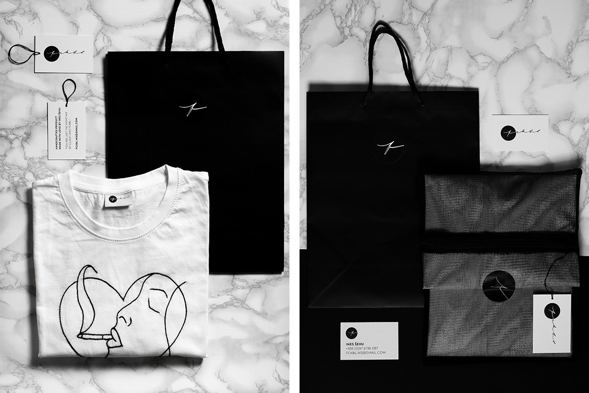
Creative direction is based on the elegance and linearity of the thread used to sew design schemes into pieces of clothing. The brand symbol is a letter "f" since its form resembles a needle and thread, and a stylised silhouette of the female body (referring exclusively to the female fashion brand). It also subliminally associates with the word "fashion".
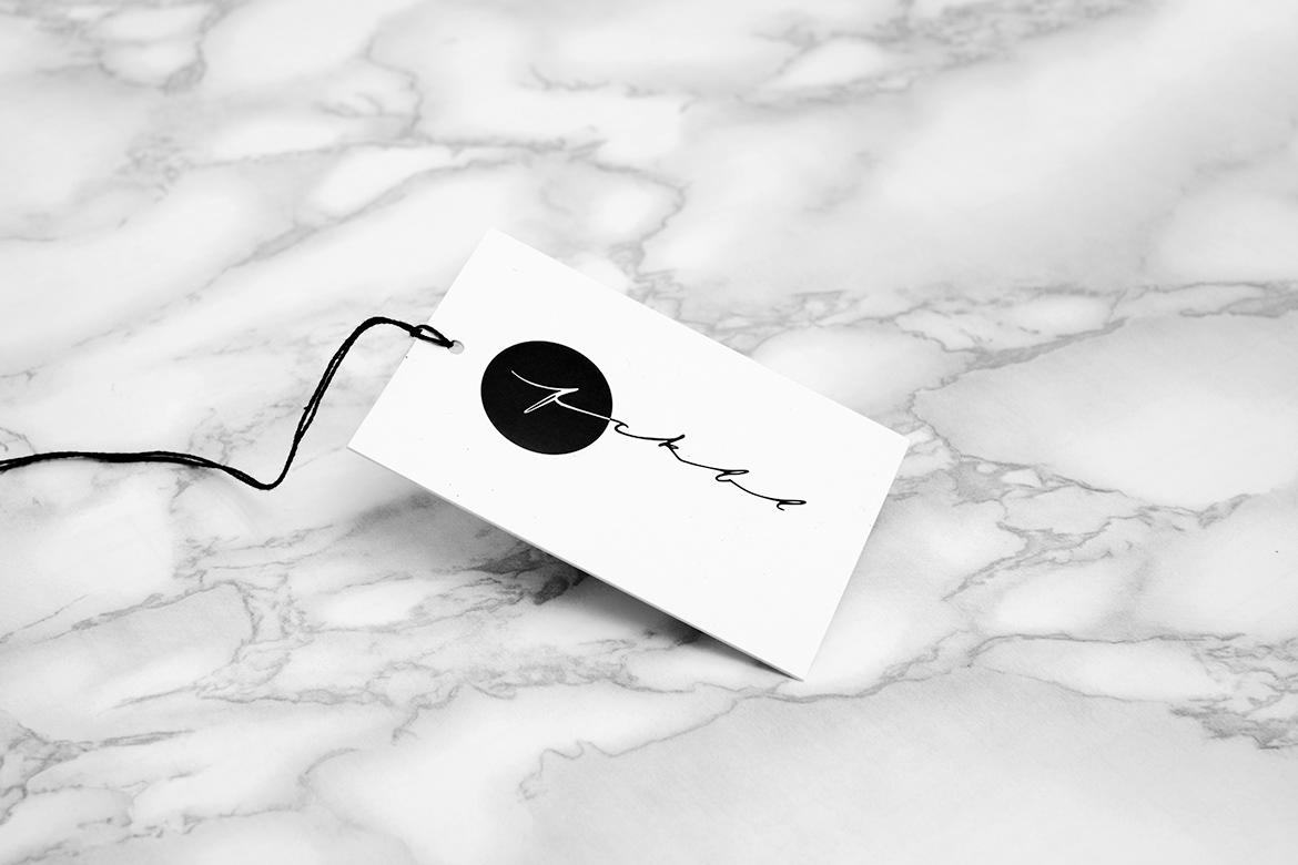
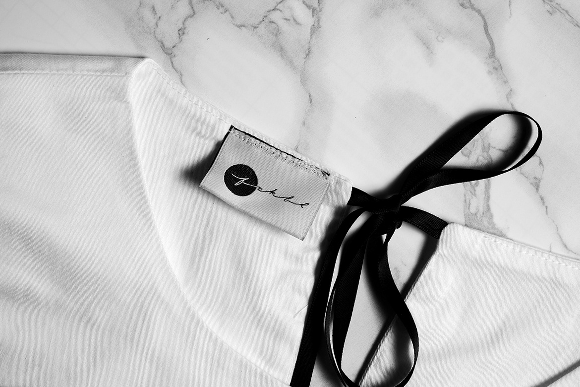
Thanks to its simplicity, the logo is applicable in various forms - both digital applications and hand-sewn into the fabric look great.
Given that FCKBL clothing is handmade and unique, the logo typography was designed respectively.
Creative direction is based on the elegance and linearity of the thread used to sew design schemes into pieces of clothing. The brand symbol is a letter "f" since its form resembles a needle and thread, and a stylised silhouette of the female body (referring exclusively to the female fashion brand). It also subliminally associates with the word "fashion".
Thanks to its simplicity, the logo is applicable in various forms - both digital applications and hand-sewn into the fabric look great.
YOU ARE JUST THE RIGHT MIX OF CLASSY AND FCKBL.


______
Credits
Client // FCKBL // Ines Šehu
Agency // Studio 33
Art Direction // Leo Vinkovic
Design // Maja Gjajic
Photo // Marin Loncar
Do not use any photo without author's written permission.
© Studio 33


