The talk about how Apple are going to ‘flatten out’ their UI style has set the rumour-mills ablaze with completely spurious conjecture. So I thought I’d add to it.
I've written a piece about trends I've noticed in iOS design recently and tried to approach it from evidence of progression within design of some of the top iOS apps.
Read the whole thing here.
Read the whole thing here.
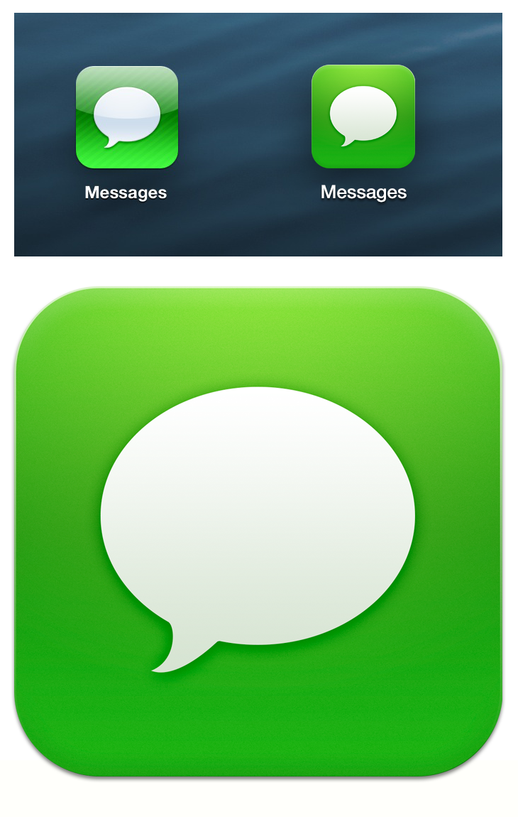
I decided to have a go at redesigning a one of the native iOS icons (which, to me, are in dire need of a spring clean) using some of the ideas I discussed.
I chose the Messages icon simply as it displays the 3 factors that I believe need addressing in iOS design and specifically in the launcher icons; the gloss, the stripes and the loud colours. I also made a simple change to pull the Label text down in boldness to Helvectica Neue Medium and up the font size to 26px to give it clearer counters and a smoother, more legible readability. The colour’s still bright as I don’t believe the pastel tones that are popular at the moment reflect iOS styling enough but I tried to at least tone it down a notch.


