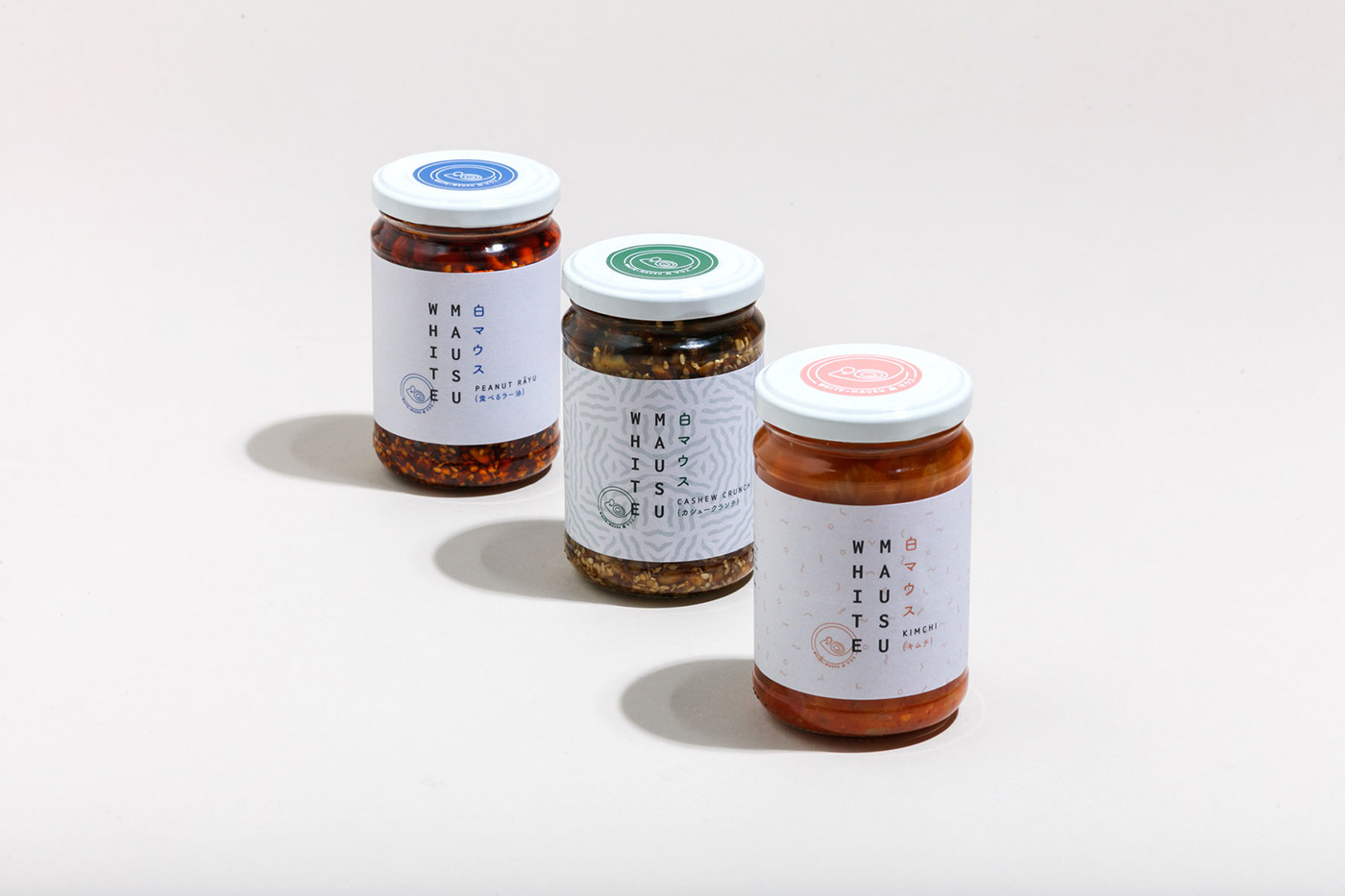
'White Mausu’, or ’White Mouse’ as Katie Sanderson’s grandmother affectionately called her, was the starting point for our exploration in creating a brand that intersects both Asian and Irish cultures. Having worked in kitchens across the globe, Katie developed a series of condiments that blended together the best of both culinary worlds.
The logo we designed is a reference to the Japanese way of writing called tategaki (縦書き) – which literally means 'vertical writing'. We then created a secondary mark to reference the 'mouse' that could be used on labels and across the brand. The illustration is a mouse in a round circle with a spiral triskele similar to the symbol found on a number of Irish Megalithic and Neolithic sites as a reference to this being an Irish product with a very Japanese feel.
As the business has grown they have expanded into doing off-site pop-up stalls selling Rice bowls using their products. They have also marketed their Peanut Rayú to multiple artisan shops across Ireland, with an expanded upcoming range of products in the pipeline.