For Andrei Voznesensky's cultural centre we have developed a logo that combines a poet's quill as a reference to works of the great Russian poet and the letter "B" (Latin V) from Voznesensky's autograph. Thus, the rhythmic of the art and the plastic of the name were combined in this solution.

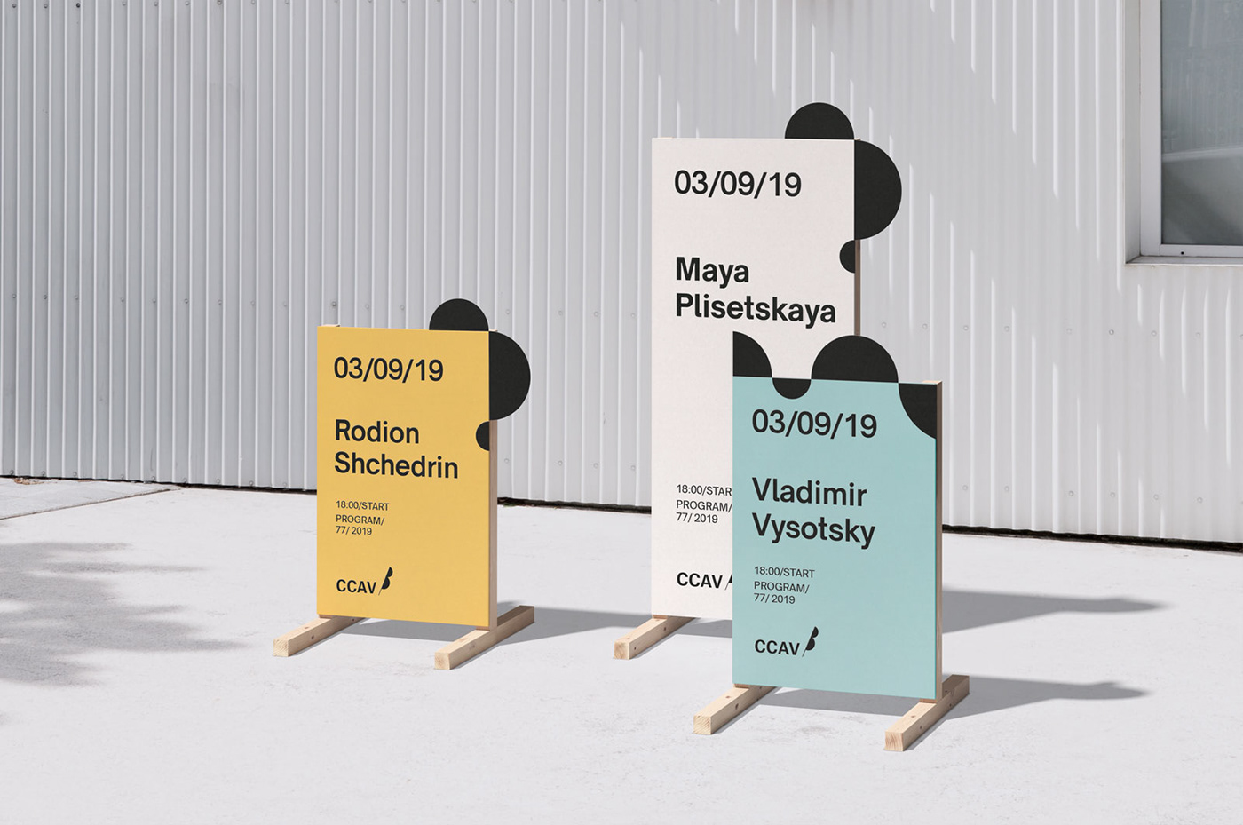
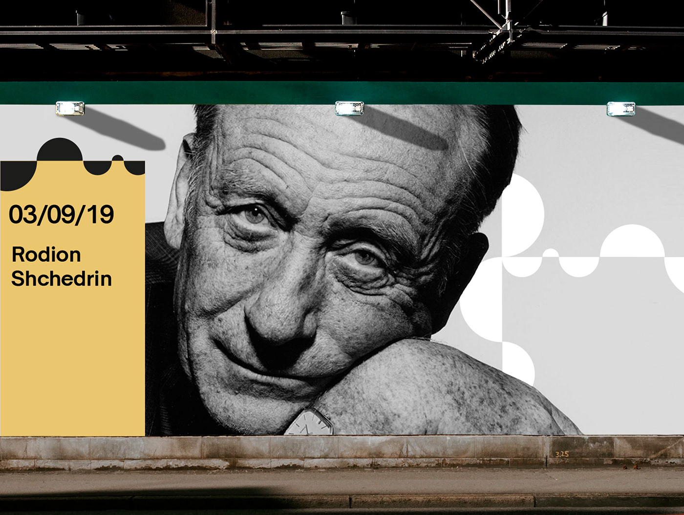
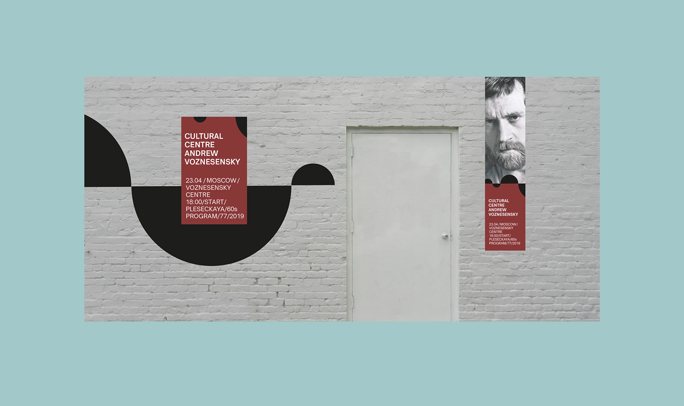
There is a corporate pattern based on the logo, which allows one to create almost any configuration of elements, while maintaining the logo's authenticity. The pattern, which does not follow a uniform principle of construction, can be easily adapted to a variety of formats.
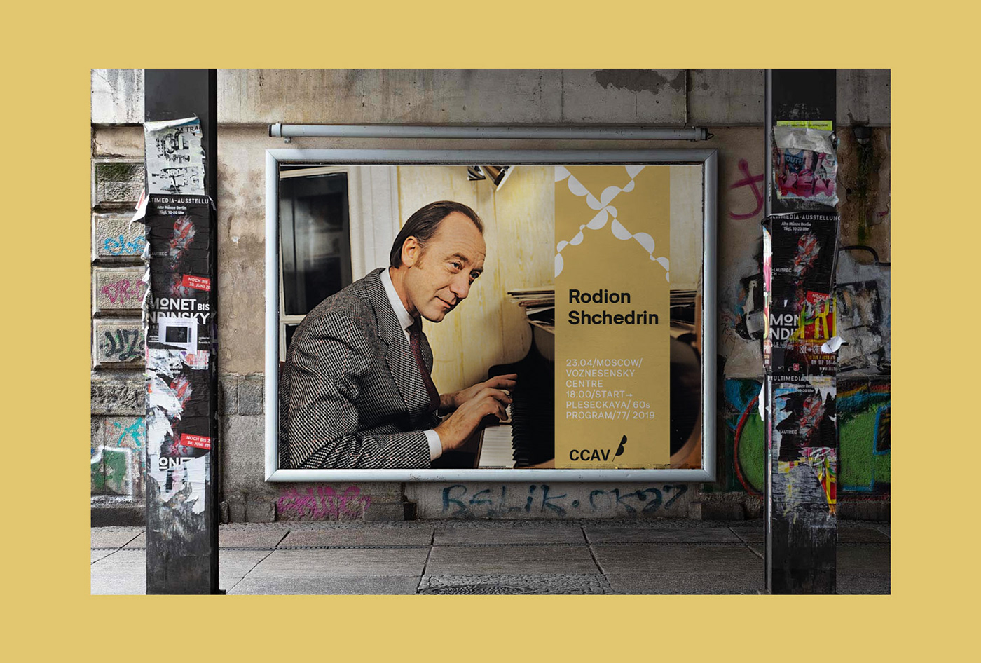
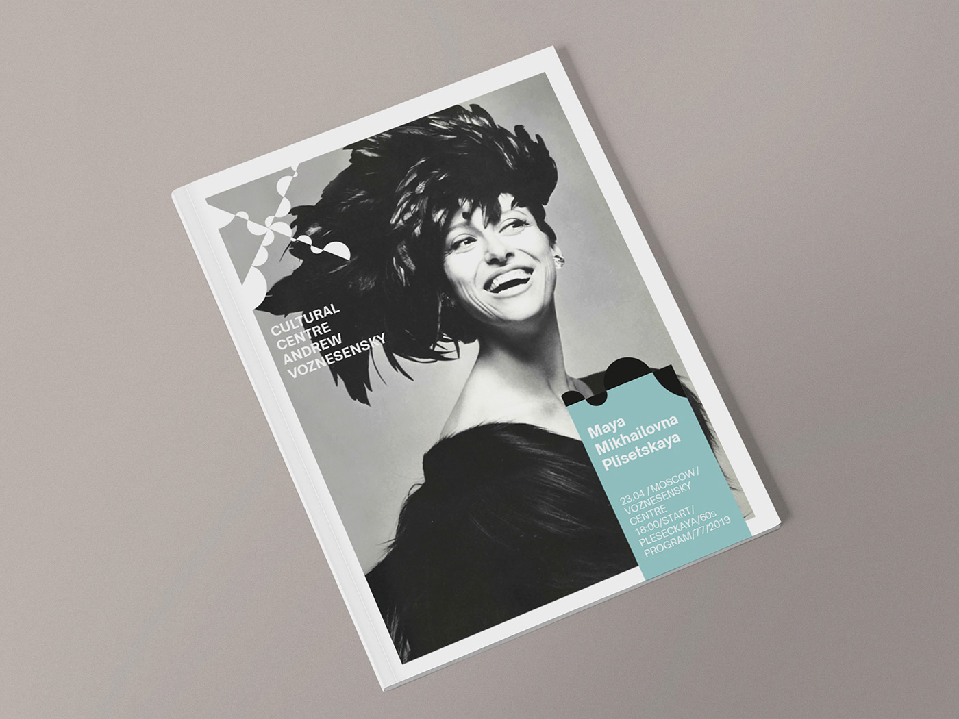
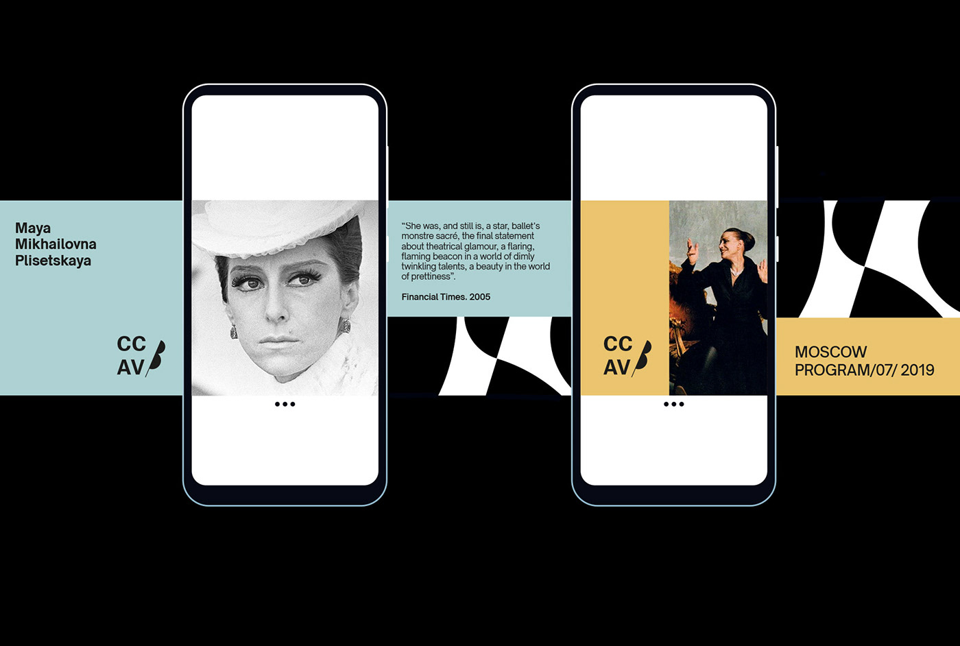
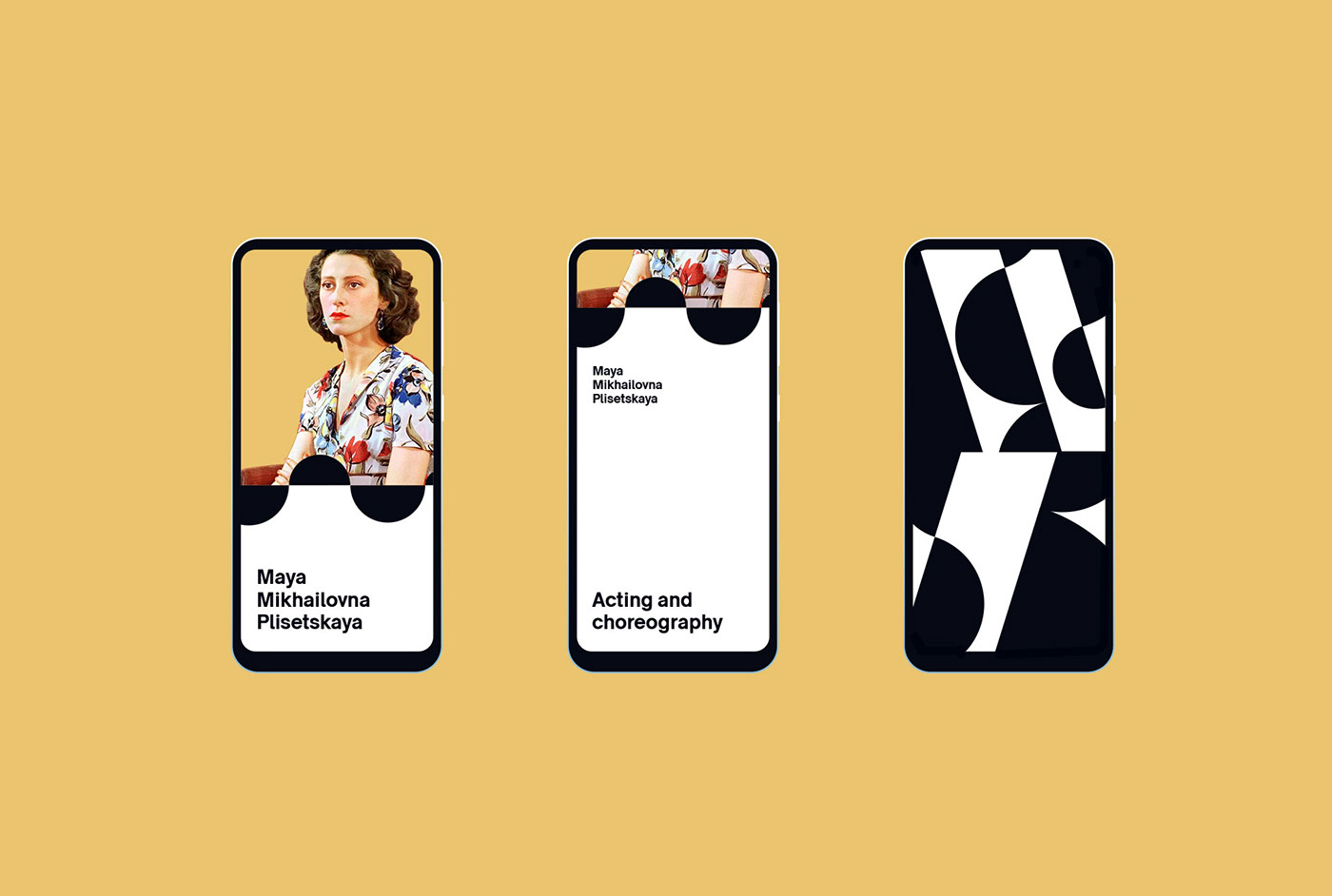
The dualistic minimalism of black and white, often heard in the work of Voznesensky himself, is effectively complemented by a discreet second color palette for use in the furnishing of cultural center spaces, communication materials, and merchandising.