Beila is the new - and only - boutique hotel in Bilzen. A name that trips off the tongue with great elegance. An interior with an eye for detail.
When we start the concept design of an interior design project, it’s often the interior designer that starts collecting moods, picking materials and drawing up the interior. It’s only later in the process that the graphic designer comes into the picture. Not with Hotel Beila. In this case, the concept design hinges on graphic lines. How did that work out? Check it out!
The decision on ‘Beila’, the name of the hotel, was quick and easy. Beila was Bilzen in the year 950. A name that trips off the tongue with great elegance. Our client was very excited about Beila. With the enthusiasm, the elegance and the history encapsulated in this name, we got to work.

As we said before: the concept design hinges on graphic lines. So first things first: the logo. We started with the 1819 coat of arms of Bilzen. We drew inspiration from the interplay of geometrical lines and the curves of the tree. The color palette was based on the coat of arms as well, with this as a result:

Depending on the type of communication, the logo appears in different shapes and colors. We experimented with watercolor ink to create gradients and ‘stains’. They became part of the corporate identity, including nametags, menus and stationery, but even, taking things a step further, in the aprons of the staff.
During a brainstorm with our client, a few key words popped up:
honest – accessible – detail – new – rhythm – calm
Materials
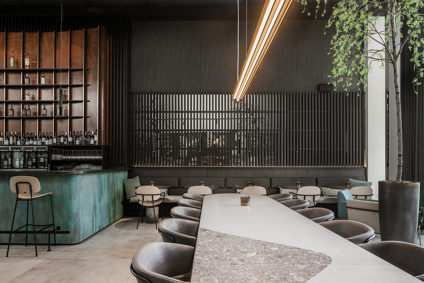
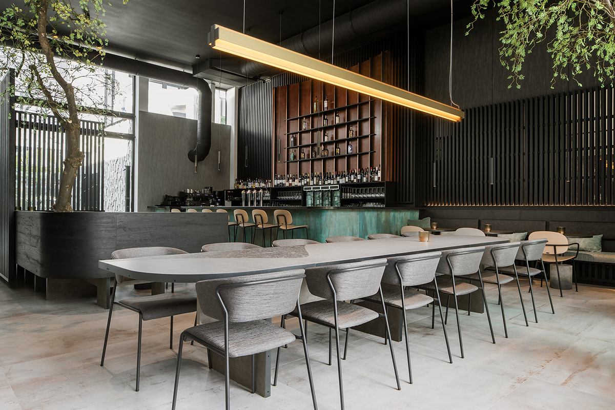
We didn’t go for the most luxurious materials, yet we picked materials that have a luxurious appearance. We opted for industrial materials, though we used them in a different way. For example, the cladding of the bar looks like oxidized copper. Oxidized copper is not exactly considered a luxurious material but it does have luxurious look. Moreover, we introduced a material previously used only outside, in the interior of a boutique hotel.


Color
Here we revisit the graphic lines that were drawn in the concept design. The colors we chose in the concept phase are the colors we use in the interior design.
Details
People with an eye for detail will feast their eyes on Beila. Those who pay attention, will recognize the lines of the logo in the fixtures of the wall lamps, in the curve of the tables and, if you look below, within the floor.
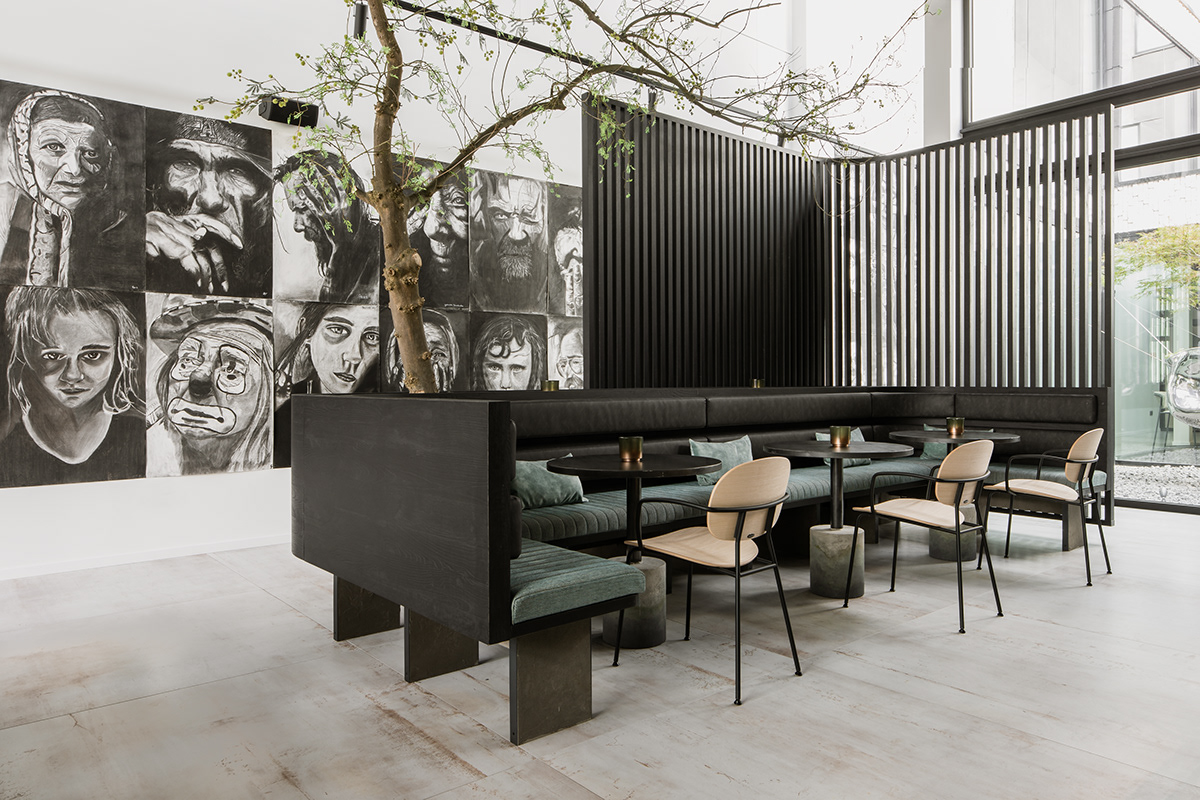
Calm and rhythm
No to cacophony, yes to spaces in which you can settle at ease with a good glass of wine. We chose rhythm to provide Beila with this calm character. Rhythm is embedded in the materials, shapes, colors and patterns. Take the wooden cladding for example, which is used in various places: the wall behind the bar, two benches, but also in the lobby and hotel rooms. And where did we see that rhythmicity again? Oh right, the coat of arms.


