Studio Theca – House Brand
Idea | Need
Here it is not about a hypothetical project which raises specific fictitious requests and problems that we, as a communication and graphics agency, try to solve through functional solutions. Here it is about the realization of our logo. We chose to include it in the “Projects” section, because it perfectly represents our way of approaching planning and creativity, under all their aspects.
Proposal | Solution
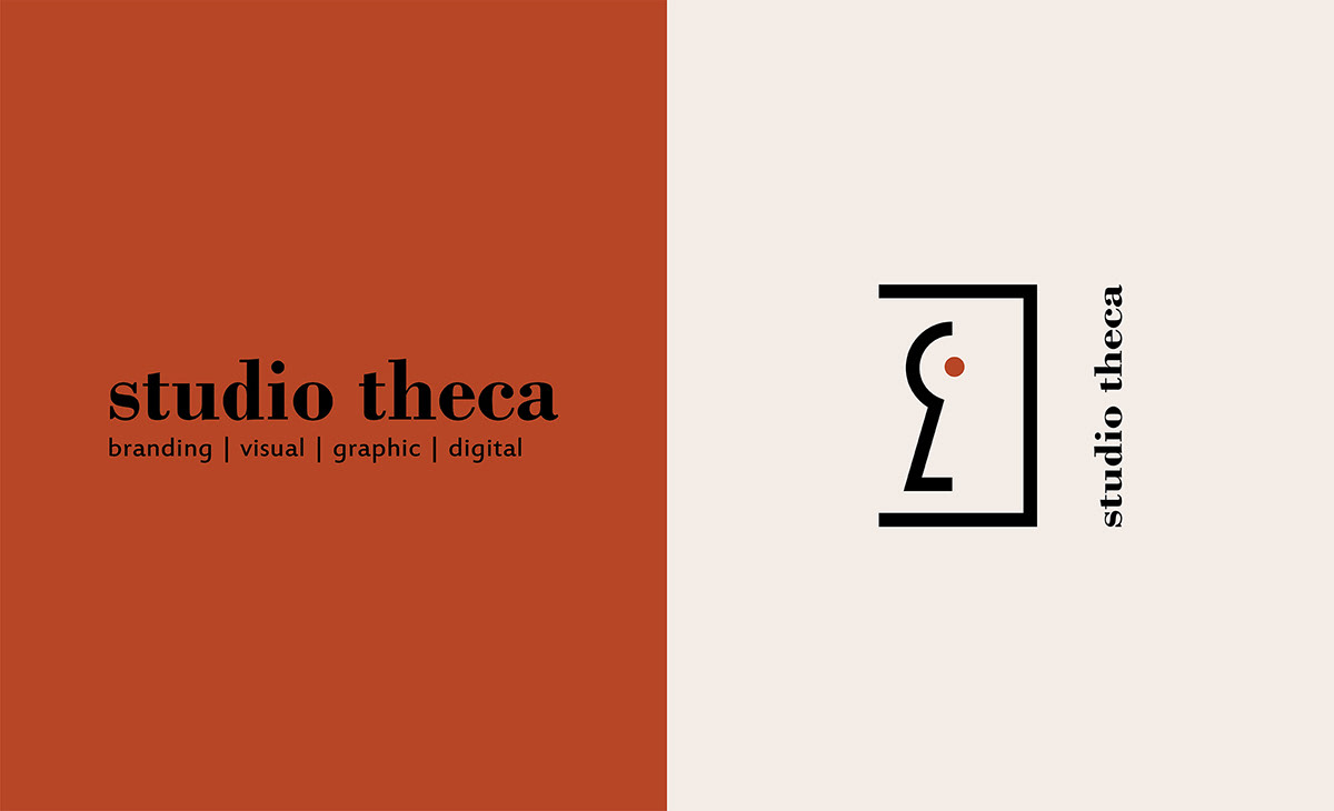
Naming | The choice of this name “THECA STUDIO” is the result of a long brainstorming meeting where we defined the company philosophy that leads the way we move on to the business communication market.
THECA STUDIO, in fact, aims to shape and strengthen quality products and services, making them original and precious, in other words, unique. What a better choice than THECA STUDIO, then – where STUDIO symbolizes the work of analysis and introspection, and THECA is the precious container where we use to keep our most precious and cherished things: our reason for being in two words.
THECA STUDIO, in fact, aims to shape and strengthen quality products and services, making them original and precious, in other words, unique. What a better choice than THECA STUDIO, then – where STUDIO symbolizes the work of analysis and introspection, and THECA is the precious container where we use to keep our most precious and cherished things: our reason for being in two words.
Colors | For the logo, we chose a palette of elegant and light-shaded colors, given that we want our approach to be exclusive, as far as possible from the idea of a “commercial brand”.
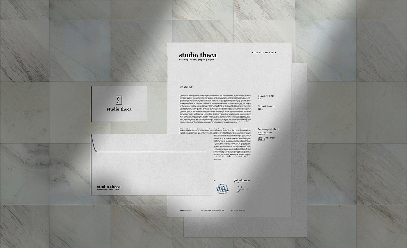
Glyph | The graphic design of the logo reminds indirectly of the agency name. We designed, in fact, the stylized eyelet of a case lock (symbol of the packaging), with a precious gem inside (symbol of the product).
GIF | The background image used in the animated GIF of the logo is that of Antelope Canyon, the most iconic slot canyon in the United States. Its curved lines, so voluptuous and enveloping, recall our way of “satisfying” and “naturally following” the specific needs of each client, always developing the solution that better “fits” his targets.