Brand Identity and Stationery
NEO Fund
OBJECTIVE: Sell a small business lender to a community that doesn't trust traditional banks.
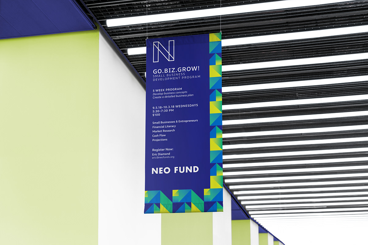
SOLUTION: Instead of trying to make NEO Fund into a traditional bank, we looked at what makes them unique. The partners are as likely to wear sneakers to work as a dress shirt. Their focus isn't on formality or appearances, but rather in helping people by being honest, transparent, and speaking directly.
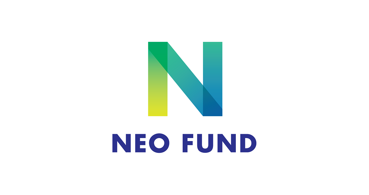
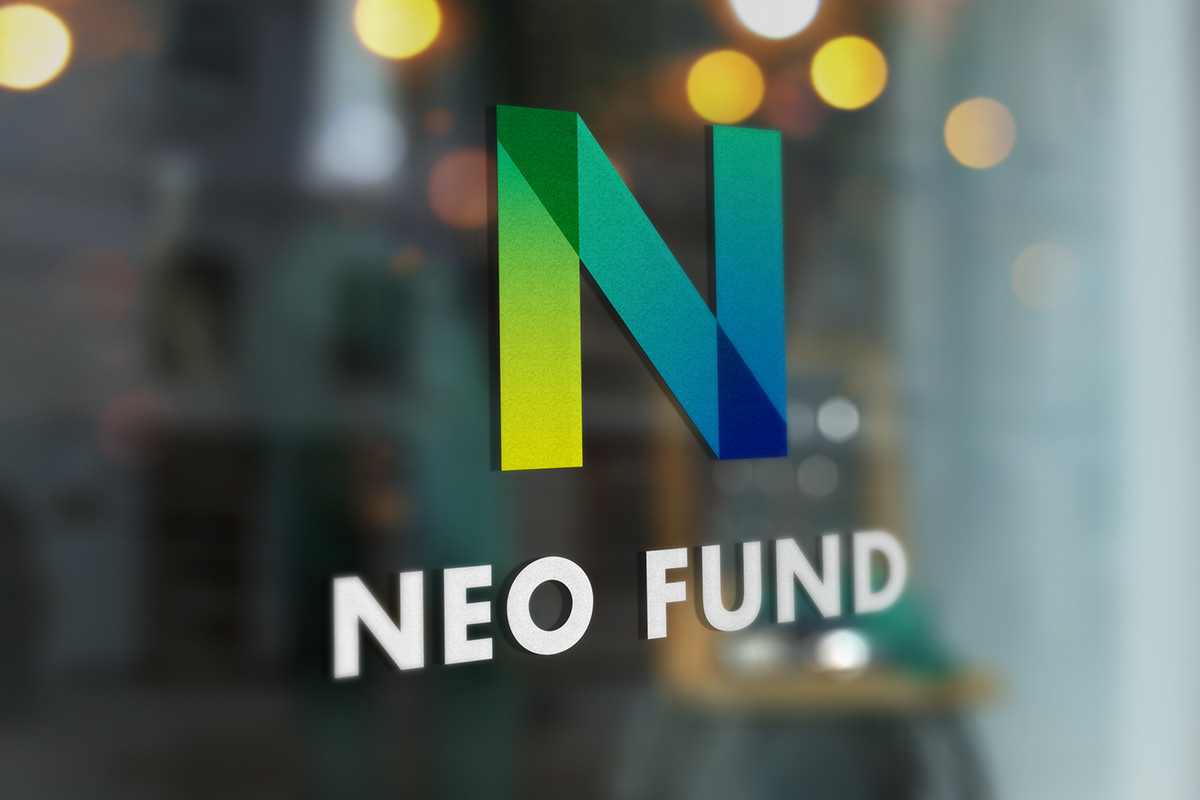
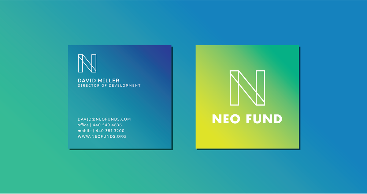
We developed a monogram mark that was stripped of all ornamentation, and introduced a layer of transparency. Their secondary mark became a wireframe of the color version that hides behind nothing but is incredibly flexible. We avoided the overly bold primary colors seen in so many larger banks. A flexible set of patterns allow them to build banners, posters, and other materials as necessary.