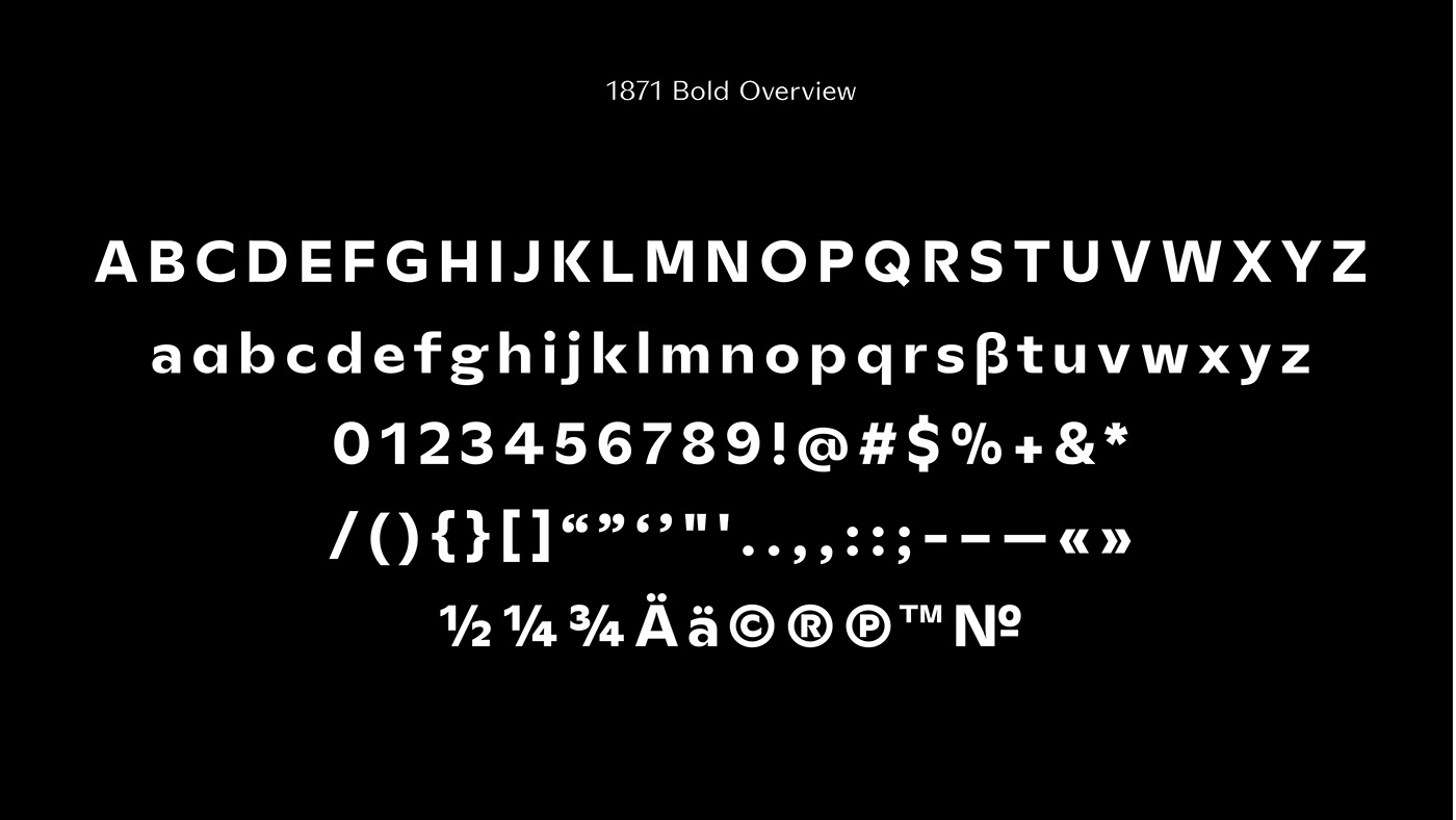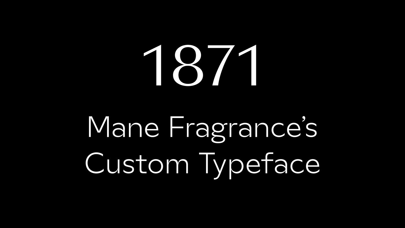
1871 Mane Fragrance's custom typeface
The design of 1871 was based on a synthesis of research around the Italian typefaces of the 1930s as well as the typographical universe referring to the Art Deco movement. The challenge lay in designing a custom font-family that could blend with the existing visual identity while having a strong personality that borrows from Mane’s DNA.
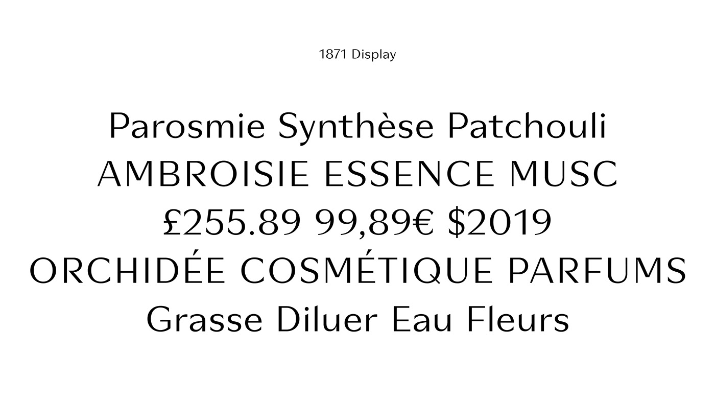
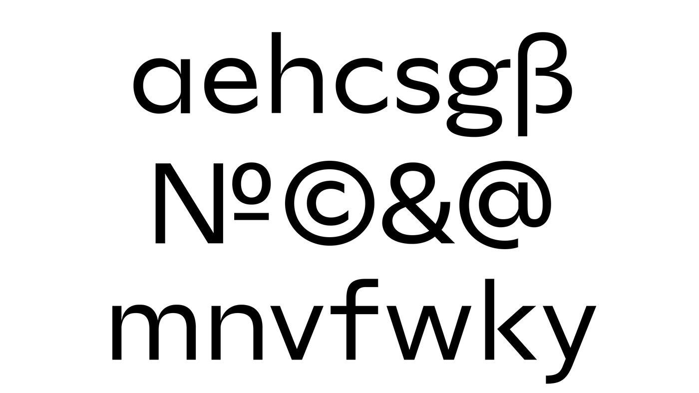
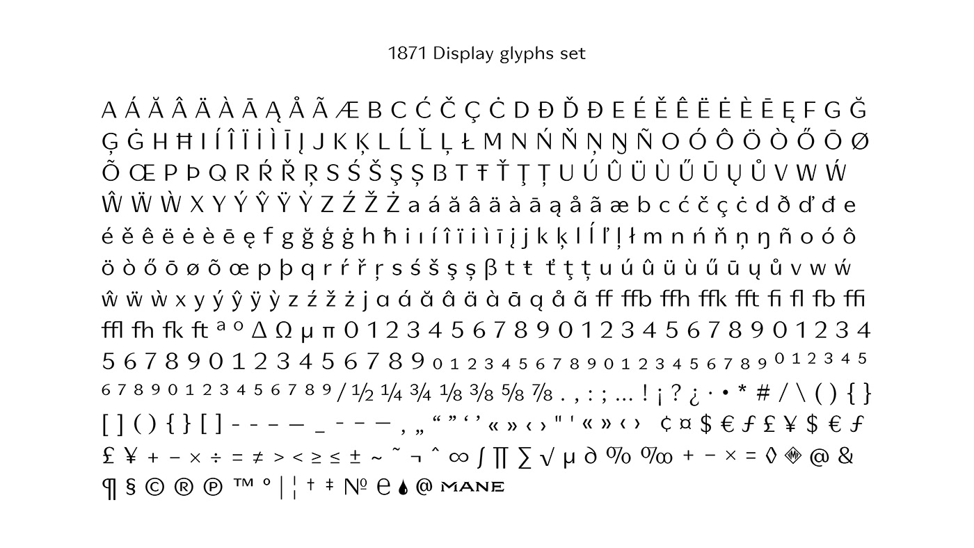
In the desire to anchor this future font-family in the historical territory of the brand, many specificities have been brought. Generally speaking, and with reference to the original logo still in force, the 1871 width is wide and the character has a large x-height in both Display and Text. The contrast between downstrokes and upstrokes in Display version takes its roots in the French Didots of the late 19th century, while the off-center central strokes are a reference to the style ‘Art Déco’. In more detail, the connections between the counter and the stems are refined and sharp. Finally the terminals, incisor in Display, vertical in Text version, are long and open this providing a nice momentum in the drawing and making the reading easier by its horizontality.
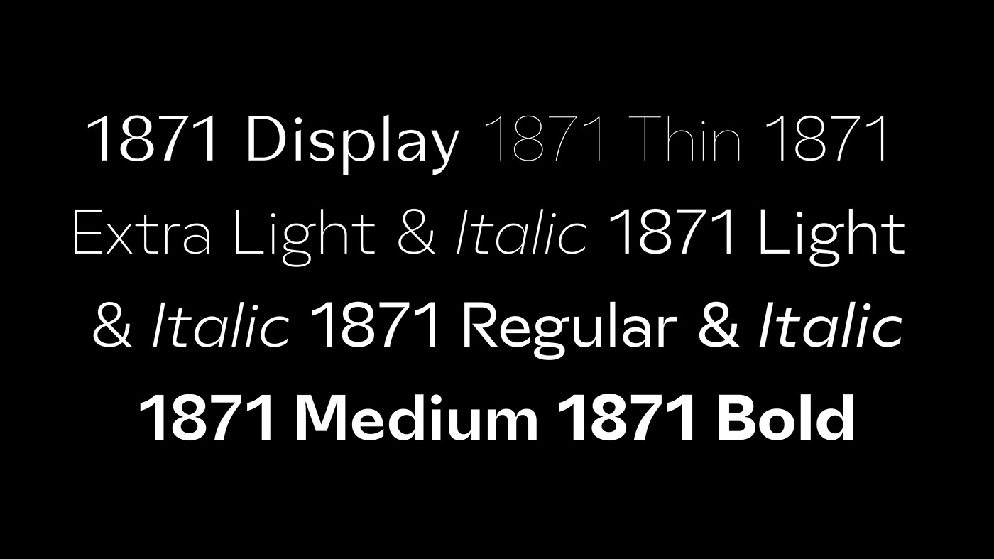
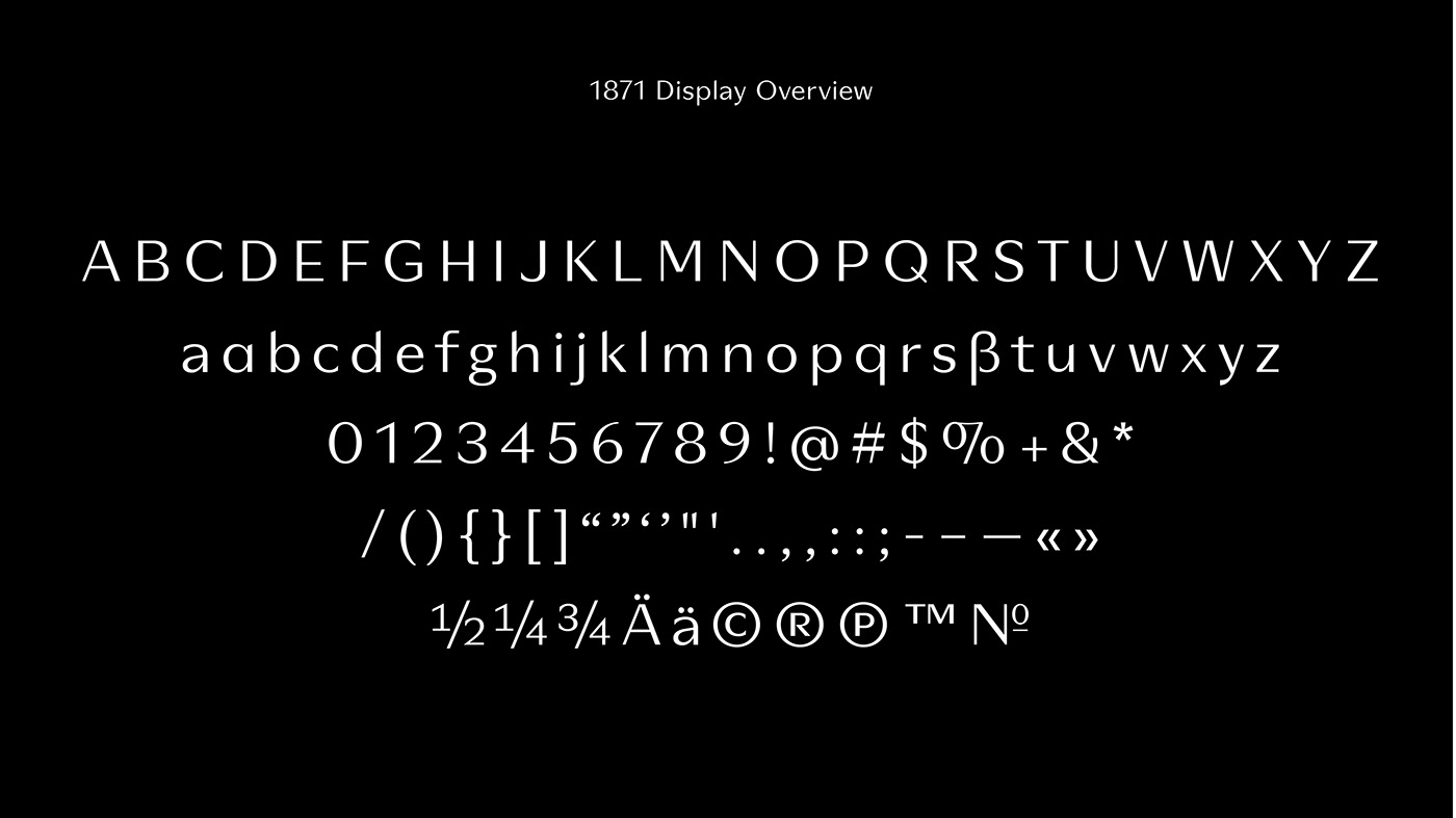
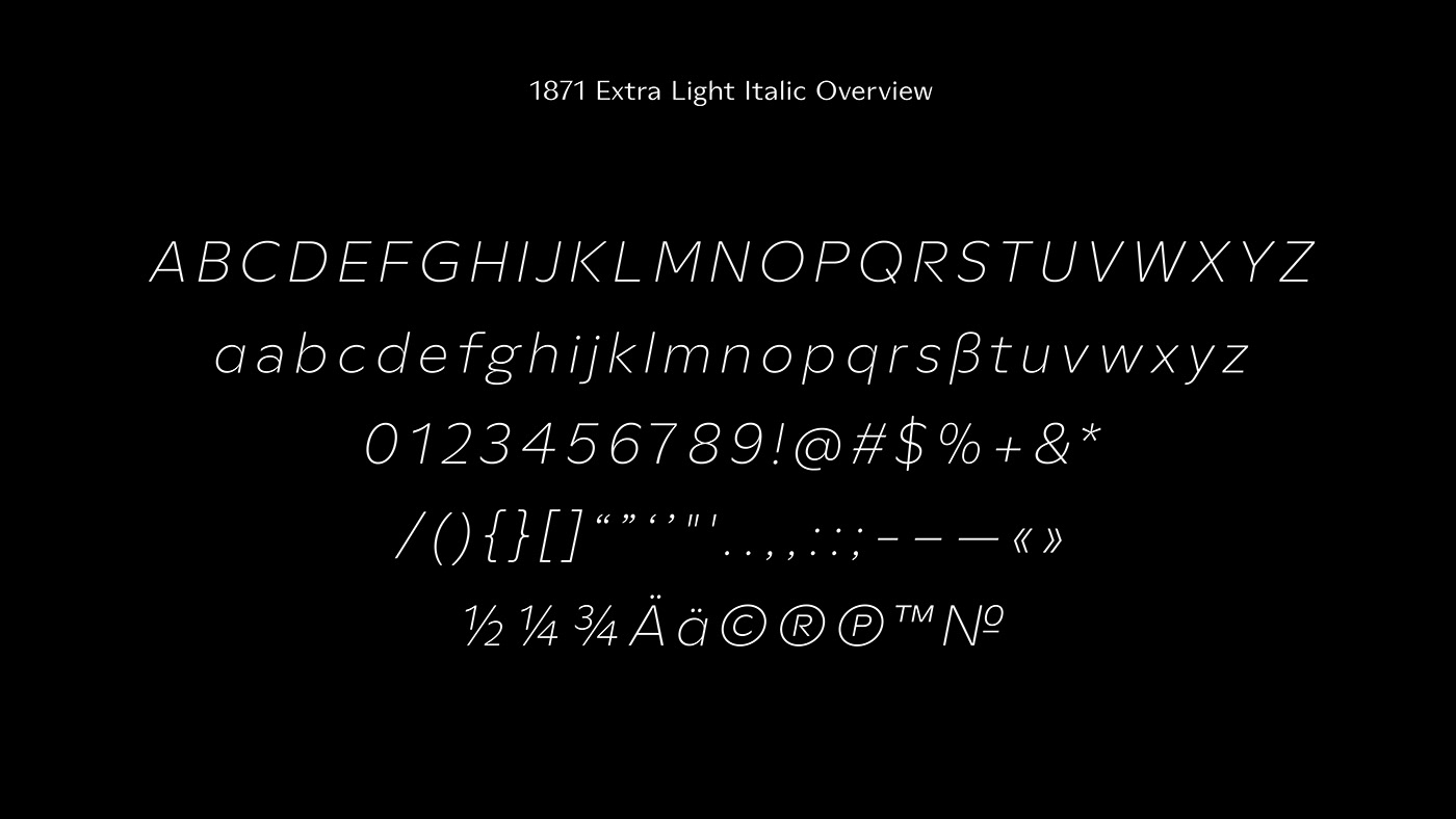
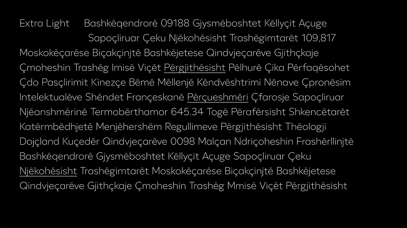
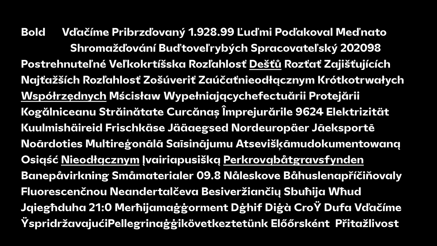
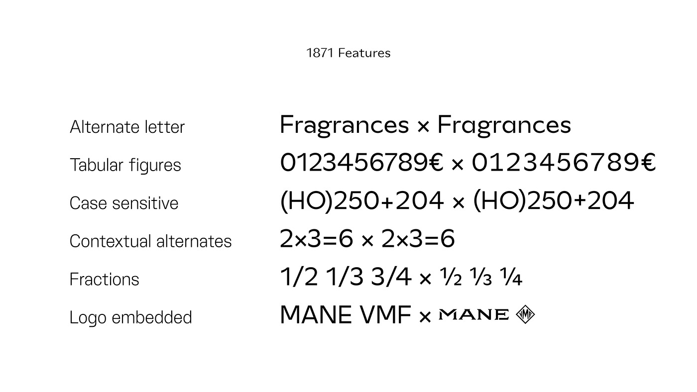
1871 is a complete font-family consisting of two versions. Both of 'sans-serif' classification. A Display version, contrasted and a Text version with seven fats and two italics.