

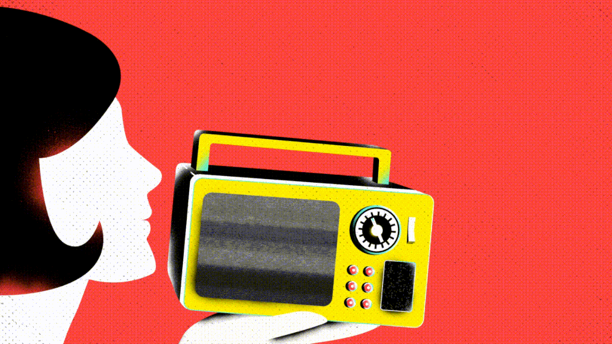
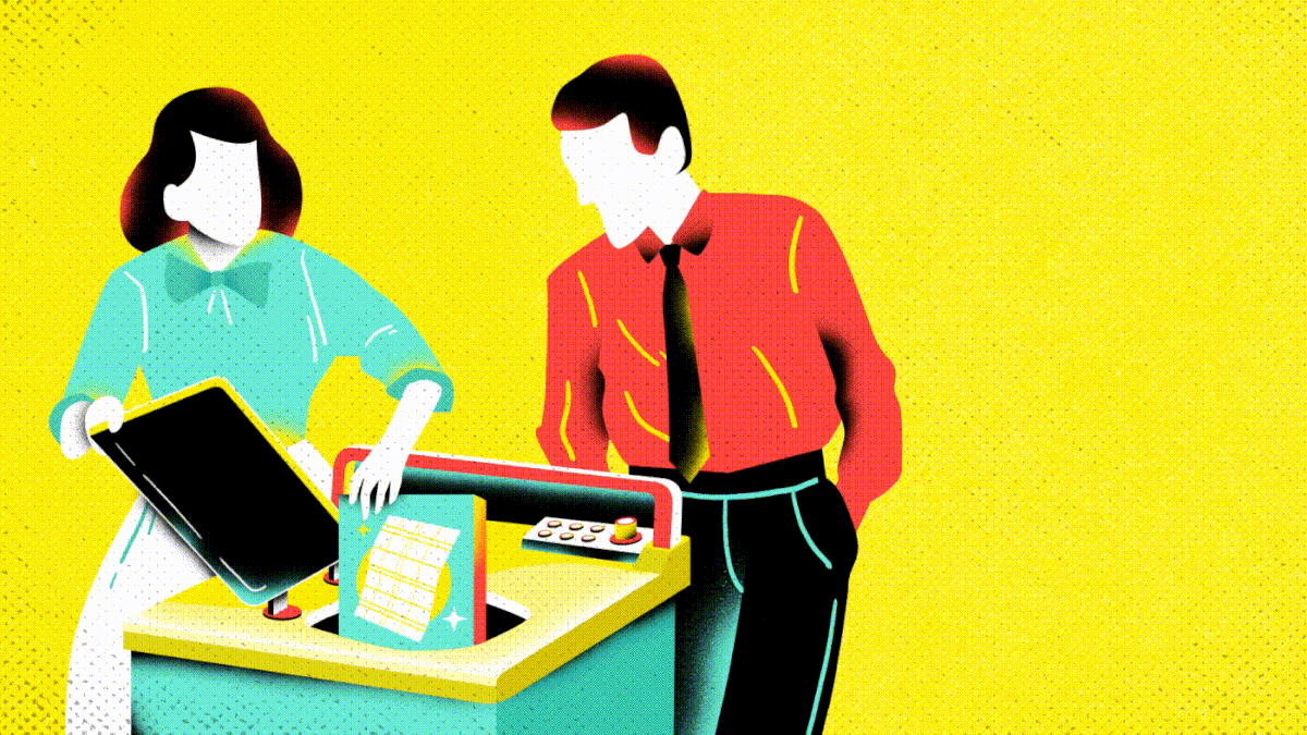
Branding
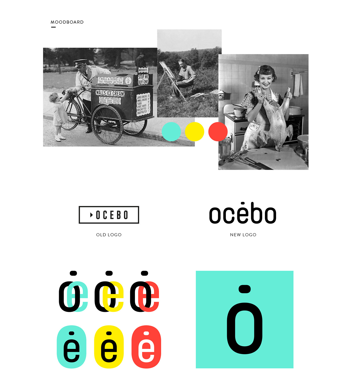
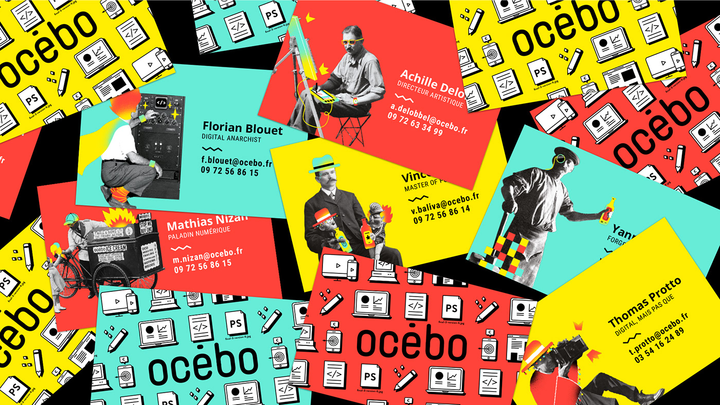
Ocebo, a digital studio based in Lyon - France, welcomed me as their digital designer and illustrator and asked me to renew their visual identity. Their old logo used the CTA button shape (call-to-action) and they wanted a more neutral logo to develop a colorful and funny graphic universe. They wanted to keep vintage photos they already had in their branding and mix them with a pop and modern touch. I also designed a set of pictograms to enhance their presentations and official documents.


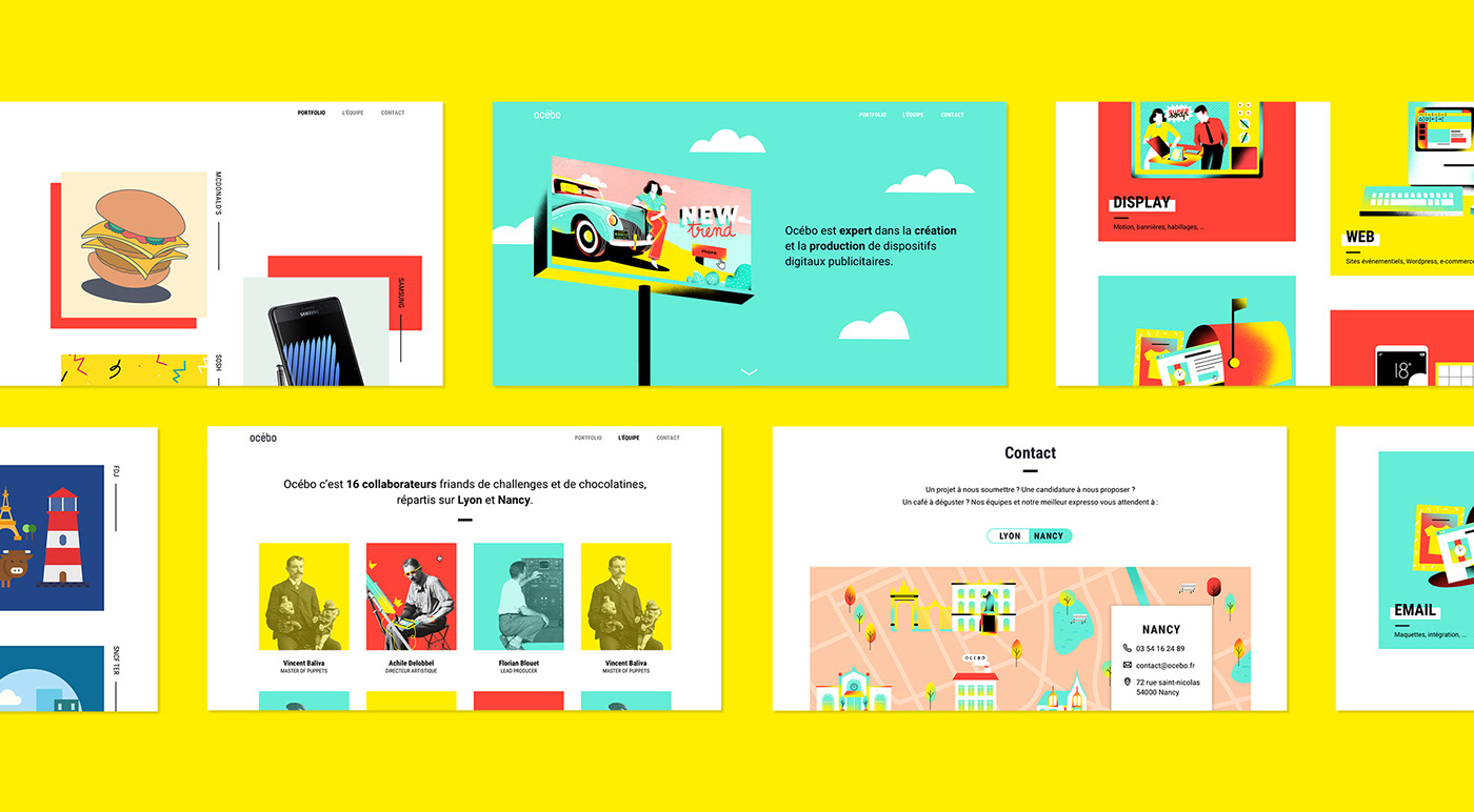
Web design + illustration
The website has also been renewed to meet the codes of the new guidelines. With the art director Achille Delobbel,
we reworked the UX in order to propose a more structured and simplified tree structure and navigation.
The website has also been renewed to meet the codes of the new guidelines. With the art director Achille Delobbel,
we reworked the UX in order to propose a more structured and simplified tree structure and navigation.
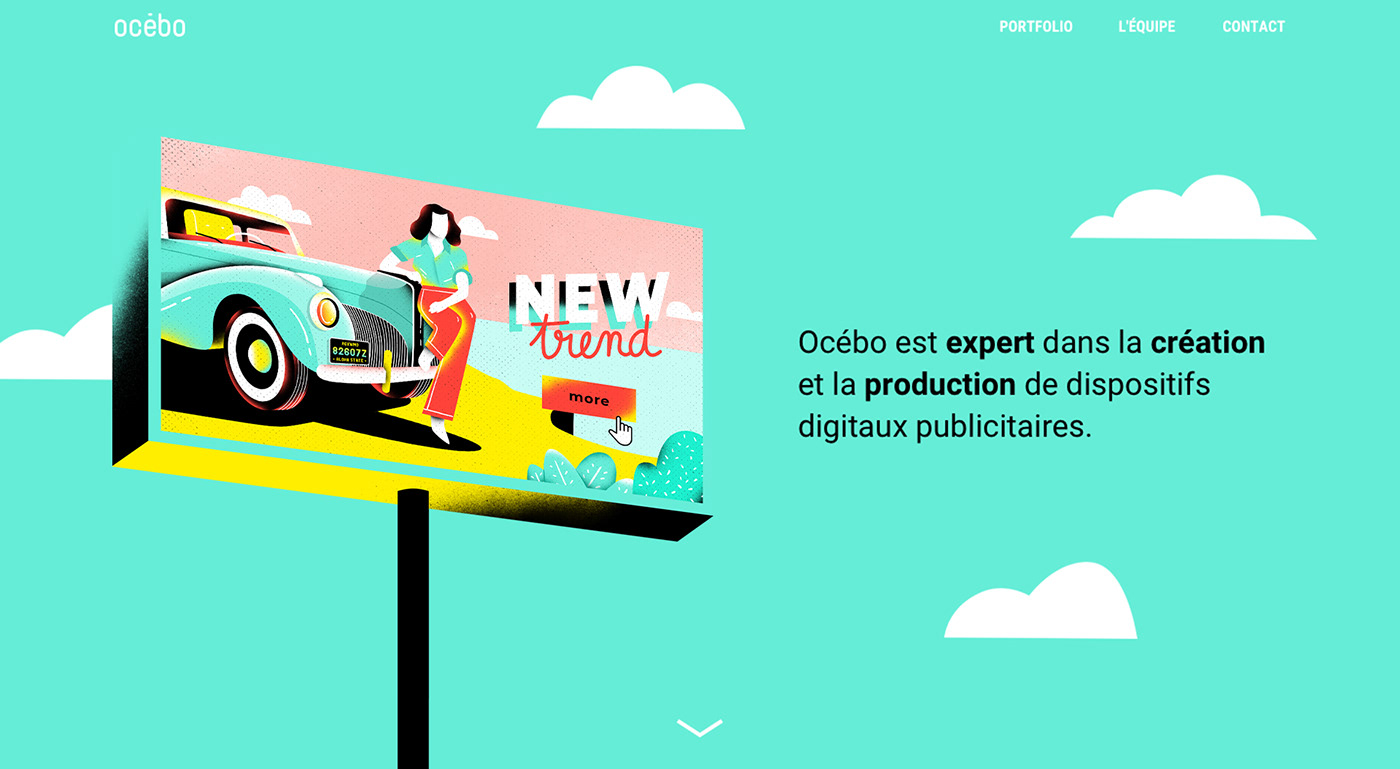
Our portfolio is mainly about digital advertisings, we designed a home page with illustrations to have a graphic consistency. These illustrations refer to both vintage and digital advertisements. I also customized team portraits depending on our job, our personality or our hobby.


Thanks for watching!
Branding + illustration: Jenny Lelong
UI-UX: Achille Delobbel
Motion design: Anthony Barre
Production: Ocebo
Branding + illustration: Jenny Lelong
UI-UX: Achille Delobbel
Motion design: Anthony Barre
Production: Ocebo


