


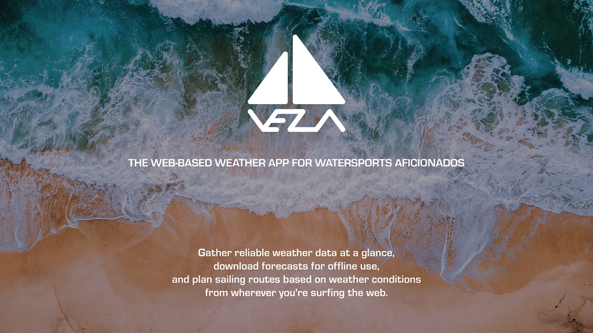
Introduction
As part of the CareerFoundry UX Design course, I chose to create a weather app for watersports aficionados: VELA, a responsive web app that follows the mobile-first approach.
Problem Statement
Our weather app users need a way to access well-organized and reliable weather data while preparing for watersports and being offshore because they wish to be able to quickly review forecasts as well as present maritime conditions for safety reasons irrespective of their current location.
We will know this to be true when we see how many sailors, surfers and divers are using our app for planning and organizing their watersports activities according to current weather conditions.
Potential Solutions
An app that allows sailors, surfers, and divers to access reliable weather data in a time-efficient and flexible manner.
Weather forecasts and information about maritime conditions will be available in real-time but also as downloads so they can be used without Wi-Fi access.
Weather data overviews will be customizable according to individual needs in order to reduce complexity.
Research
Competitive Analysis
I started research by performing a competitive analysis of two products and by reviewing app store comments by weather app users, both of which served as the basis for setting up user stories.


Interviews
Following the competitive analysis, I conducted three interviews with potential users via Skype. The purpose of these interviews was to
1) better understand the user behaviors and expectations around watersports activities,
2) determine what tasks potential users would like to be able to complete while using a weather
forecast app for watersports aficionados, and
3) collect data about the context in which potential users would use the app.
The outcome of the interviews was then structured by means of affinity mapping.


User Personas
Based upon the organized interview data, I designed two user personas and developed user journey maps as well as user flows that catered to the user personas’ needs and requests.


Mobile-First Design Plan
The above documents served as the basis for the mobile-first plan and the development of the app’s core features.


Design
Following the research phase, I performed an online card sort study to evaluate what might be the best solution for organizing the information architecture of VELA. By means of rapid prototyping I then created the first sketches for VELA on paper for both the mobile and desktop versions.
Mobile Sketches


Desktop Sketches


After the first steps of the design process, I created the first iteration of grayscale high-fidelity wireframes for the mobile and desktop versions of VELA which already varied significantly from the early sketches. These would eventually become the prototypes for the first usability test. Along with the wireframes, I also created an early version of the sitemap.
First Mobile Wireframes


First Desktop Wireframes


Early Sitemap

Testing & Iterations
Usability Test
The goal of the usability test was to assess the learnability for new users interacting with VELA for the first time on mobile and desktop devices. The test objectives were
1) to determine if participants understand what the responsive web app is about in a quick and easy manner and the value it provides,
2) to observe how seamless the sign-up process can be performed and whether the subsequent onboarding slides provide sufficient information for first-time users, and
3) to observe how participants navigate through the app and find information about how to display and export forecast data, and travel routes.
The study tested six participants who were recruited via the personal network and the hallway testing method. Five tests were conducted as moderated remote usability tests, one test was conducted as a moderated in-person usability test. Participants engaged in test sessions with an average duration of 44 minutes. Three participants began by testing the mobile version and then test the desktop version of the app. The other three participants began by testing the desktop version first.
Errors were measured using Jakob Nielsen’s scale:
0 = I don’t agree that this is a usability problem at all
1 = Cosmetic problem only: need not be fixed unless extra time is available on project
2 = Minor usability problem: fixing this should be given low priority
3 = Major usability problem: important to fix and should be given high priority
4 = Usability catastrophe: imperative to fix before product can be released
Satisfaction was also measured using the Single Ease Question 7-point rating scale after each completed task.
Before creating test result documents, the outcome of the study was organized by means of affinity mapping.


Usability Test Results


Revisited Wireframes
In accordance with the test results and the participants’ feedback I designed a new and colored iteration of wireframes. Improvements were applied to the onboarding slides, the desktop navigation bar, the way the user can toggle between map and diagram view, the ‘Download GIF’ option, and the route planning process. The latter now featured modified travel details, the option to add stopovers and to download the route plan as an image file. The first colored iteration also allowed for using the weather parameter list in diagram view as a color-coded legend.
Samples of the Mobile Iteration


Samples of the Desktop Iteration


Native App Version for Android
After I refined the wireframes and prototypes, I decided to design a native app version of VELA for Android according to Material Design Guidelines. The design decisions made during this iteration would also inform later refinements of the responsive web app version, particularly with regard to the menu structure.


Sign-Up Process for Android.


Onboarding Process for Android.


Selecting Forecast Model for Android.


Download Forecast as GIF for Android.
Preference Test
Next, I conducted a preference test to decide upon what version of the introduction screen to use. Version 1 included two buttons: one for signing up, one for logging in. Version 2 only featured one sign up button, modified text, and different vertical spacing between the single elements, such as the logo, the text, and the button. Participants were asked to pick their favorite design and to briefly explain their choice.


Left: version 1 of the introduction screen; right: version 2 of the introduction screen.

With 10 out of 15 participants opting for the introduction screen only needing one CTA button, the preference test turned out to be an unambiguous vote for the second design option.
Onboarding Notes
Independent of the usability and preference tests, I decided to modify the way onboarding notes are displayed to increase the focus on the function that is being explained. In their first iteration, the onboarding notes were modeled after a pop-up window. In the following iterations the onboarding note principle was reversed. The screens that feature an annotation now appear to be masked with a darkening and blurring overlay that draws the attention to the still visible and relevant section.


Left: First iteration of the annotated Forecast Models screen; right: latest iteration of the same screen.
Peer Review
After further iterations of the prototype that mostly involved visual modifications, I conducted a peer review to test which areas of the app remained to be improved. Four participants engaged in the peer review that featured an interactive prototype of the mobile version made of 238 wireframes. According to the participants’ feedback I modified the instructive content on the sign up and log in screens, three onboarding slides, a further onboarding note, the forecast models screen, and the colors in the list of forecast diagram parameters that used to be hard to read.
Samples of Revisited Mobile Wireframes after Peer Review


Accessibility
For the latest iteration of the VELA prototype, I consulted the WCAG guidelines for accessibility to add a speech input option and to improve contrast settings as well as labeling for forms.
Before


After


Documentation
Style Guide


Pattern Library


Latest Prototype
Interactive Prototype
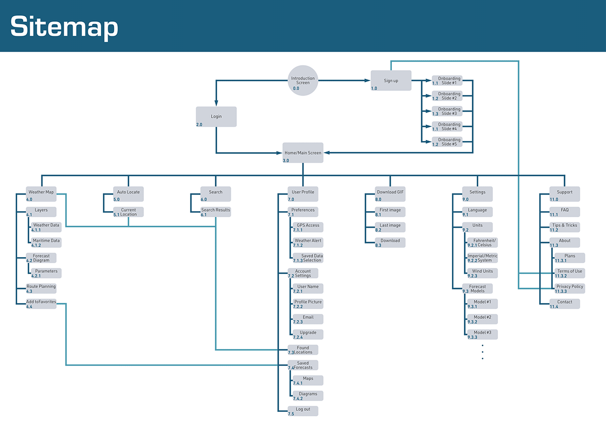
Latest Sitemap
Future Steps
New Hypothesis
Originally, the projected minimum age demographic for this app was supposed to be 16 while the projected upper age range demographic was supposed to be 45. This may have turned out to be a target group that might be too large in terms of demographically related expectations and preferences, particularly with regard to certain design choices. As the app is neither designed to appear particularly playful nor flashy, but rather focused on its purpose, it might not appeal to a younger audience in every respect. This, however, should not come as a surprise, as the potential users that have been interviewed during the user research phase and according to whose needs and requests most features have been developed were closer to the projected upper demographic range.
Validation Strategy
The hypothesis will be validated by performing more usability and preference tests that will also allow for the evaluation of demographic data by asking the participants about what age group they belong to.
Areas that need specific improvements
So far, the design process was almost exclusively focused on those features and functions that arose directly from the user research phase as well as the feedback that resulted from usability and preference tests. There are, however, still a couple of basic features and functions that haven’t been covered yet by prototyping. Among the features in question are in particular: the user profile section as well as language and units settings.
User Testing
Future user testing will include usability tests as well as preference tests. Both will be utilized with regard to not yet existing wireframes of the above mentioned still missing features. Usability tests will be performed to test implemented navigational patterns while preference tests will be utilized to help making aesthetic decisions. New usability tests should be focused on newly added features and functions first. Once the prototype is complete, a final run of usability tests will be performed to evaluate the overall acceptance of features and navigation principles.
Timeline for improvement and implementation
I will dedicate another month to the design of the still missing screens and features. The implementation of the newly designed screens and features will then be tested in the following two weeks. Necessary improvements or refinements will then be designed over the course of another two weeks, so that a final test run with a prototype that contains all basic functions and screens could take place in about two months from now.


