Our Normal
Our Normal want to improve and enrich the lives for families with children with special needs through wider social family networks.
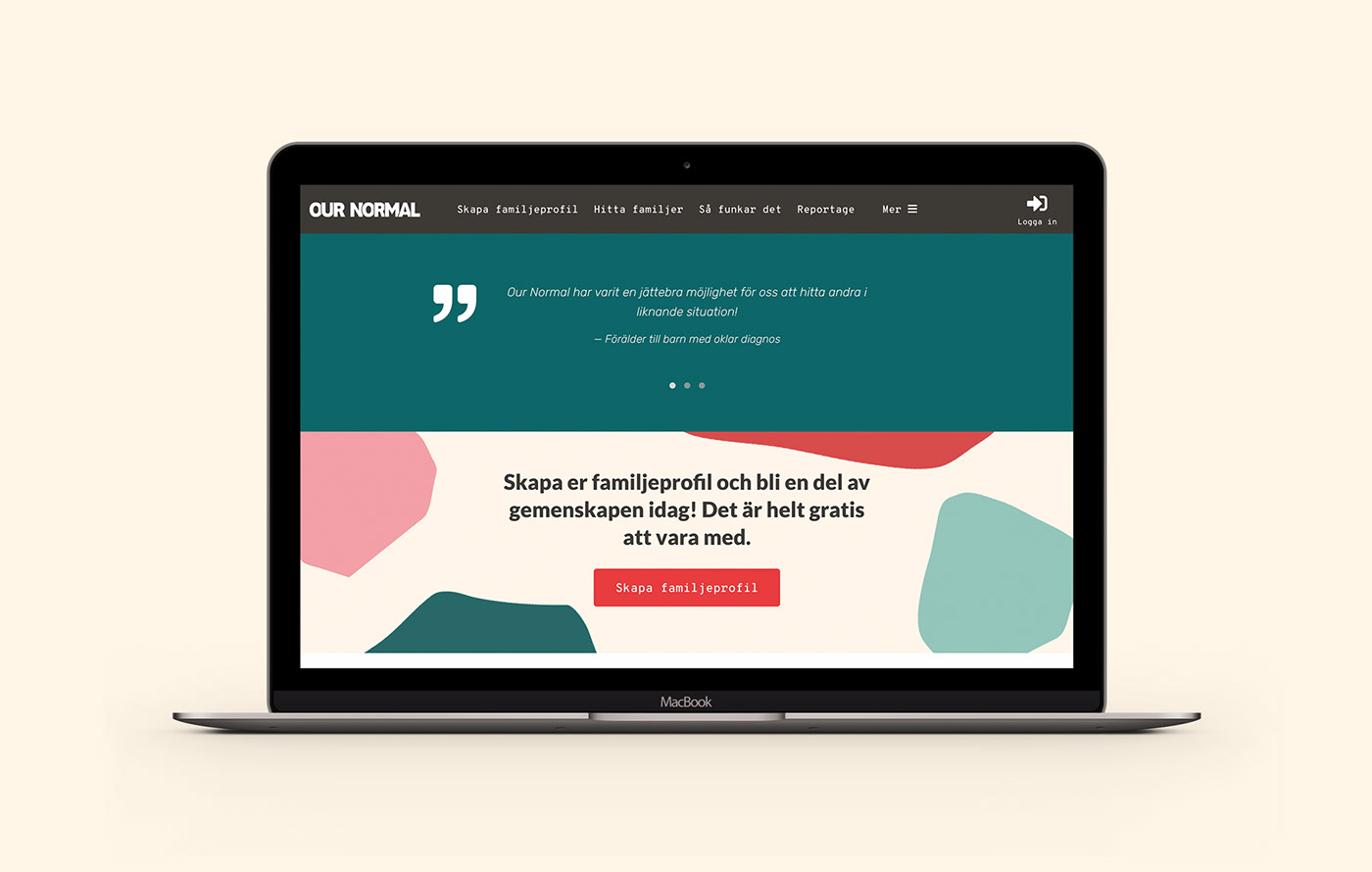
The new identity for Our Normal is loosely based on their first logotype which had a irregular stone shape that represents the diversity of the families and the children. I wanted to keep the stone shape but develop it into a serie of graphic elements rather than just a part of the logotype.
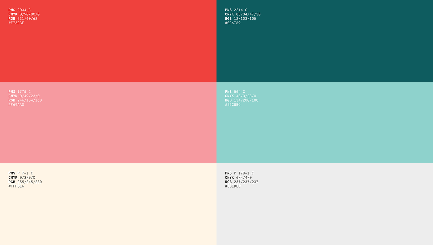
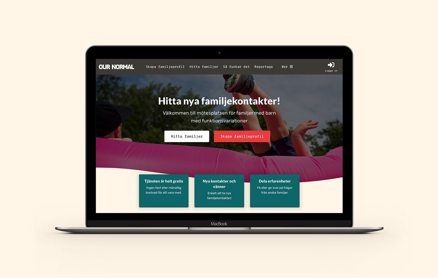
The logotype now represents the network part of the platform with the letters connected. The brand colors are bright and happy and the typography is soft and friendly, giving Our Normal a strong and approachable voice in both the family community but also in the social movement of disability rights.
Creative field(s)
Identity
Illustration
Print production
Identity
Illustration
Print production