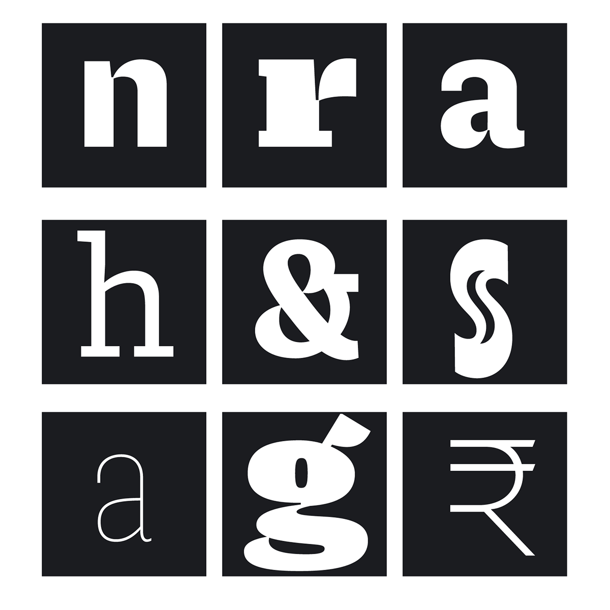
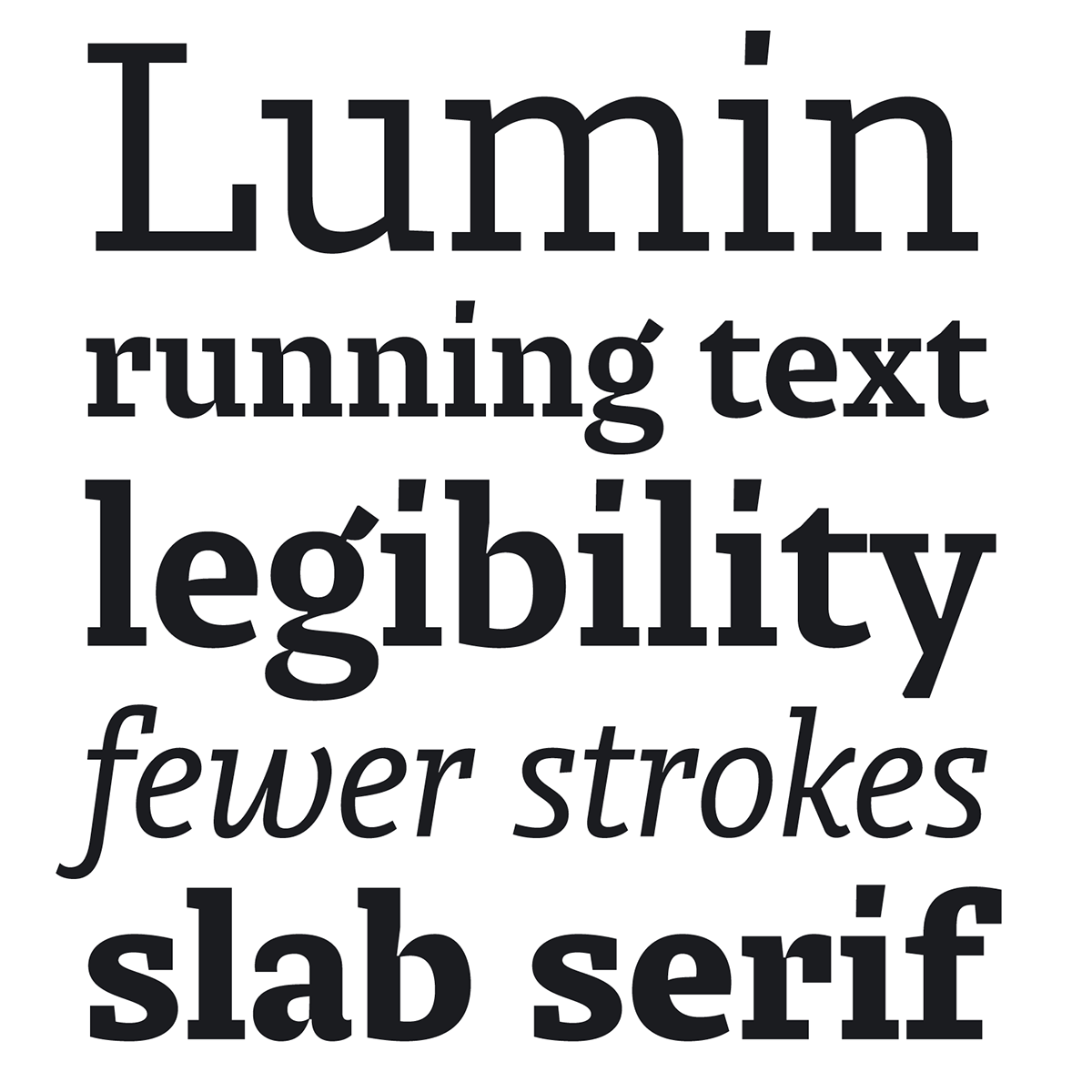
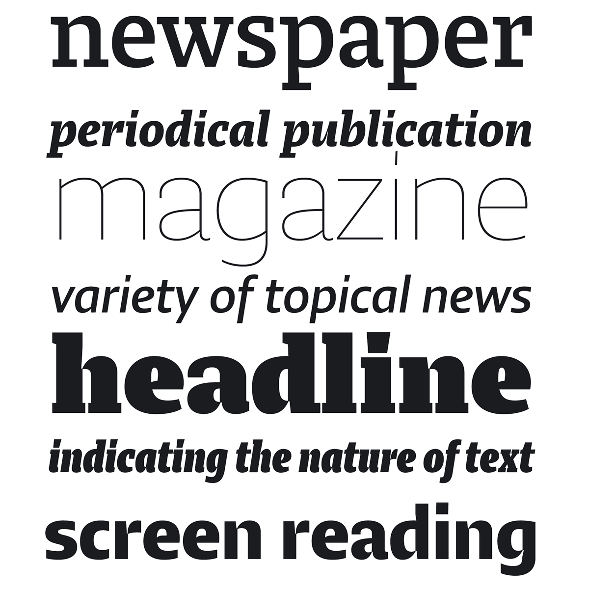
The Lumin family includes slab-serif, sans serif, condensed and display typefaces, all of which play with the idea of contradiction. The contrast between horizontal and vertical strokes seems to be quite subtle, evoking the slab serifs of the past century. The stroke connections, however, are sharply chiseled, reminiscent of high-contrast modern types, an effect especially pronounced in the heavier weights. The result is hybrid letterforms that look almost like stencil drawings, yet maintain high legibility at the smallest sizes.