Brand Identity for the innovation & design consultancy pull.

By innovating great experiences pull helps brands to connect with people deeply and ultimately, make them smile. Our job was to create a brand that transports this empathizing process in a clear and friendly way.


The wordmark is a self-created lettering that speaks a friendly and individual language.
The imagemark is a string to pull on to transport the meaning of the brands name visually. And it´s the initial too, of course.

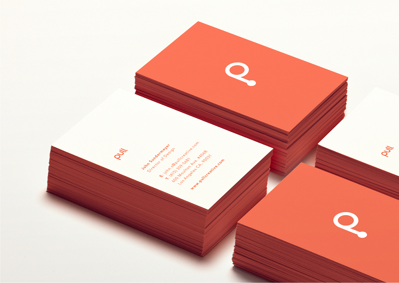

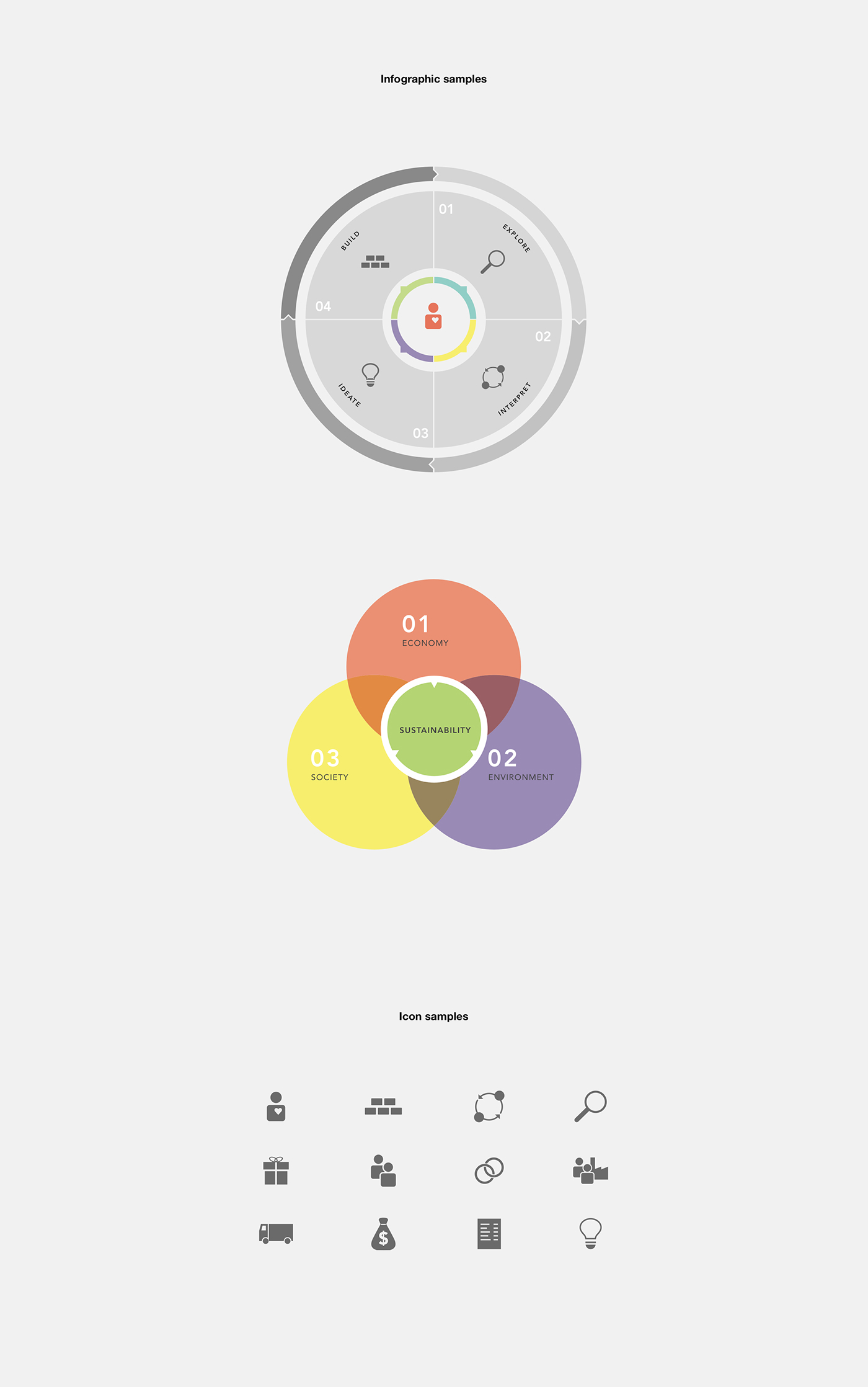
By choosing an intense color combined with light spaces, clear typography and likable infographics we made a Corporate Design that perfectly fits to pull’s approach.


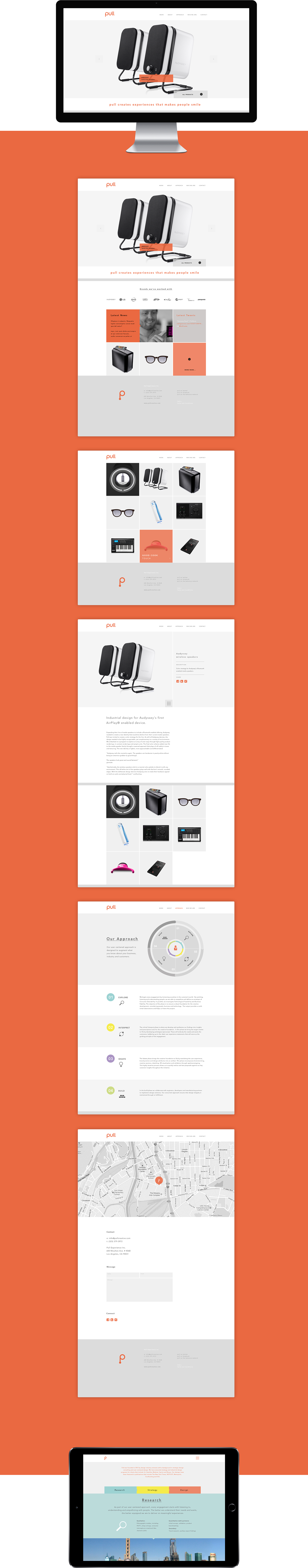
After defining the look & feel we designed the website for pull.