*Personal Project*
Research:
Before creating anything, I first did a bunch of research on Vans including their history, values, core customers, brand messaging and competitors. After this initial research phase, I found 3 major concepts that define the core values of Vans: youth, authenticity and creative expression. I used these 3 concepts to guide my entire creative process.
Problem:
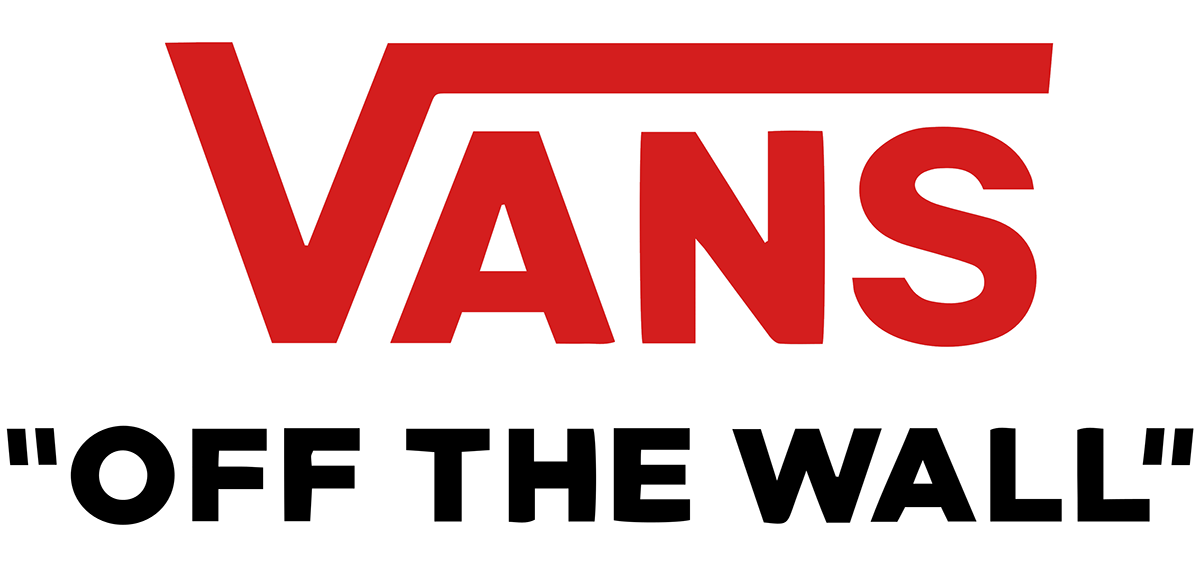
Now that the core values were identified, the next step was to frame the problem so that the design process had a real backbone and wasn't just a redesign for the sake of aesthetics. While I think the current logo is fantastic as it is, it seems to be a bit too clinical and boring. I can see how this kind of logo would appeal to a large company like Vans that is trying to expand its business into more than just "skateboarder shoes". However, I think the original values of the brand aren't reflected so well and the personality is lost. On the other side of things is the older skateboard logo (see mood board below), which has tons of personality but communicates too much to a specific demographic, skaters. With this in mind I framed to project goal as follows...
Goal: To redesign the current logo to better represent the roots of Vans as a symbol of youth, authenticity and creative expression.
Constraints:
1) The hugely iconic V with the horizontal extension must be preserved.
2) The logo colors must remain the same.
3) The logo must not contain any overtly skateboard-related imagery (i.e. it should appeal to a wider audience)
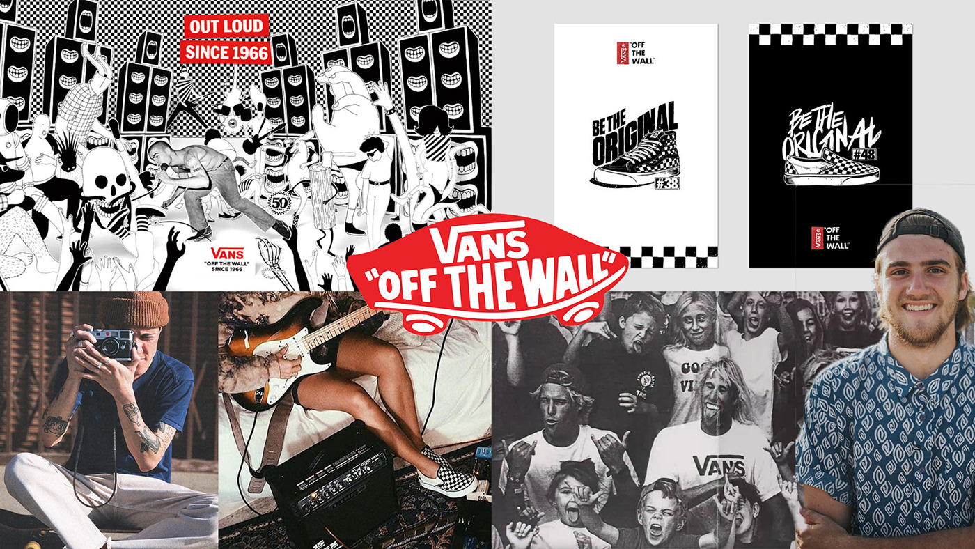
Mood Board:
At this point I gathered a bunch of images to use as inspiration for the visual style of Vans. Most of the photos I gathered came from Unsplash (free stock photo site), Pinterest and the Vans Instagram account. I then selected a few key images to create a mood board that served as a visual reference. I routinely referred back to this board (along with the 3 key words from earlier) to remind myself of the overall look I was going for.
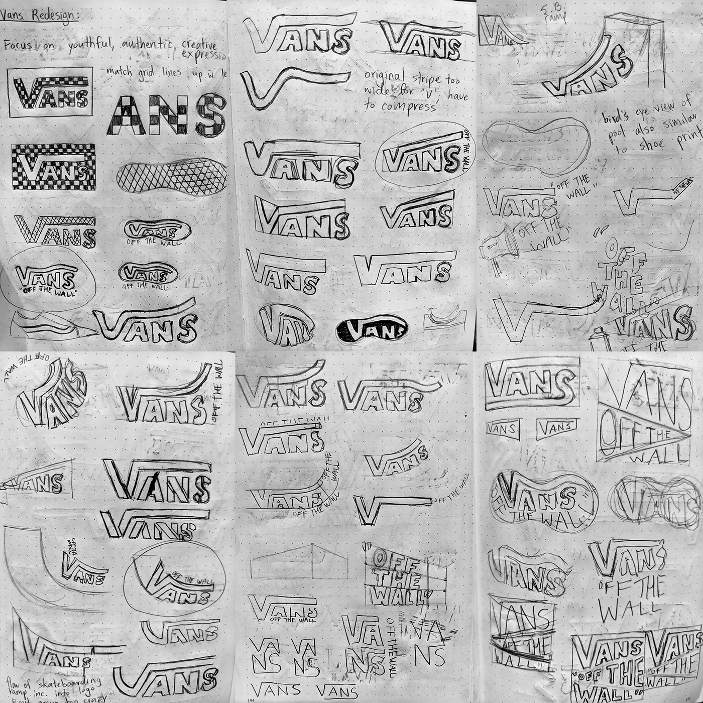
Sketching:
At this point all the research along with the images from the mood board have been floating around in my head, generating a lot of ideas that could finally be transferred onto paper. At first my sketching process was a bit more structured so that every sketch had a solid concept behind it (ex. focusing on the waffle pattern of the shoe, the curve of a skateboard ramp, bending the V to resemble the curved line on the old skool shoes). After all those ideas were exhausted I started to get more experimental and just started drawing anything that came to my mind. I went back and forth between these two approaches and somewhere in between, some effective logos started to show up on the page.This whole process took place over a few days, as it is very important to give your mind some time to rest and refocus so that new ideas can emerge.
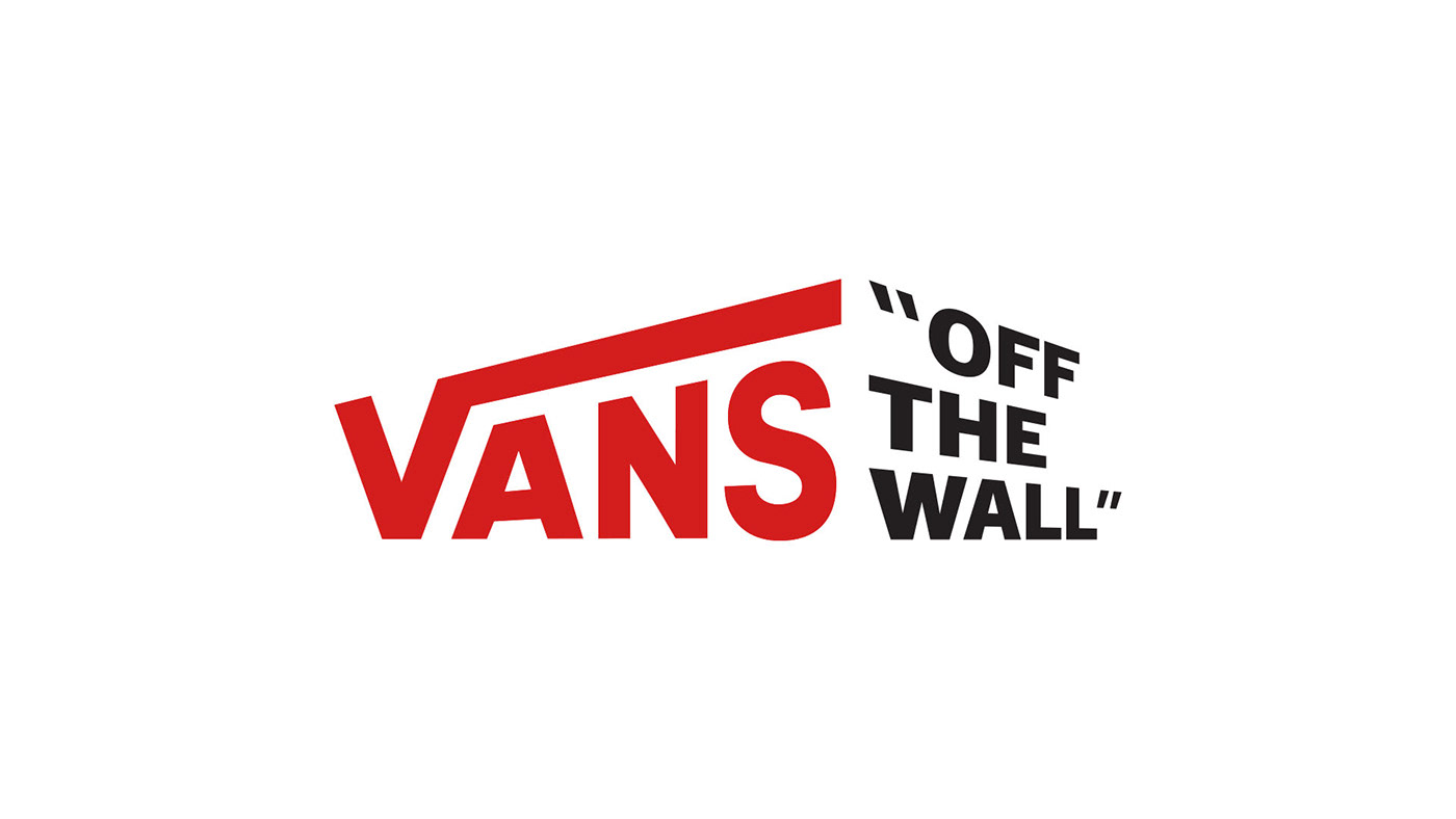
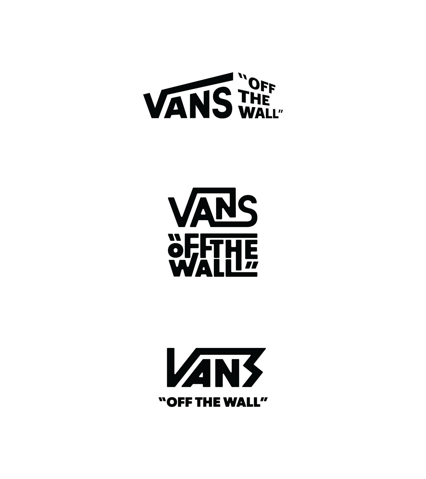
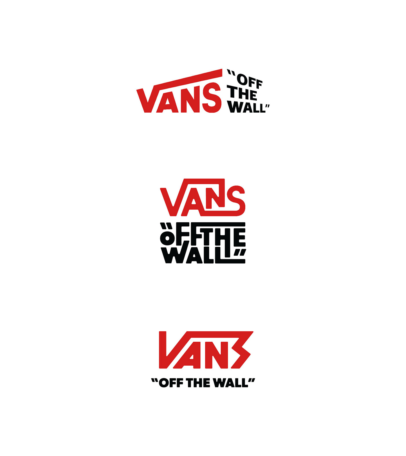
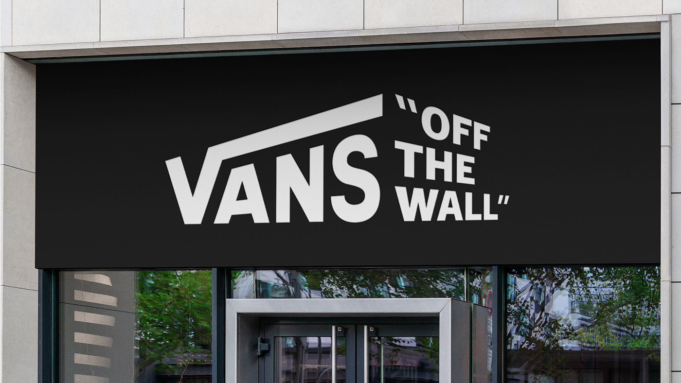
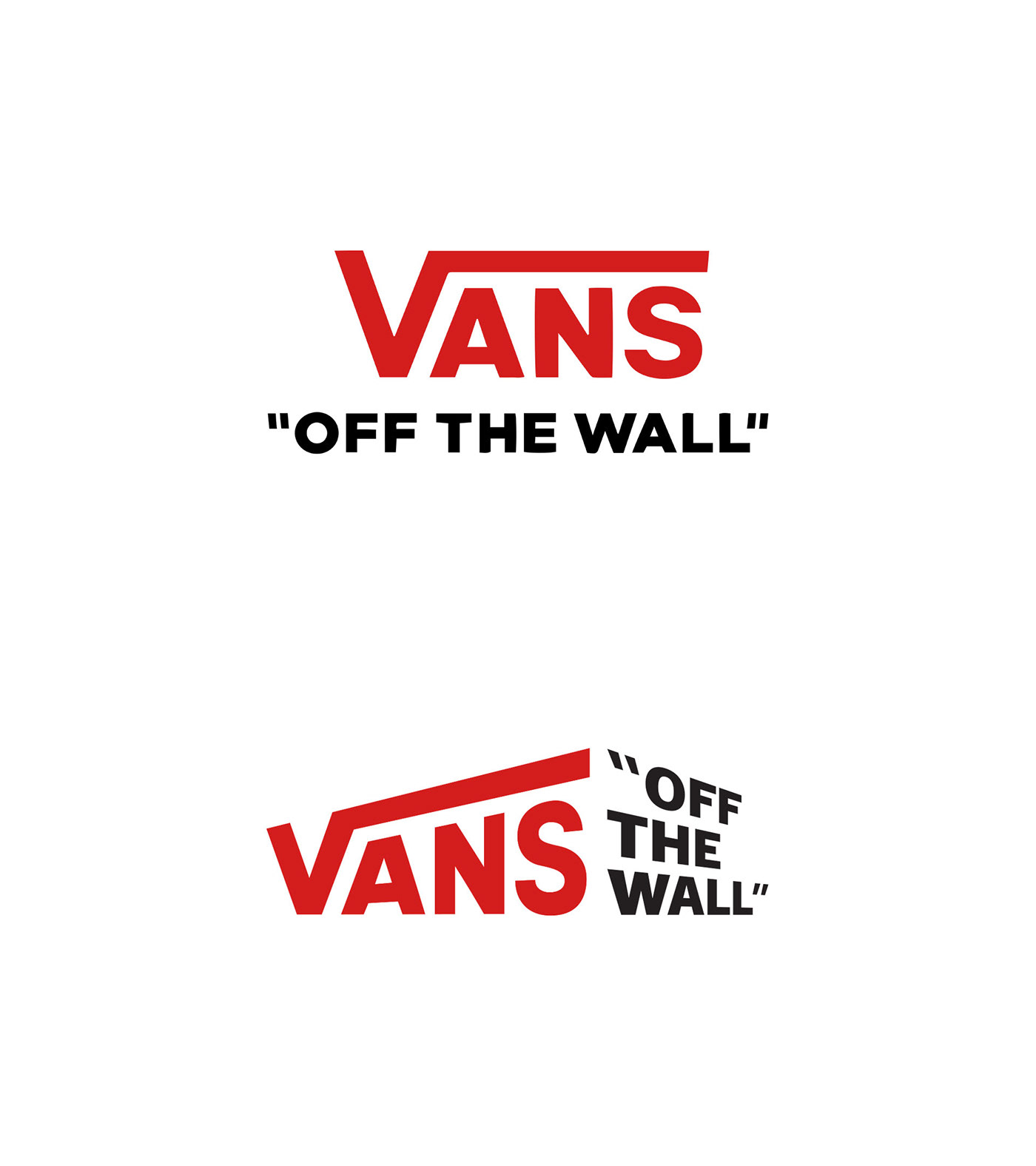
Option 1:
For the first option I took the awesome movement created by the iconic V and exaggerated it to give the logo more energy. The tagline helps convey the 3D in-your-face look.
Option 2:
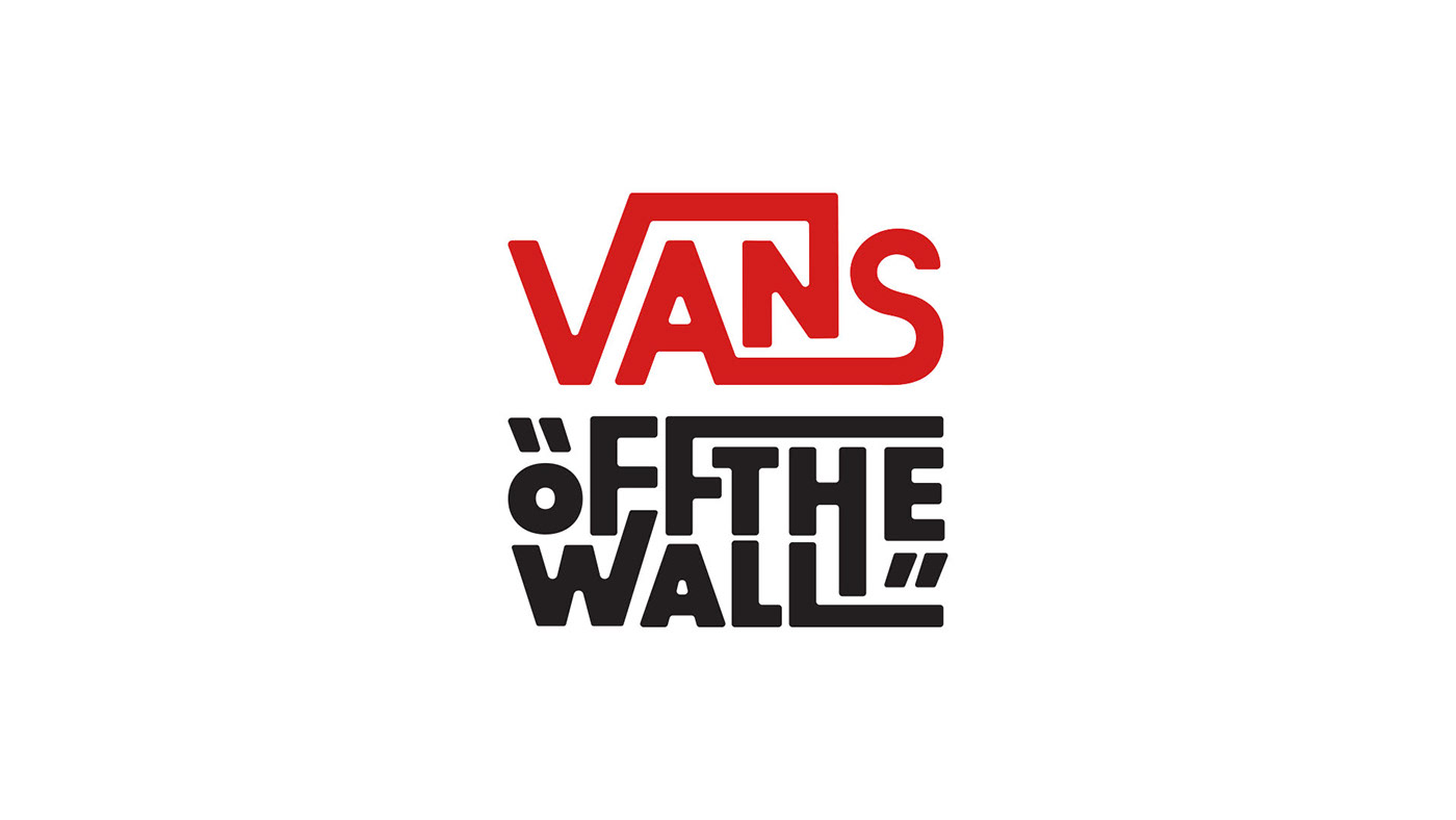
The second option gives off a 70s style that I think looks really interesting. The letters were shortened, bent and extended to fill more of the negative space, giving everything a more dynamic look. The Vans logotype along with the tag line fit together nicely within a square.
Option 3:
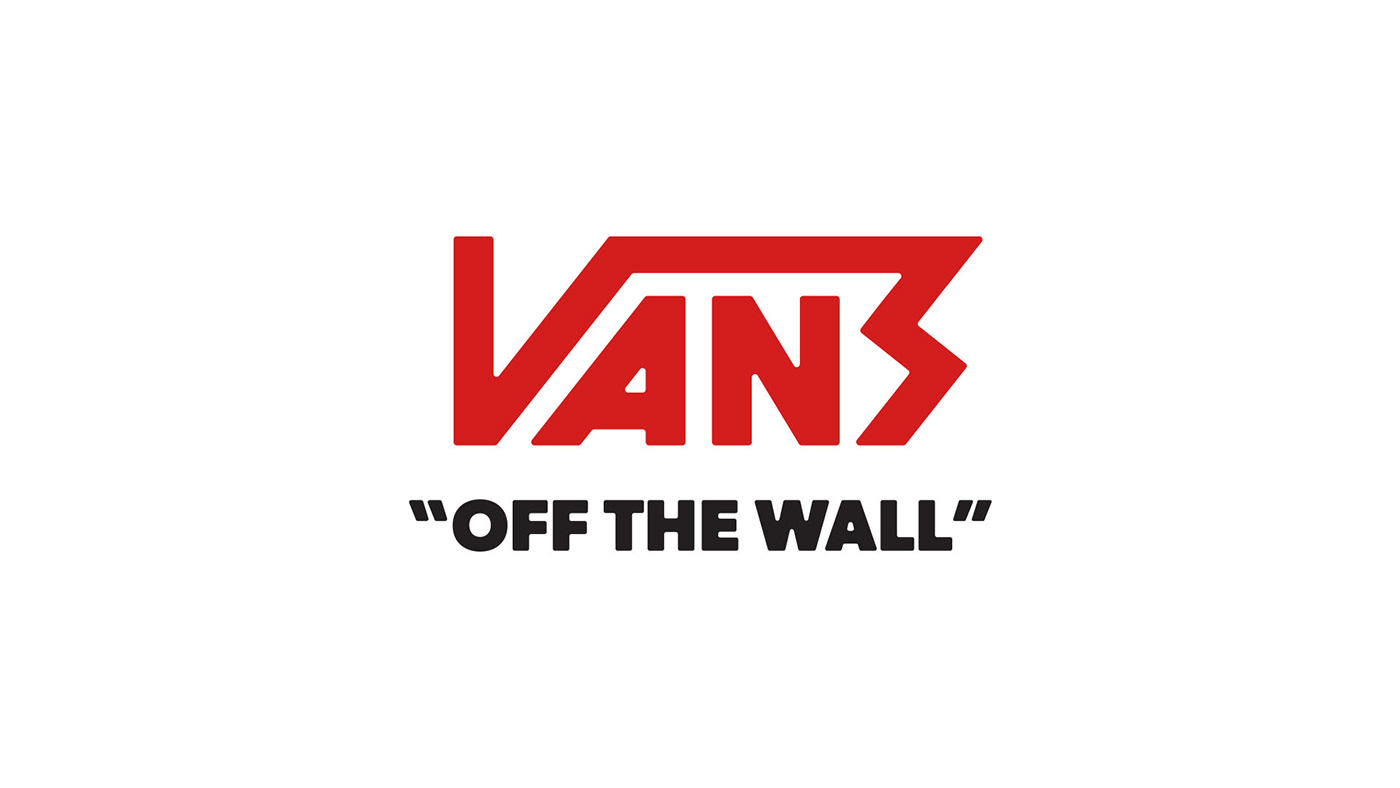
For this final option I wanted to go for something really thick and bold. The lightning-bolt looking S gives the logo lots of energy, definitely calling back to 80s hard rock and heavy metal style (but not so over the top, of course).
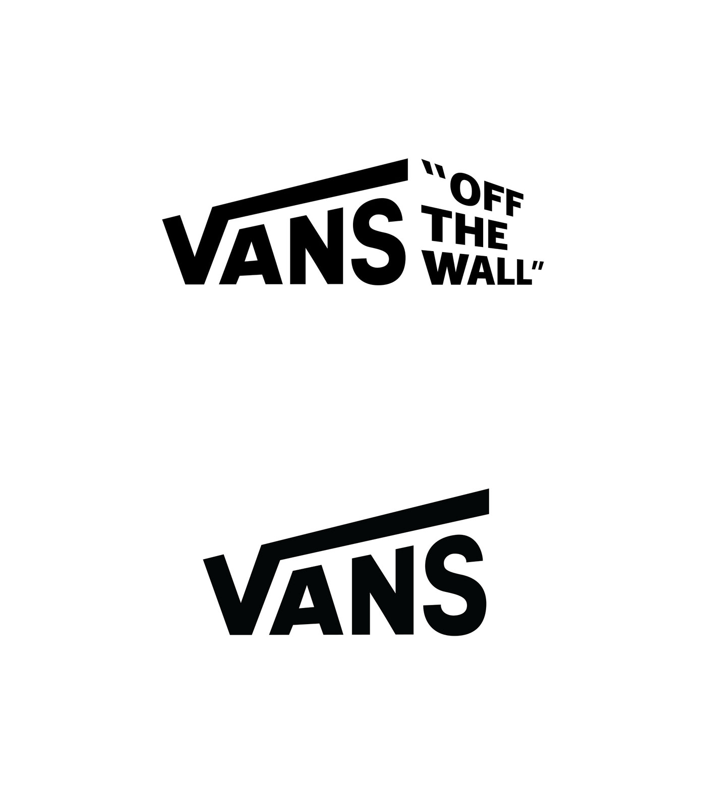
Final Choice:
While I think any 3 of these options would be effective, logo #1 is the clear choice for me. It retains most of the original's look while infusing a lot more of that youthful energy. I think most people would still easily recognize the new logo as Vans, but now get a better sense of the brand's personality. It also still works when the tagline is removed, which may be necessary for certain applications.
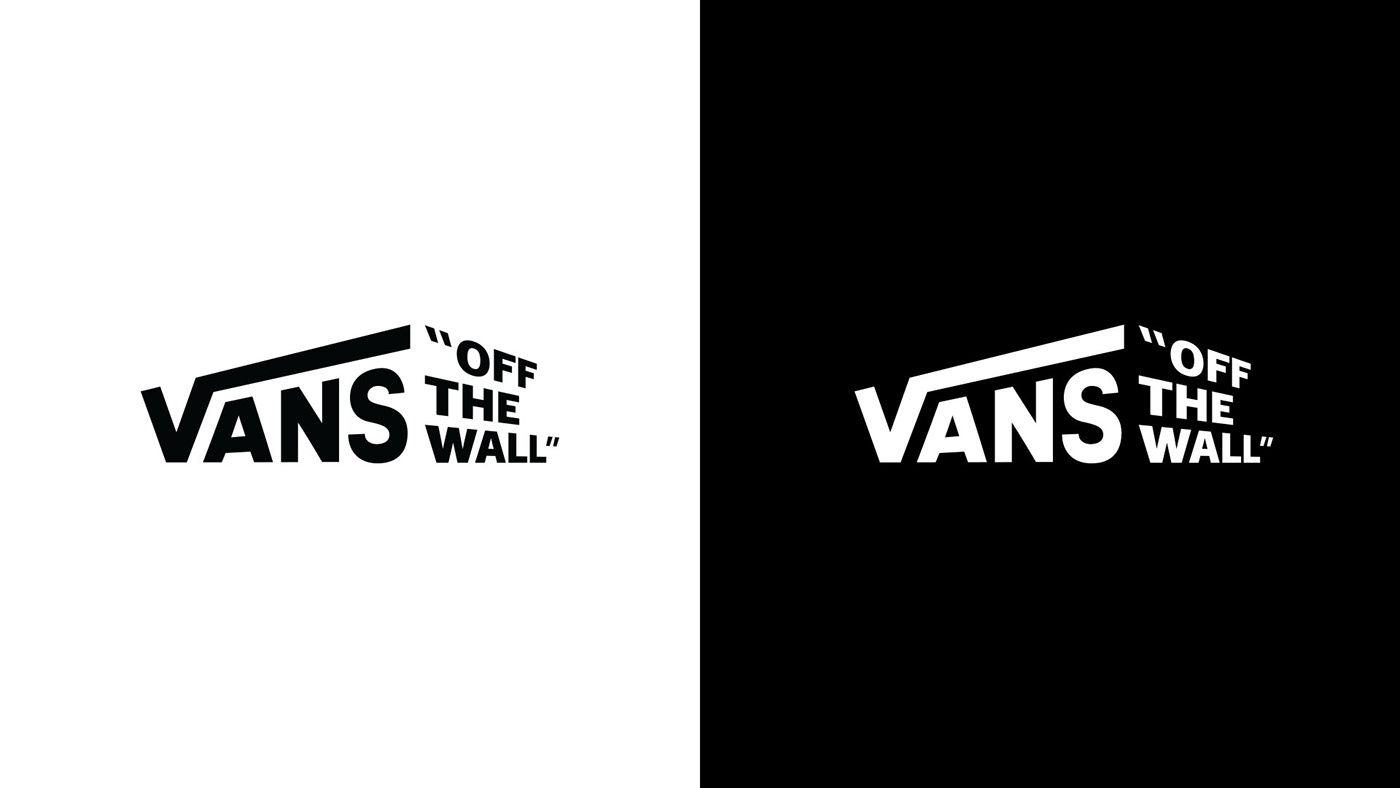
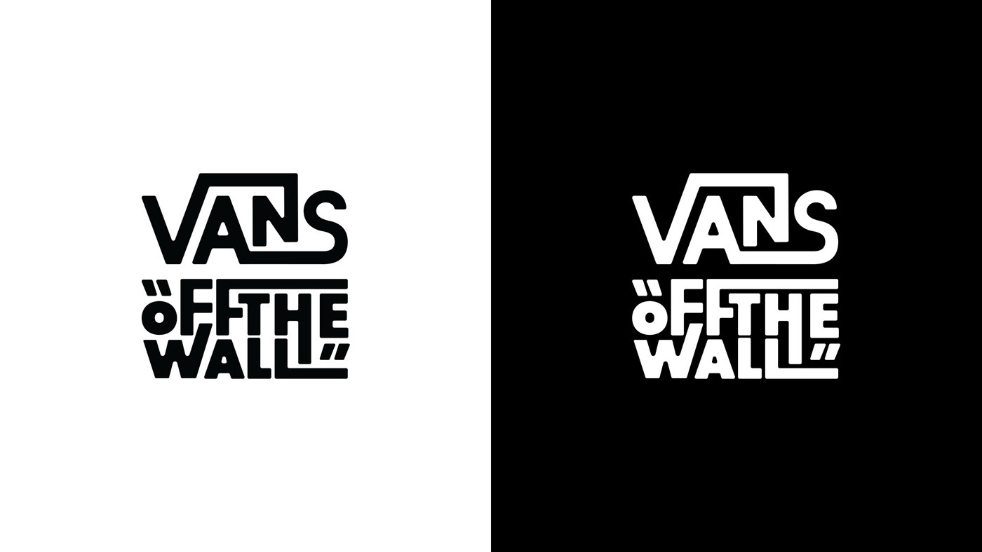
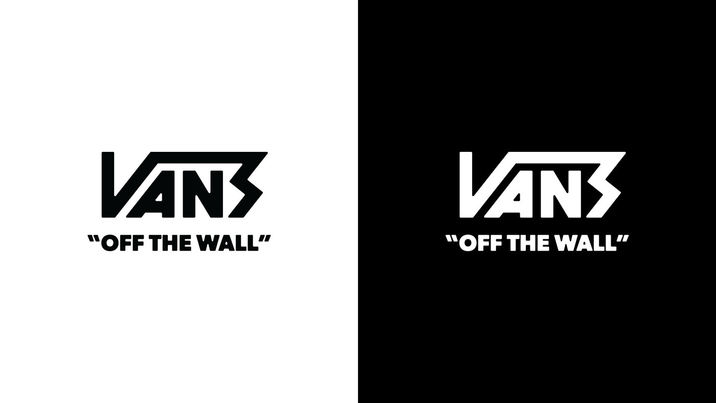
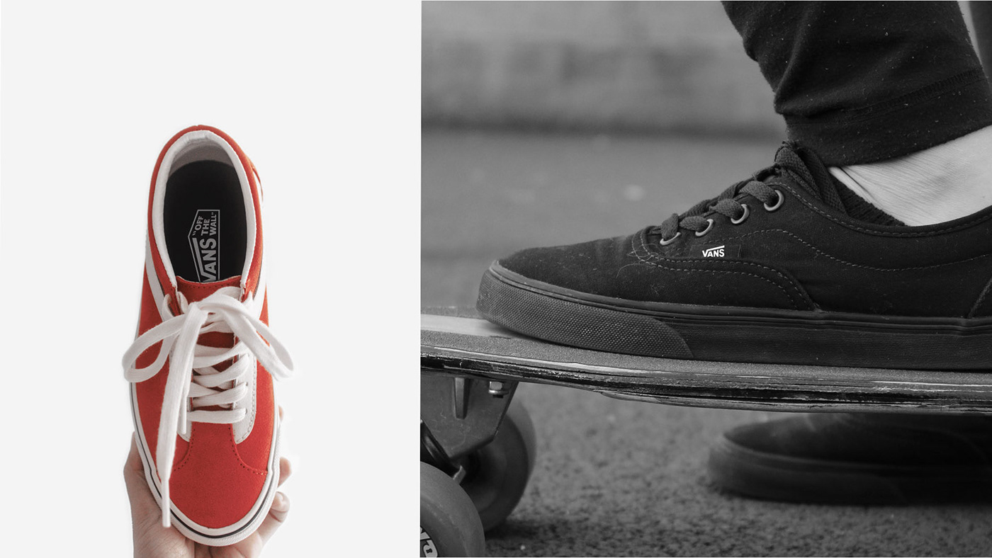
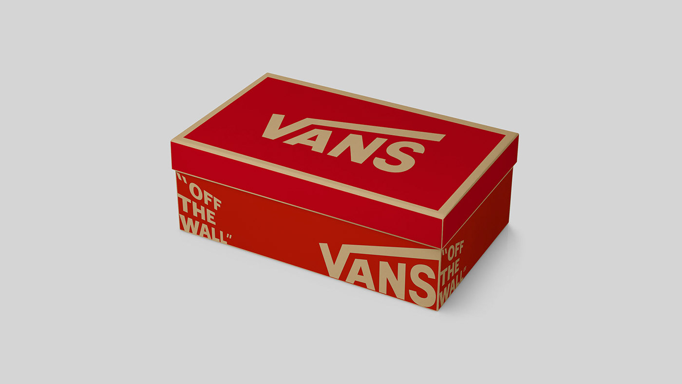
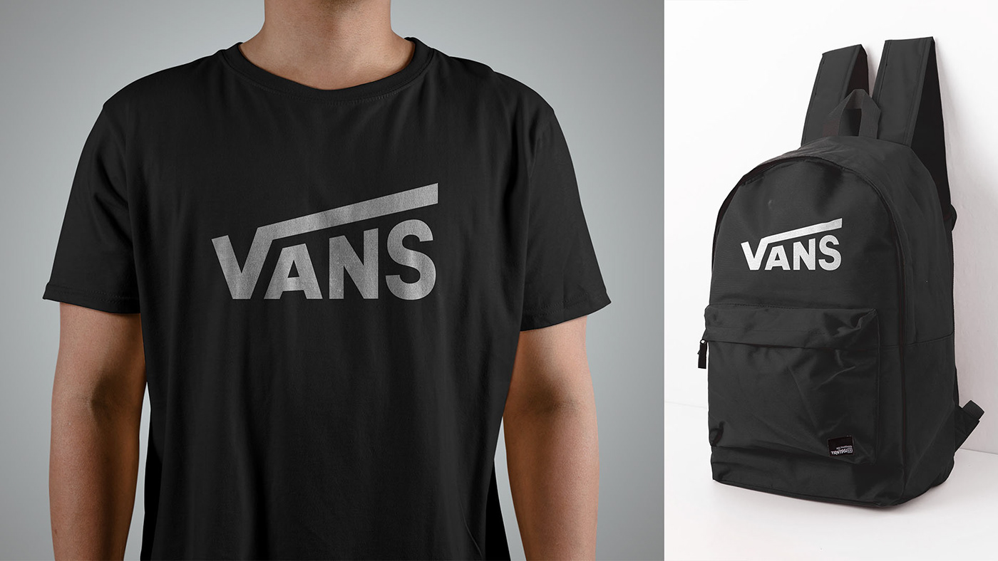
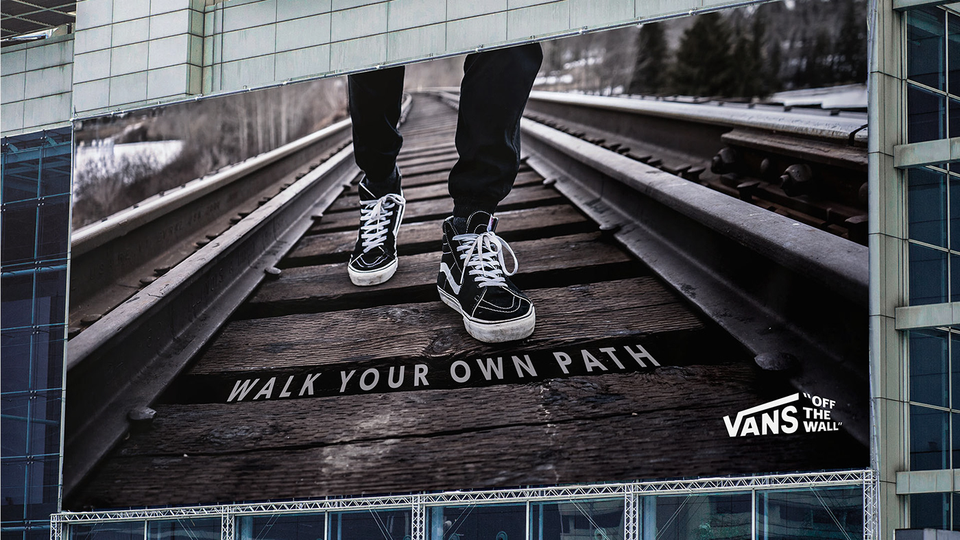
Mock ups:
The following mock ups are used to show how the logo would look in small, medium and large-scale applications. It is always important to consider how the logo would be used in the real world.
Final Thoughts:
This is definitely the biggest design project I've tackled so far. I put a lot more focus into the initial research and exploration stages than I typically do, and it has really proven to be helpful for generating better ideas. I really hope you enjoyed seeing the process as much as I enjoyed doing it, even if you don't agree with my choices. Any feedback is sincerely appreciated!
Have a nice day :)


