Phalomedic
BRANDING | PHALOMEDIC | JULY - AUGUST 2019
Phalomedic is a pharmeceutical company that focuses on researching and handling distribution of medicines to hospitals, medical stations, and pharmaceutical retailers mainly in Ho Chi Minh City and other areas of Southern Vietnam.

THE ASSIGNMENT
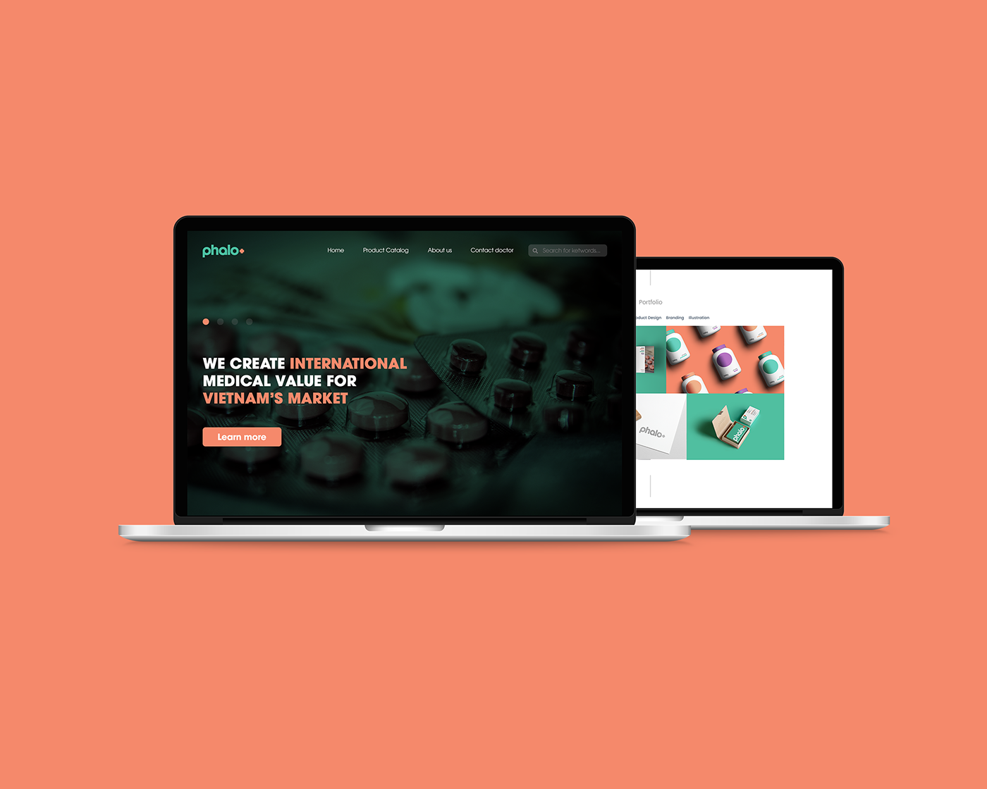
With the mission to enrich and empower domestic pharmaceutical scene in Vietnam against imported products, Phalomedic wanted to venture on a distinct and friendlier approach compared to its local competitors by creating an efficient, pleasing, and diverse brand that speaks to both the corporate enterprises and the average Joe.

THE CONCEPTION & SOLUTION
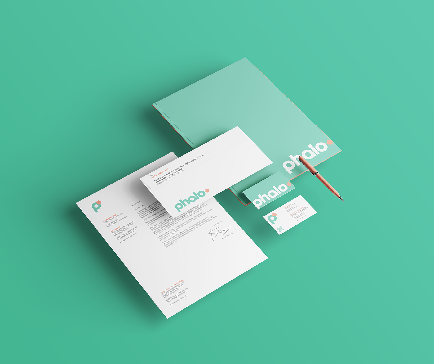
A medical business at its core, Phalomedic is still best represented through an international medical symbol: the cross. Nevertheless, the brand looked into differentiating Phalomedic as a diverse distributor with an array of product lines and as a visually engaging retailer.
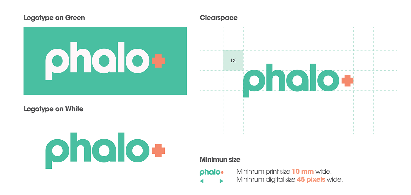
Hence, the logo consists of the chosen typeface, modified to be more pleasing and welcoming, and the symbolized cross. By using more than the conventional two-color color scheme, the brand expects to reach its ample nature through the use of the third.