

Background
The aim of this program is to raise the awareness of cancer. The target audience are the young boys and teenagers with the age between 10-20 years old. The client is the German Cancer Aid. The project has not been considered by the client.
Concept
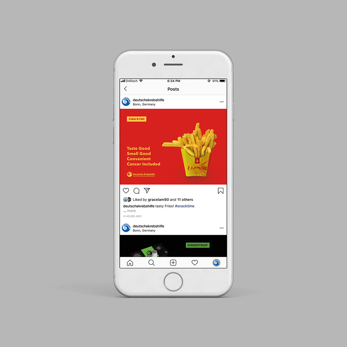
The concept of this project is to design 3 product advertisements. They are cigarette, fries and beer. They are unhealthy products and may cause cancer. The advertisements will look genuine and will have no difference with the normal product advertisements. "Cancer" elements will be put inside the advertisements subtly.
Cancer cell silhouette shapes is one of the design elements of the package design. The viewer will not notice it at the first glance. Also the product descriptions, "Cigarette for Boys" and "Beer for boys" are controversial and eye-catching. They will attract the viewer and the viewer will try to find out what is going on. Besides that, the selling points of the products always have "Cancer Included" at the end.
When the viewers see the advertisements, they will treat them as normal advertisements. But then they will be surprised by the "cancer" elements inside the advertisement.
Typography
The target audience of this campaign are the teenagers and boys. They are active, sporty, do not follow rules and energetic.
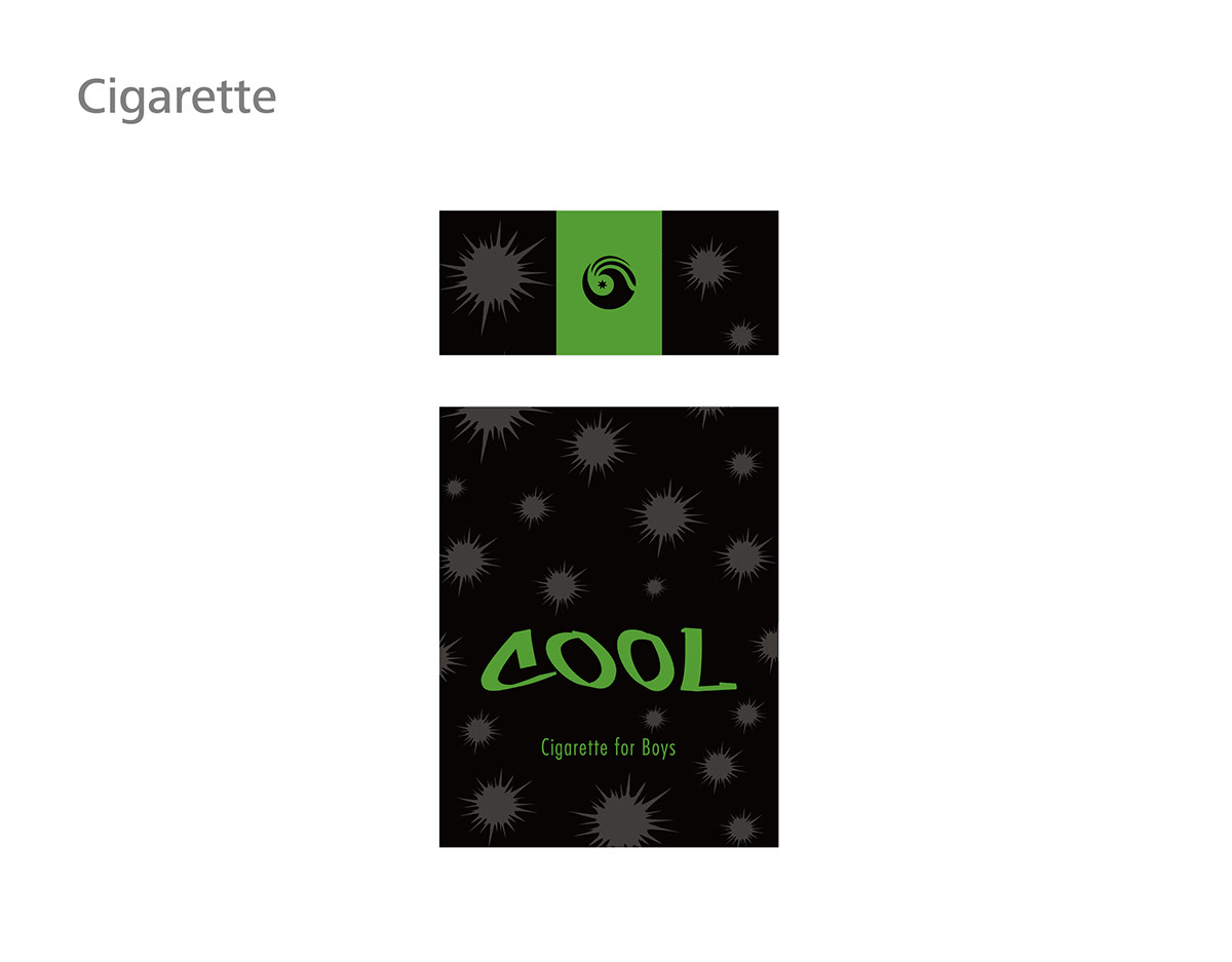
A graffiti font is used in the brand of products. The appearance of this graffiti font is wild and powerful and not in order. This font is a good fit to describe the teenagers.
Futura font is used at the product description in the product. Futura font is a ordered font and based on geometric shapes. It has a nice contrast with the wild graffiti font.
Avenir font is used at the advertisement. It has good proportion and look very modern. This font is a "wide" font in shape and it fits the landscape orientation advertisement.

Cancer cell
A silhouette of cancer cell will be used in the package design of products.
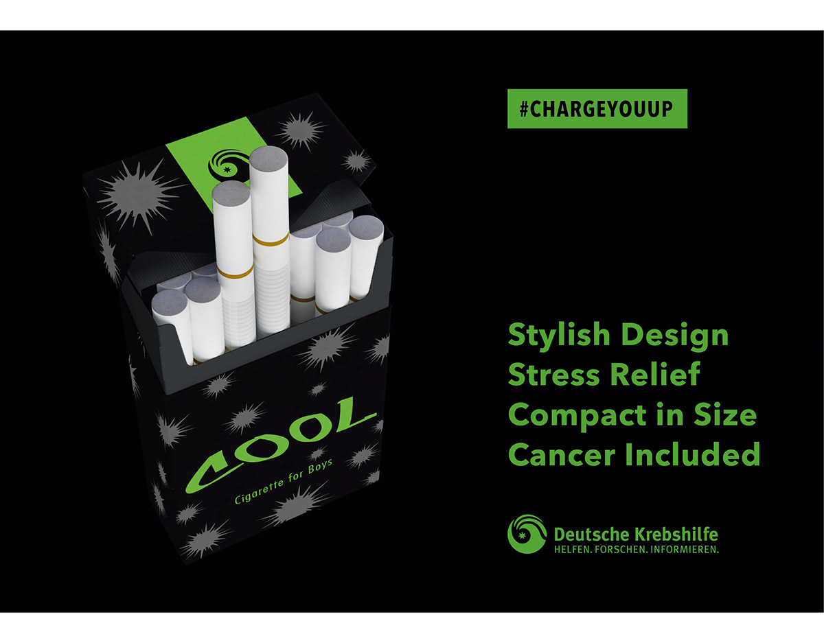
In the cigarette package, this cancer cell shapes are placed randomly over the package.
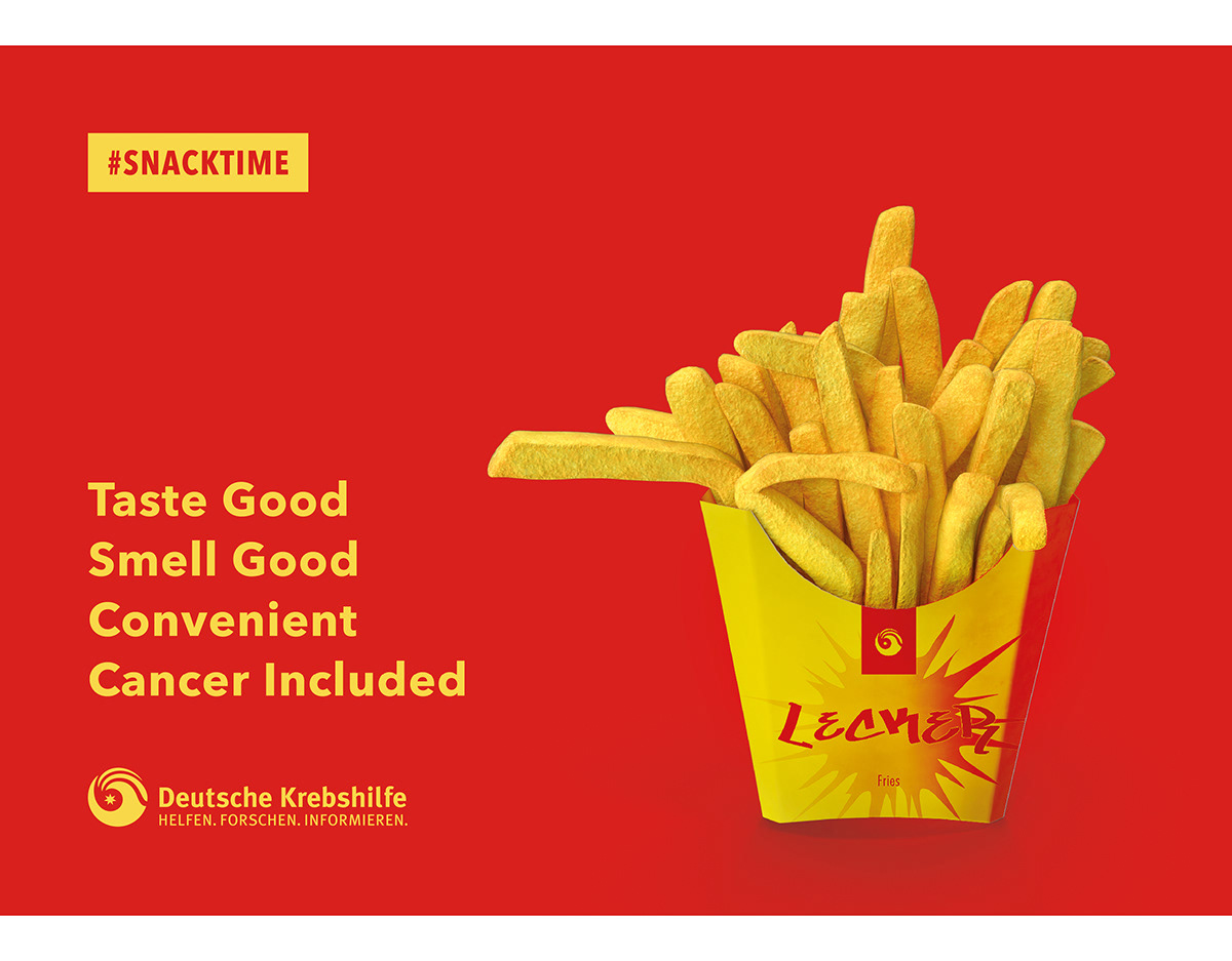
In the fries, one big cancer shell shape is placed at the middle. The shape also has a connection with the splashed cheese/ketchup sauce.
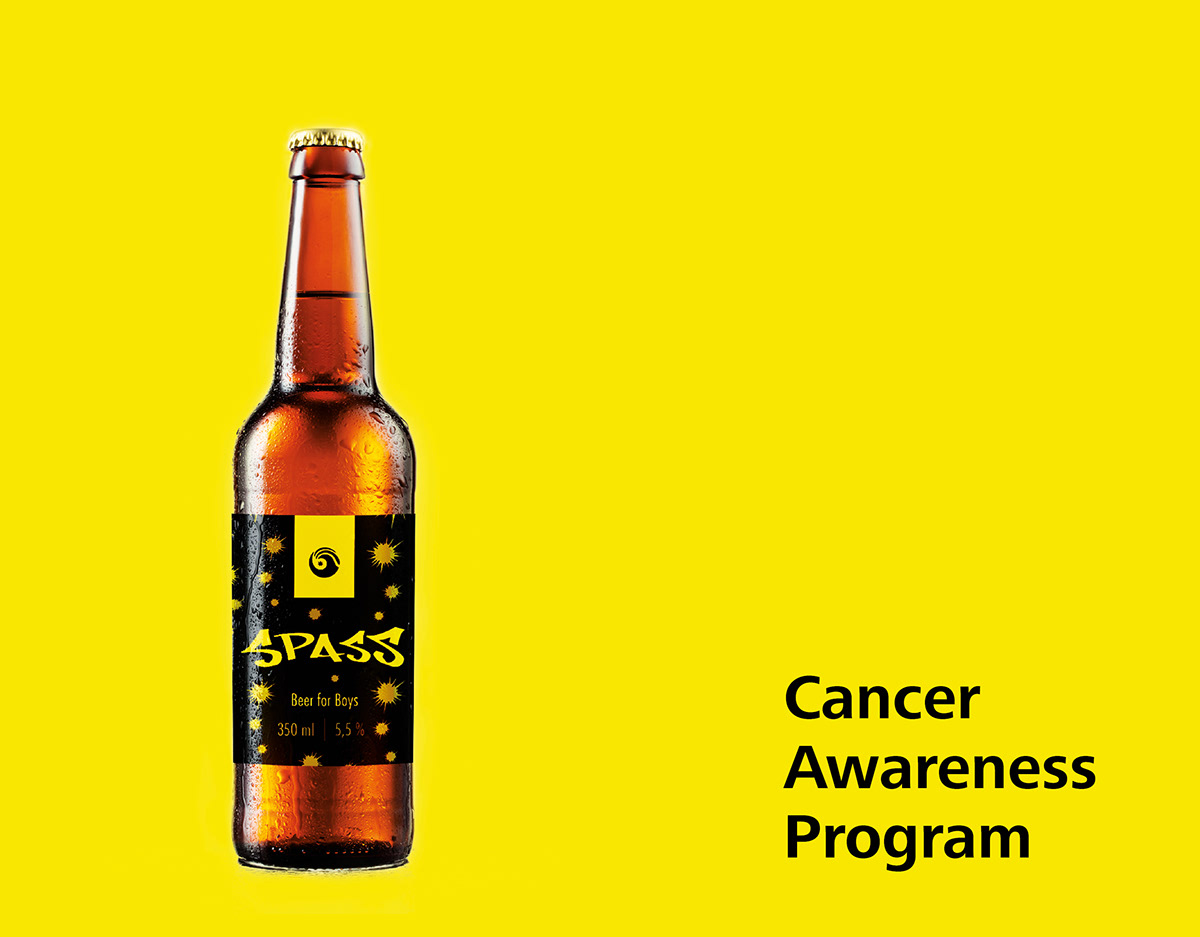
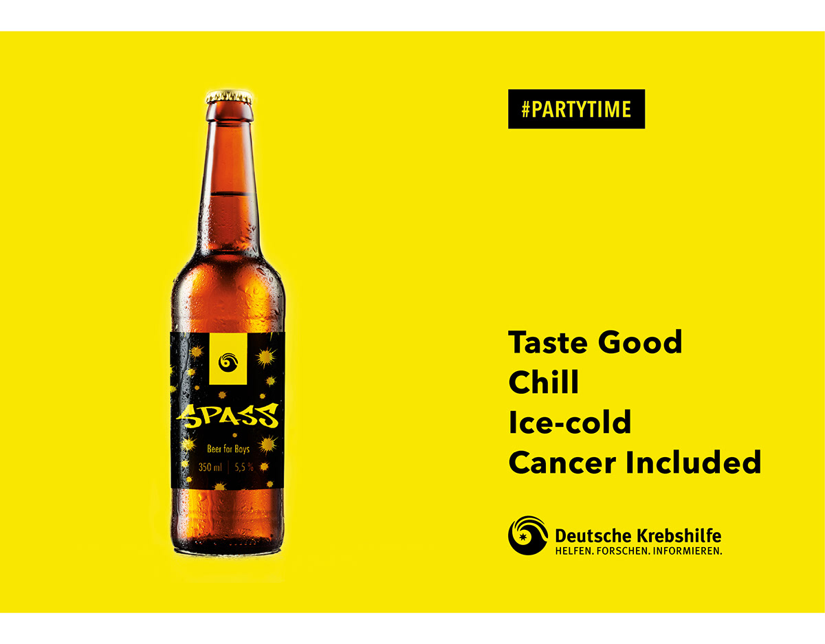
In the beer, the shapes are put in the appearance of beer bubble.

Packaging design
For the cigarette, "Cool" is used as the brand name as many teenagers smoke because they want to look cool. Green and black colors are used. It is because green color can reflect teenager's energy and the black color make the advertisement look more like a campaign and more serious.
For the fries, "Lecker" is the brand and it means "tasty" in German. Yellow and red colors are used as this is a classic color combination of fries of some brand. Red and yellow also represent dangerous and warning and it fits the theme of the campaign.
For the beer, "Spass" is the brand and it means "happy" or "fun" in German. Yellow and black colors are used as yellow color is the color of beer in general. Black color make the campaign look serious.


Design mockups


The End
Thanks for watching


