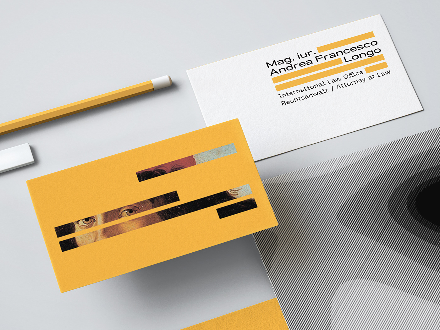
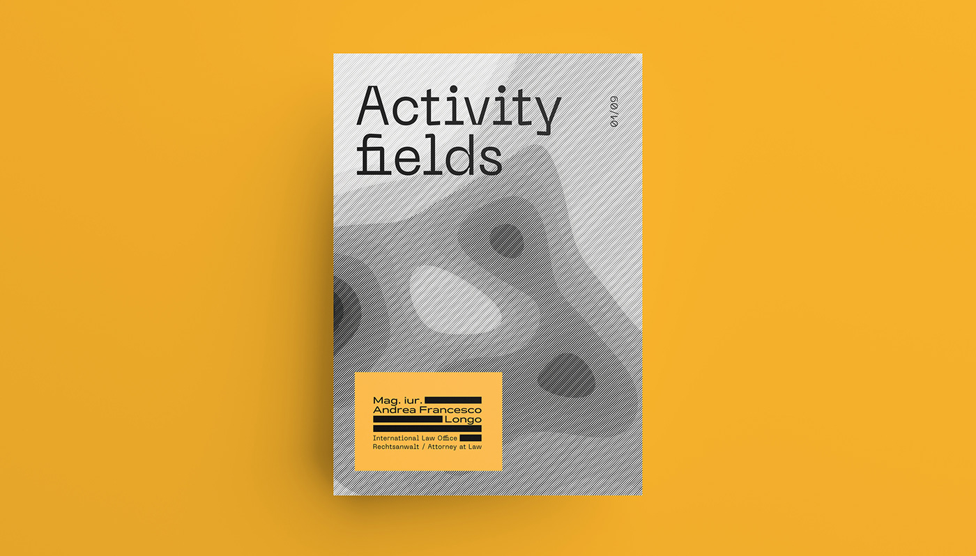
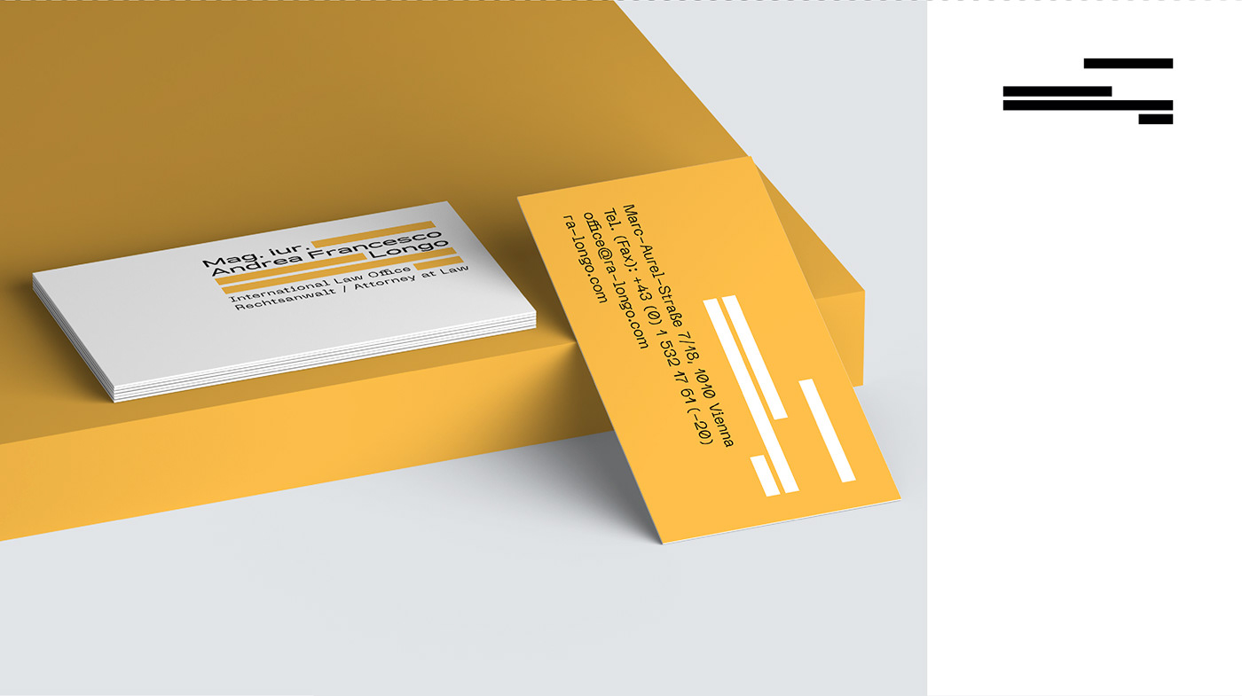
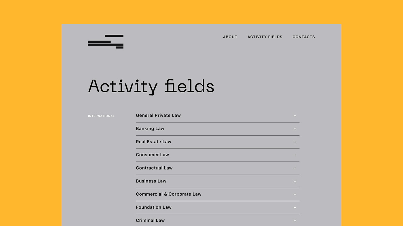
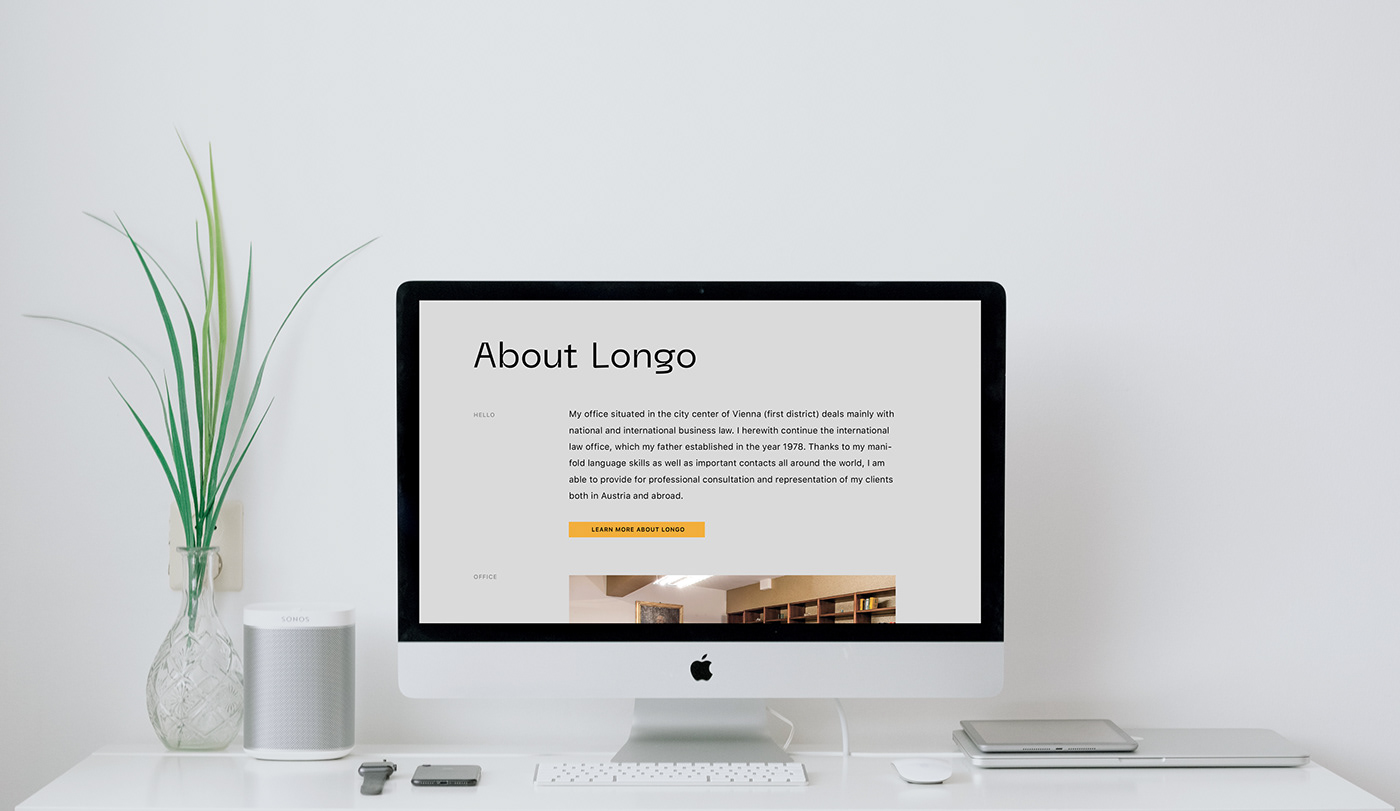
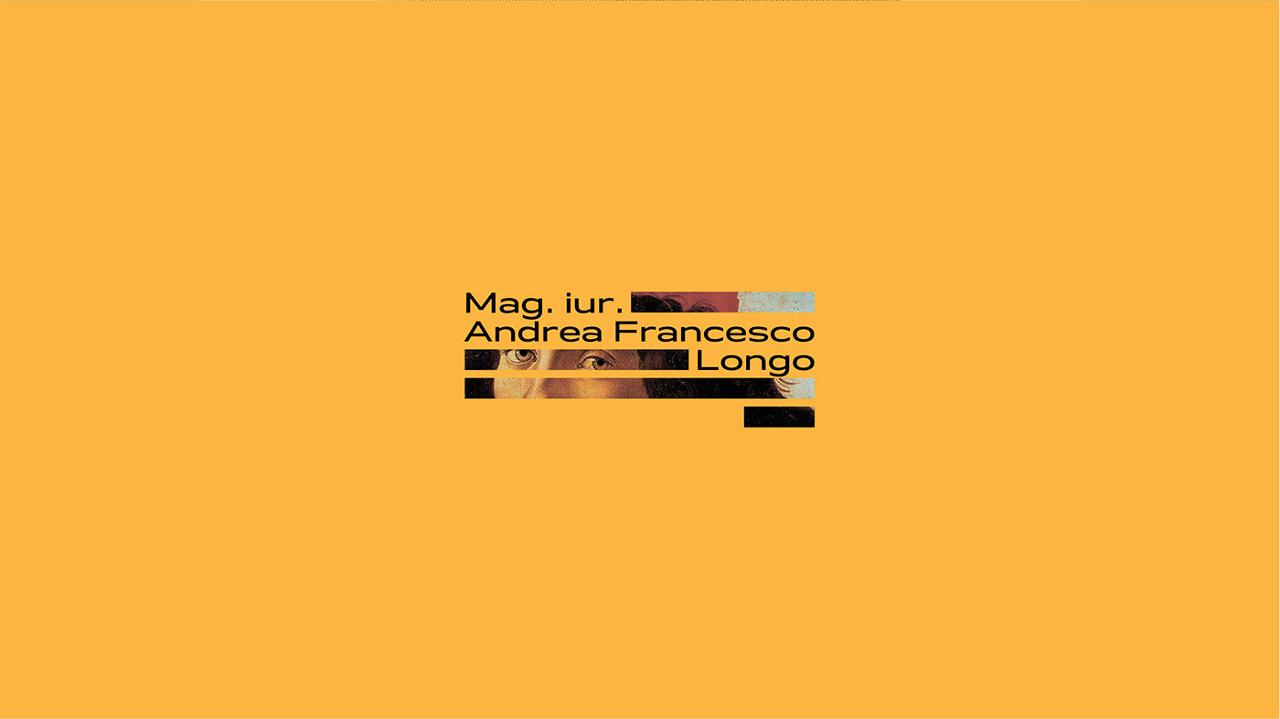
Our studio has developed a new visual identity for Mag. iur. Andrea Francesco Longo (Vienna). The aim of the rebranding was to connect to the core of the brand’s target audience as determined by its philosophy of “Less is more”—it’s better to concentrate on a few select clients and give them all of your time and energy, than to have a plethora of clients you’re only able to serve superficially. Based on such brand values as: perfectionism, trust and status, a brand platform called “Top Secret” was born. The concept was inspired by a painting that depicted partially blacked out fingerprints (symbolizing the idea of client safety and legal security) in the client’s office. Having examined the office further, we noticed that a great number of the law books, contained in his library, had yellow spines, which lead to our corporate color choice. We also recalled James Bond films, top secret and encrypted files, the Enigma code and Alan Turing's method. For the logo, we settled on an abstract encryption symbol, referencing the visual aesthetic found in classified documents. We also took our client’s Italian roots into account, combining classic Italian traditions (Renaissance paintings used as visuals in communication media) and a modern approach to business.