

Kalon Tea
─
Kalon (noun): A beauty that is more than skin deep, an outward sign of inward goodness, nobility, and honorable character.
Kalon Tea is a tea factory in Taiwan. The founders were deeply fascinated by the beauty of tea since 1981, they have been focusing on exploring the unique flavour of the tea. Just like the scientist discover the new element, Kalon names and defines each new flavour like the elements on the chart.
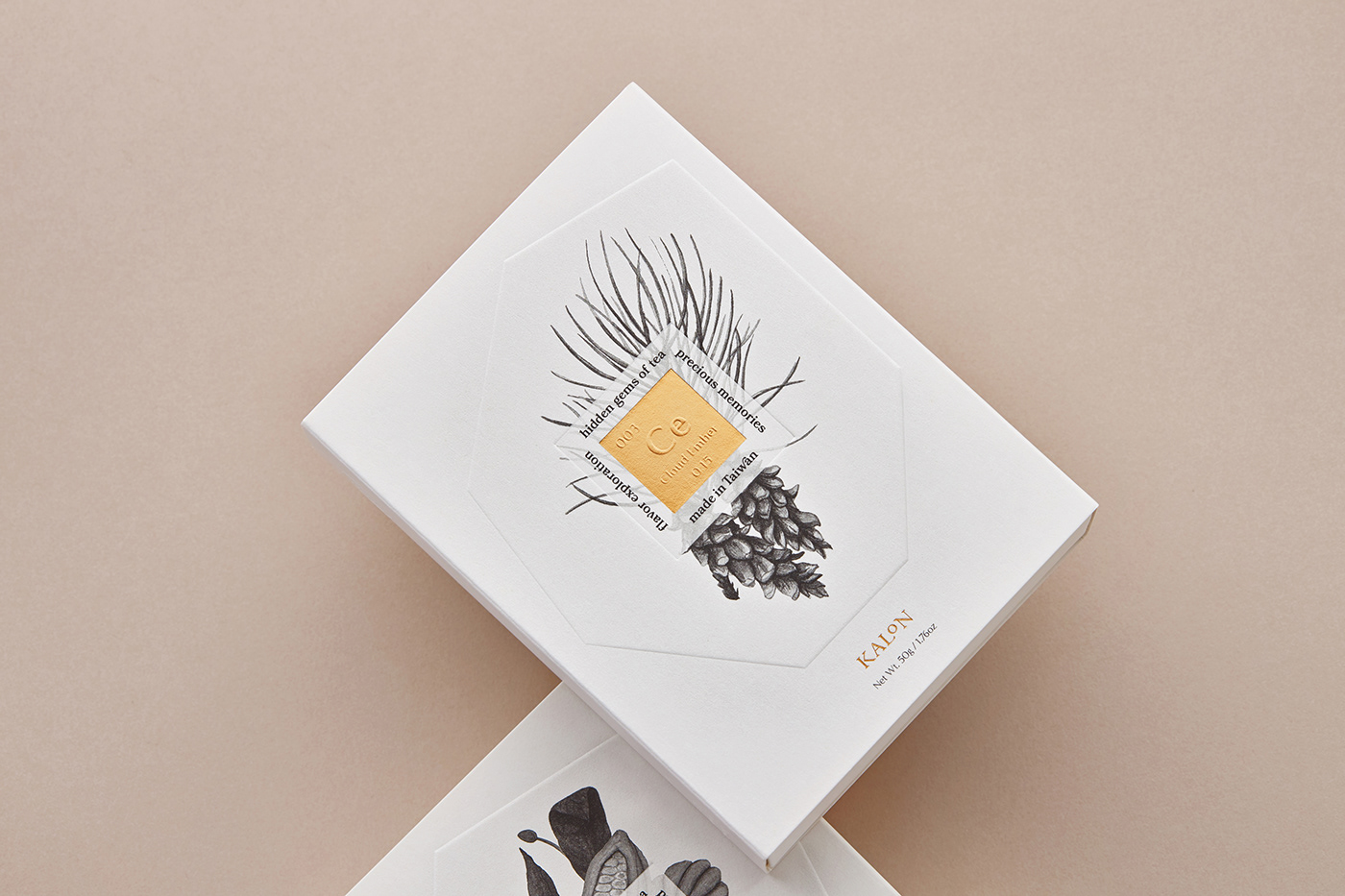
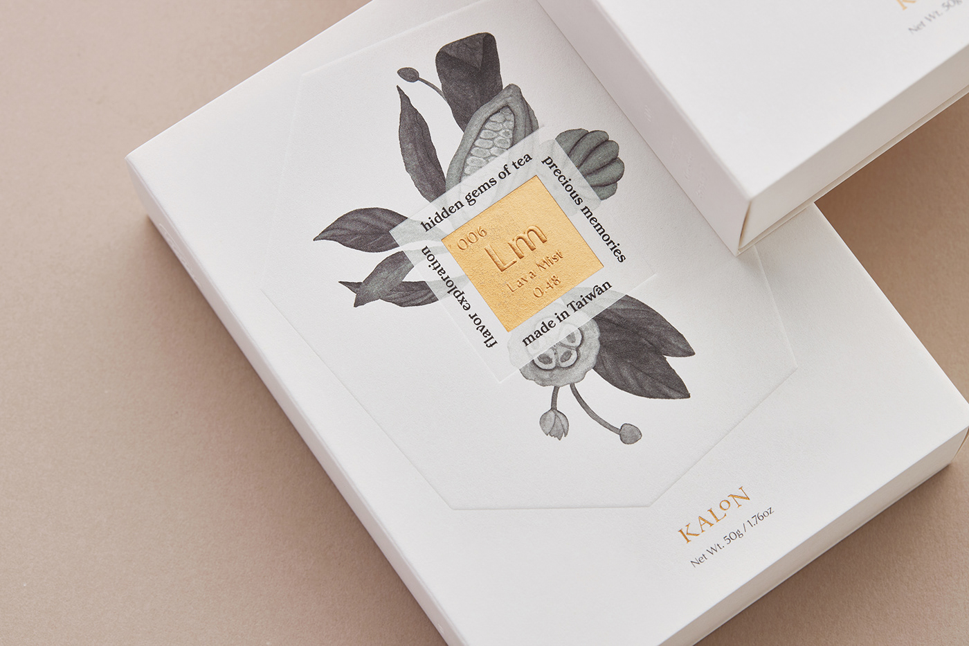
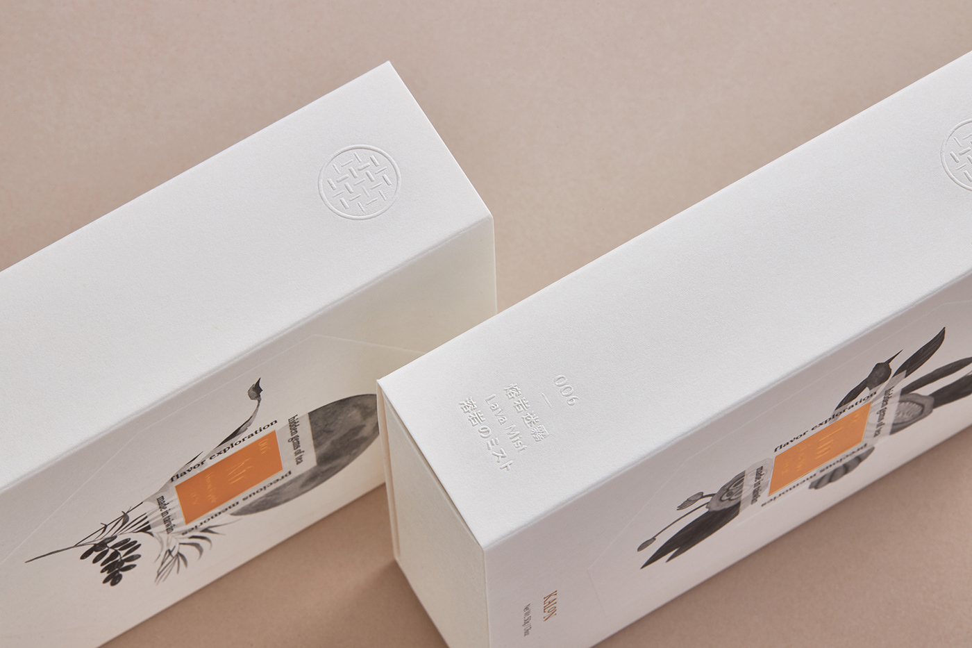
Hidden Gems of Tea
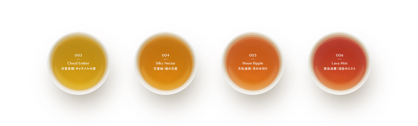
The process of developing tea fragrances is like digging for rare gems. To reflect the brand image, this packaging uses the periodic table of the elements as the visual inspiration and sets a unique number and denomination for each different gem aroma to establish a complete tea fragrance system. Hidden inside the plain white box, you will be delighted to discover the tea body of gem image, each flavour has its unique colour, flashing each unique and unforgettable taste bud memory.


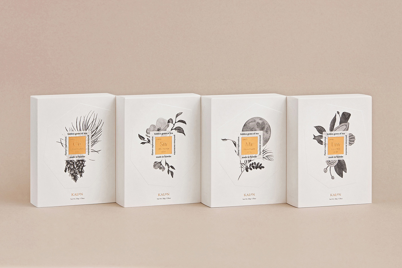


研發茶香的過程猶如挖掘稀有寶石,埋首茶葉堆裡作業只為遇見令人傾心的新味道。為了體現開蘭茶茶葉科學家的品牌形象,這次包裝以元素周期表的視覺方式去呈現系統性的命名,並為每款不同的寶石香氣設立專屬的編號與名稱,建立一套完整的茶香系統。另外,隱藏在素白外盒的裡面,你會欣喜發現寶石意象的茶體,不同味道有各自專屬的顏色,閃爍着每個獨特而難忘的味蕾記憶。
開蘭茶是台灣南投的自有茶廠,深深著迷於茶香的美好,1981年起開始以科學研究態度專注開發茶葉的特有風味。猶如科學家發現元素的欣喜, 開蘭茶為每個新口味命名與定義,希望你找到一款屬於你的茶香,重溫生命中的美好曾經。
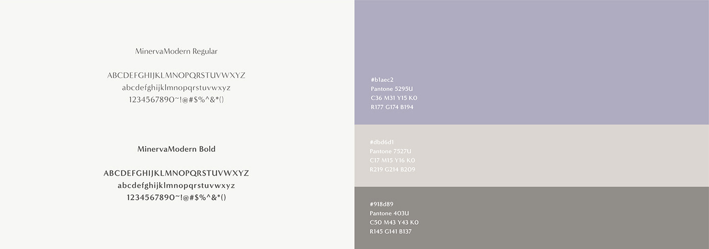
AD&D. Choi Hiocheng
CL. Kalon Tea Company
Product Phot. Mo Chien
CL. Kalon Tea Company
Product Phot. Mo Chien
Year. 2019


