Stay is a mobile guest experience platform that enhances how guests interact with hotels during their stay. In a few years, they have greatly increased their products' portfolio and that led to improvisation when working at different touchpoints.
They wanted to be perceived as a technology-savvy partner offering simple to use and fast to install customizable solutions. They needed a brand system ready for an in-house implementation allowing a certain degree of improvisation in future growth phases.
In a technological environment, where space economy predominates in every way, we believe that having a brand-name memory element that works autonomously is essential. We found a technological element that helped us telling in a simple and natural way, that they can interact with the preferences of their clients' guests to make their stay better. A very recognizable gesture in a very technological environment that speaks about choices.
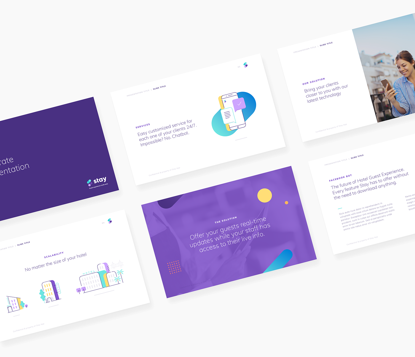
For the color palette, we chose a purple as the main color supported by normally dominant blues in the tech world and an extended color range to favor a more friendly visual and illustrative world that helps us raise the voice with a more casual tone when needed. An illustrative world part of a brand system that can be easily followed-up by their in-house teams.
Enjoy your stay!