


This UX/UI Case study is a personal project which focuses on creating an effective mobile shopping application. The concept for this project revolves around combining the traditional approach of an online shopping experience with the social media aspects of Pinterest to create a new experience. One where the user’s taste is accounted for in a more direct way.
Research shows that 90% of weekly Pinterest users make purchase decisions by reviewing pins they saved. 80% of the 291 million Pinterest users are doing so through the mobile platform.
In light of this I decided to explore ways of providing a more personal shopping experience, one which inspires users to make a purchase rather than overwhelm them with products they never needed.
...

RESEARCH
To start off I researched other online markets which are considered as ‘big fish’ in the business. Mobile apps for Amazon, Ebay, Craigslist, Wallmart and Etsy where among the most prominent contributors to my findings. User flow and features unique to each app where taken into account. A pool of 100 user reviews ranging from 1 to 5 stars provided clear pros and cons across all the apps I analysed, upvoted reviews where given more importance. These user reviews where sorted into 3 main categories:
1. Navigational Issues
2. Technical Bugs
3. Content Issues
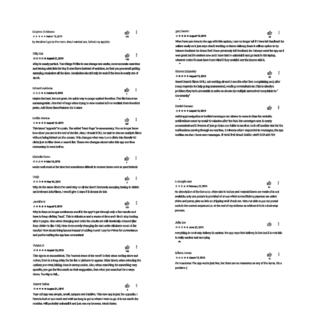
For the sake of conducting more UX targeted research, I focused more on the Navigational issue category. The most prominent issues mentioned were:
- Cluttered homepage
- Too many menus & non intuitive navigation
- Unreliable filtering options and Ineffective search results
- Product page count
- Hard to purge multiple items from wish-list
A smaller pool of user interviews gave me further insight into how the mentioned issues effect the user’s experience. One remark really stood out to me as it highlights how lacking current solutions are, when it comes to connecting with their users.

...
PAIN POINTS & GOALS
Research has been summarized into the following “Pain Points”:
- The user is overwhelmed with too many product choices and distractions
- Long unintuitive navigation is causing the user to lose interest
- Current solutions do very little to facilitate the user’s need to be inspired into buying specific products which fit his/her
unique taste
In response to these “Pain Points” are the following Goals:
- Design a streamlined filtration system which helps the user explore all products relevant to them without feeling overwhelmed or nagged into a decision
- Build a simple, compact, intuitive navigational experience by:
1. Defining clear hierarchy within layouts via proportion, contrast and functional animation
2. Reducing navigational steps without compromising functionality via UI which responds to user intentions
3. Use repetitive visual cues to help train the user into feeling in control and familiar with the UI
...
RESULTSThe following prototype demonstrates proposed solutions in action. High definition viewing is recommended.
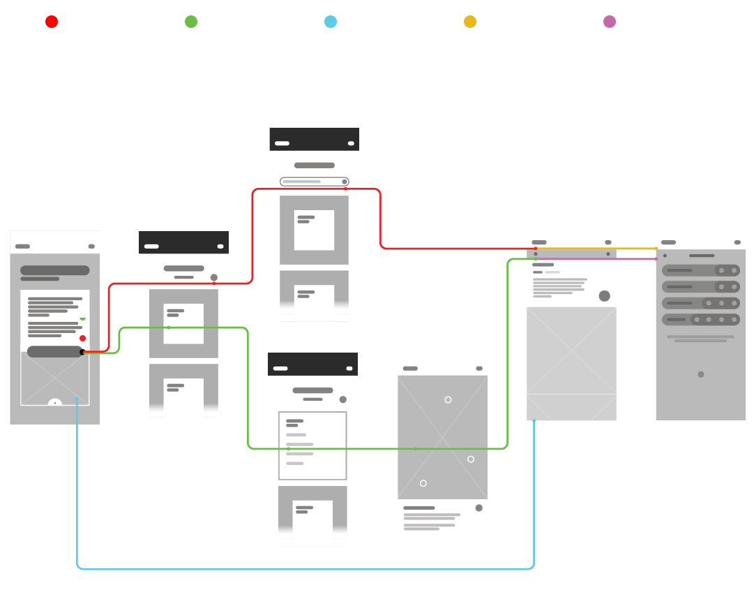
USER FLOW
The diagram below proves how the app would satisfy the needs of five common user scenarios, it does this by illustrating user flow for each kind of user. The goal of these user flow diagrams is to get the user to a Products Browsing screen which is most relevant to their needs. It also makes sure that the user reaches the Products Browsing page using the shortest and most intuitive path.
CONCLUSION
This personal project would require a larger data pool and further testing needs to be conducted for this approach to be entirely justified. That being said, I believe that it shows promising results with regards to achieving the previously mentioned goals.


